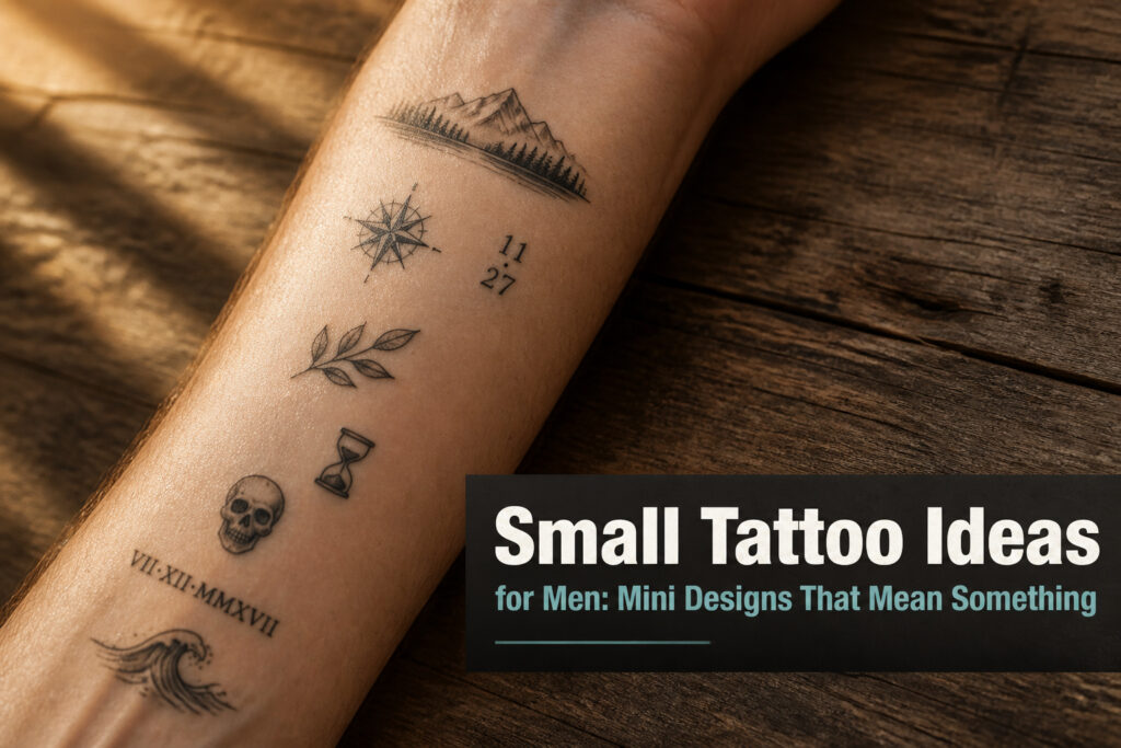
Small tattoos for men range from $100 shop minimums to triple that for micro-realism, but price is not the real filter. The deciding factor is whether the design you want can still read in two inches after the lines soften. A melting watch needs four clean weight transitions to stay liquid; a skull needs a pinhead highlight in each socket or it collapses into a dark oval. The article below walks each design by what actually determines if it lasts.
1. Melting Watch
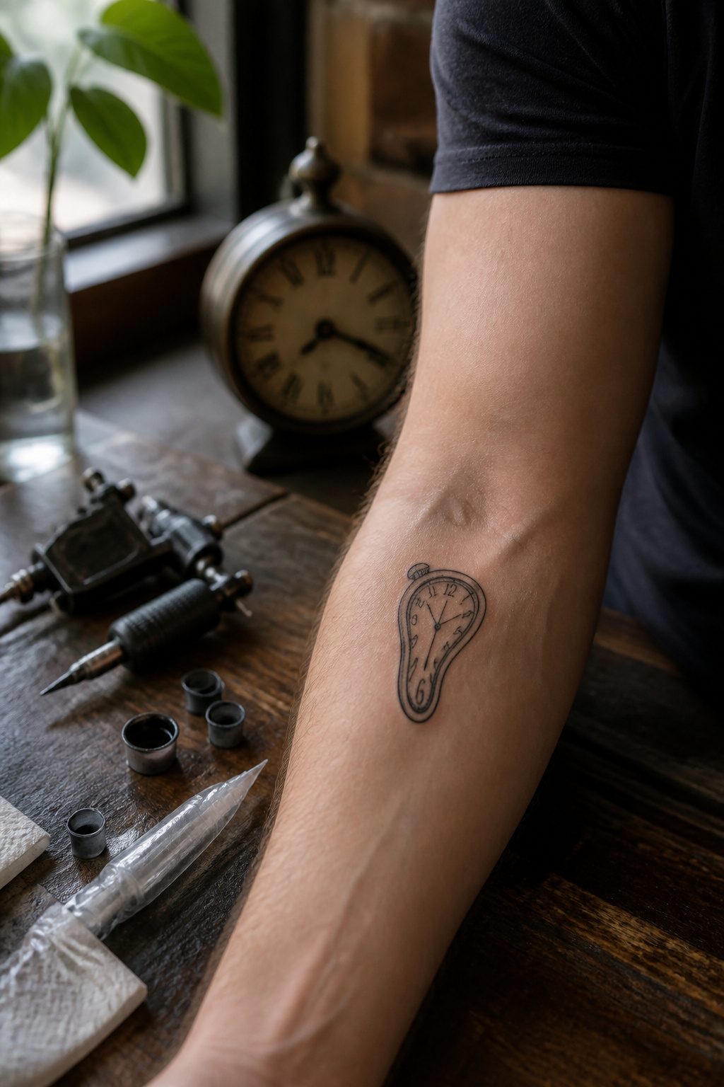
Salvador Dalí’s melting clock folds surprisingly well into two inches of skin or less. The soft, draping curves carry the image even when the numbers dissolve into suggestion. I have watched artists preserve the liquid slump of the original with three or four clean weight transitions, no heavier than a fine liner pass, letting the surrealist tension read without crowding the wrist or inner forearm.
Small tattoos heal on the surface in 2–3 weeks, though deeper layers take up to six months.
That surface window matters for a piece this reliant on delicate line weight. Shop minimums run $100–$180, and the cost lands less in the ink than in the artist’s control of micro-detail. Patchy saturation kills the melting effect; the clock must look like it is yielding, not like it was drawn poorly.
2. Spiders
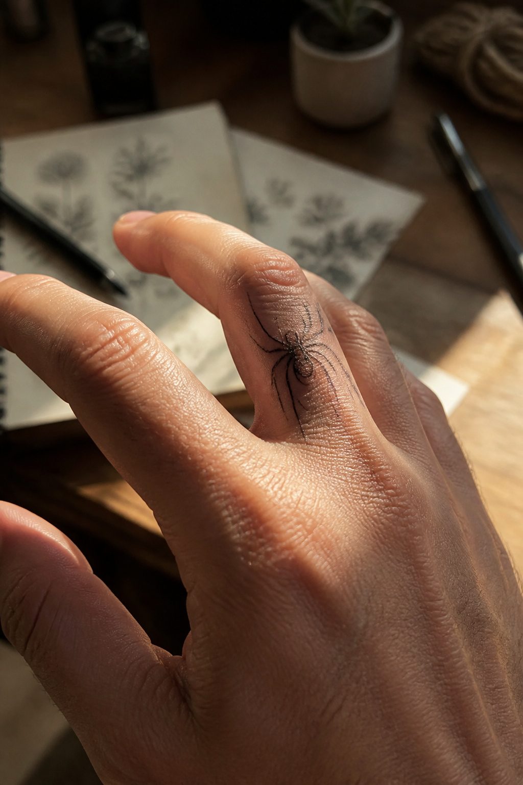
A spider on a finger or the side of a hand works because the eight legs give the artist something to do even at half an inch. The body sits at the joint or the knuckle, and the legs trail across the webbing or down toward the wrist. Neck placement turns the spider into something seen only in passing, a profile view that depends on the legs reading as legs, not a blob with sticks.
Bony spots like the finger joints push a 2–4/10 pain rating toward the higher end. The needle rattles against tendon and bone, and what reads as mild on a forearm becomes sharp and concentrated where the padding is thin. The neck carries the same risk along the spine and at the collarbone edge. A good artist will keep the lines single-needle and fast, knowing that fine detail in a tender spot tests how long the client can hold still.
The cost lands at shop minimum, usually $100 to $180, and the session runs 45 to 90 minutes not because the spider is complex but because small work demands steadiness the artist cannot rush. Surface healing takes two to three weeks, though the deeper layers settle over months.
3. Intricate Crosses
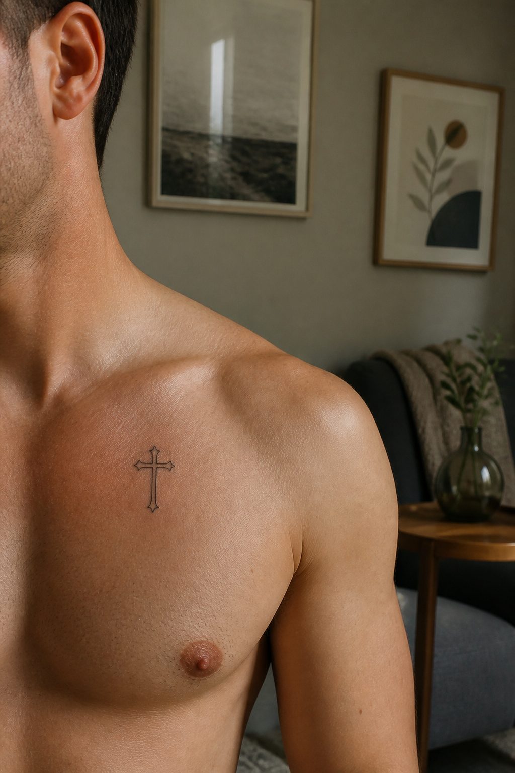
A cross scaled down to two inches or less only stays readable if the line weight hits a sweet spot. Go too fine and the ink bleeds into a gray smudge within five to seven years on a hand or wrist; go too bold and the detail you wanted collapses into a black bar. 0.3 to 0.5 millimeter lines, with 0.8 to 1.2 millimeter outer borders, hold their geometry through a decade or more on a chest or shoulder where sun and friction stay low.
Forearm interior or upper chest keeps the meaning for you, not the room. That matters when 27% of American men already carry at least one tattoo and the question is no longer whether to get one but whether yours will still look like itself at forty. Protected placement plus SPF 50 on the rare days it sees sun buys you ten to fifteen years before a touch-up, against half that on exposed skin. The chest sits flat, too, which lets an artist build real interlace or filigree without the distortion a curved surface adds.
Meaning here works the same as any small symbol: pick the specific cross that maps to an actual event or person, not the general idea of faith. The design ages better because you keep seeing the reason, not just the shape.
4. Skulls
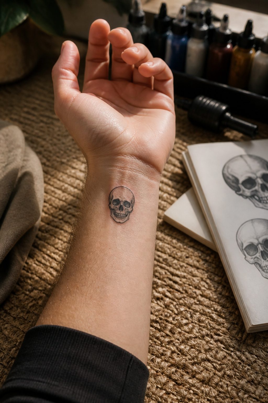
Skulls have been part of American tattoo culture since the trade began, and they still hold ground because the jawline and eye sockets simplify naturally at small scale. A photorealistic piece can run no larger than a quarter and still read as bone, while a single needle line drawing reduces the same shapes to three clean strokes. The forehead and cheekbone planes flatten to geometry without losing recognition, which is why the style jumps so easily from hyperdetail to minimal.
Placement matters more here than with most small designs. Hand and wrist work keeps the skull visible without drifting into face-tattoo territory, and the upper arm lets it sit as a single unit or anchor a larger sleeve later. One in six tattooed men in the US already carries multiple pieces, so a small skull often becomes the anchor point that future work arranges around. The 17% who stack ink tend to start with something this adaptable.
The eye socket is the detail that makes or breaks the piece at small sizes. Too much black fill and it becomes a dark oval; too little and the skull loses its gravity. A good artist leaves a highlight point in each socket, no larger than a pinhead, to keep the bone from looking punched out. That single decision separates a skull that ages clean from one that blurs to an unrecognible blob in five years.
5. Abstract Stars
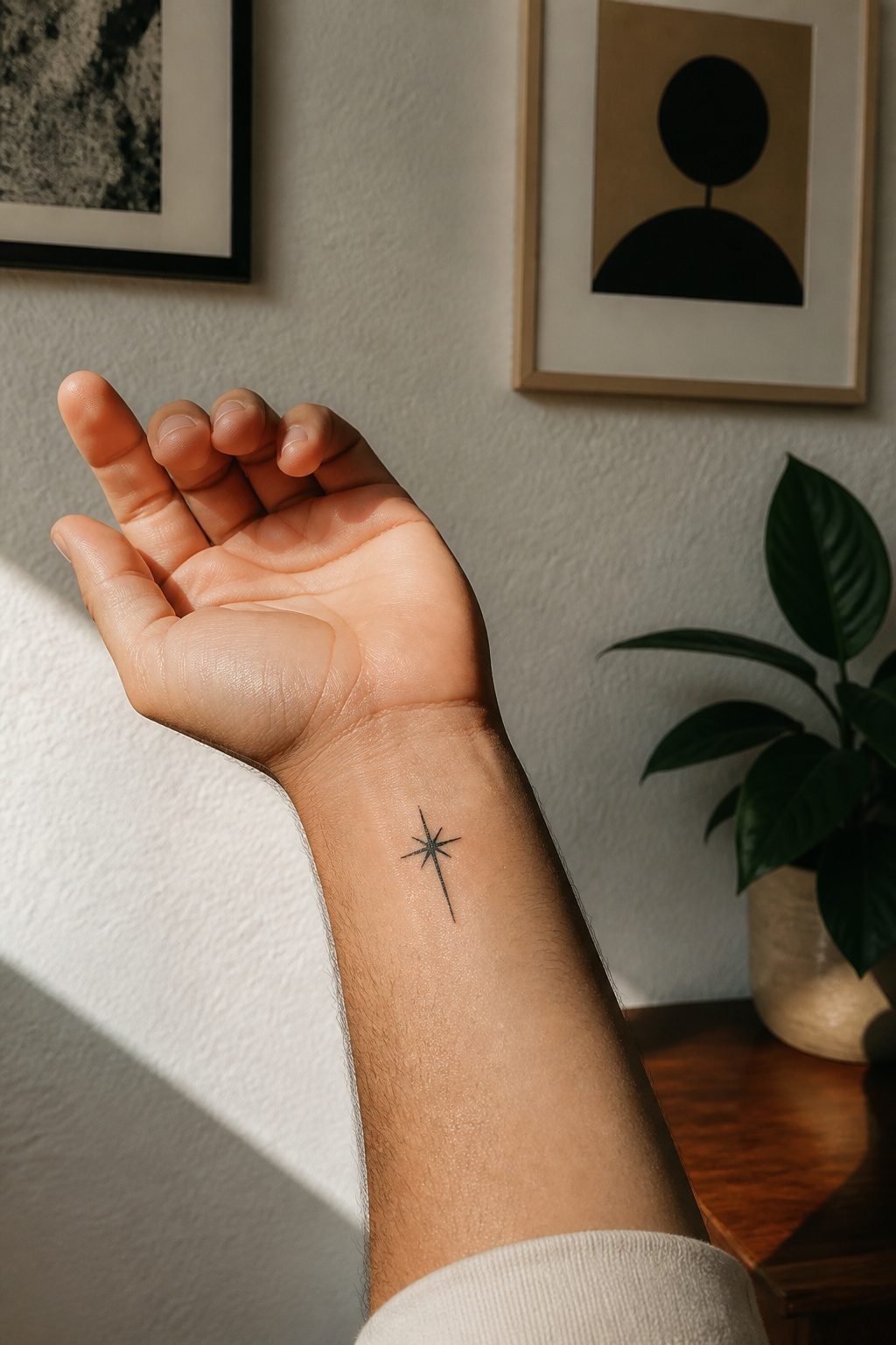
A five-point star with perfectly straight lines and identical angles looks fine at three inches. Shrink that same design to an inch and a half and the proportions fight each other; the points turn stubby or the center goes muddy. Abstract versions solve this by picking one or two elements and letting the rest dissolve. A curve that suggests an arc without completing it, or a cluster of short lines that imply radiance without drawing every ray, keeps the star readable at the size most men want for a first tattoo: something that hides under a work sleeve and does not need explaining.
Geometric abstraction also dodges the clip-art problem. A literal star risks looking like a sticker from a childhood workbook, especially in solid black. Breaking the shape into triangles, or using negative space so the skin itself forms the center, gives the design enough structure to feel intentional and enough restraint to stay subtle. The best versions I have seen use asymmetry: one long line against two short ones, or a gap placed deliberately off-center. That small imbalance keeps the eye moving and stops the tattoo from flattening into a symbol.
For a first piece, this matters more than most people expect. A small abstract star sits well on the inner wrist, the side of the ribcage, or behind the ear, places where the skin shifts and stretches. The simplified geometry holds up because there is no fine detail to blur as the body moves. It reads as a design choice rather than a compromise, which is exactly what you want when you are still learning how a tattoo feels on your body and whether you want more.
6. Lego Characters
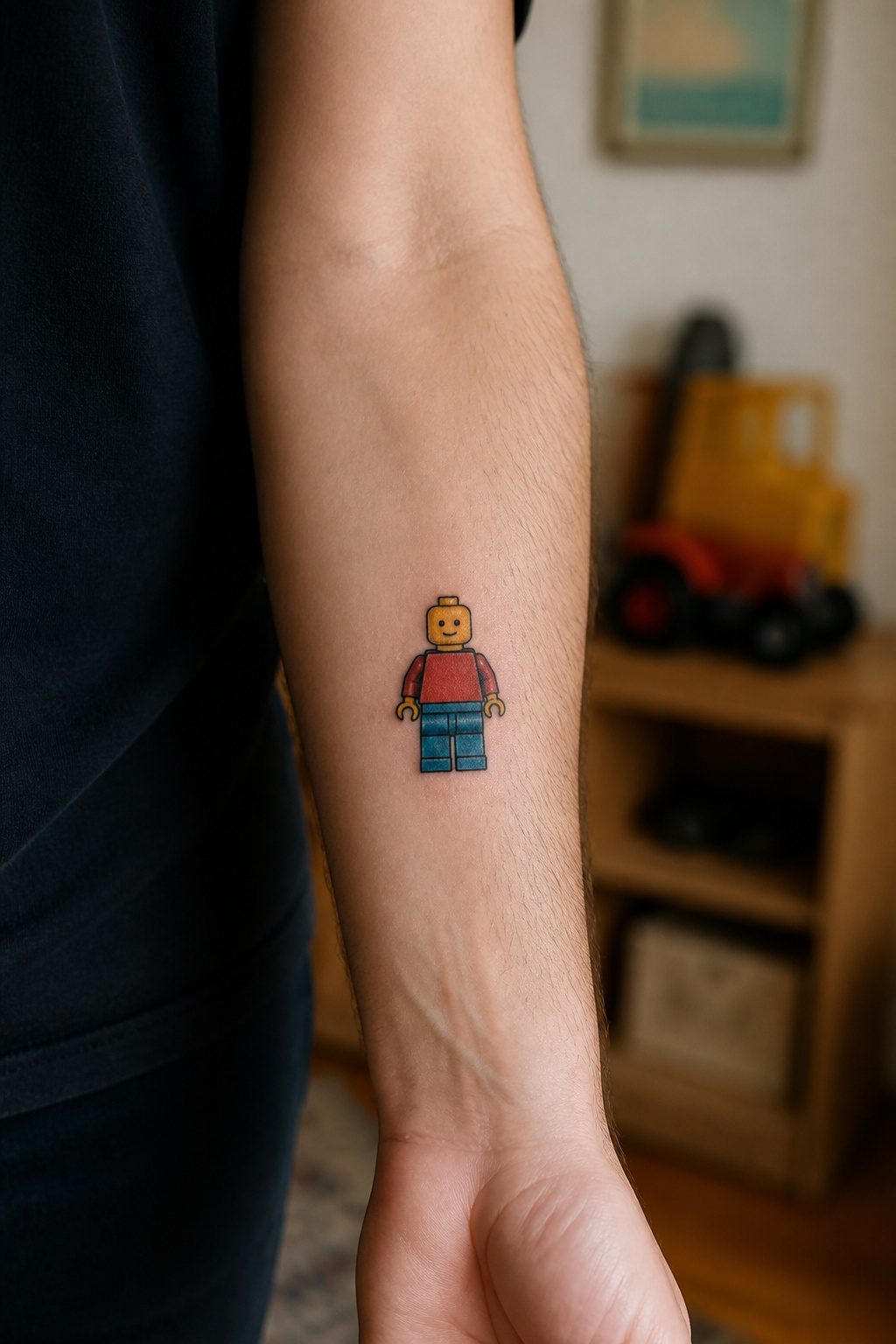
A Lego minifigure reads well small because the design was already built for tiny, molded plastic. The cylindrical head and blocky limbs are simple geometry a needle can trace without bleeding into noise. I have seen a two-inch Boba Fett on a forearm hold up from five feet away, and the reason is those rounded corners and single-width lines. The original toy designers solved the tattoo problem forty years before the gun touched skin.
Simplified color blocking helps too. A yellow face, single-color torso, black hands: three passes, maybe four if you want the printing detail. Most of these run one to three hours depending on whether you add a accessory or keep it bare. The bare version is smarter. A lightsaber or coffee cup in 1.5 inches turns to a stick, so I tell people to pick the figure that is recognizable by silhouette alone.
7. Eyes
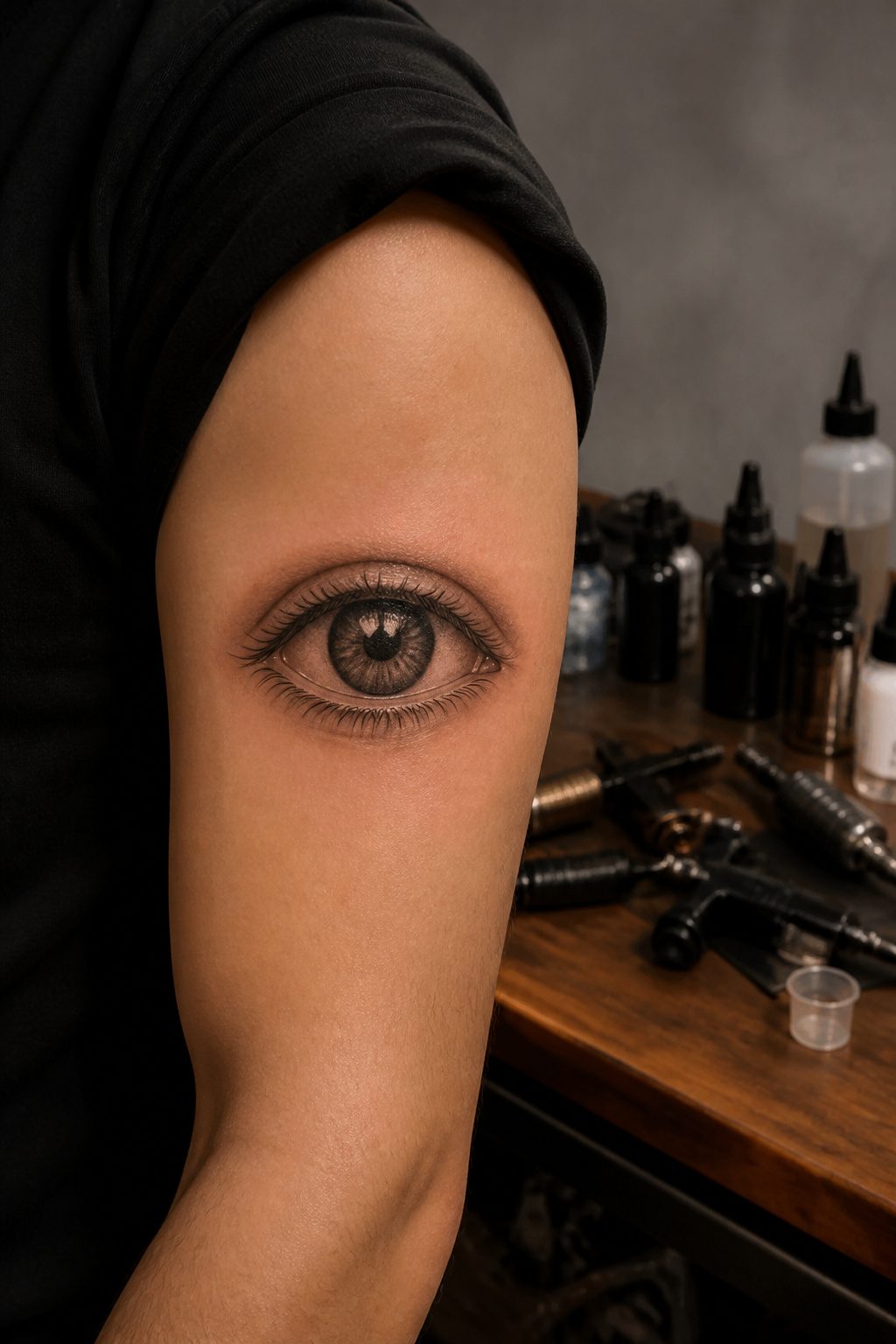
An eye the size of a quarter still needs a pupil that reads as round, an iris with at least two tones, and a catchlight or the whole thing flattens into a grey oval. That is the line. Drop below two tones in the iris and the image fails; you lose the wet look, the depth, the reason you wanted an eye at all. Single needle work can hold detail down to roughly the diameter of a sesame seed, but the artist has to know which marks carry information and which ones blur together in six months.
Micro-realism specialists work at this scale regularly, and the difference shows in how they plan the fade between iris and sclera. A generalist often tries to pack in every striation and ends up with mud. Someone who does this weekly leaves negative space deliberately, knowing that skin heals slightly softer than the stencil reads. Ask to see healed photos from a year back, not fresh work. The detail you are paying for lives or dies in that window.
8. The Creation of Adam Hands
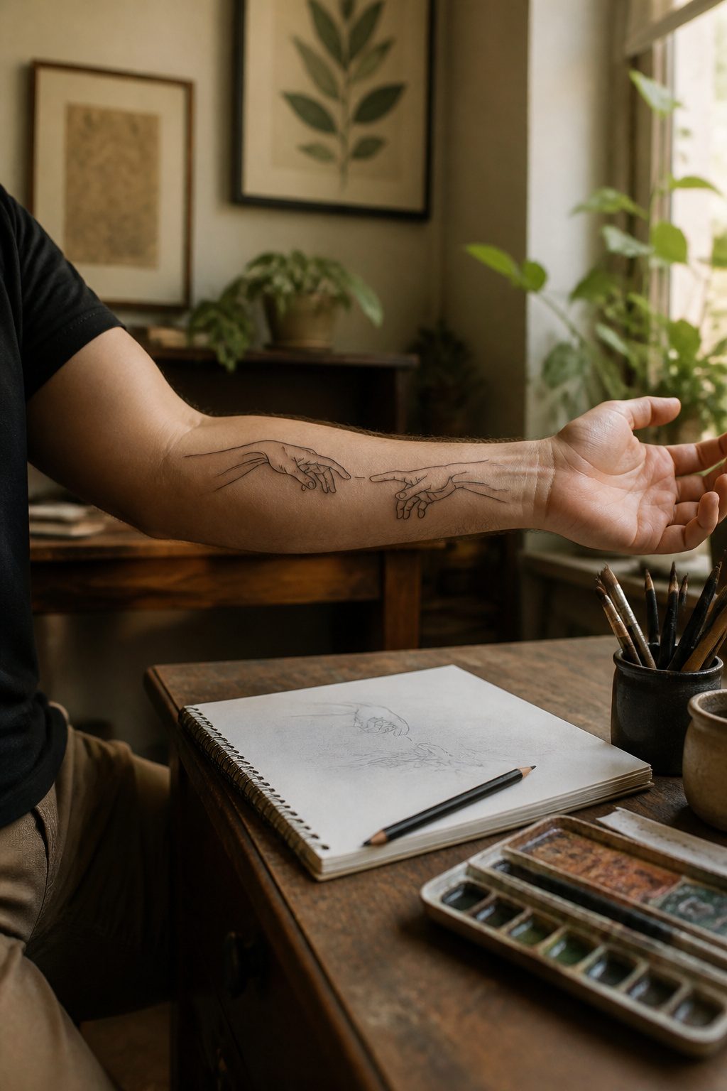
Michelangelo’s near-touching hands from the Sistine Chapel ceiling work surprisingly well at palm size or smaller. The power is in the crop: slicing the famous frame down to just those two reaching fingers turns an epic scene into something private, a quiet moment between you and whoever recognizes it.
The gap between the fingers is what makes or breaks the tattoo. Too narrow and the ink will blur together inside of a few years as the skin ages; too wide and the tension dissolves. Most artists worth their rate leave roughly the width of a pencil line between the fingertips. That space reads as alive, charged, the moment before contact.
Skin movement matters here more than with most small pieces. The back of the hand shifts constantly, so placement on the inner forearm or just above the wrist tends to hold sharper lines longer. I’ve watched this design age on friends who went either direction. The ones who respected the negative space still have fingers that look like they might touch; the ones who cheated the gap ended up with a smudged clasp that lost the original meaning entirely.
9. 8 Ball
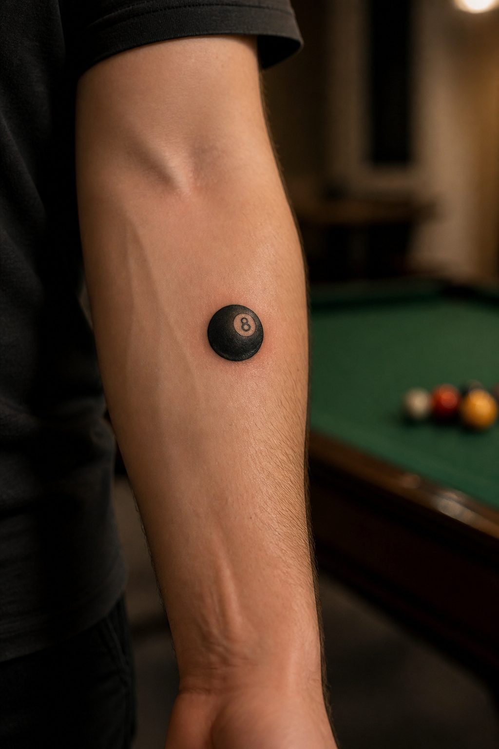
The solid black fill in an 8 ball tattoo ages better than most small designs because the ink sits in one dense plane rather than in fine lines that spread. A billiard 8 ball reads instantly at small sizes, the white circle and black field holding that high contrast even after years of sun and skin turnover.
Wrist placement keeps it in sight, though the bone there makes the session sting more than muscle areas. The forearm gives the artist a flatter bed and the wearer an easier healing stretch, plus you catch it in peripheral vision without the hand-in-face frequency of the wrist. Either way, the circle shape wraps naturally around the arm’s cylinder, which is why the design has stayed common in shops for decades.
Black fill does require a heavier hand than outline work. Go too light and it heals gray; go too deep and it scars. The good artists build it in passes, letting the skin cool between rounds. Ask to see healed photos from their book, not just fresh work, because that solid field tells the truth about their saturation in a way line art can hide.
10. Ice Cube
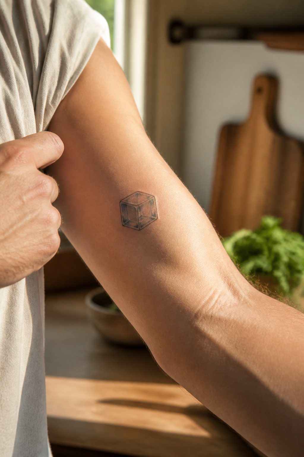
Frozen water sounds like a terrible subject for ink that sits under your skin, and that contradiction is exactly what makes an ice cube tattoo interesting. The whole point of ice is transparency, light passing through, and tattoo pigment is fundamentally opaque. What convinced me, looking through portfolios of artists who pull this off, is that the best ones stop trying to render clarity and start using negative space as the medium itself. The "clear" parts of the cube are your skin showing through, framed by pale blue or gray linework that suggests refraction without ever claiming to achieve it.
Placement matters more here than with most small designs. The back of the hand or the inner forearm gives the flat plane an ice cube needs to read as a solid object with edges catching light. Curved areas, like the bicep or calf, break the geometry and the illusion collapses. I have seen attempts on fingers where the cube looks like a misshapen blob, the negative space reading as accidental gaps rather than intentional design.
The highlight is the trick: a single small white dot or un-inked fleck at a corner, placed where a real ice cube would catch a light source. Without it, the shape goes flat. With it, the whole thing suddenly has depth, temperature, weight. The tattoo stays small, under an inch in most cases, because scaling up just reveals how much the negative space depends on proximity to read correctly.
11. Cyber Sigilism
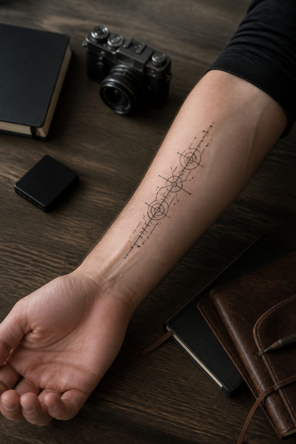
Thin lines that look sharp on a phone screen do not always stay sharp on skin. Cyber sigilism, the style mixing circuit-board geometry with occult marks and gothic arches, blew up on social media for exactly that reason: it photographs clean against black backgrounds and flat lighting. The reality is different. 2–3 weeks of surface healing is standard for small work, but the deeper layers keep settling for months, and those hairline traces are the first to blur as collagen shifts. An artist who understands the style will build in a touch more weight than the reference image suggests, knowing the 0.3 mm Instagram stroke will feather out. Placement matters here more than most. The inner forearm or collarbone, spots that see less direct sun and less rubbing against denim seams, hold the precision longest. Fingers and wrists, popular for the "jack into the matrix" look, age faster and hurt more; bone proximity pushes the pain scale toward the 4 end. Shop minimums still apply, so a design that takes forty-five minutes can cost the same $100–$180 as something twice the size. The trade is worth it only if you accept that the tech-gothic edge will soften into something more organic within a few years.
12. Matchstick
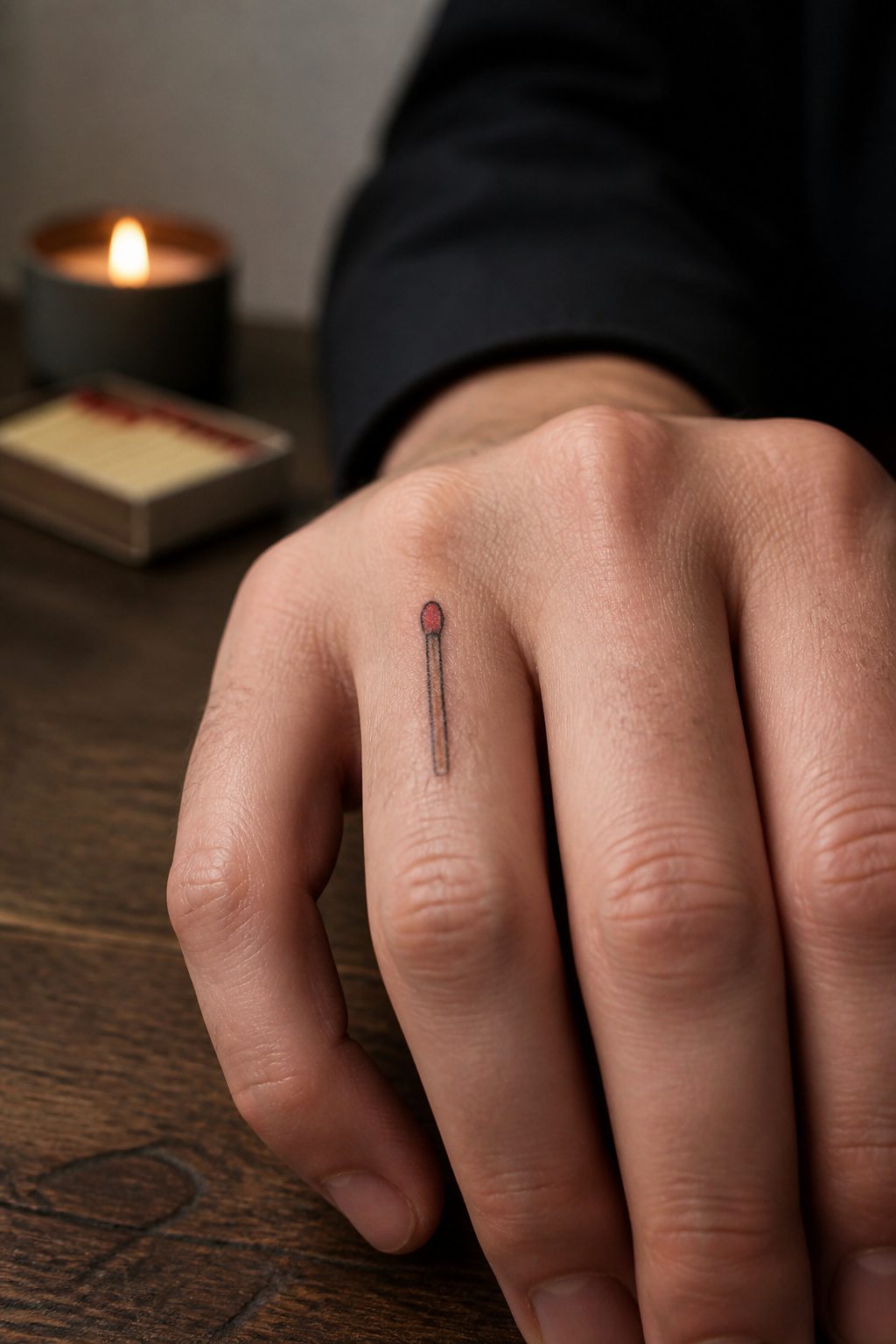
A single matchstick tattoo carries more meaning than its size suggests. The slender form follows the natural line of a finger or tucks cleanly behind the ear, placements where a bulkier design would fight the bone. An unlit match reads as potential, a flame reads as action, and the red tip gives you color in a space that usually forces blackwork. That small dot of pigment holds up because it sits on a shape already drawn by the outline; the eye reads the whole match, not just the red. Behind the ear, the mastoid placement hides it for work and reveals it with a hair tuck. Along the finger, it becomes part of daily gesture, the flame upright when the hand rests on a table. Either way, the matchstick rewards the minimalist impulse without looking like a symbol you grabbed from a flash sheet because it was small enough.
13. Mini Faces
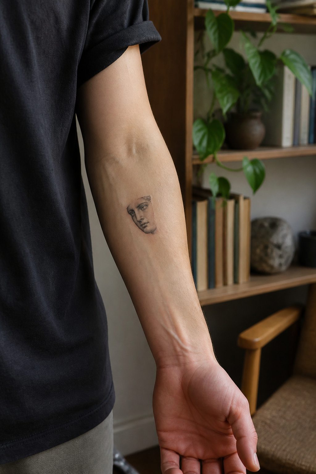
A portrait the size of a half-dollar can still read as a face, but the margin for error disappears fast. Below an inch, noses flatten and eyes melt into dark blobs unless the artist knows exactly which lines to keep and which to drop. That is why experienced artists matter for this subject more than almost any other small tattoo ideas for men.
The pain sits low on the scale, around a 2 to 4 out of 10 on most placements like the inner forearm or wrist, though bone proximity nudges the number upward. Collarbone and tricep work carry that same range with sharper moments where the needle rides the edge of bone. The real discomfort is mental: sitting still while someone renders your brother’s eyes or your daughter’s smile at postage-stamp scale, knowing one twitch wastes an hour of meticulous work.
Shop minimums apply regardless of size, so expect roughly $100 to $180 even for something that takes under an hour. The 45 to 90 minute session duration sounds brief until you are holding your breath so the artist can hit a two-millimeter highlight. A face tattoo is personal and public both; it redefines your image in ways that affect professional circles and daily interactions alike. Choose the artist for their portrait book, not their flash sheets.
14. Twinkle Stars
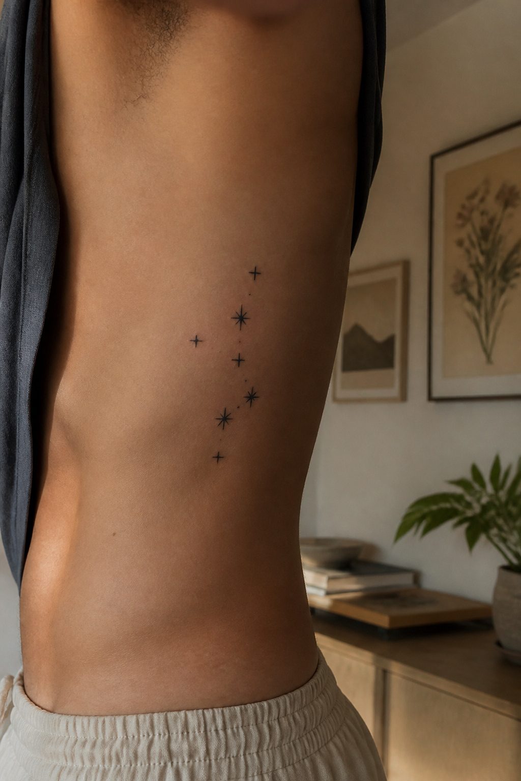
A single star tattoo, even a small one, risks looking like a sticker that wandered onto the wrong body. Clustering changes the logic entirely. Three to five stars with short sparkle lines between them read as a constellation or a stray bit of night sky rather than an isolated mark. The eye registers pattern, and pattern carries intention.
The sources note two ways to play this: tight clusters where stars overlap slightly, or a looser scatter with sparkle lines doing the work of connection. The tight version suits a wrist or collarbone, places where a small field of ink needs to hold together as one shape. The loose scatter works better on a forearm or rib, where the lines can stretch and the negative space between stars becomes part of the design.
Color is where the men I know have split. Some keep it to black ink and let the linework carry the piece. Others add a single accent color, usually on one star or on the sparkle lines themselves, so the cluster has a clear center of gravity. The passages mention protection and guidance as the usual meanings attached to stars, but clustered small enough, the symbolism loosens up and the tattoo reads more as texture than statement. That is often what a small tattoo does better anyway.
15. Flames
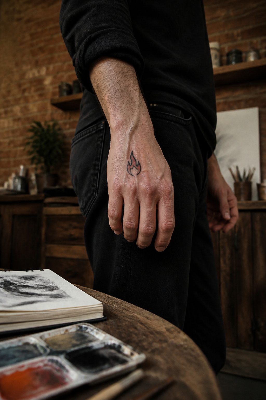
A small flame tattoo freezes motion in a way few other shapes manage. The classic teardrop with its pointed lick at top reads instantly as fire, the same shape sailors wore a century ago. Newer stylized versions stretch those curves into geometry or break the flame into single floating lines, and either approach works at two inches or smaller.
Color is optional in either camp. Black linework carries the shape on its own, and a skilled artist builds heat into the drawing through taper, not pigment. That said, a thin wash of orange or red at the base can suggest temperature without turning the piece into a bright decal. The meaning stays open, which is the point: passion, destruction, or the tension between them, depending on where you place it and what you tell people.
16. Swords and Daggers
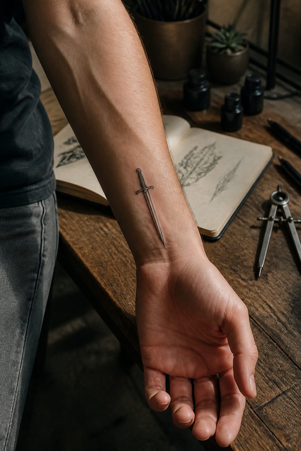
Small sword and dagger tattoos carry their weight through symmetry, not size. A straight blade reads cleaner at two inches than a curved one; the eye catches any waver in a line that claims to be vertical, while a saber or scimitar forgives less because the curve itself must flow without hesitation.
The hilt is where the detail lives. Guards, pommels, and wrapping take up more visual space than the blade ever could, which is the point. A three-quarter-inch crossguard with simple geometry anchors the design better than a longer blade with nothing at the base. I have redrawn more of these than I can count, and the ones that last are the ones where the hilt was sketched first and the blade grew from it, not the reverse.
Curved blades demand a single confident motion from the artist. Any stop-and-start line shows, and at small scale there is nowhere to hide it. Straight blades allow for shorter pulls and easier correction, which matters when the whole piece sits under two inches.
17. Barbed Wire
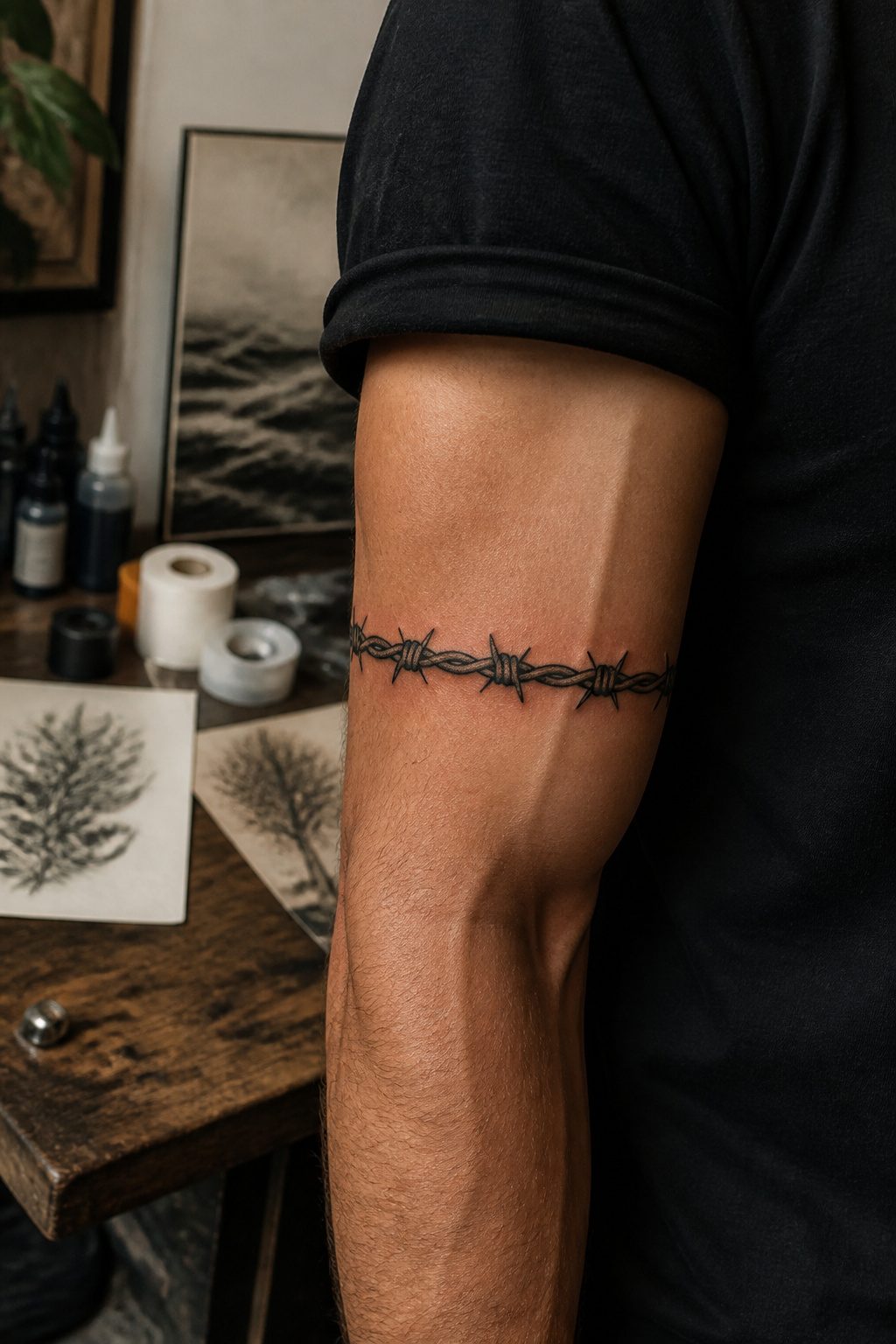
A single strand of barbed wire running the forearm reads like a scar you chose. The band version, wrapped clean around a bicep or calf, does something the isolated line cannot: it turns the limb into a continuous surface, the pattern breaking only at a seam the eye completes on its own. That wrap-around placement costs more in chair time and in the artist’s planning, but the continuity is the whole point.
The 1990s made this motif unavoidable on rock album covers and mall-poster blacklight art. What returns now is stripped down, usually blackwork without the old chrome highlights, and the context has shifted. Where the earlier wave leaned into aggression, the current small-scale version tends toward restraint, often paired with something organic, a rose stem or a soft script, so the barbs register as protection rather than threat. The smaller scale helps: at two or three inches, the detail stays readable without shouting.
Placement matters more than detail here. A strand that wraps the wrist or ankle will soften faster with movement and sun than a flat patch on chest or back. The band option also limits future work around it, the circle closing off the canvas in a way a straight line does not. Budget for touch-ups every few years if you go the wrap route, especially on a calf or forearm that sees regular sun.
18. Solar System
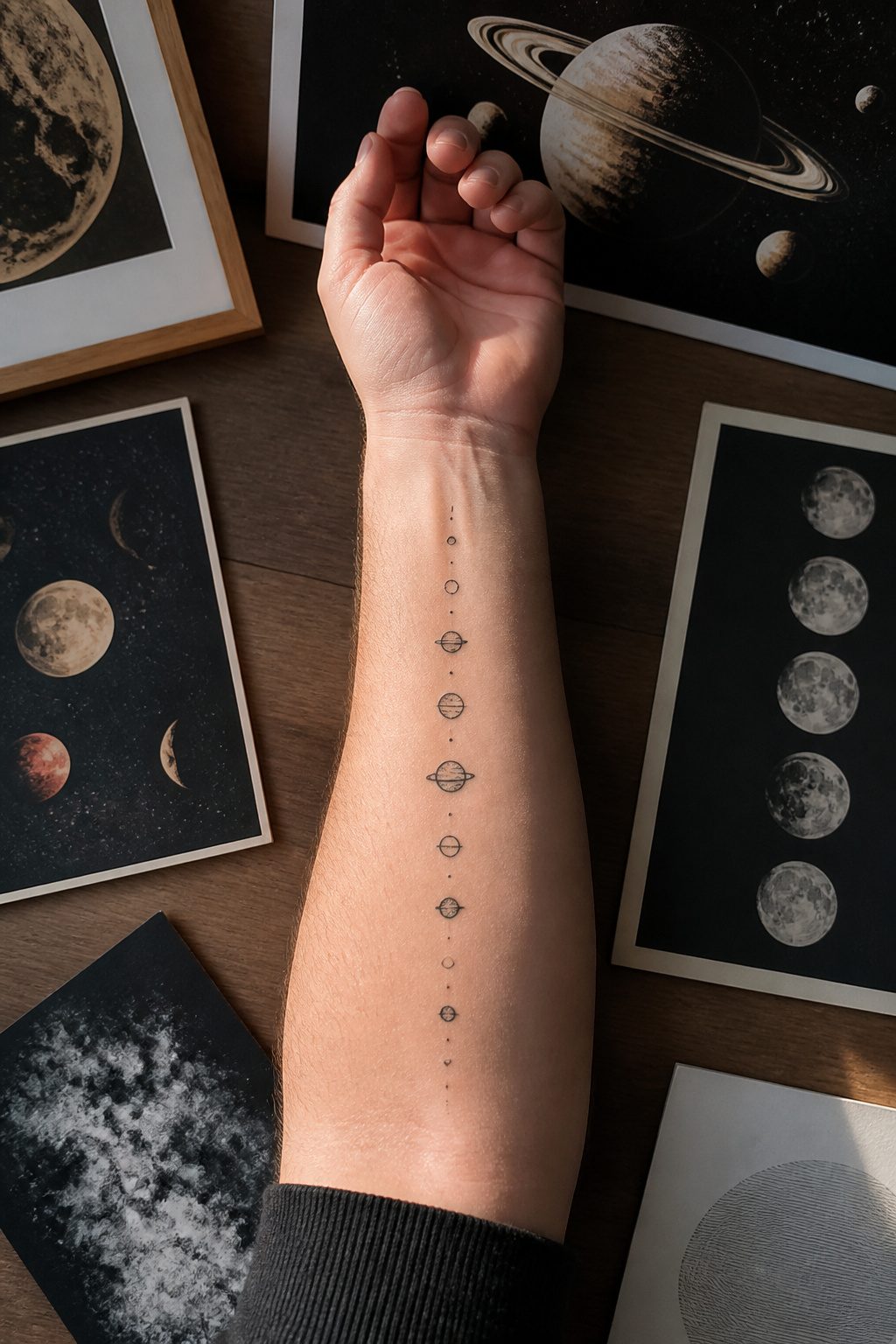
A solar system tattoo compresses eight planets plus maybe Pluto into a strip of skin about the length of your inner forearm. The trick is orbital spacing: Mercury sits almost on top of the sun, while Saturn and Jupiter swallow most of the visual room between them. Mars and Venus keep their detail longest because their surface features read as simple dots, but Uranus and Neptune lose color first and end up as hollow circles or single blue strokes. I have watched artists redraw the asteroid belt three times before they accept that a few grainy dots look like a smudge at this scale and drop it entirely.
Budget $100 to $180, which is standard shop minimum for the precision work this demands. Straight lines matter more here than in most small pieces because the orbital paths are long relative to the planet size; any wobble throws the whole sequence off. Black ink must pack solidly for the planets you keep dark, and the artist needs to manage micro-detail without letting color bleed between orbits. A 45- to 90-minute session is typical, though simpler black-only versions sometimes finish faster.
19. Kiss Mark
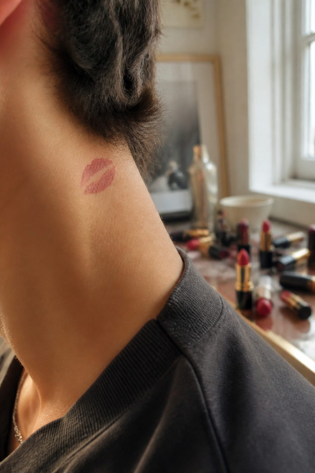
A lip print tattoo lives or dies on how the ink handles the soft edge of worn lipstick, not the hard outline of freshly applied color. That blurred transfer is the whole point; crisp linework turns the image into a sticker instead of a kiss.
The collarbone and side of the neck are the usual placements, spots where an actual lipstick mark might land. At small sizes, the gradient from saturated center to faded rim needs enough skin to read. Too tight against the jaw or tucked too far under the clavicle, the blur collapses into a smudge without the recognizable shape.
I have watched artists fight this by overworking the dotwork, trying to render every pore and texture. The better move is fewer passes with a single needle, letting the machine’s vibration do the softening. The skin does the rest as it heals.
20. Snake
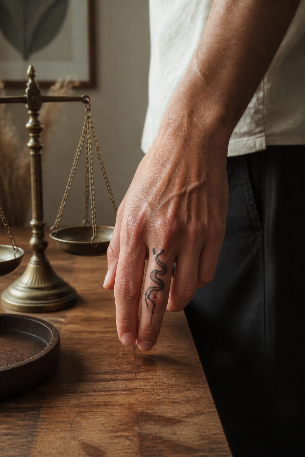
A snake coiled into a spiral or stretched along a finger knuckle works because the body bends to fit whatever odd space you have left. The curve wraps around a wrist bone or tucks behind an ear without fighting the anatomy. At small sizes, individual scales disappear into gray mush; the better move is a few hatched lines near the head and tail that suggest texture while the middle stays clean black silhouette. I learned that lesson watching a 45-minute session turn a two-inch cobra into a smudged mess because the artist tried to render every diamond scale. Suggest the scales, never draw them, and the design holds for years. Surface healing runs two to three weeks, same as any small line work, though the bend points, wrist and finger especially, scab thicker from movement. Placement on the inner forearm or tricep sits flatter and heals cleaner. Shop minimums land around $100 to $180 even for something this compact, so the snake pairs well with a second small piece in the same sitting if you want to get your money’s worth.
21. Spiderweb
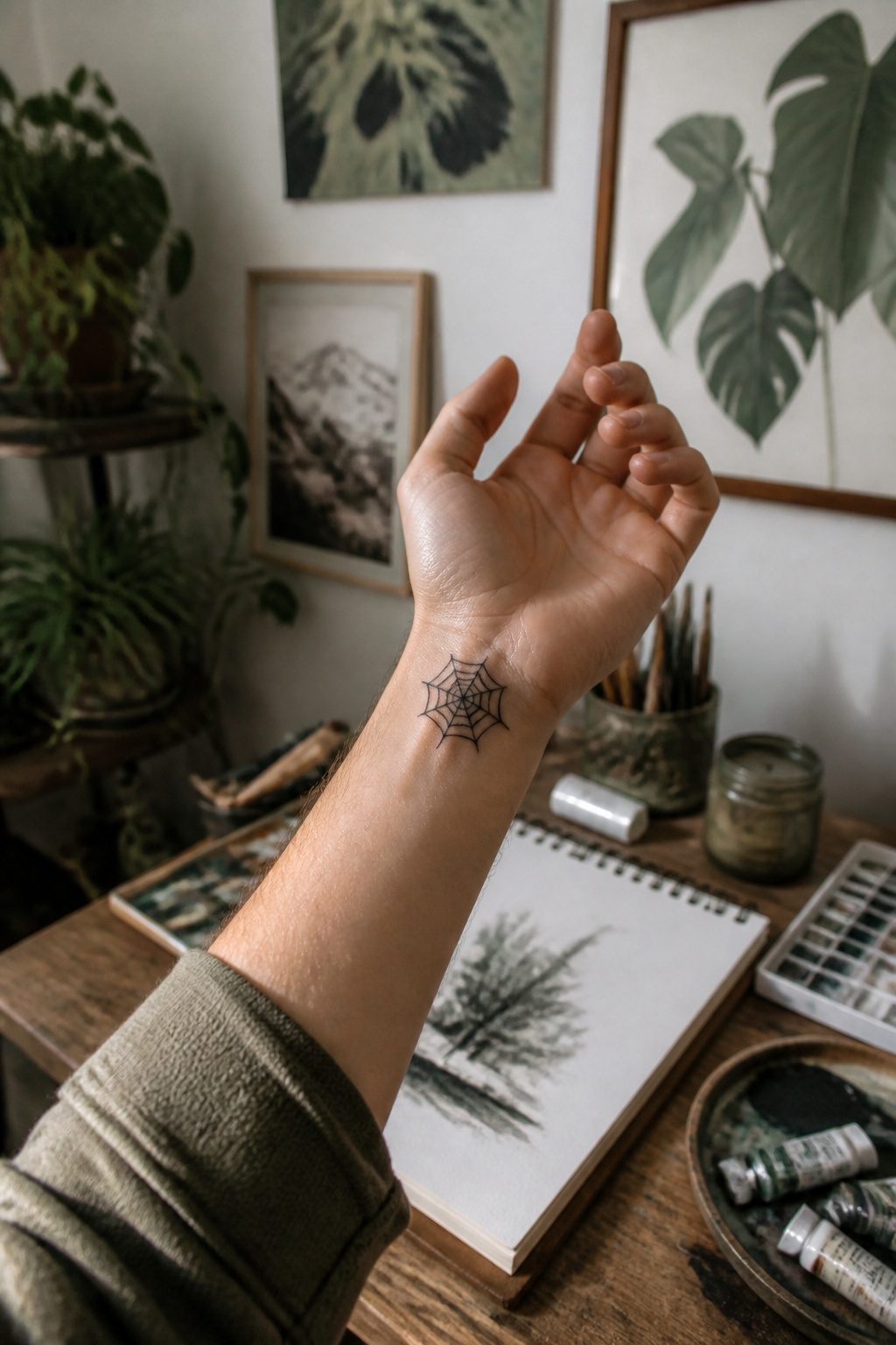
A spiderweb works two ways as a small tattoo: radial symmetry draws the eye inward, making it read as complete even at two inches across, or it fills gaps between existing pieces without fighting for attention. The single-line approach, one continuous thread from center to edge, holds its shape better over the years than shaded versions where static gray can blur into a muddy smudge. I have watched fine web work on a forearm stay readable after a decade because the black lines stayed crisp; the same size with dot-shading needed a touch-up at year four.
With 27% of American men already tattooed, the web pattern suits someone adding to a sleeve or starting small. It carries enough weight to stand alone behind an ear or on a wrist bone, and the geometry means your artist cannot hide a wobble. That precision costs time, so book an appointment with someone who shows healed photos of line work, not just fresh ink.
22. Copyright Birth Year
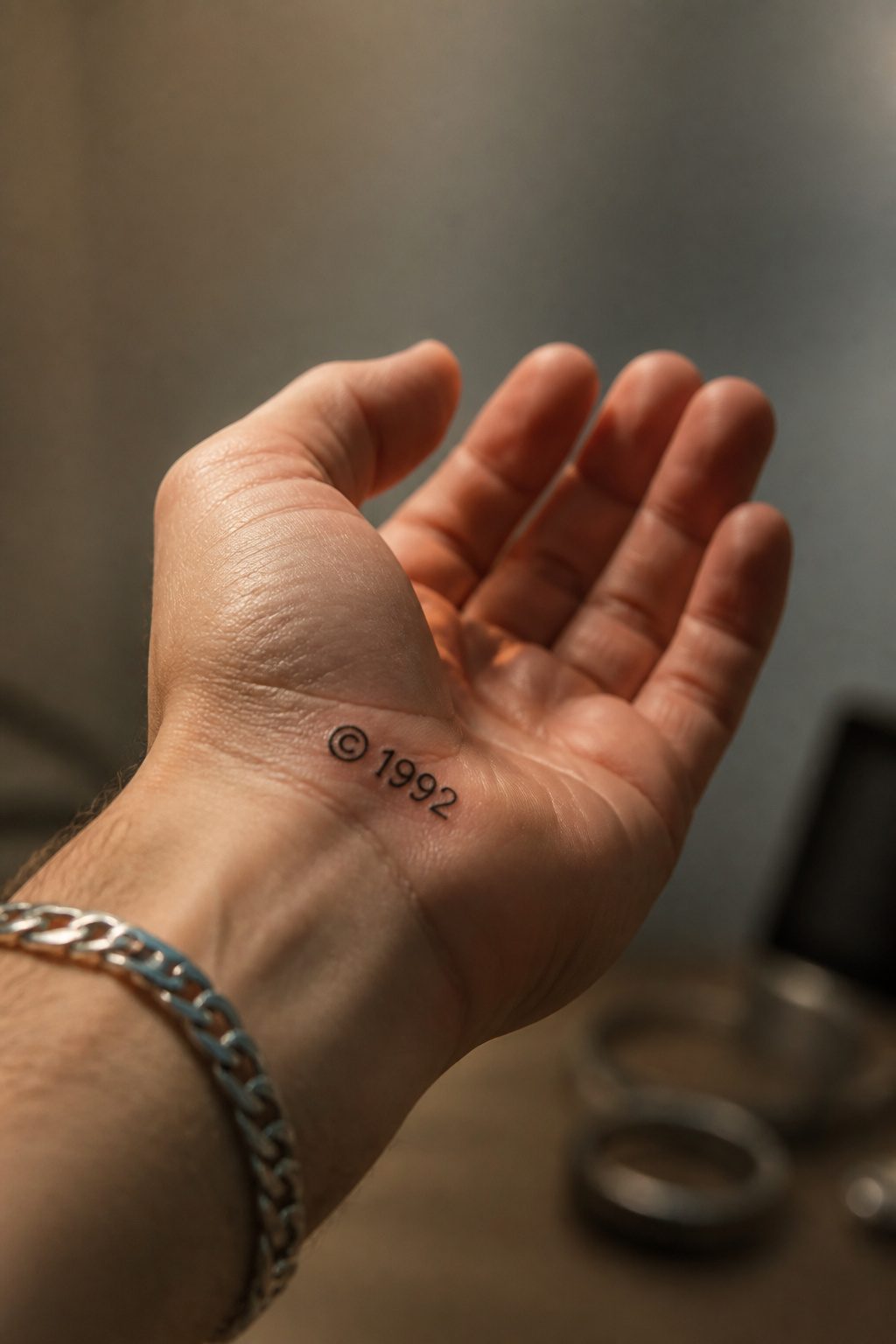
Four digits and a symbol carry more weight than most people expect from a small tattoo ideas for men search. The copyright mark flips a birth year from diary entry to declaration, and the spacing between them is where the design lives or dies.
I have watched clients bring in screenshots where the © sits dead center between numbers, and the result looks like a label on a shipping crate. The better move is tucking the symbol tight against the last digit, baseline aligned, so it reads as punctuation rather than a separate element. A 1992 with the symbol riding low and close feels stamped, official, almost like a maker’s mark on steel.
Font choice matters more here than with word tattoos. Serif numerals at small scale (think 1.5 to 2 inches across the wrist) hold their line weight where sans-serif thins can blur into ambiguity within a few years. Old Style figures, with their varying heights and descenders, keep four digits from looking like a safe combination.
Placement on the side of the finger or the flat plane below the thumb works because the shape is already horizontal; the eye accepts it without rotating. On the collarbone the same design needs more air around it, otherwise the symbol crowds into the clavicle line and the whole thing reads cramped.
23. Cute Ghost
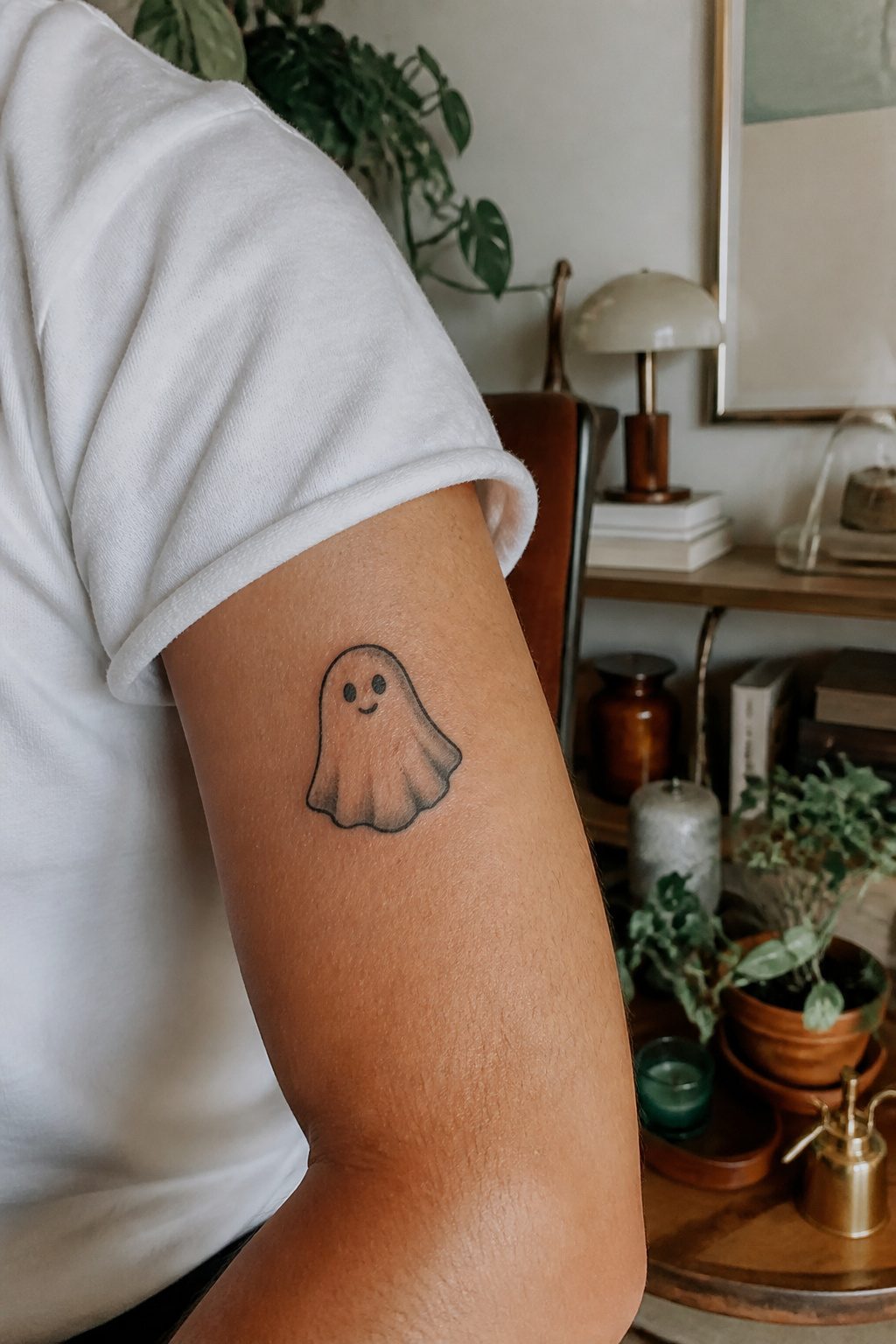
A sheet ghost distills the figure to three curves: the rounded dome of a head, the widening drape of the body, and two stubby arms reaching out like a child asked for a hug. There is no jaw to shade, no ribcage to get right, no fingers that will blur in two years. The form lives or dies on how those curves meet, and a good artist keeps the edges soft enough that the ghost looks like fabric rather than a cutout.
The expression carries the weight. Two small black ovals for eyes, maybe a downturned mouth or a tiny surprised O, and the thing becomes a feeling rather than a costume. That is why the image works past October. A Halloween tattoo dates itself; a small sad ghost on the inner wrist reads as a mood, a shorthand for anxiety or grief or just liking something a little strange. The subject has slipped into year-round use because the sheet form strips away the seasonal details. No pumpkin, no cemetery, just the basic idea of something friendly hiding under a cover.
The rounded edges matter more than the face. Sharp corners turn it spooky; keep everything bulbous and it stays approachable. Placement on the upper arm or behind the ankle lets the curve follow the muscle or bone instead of fighting it.
24. Anchor
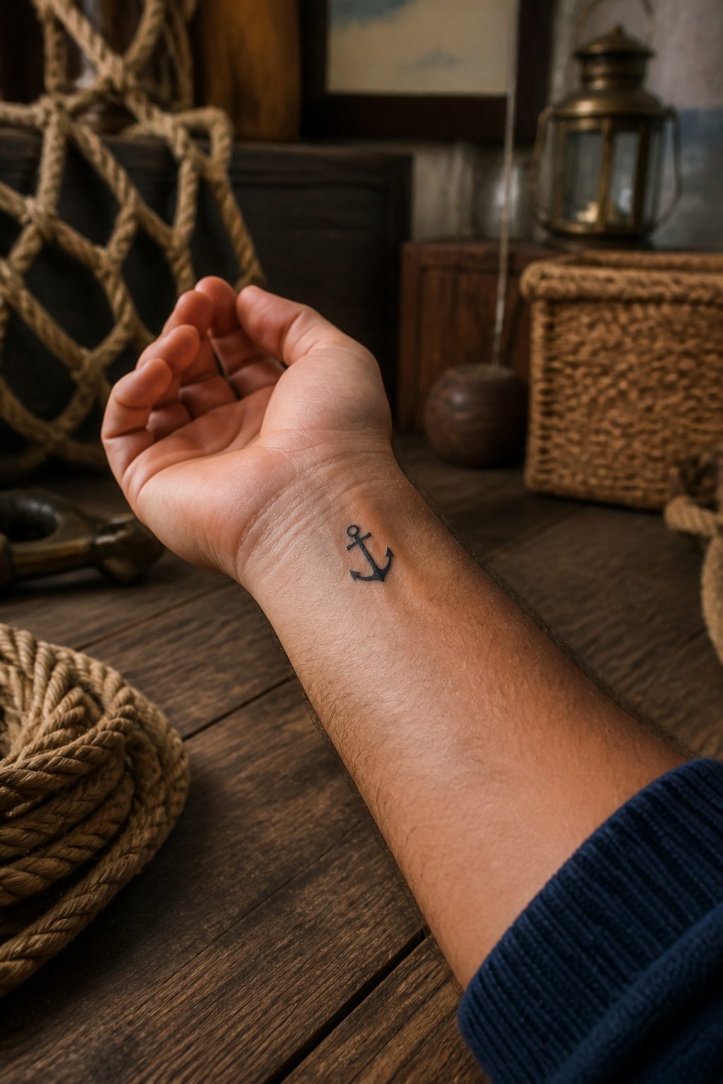
Bold lines and compact geometry made the anchor a staple of Western traditional flash, and that same simplicity keeps it alive as a first tattoo. The design reads instantly even at two inches. A rope-wrapped version adds texture and nods to the naval history, while a clean anchor with no coil sits flatter on a wrist or behind the ear. That choice matters because 17% of tattooed men go on to get multiple pieces, and placement you outgrow fast becomes awkward real estate. I would take the clean anchor for a first piece. It ages better as skin shifts, and a good artist can always build a rope detail into a larger composition later if the collection grows.
25. Small Heart
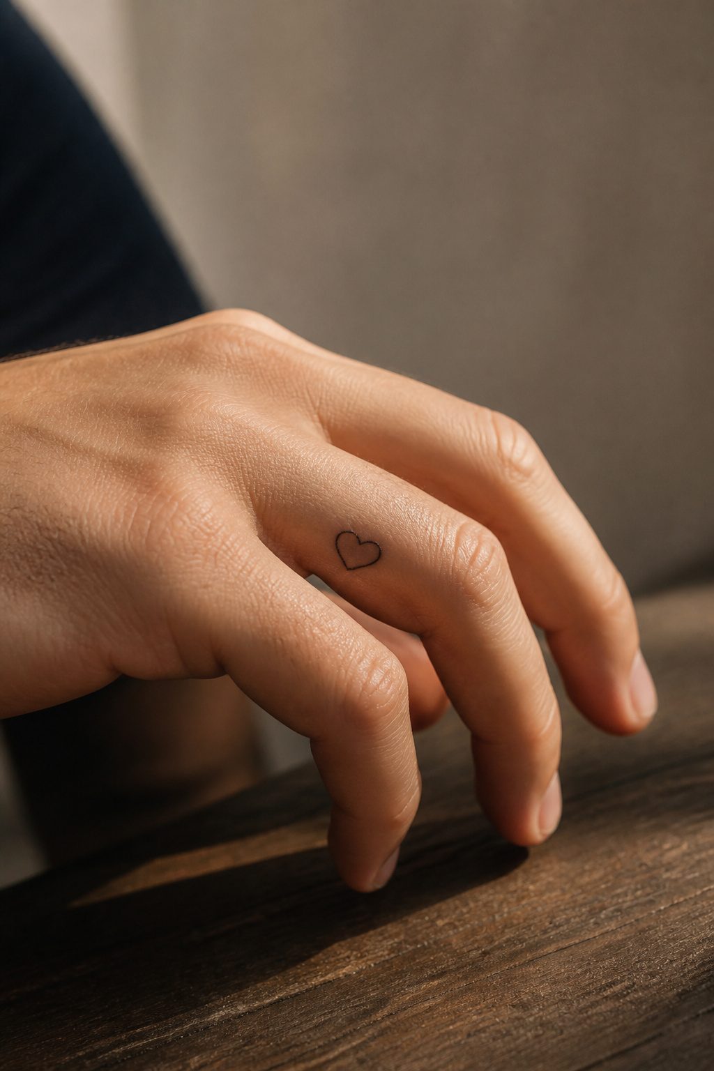
The heart shape shifts from a clean two-lobed icon to a full anatomical rendering, and the gap between them is where most small tattoos land. A simple outline reads as universal, a filled solid shape reads as commitment, and the anatomical version reads as something closer to biology or grief. The form is doing the work, not the complexity.
Finger placement is where this design earns its reputation. The skin there sheds faster and the needle sits against bone, so 2–4 out of 10 on the pain scale climbs toward the top of that range. Line precision matters more than usual: a wobble on a forearm disappears into muscle movement, but a finger is a narrow stage and the eye goes straight to the flaw. The limited space forces minimalism whether you planned it or not. A clean single-line heart along the side of the finger, or something tucked near the knuckle, stays visible without demanding attention. That visibility is the trade: you are looking at your own statement dozens of times a day, and so is everyone who shakes your hand.
26. Celestial Bodies
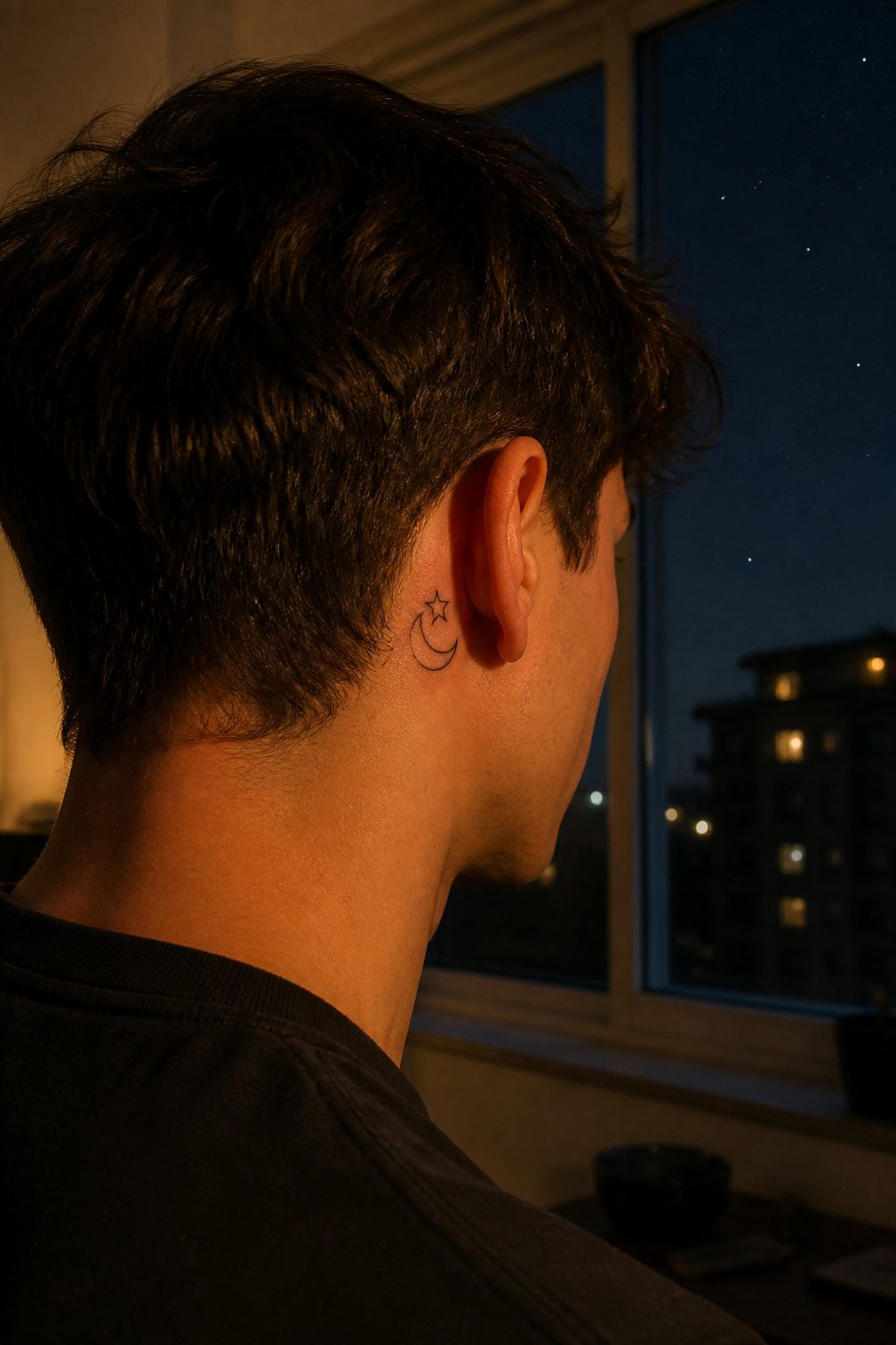
A crescent moon sits better on a wrist or behind the ear than a full disk because the curve follows the body’s line without fighting for flat space. The full moon needs a broader field, maybe a shoulder or upper arm, to keep from looking squeezed.
Stars work as punctuation around either shape, though the story shifts depending on placement. A single star above a crescent reads as night watch or guidance; scatter several below a full moon and the weight drops to the bottom, like gravity pulling at light. I have drawn more of the scattered kind on men who want the tattoo to feel like a moment rather than a symbol they have to explain.
Combining sun and moon in one piece asks for careful balance. The sun’s rays eat space quickly, so I keep them short, almost blunt, when the moon shares the same skin. Otherwise the moon becomes an afterthought. The narrative writes itself, two bodies in cycle, but the design fails if one dominates by accident.
27. Minimal Sunset
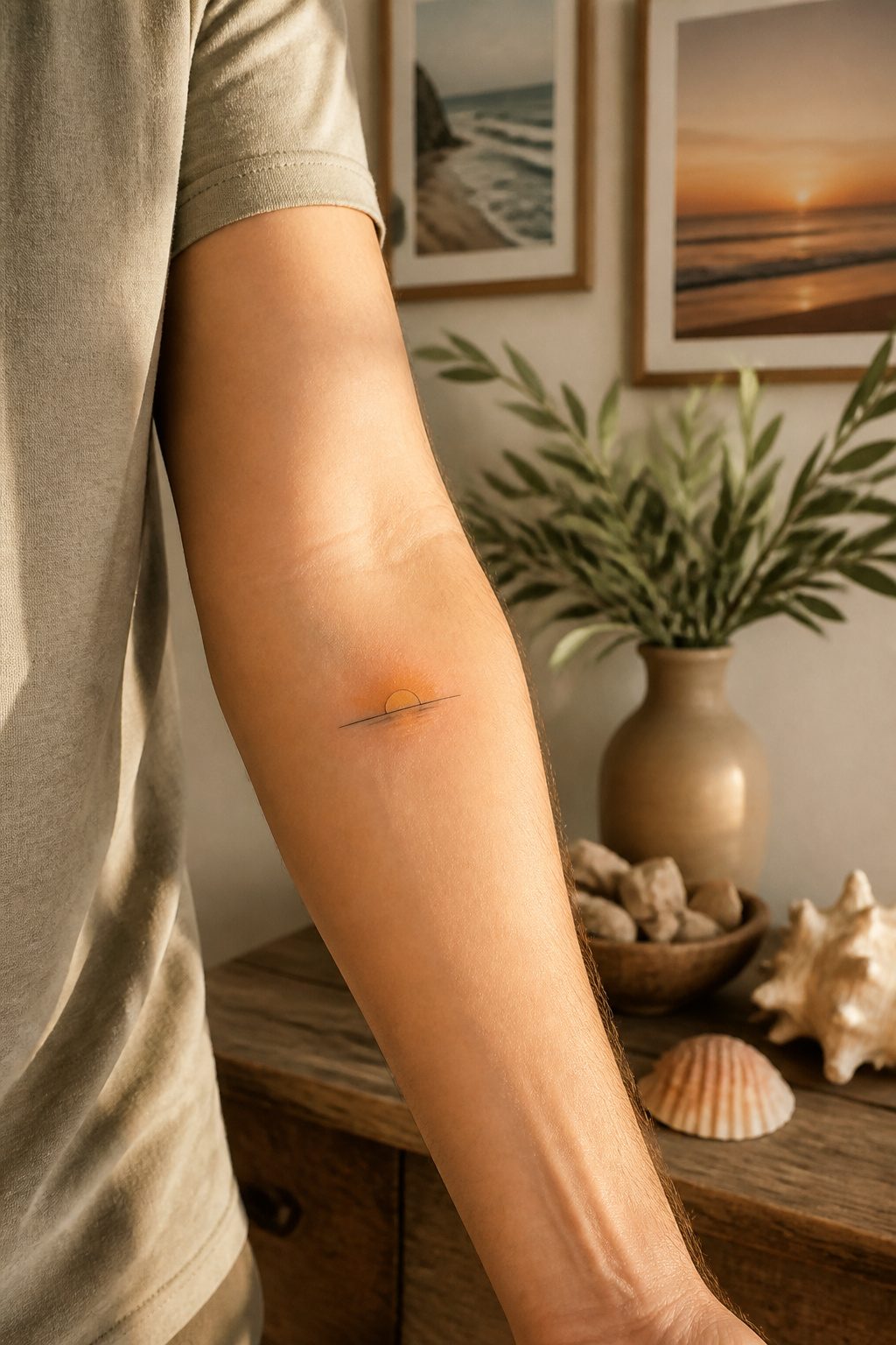
A horizon line and two bands of color above it can read as a full sunset to the eye. The brain fills in the rest: warmth, ending light, open sky. That extreme simplification is what makes this design work at a small scale.
Color choice is where most of these fail. A sunset that looks vivid on a screen turns muddy when reduced to an inch or two of skin. Soft orange fading to near-white, or deep coral into pale gold, holds up; purple bleeding into black collapses into a bruise. Saturation matters more than detail here.
I have watched clients insist on every color they saw in a reference photo, then watched those same tattoos blur into a single dark mass within a few years. The best small sunset I have seen used three tones total: a thin dark line for the horizon, a warm middle band, and a bright upper edge that caught light like actual sky. It sat on a wrist and read clearly from across a room.
Placement helps. Inner forearm or upper chest give the horizontal line the space it needs; wrapping it around a curve distorts the geometry that makes the image legible.
28. Pottery Mania
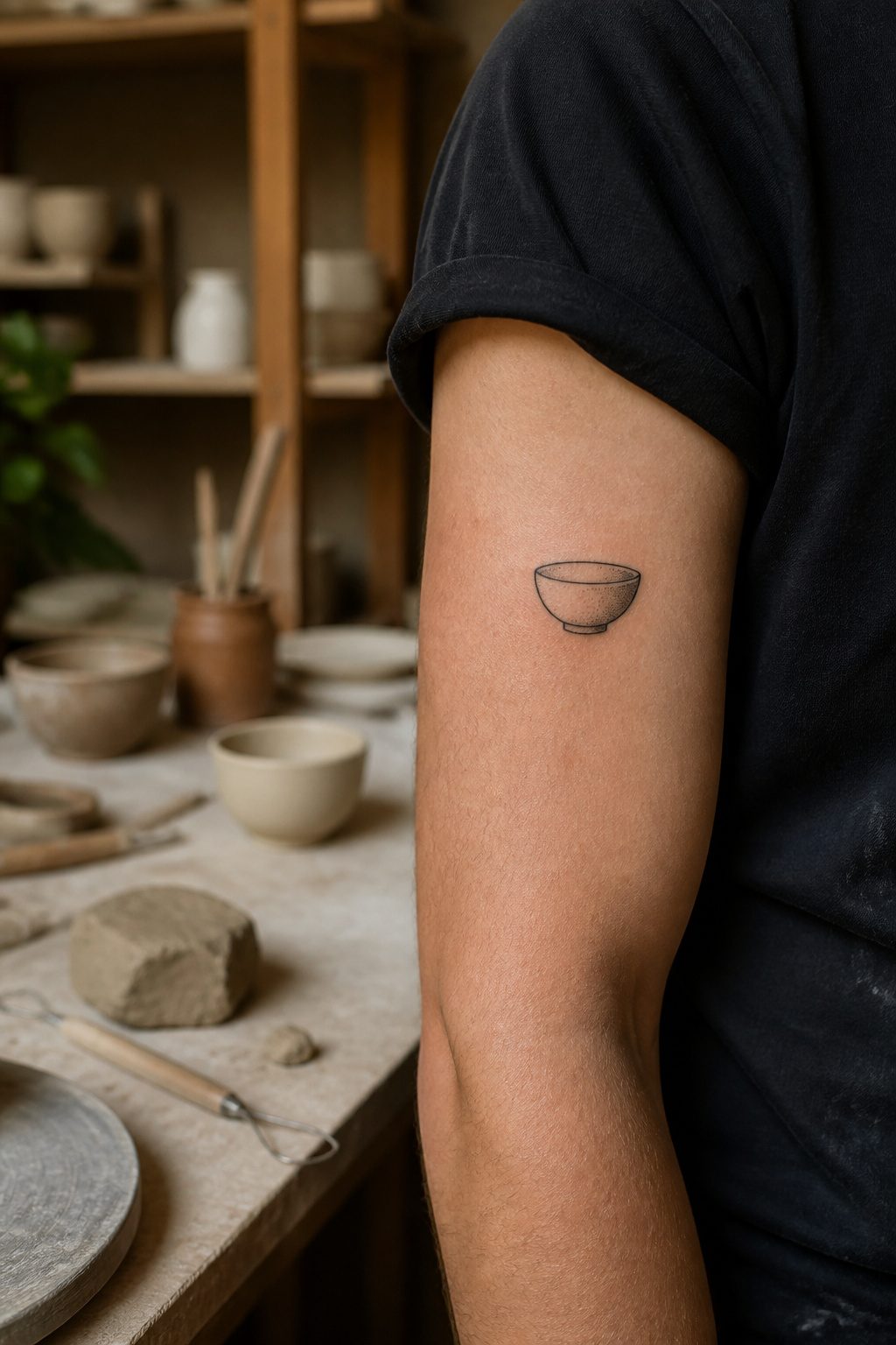
The craft revival that started around 2015 put pottery wheels back in apartment living rooms and made vessel shapes something people actually recognize again. A simple bowl or jug silhouette reads differently on skin than geometric art because the curve of a shoulder or the hollow of a collarbone already echoes what clay does on a wheel. The tattoo follows that logic instead of fighting it.
Most of these run small, one to three hours depending on whether you want just the outline or the slight shading that suggests ceramic glaze. The ones that work best stay under three inches and avoid handles or spouts that would wrap awkwardly around an ankle or wrist. A friend of mine went with a cracked teacup on his forearm, the line thin enough that from six feet back it looks like a coffee stain shaped like something intentional. That is the sweet spot for this style: familiar enough to read instantly, spare enough that someone has to move closer to see what it actually is.
29. Anime Themed Tattoos
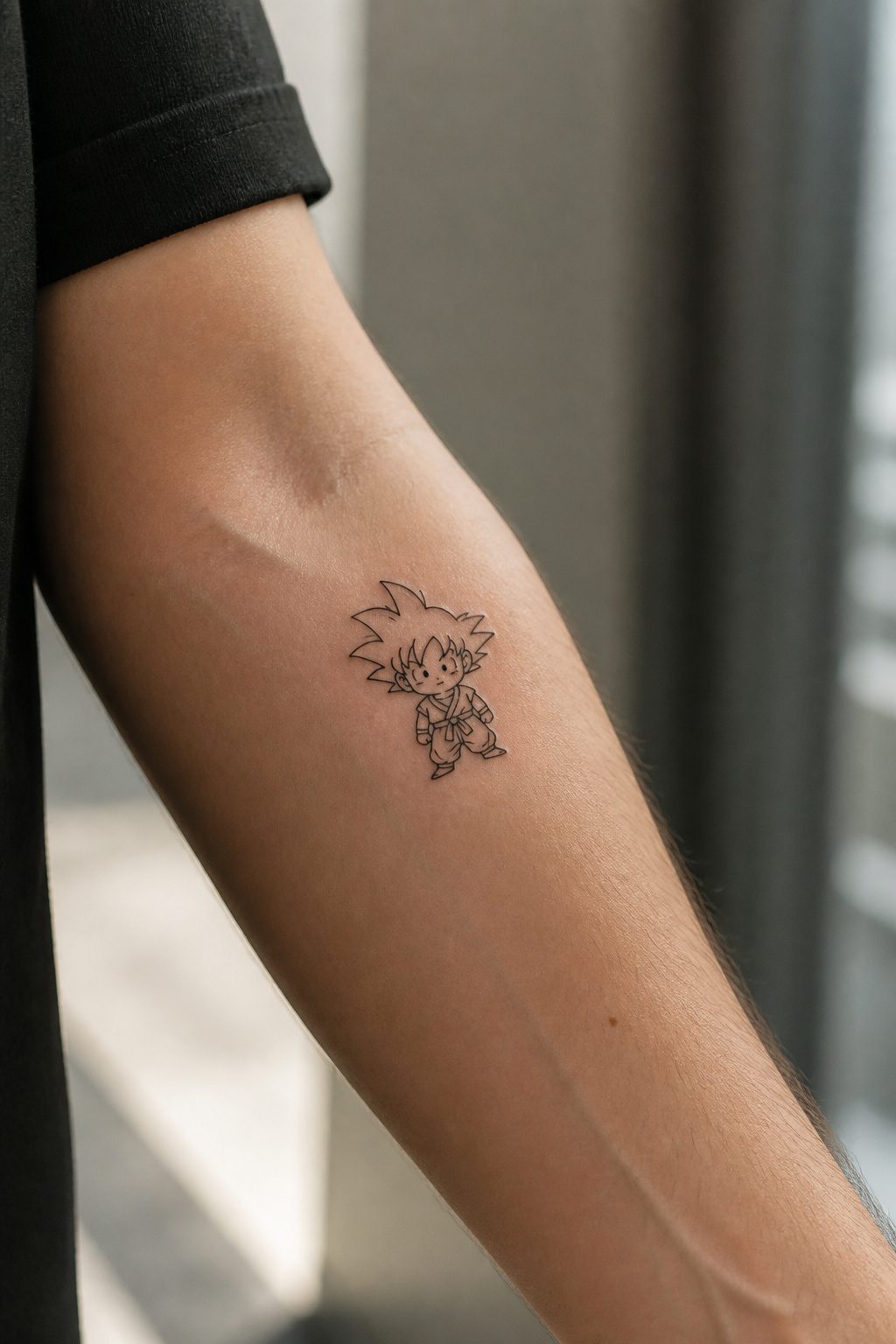
Anime line art was built for this. The clean outlines and limited shading translate to skin almost directly, so a two-inch Sailor Moon silhouette or a Dragon Ball kanji holds its detail without blowing out over time. Color is possible, but the black-and-white manga style tends to age cleaner at small sizes.
The licensing issue is real. A shop won’t stop you from getting Pikachu, but recognizable characters carry trademark protection that can complicate flash sales, portfolio posts, or any artist hoping to publish the design. Original characters or generic symbols, the ones that read as anime without naming a specific series, sidestep that entirely.
For men who want the style without the paperwork, a simple chibi outline or a geometric pattern pulled from a fictional universe does the job. The aesthetic lands; the legal question doesn’t come up.
30. Thunderbolt
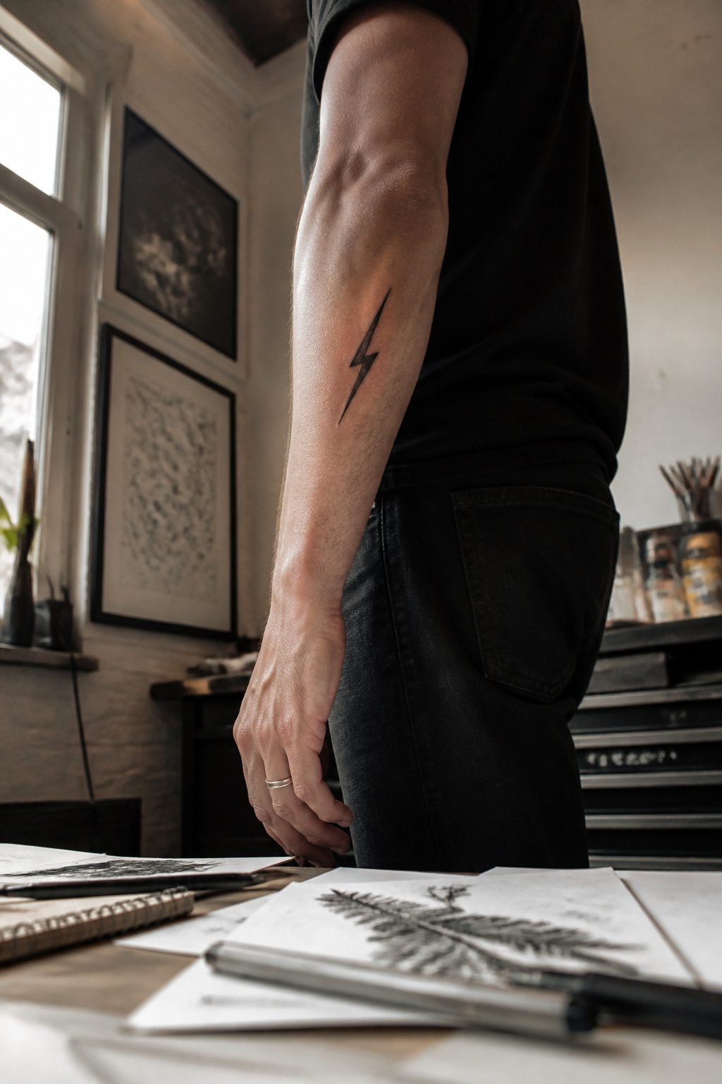
A single lightning bolt reads as pure voltage, a clean jagged line that carries its own energy without needing context. The branching kind, the kind that splits into three or four prongs, works better on slightly larger skin real estate; on a narrow forearm or the inside of a calf, the single strike keeps its shape instead of turning into a tangle.
The narrow placements matter because a bolt’s natural geometry runs vertical. Lay one down the outer forearm and the line follows the bone, the taper of the muscle. On a calf it rides the long axis of the leg, visible from the side without wrapping around. A bolt that tries to curve with the body reads as a compromise; straight is the whole point.
I have watched clients debate the thickness of the line for this one more than almost any other small design. Too thin and it fades toward a scratch in eighteen months. Too heavy and the crisp angle at each turn goes soft. The middle ground, a line weight that holds the point of each jag, is what makes the symbol read as electricity rather than a random zigzag.
31. Emojis
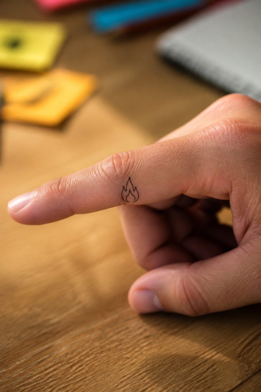
Emojis on skin are a bet on how well a 16-pixel icon survives translation into ink and line. The flame, skull, and face emojis lead the pack for a reason that has nothing to do with popularity and everything to do with geometry. Each carries a simple silhouette, a shape you read from across a room before you read the detail. A flame needs two curves and a point to register as fire. A skull needs two circles and a triangle. The face emojis, the grin or the sunglasses, flatten into bold lines that still read as expression.
The ones that fail are the ones that lean on color or context. The eggplant, the peach, the folded hands: subtract the yellow skin tone or the specific shading and you are left with an abstract shape that could be a vegetable, a buttock, or a prayer. The meaning drains out. I have watched clients insist on the crying-laughing face only to see it heal into a blurry oval with dashes, the tears indistinguishable from cracks in the ink.
The rule is silhouette first, detail second. If the emoji does not read as itself in pure black on a white background, it will not read on skin. The flame works because fire is a shape we know before we know color. The skull works because bone is bone. The face works because we are wired to see faces in almost anything, so a crude one still scans as human. Pick anything busier and you are asking the tattoo to do work that even your phone screen struggles with at small scale.
32. Dragons
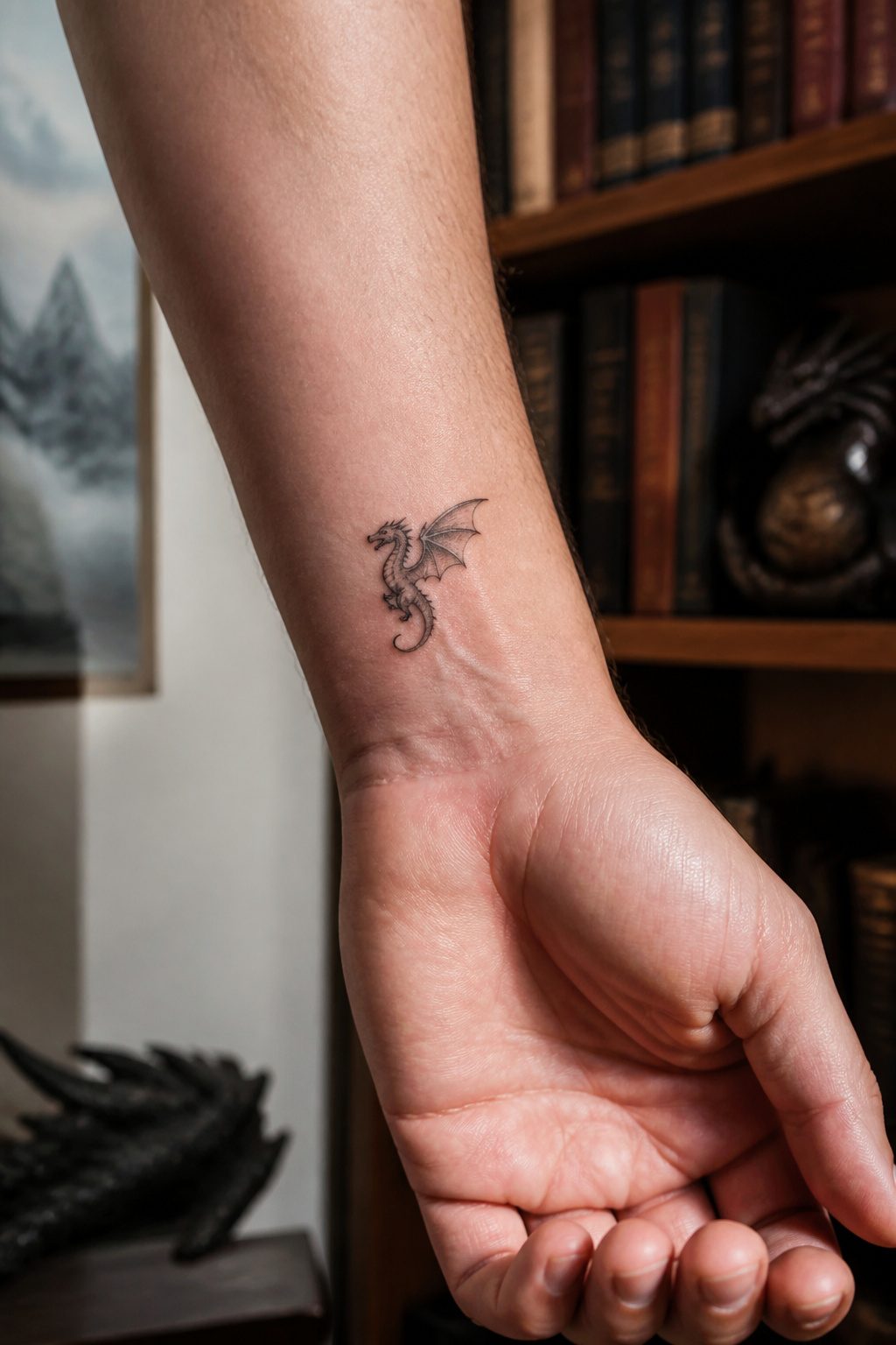
Eastern dragons coil better than Western ones when space shrinks under two inches. The serpentine S-curve of a Chinese or Japanese dragon lets the eye read the form instantly, where a European dragon’s spread wings and heavy limbs collapse into a blob of intersecting lines. I’ve watched this mistake repeat on wrists and fingers: someone brings a reference image of Smaug or a medieval heraldic beast, and the artist has to explain that the four legs, the bat wings, the blocky torso all demand real estate a small tattoo cannot spare.
What drops first is the claws, then the wing webbing, then the individual scales. An Eastern dragon at mini scale keeps its whiskers and the pearl it chases, loses the dorsal spines, and survives as a flowing silhouette. The Western alternative needs a different strategy entirely, usually a single wing or a curled tail with the head alone, the body implied. The pearl or the eye becomes the focal point that sells the design when the rest is barely a few strokes of ink.
33. Small Cross
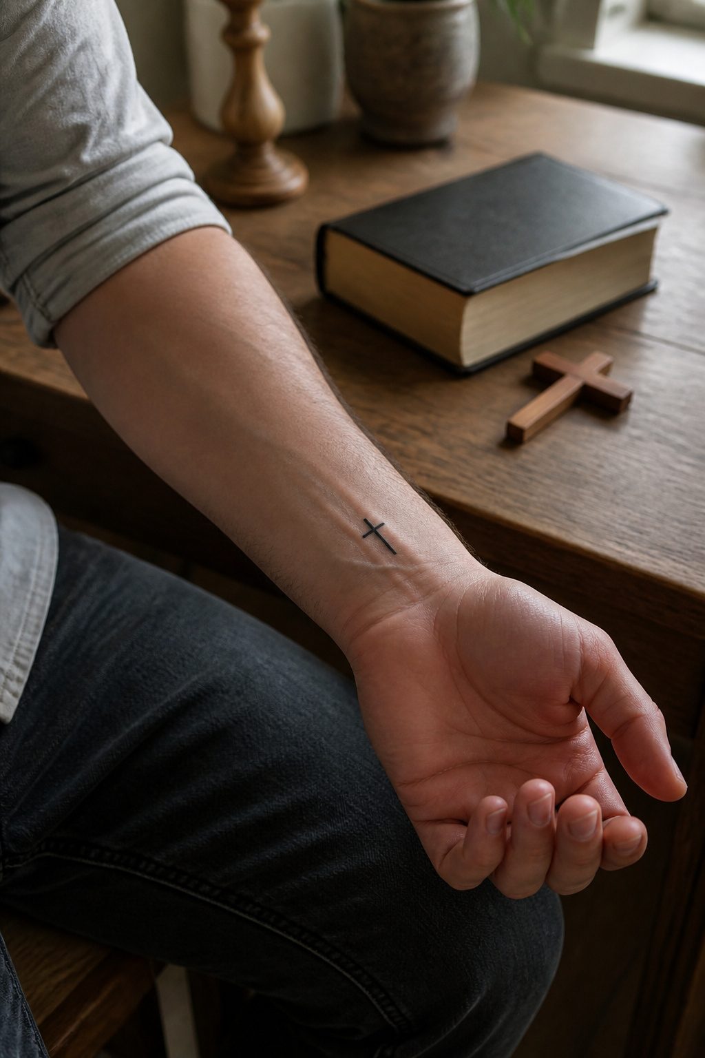
A small cross lives or dies on the line weight. A single clean line reads as quiet faith, something you notice in passing rather than a billboard. Double outline adds structure but risks reading as jewelry or branding, which defeats the point of a tattoo this size.
The wrist and the mastoid, that spot just behind the ear, are where this design actually works for concealability. The wrist lets a long sleeve drop over it in professional settings; the mastoid hides under hair or shows only when the head turns. Both placements suit the single-line version because the design stays readable at an inch or two without crowding.
I have watched the double-outline cross blur faster on the mastoid than a single line. More ink means more diffusion in an area where the skin moves constantly against the skull. The single line keeps its geometry longer, which matters more than the extra visual punch the double outline gives on day one.
34. Small Snake
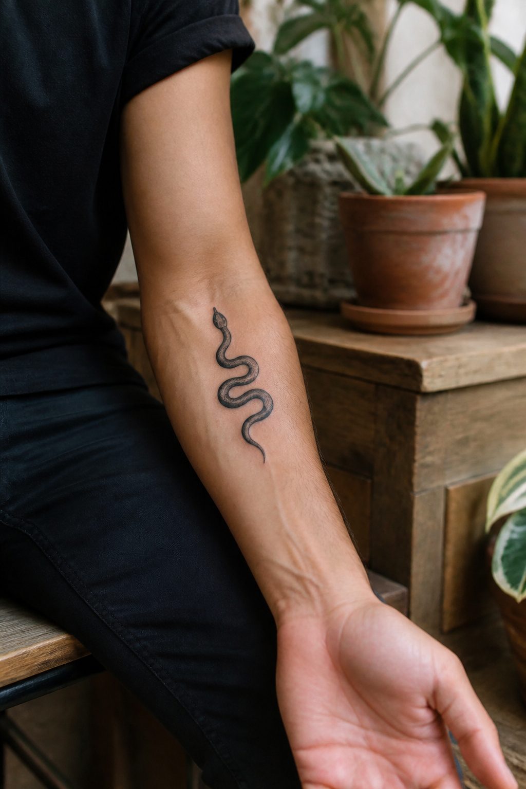
A small snake tattoo keeps the serpent readable without the scales, eye ridges, and jaw hinges that turn a full piece into a commitment. Most of what works here is either the head alone or a single looping curve of body, maybe with a split tongue or an open mouth to signal what it is.
Head-only designs sit well on a wrist inner edge or behind the ear, places where a coiled body would tangle and blur. The body-curve option, usually just one S-shaped line, flows along a finger or collars onto a shoulder. Either way, the artist drops detail that would matter at three inches but turns muddy at one.
This is where the small snake splits from the fuller snake entry in this list. That category assumes enough room for pattern, for the recognizable hood of a cobra or the knot of a ouroboros. The small version trades storytelling for placement freedom. What you lose in mythology you gain in discretion, and for a first tattoo or a gap-filler between larger work, that trade usually wins.
35. Small Wolf
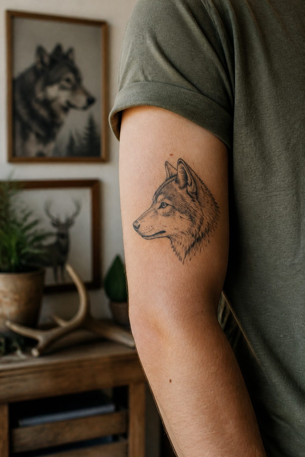
A wolf head at two inches across leaves almost no room for the layered fur that makes the animal look real in larger work. The tattooist has to decide fast: profile or straight on. Profile wins for small scale because the snout, the ear, and the ruff line up in one readable shape. A frontal view needs both eyes, the full muzzle width, and the cheek fur to balance, which crowds the space and turns into a dark blob once healed.
Fur texture is where most small wolf pieces fail. Dense crosshatching that looks fine on a flash sheet closes up under skin. What works is picking two or three direction changes, a sweep down the neck and a shorter stroke at the cheek, then stopping. The howling silhouette is the safer bet: one long back line, head thrown up, maybe a single suggested rib in the chest. That negative space the howl opens up, the gap between jaw and throat, reads as wolf even at an inch because the posture is unmistakable. I have redrawn more of these than I can count for walk-in clients who brought phone photos of full-shoulder pieces and expected the same impact on a wrist.
36. Small Lion
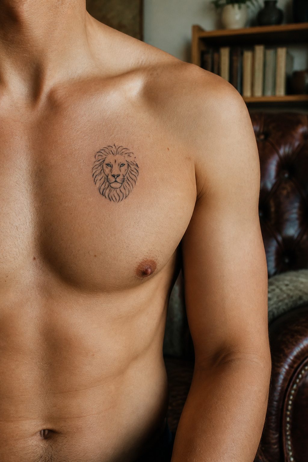
A lion head at two inches square sounds generous until the needle starts moving. The muzzle collapses into a smudge, the eyes go hollow, and what started as a noble portrait ends up looking like a house cat with mange. The mane saves the design. Flowing lines radiating outward need far less precision than a symmetrical face, and they read as lion even when the center stays almost blank.
I learned this watching an artist in Vancouver work through exactly that failure on a client’s shoulder. The face outline was already blown, too heavy to fix. She pivoted hard, built the mane up in layered gray wash until it framed nothing but suggestion, and the piece finished strong. The negative space inside the mane does the work your detail cannot.
Upper arm and chest carry the shape best. Flat planes let the radial mane sit without wrapping or distorting, and the natural taper of the deltoid echoes the way a real mane frames the body. Chest placement keeps it visible without the commitment of a forearm, and the pectoral muscle gives the mane a subtle forward tilt that reads as alertness. Small means the mane stays line-based; skip the solid black fill and let the skin tone breathe through.
37. Small Crown
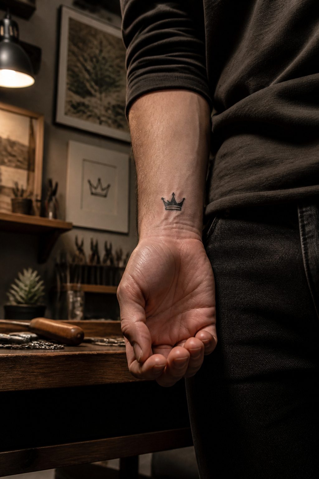
A crown stripped down to its geometry still reads as power if you keep five to seven spikes in the design. Fewer than that and the silhouette softens into a generic starburst; more, and the points blur together once the tattoo ages or tans over.
The shape almost always carries something written beneath it: a date, a set of initials, a short word like "king" or "legacy." The crown does the symbolic lifting, so the lettering can stay plain block or typewriter font without competing for attention. That pairing also solves the placement problem. A crown alone can look marooned on a forearm or chest, but anchoring it to a date or name gives the eye a path to follow and fills the space the way a single floating icon rarely does.
Color tends to fail here. Gold shading looks muddy on small work, and the metallic illusion needs scale to convince anyone. What works is stark black line, maybe a single dot of solid white on the highest spike if the artist wants a highlight. The people who come back happy with this one usually wanted something that announces itself without shouting, and the crown at its simplest does exactly that.
38. Small Dragon
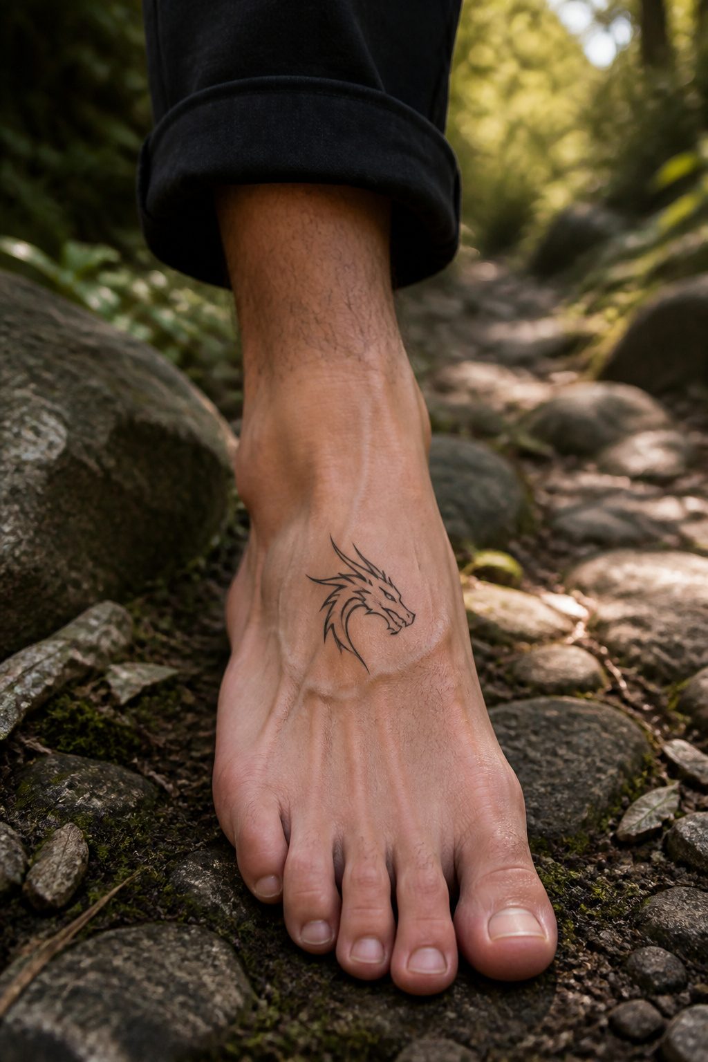
A single-wing dragon or a head-only treatment strips the creature down to its most recognizable mark. The full body with coiled tail and extended claws demands space; this category exists because some placements, the side of a finger or the narrow strip behind an ear, simply refuse to cooperate with anything larger.
The head alone, profile or facing forward, keeps the scales around the eye and the ridge of the brow. That is usually enough for anyone to read the shape without squinting. A single wing stretched upward reads as motion caught mid-beat, and it solves the symmetry problem that a centered back piece handles by default. On a wrist or ankle, one wing extending toward the hand or foot gives the design a direction; the eye travels with it instead of stopping at a static image.
Extreme minimalism here is not about making the dragon cute. It is about keeping the threat and the mythology intact while the line count drops to ten or fifteen. The mistake most people make is keeping too many details, a nostril flare, a tongue, individual teeth that muddy at small scale. What convinced me, looking through years of flash sheets, is that the artists who nail this version erase twice as much as they keep.
39. Small Flower
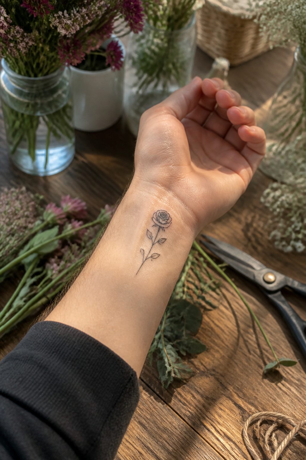
A single rose in black ink, stripped to five petals and a thorned stem, reads instantly from across a room. That immediate recognition is why the rose dominates small flower work for men despite its natural complexity. The layered bloom in a garden would tangle at an inch wide; on skin, bold negative space between petals does the job of detail.
Botanicals that survive this reduction share one trait: a silhouette you could name in the dark. Lavender keeps its spiked crown. The lotus holds its layered geometry. Peonies and chrysanthemums collapse into soft blobs unless the artist commits to one defining stroke per petal and stops there. I have watched too many small floral pieces heal into brown mush because the artist tried to render every fold.
Species with radial symmetry, like daisies or sunflowers, survive better than asymmetrical blooms. You can rotate the design to fit a forearm or a collarbone without the flower looking broken. The rose wins partly because its slight asymmetry, a single petal dropping, adds motion without requiring precision the skin will not hold.
Color is the risk. Yellows and pinks fade fastest; a pale pink rose becomes a scar in three years. Black and grey keep the botanical readable for decades. If you want color, the safe choice is a dark red, near burgundy, packed solid rather than shaded.
40. Small Star
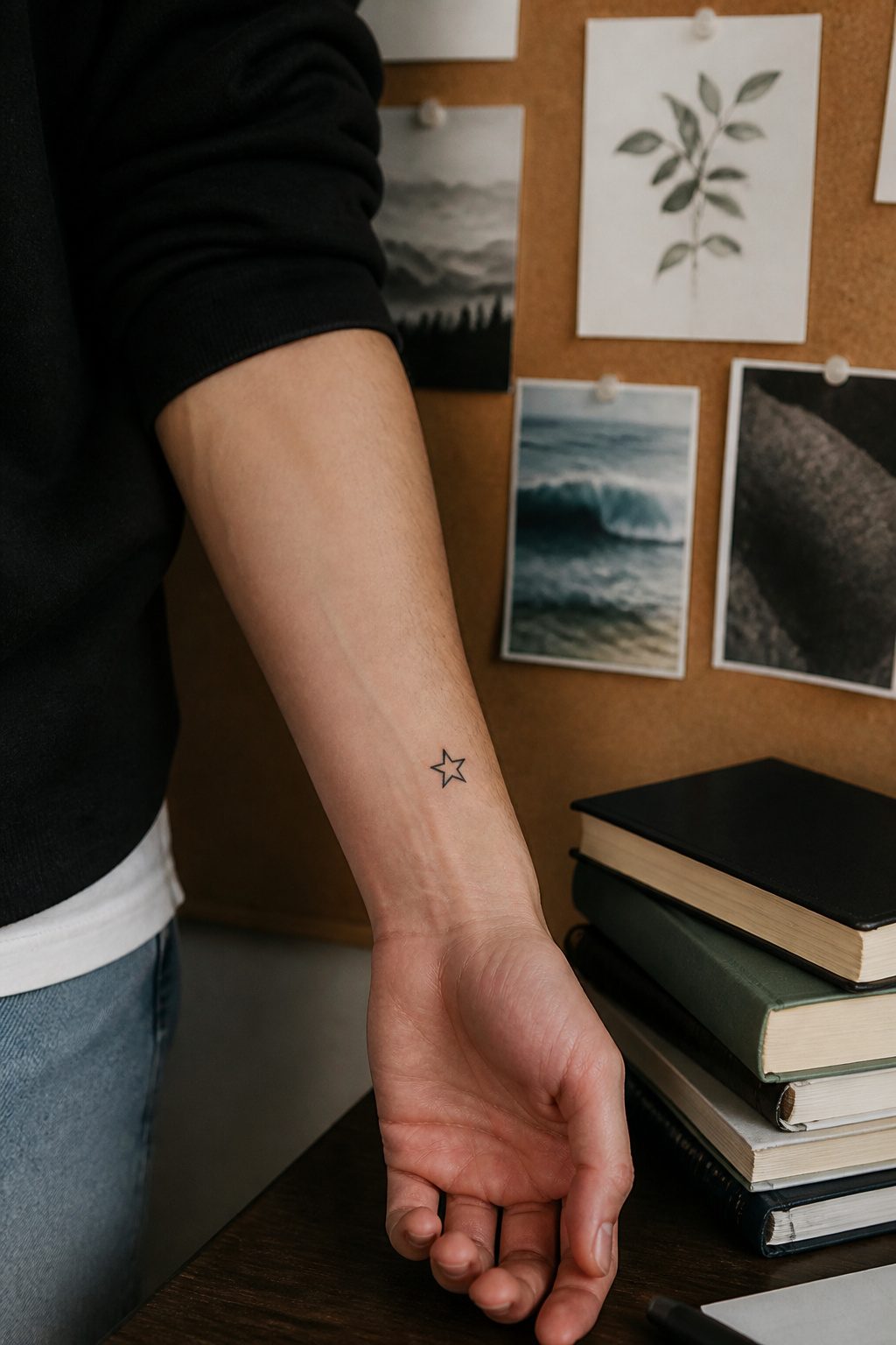
A single five-point star is the shape most people picture when they hear the word, and that simplicity is exactly why it works on skin. The classic five-point form sits flat against the body, reads instantly from any angle, and leaves room for the artist to keep line weight consistent at small sizes. Six- or eight-point versions carry a different feel, more geometric or nautical depending on context, though they demand slightly more precision to keep the angles balanced at under two inches.
Placement tends to follow the same pattern as most minimal work: inner forearm, wrist, or collarbone, spots where the flat plane of the design meets flat bone. Pain level runs low to moderate, around 2–4 out of 10, with bone proximity doing most of the work in pushing it toward the higher end.
The star’s real function is often as a first piece. The simplicity lowers the commitment, the small footprint keeps cost near shop minimums (typically $100–$180), and the 45–90 minute session duration means you are in and out without the fatigue that longer sittings bring. Surface healing runs 2–3 weeks, though deeper layers settle over months. What starts as one star often becomes a collection; the shape stacks, repeats, or anchors larger work later without clashing.
Frequently Asked Questions
What are some small tattoo ideas for men?
The article covers forty options, including melting watches, spiders, intricate crosses, skulls, abstract stars, Lego characters, eyes, Michelangelo’s Creation of Adam hands, 8 balls, ice cubes, cyber sigilism, matchsticks, mini faces, twinkle stars, flames, swords and daggers, barbed wire, and solar systems. Each design works at two inches or smaller when placed and executed with the right line weight and detail choices.
Where should I get a small tattoo?
The wrist and inner forearm let you see the design daily, while the forearm offers slightly more space and easy cover-up. Behind the ear, the collarbone, and the back of the neck keep things discreet. The upper arm works well if you plan to build a larger collection later, and the chest or shoulder holds detail longer because sun and friction stay low there.
How long do small tattoos take to heal?
Surface healing takes two to three weeks, though deeper layers keep settling for up to six months. That surface window matters most for designs built on delicate line weight, since early care determines how fine detail settles in.
How much do small tattoos cost?
Shop minimums run $100 to $180 regardless of how small the design is. The price lands less in the ink than in the artist’s control of micro-detail and the steadiness small work demands.
Do small tattoos fade faster than large ones?
Size itself does not determine fading. Sun exposure, skin friction, and placement matter more. A small tattoo on a protected spot like the inner forearm or chest lasts longer than a large one on a hand or calf that sees daily sun and rubbing against denim.