
Neck tattoos for men range from minimal symbols tuckable behind a collar to throat-spanning declarations no tie can hide, and the deciding factor is not design but placement: a 2-inch nape piece stays professional where a front-neck compass closes doors. The skin is thin, the bone sits close, and the pain scale runs 8 to 9 out of 10 on the throat, half that at the back. Most men who choose this territory do so knowing the commitment is visible before they speak, which is why the style that earns its place here needs to hold through constant movement, sun exposure, and a decade of skin shifting with every turn of the head.
1. Geometric Patterns
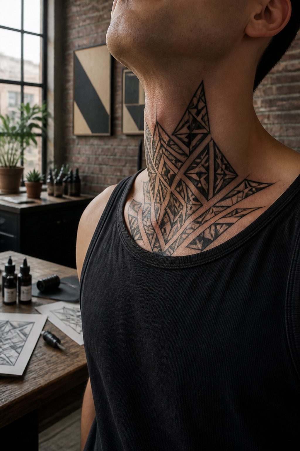
Clean lines and symmetrical shapes land differently on the neck than they do on a shoulder or a forearm. The jawline gives a geometric design a natural shelf, and the flat planes of the throat let triangles, diamonds, and rectangles sit dead center without fighting the body’s curves. Three of the research sources name this as a top choice for men, which makes sense once you watch how the ink tracks a collarbone or wraps the cervical curve.
I have seen mandalas and sacred geometry pieces that use the neck’s vertical space as part of the composition itself, running polygons straight down the throat so the eye follows the shape rather than the skin. The effect is structural, almost architectural, and it reads as deliberate rather than placed. María Fernández González, a tattoo artist interviewed on the subject, notes that symmetrical designs strike her as especially suited to this area, and the work I have looked at backs that up: asymmetry on a neck tends to look accidental, while a balanced pattern looks intentional.
Most geometric neck work stays in black ink with fine lines, though some artists build in negative space or dotwork to keep the piece from flattening out over time. The risk is the same as any fine-line tattoo, the neck sun-exposes and moves constantly, so the geometry needs enough weight in its linework to hold. A triangle with a hairline stroke will blur; one with a deliberate, consistent line width keeps its angles for years.
2. Tribal Designs
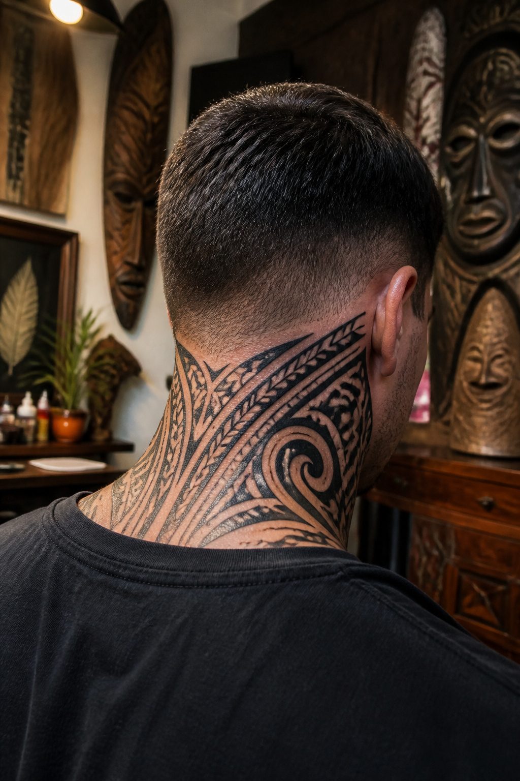
Bold black lines carry weight on the neck in ways finer work rarely manages. Three separate guides to neck tattoos for men single out tribal designs for exactly this reason: the density of historical meaning packed into those patterns gives the style an authority that reads even at a glance.
The neck’s thinner skin and constant movement during talking and turning make it a test for any ink. Thicker line work holds its shape here where delicate strokes blur or fall out over time. Solid black ink, applied in the geometric patterns drawn from Maori, Polynesian, and other indigenous traditions, sits in the skin with enough mass to stay readable despite the area’s demands.
What draws men to this style is rarely just the visual punch. The patterns connect to heritage, to the warrior symbolism these cultures attached to markings of strength and protection. That density of meaning matters on the neck more than elsewhere, because this is a placement you cannot hide. The commitment is visible immediately, and tribal design signals that the choice was deliberate, rooted in something older than fashion.
3. Black and Grey Realism
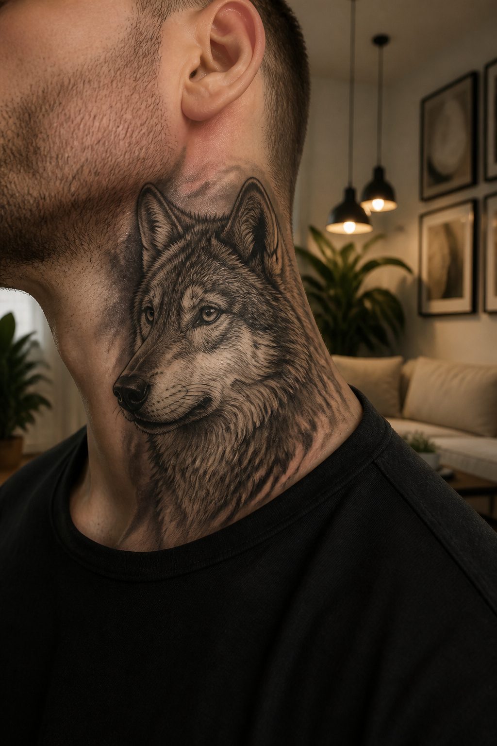
Black and grey realism on the neck lives or dies by how the artist handles the bone underneath. The jawline, the clavicle, the throat: these sit right against the surface, so every shift in needle depth shows up as a hard line or a blown-out grey where soft gradation was meant to go. Shading technique matters more here than on fleshier areas because the skin has nowhere to hide the mistake. An experienced hand works the machine like a dimmer switch, rolling from solid black through three or four distinct grey values before touching the negative space.
The subjects that carry at neck scale tend to be the ones with natural contrast built in. Portraits read well because the eye expects exactly the kind of hard-to-soft transitions this style demands. Animals with heavy fur texture, like wolves or bears, give the artist ridges and valleys to carve with the grey wash. A spider rendered in black and grey, webbing spread across the throat and trailing onto the sides, uses the same principle: the blackout body anchors the design, while the fine grey lines of the web do the optical work of connecting the piece to the wearer’s anatomy.
The neck forgives almost nothing: a portrait with muddy mid-tones turns into a grey smear within two years, and the bone structure that makes the area dramatic also makes a blown highlight nearly impossible to repair. Dot work can substitute for smooth shading in some placements, but on the neck the stipple reads as texture whether you wanted it or not.
4. Minimalist Symbols
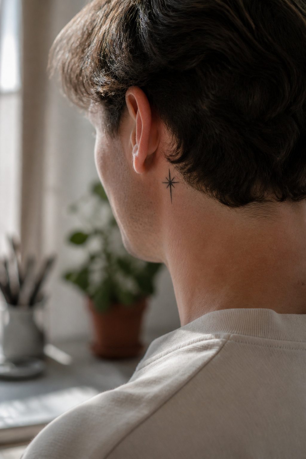
A single small mark behind the ear or at the nape carries a different weight than the same mark on a forearm. The neck frames the face; the eye travels there naturally during conversation, so the tattoo registers as intentional punctuation rather than background ornament. Forearm ink, by contrast, settles into the scenery of gesture and movement.
Start with a 2-3 inch design behind the ear or on the nape. This size lets you test how visible you want the piece to be while keeping concealment simple with hair or a collar. Clean lines age better here too, neck skin being elastic enough that micro-details blur over a decade while bold, simple imagery holds its shape.
5. Script and Lettering
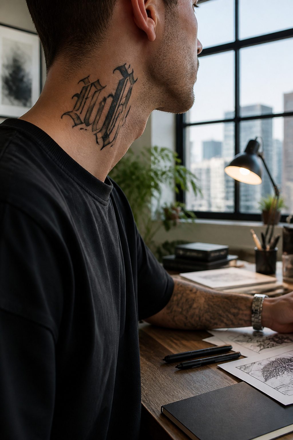
Words on the neck live in motion. Every swallow, every turn of the head, every conversation pulls at the skin, and a script that reads clean at twenty-five can blur by forty-five if the font was too fine or the spacing too tight. Bold, open lettering with breathing room between characters ages better than delicate scripts that collapse into each other as collagen shifts.
Placement above the jawline turns the text into something others clock during eye contact, which changes what gets chosen. A name, a date, a phrase meant to be read in conversation sits differently there than words dropped below the jawline into the throat, where only mirrors and intimate angles find them. Below reads more private; above reads more public, and the decision between the two shapes the weight of what gets inked.
I have redrawed enough neck pieces over the years where the original artist treated the skin like paper, static and flat. It is not. The curve of the cervical spine, the pull of the platysma, the way the skin bunches when the chin tucks, these all have to be walked through before the stencil goes down. A word that sits straight in the design can read crooked once the body moves if the artist did not account for the stretch.
Serif or sans, cursive or block, the choice matters less than whether the letterforms hold their shape at distance and under distortion. The neck forgives almost nothing.
6. Animal Motifs
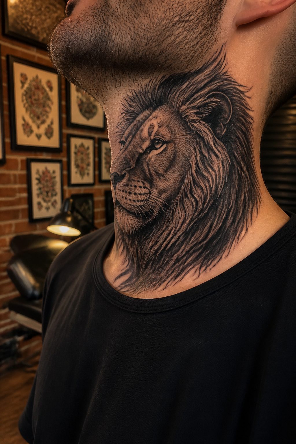
The neck’s visibility turns an animal motif from private symbolism into a public declaration. Eagles, lions, wolves, and dragons dominate this category across the sources, each carrying weight that changes when you move it from a bicep to the throat.
An eagle on the neck signals freedom and independence in a way no hidden placement can. The bird’s wingspan naturally follows the line from jaw to collarbone, and anyone facing you sees it immediately. Dragons, drawn from Chinese and Japanese tradition, carry wisdom and protection; on the neck they read as guardianship made visible, not tucked beneath a shirt where the meaning stays yours alone.
The sources split on how much realism this placement supports. One notes that predator imagery, wolves and lions especially, connects to personal resilience stories; another specifies that realistic rendering demands at least five inches of canvas and an experienced artist. The neck offers that space vertically but not always comfortably, so stylized or simplified treatments often work better here than on a chest or back.
Lions and wolves share similar territory: courage, loyalty, family. The difference is in how they wear. A wolf in black-and-gray realism captures ferocity; a simplified version reads more artistic, less confrontational. On the neck, that choice shapes first impressions before you speak.
The traditional sparrow, common in American traditional work, represents the same freedom as the eagle but with lighter visual weight. A single bird on one side keeps it subtle; a matched pair across both sides turns the neck itself into the frame.
7. Skull Designs
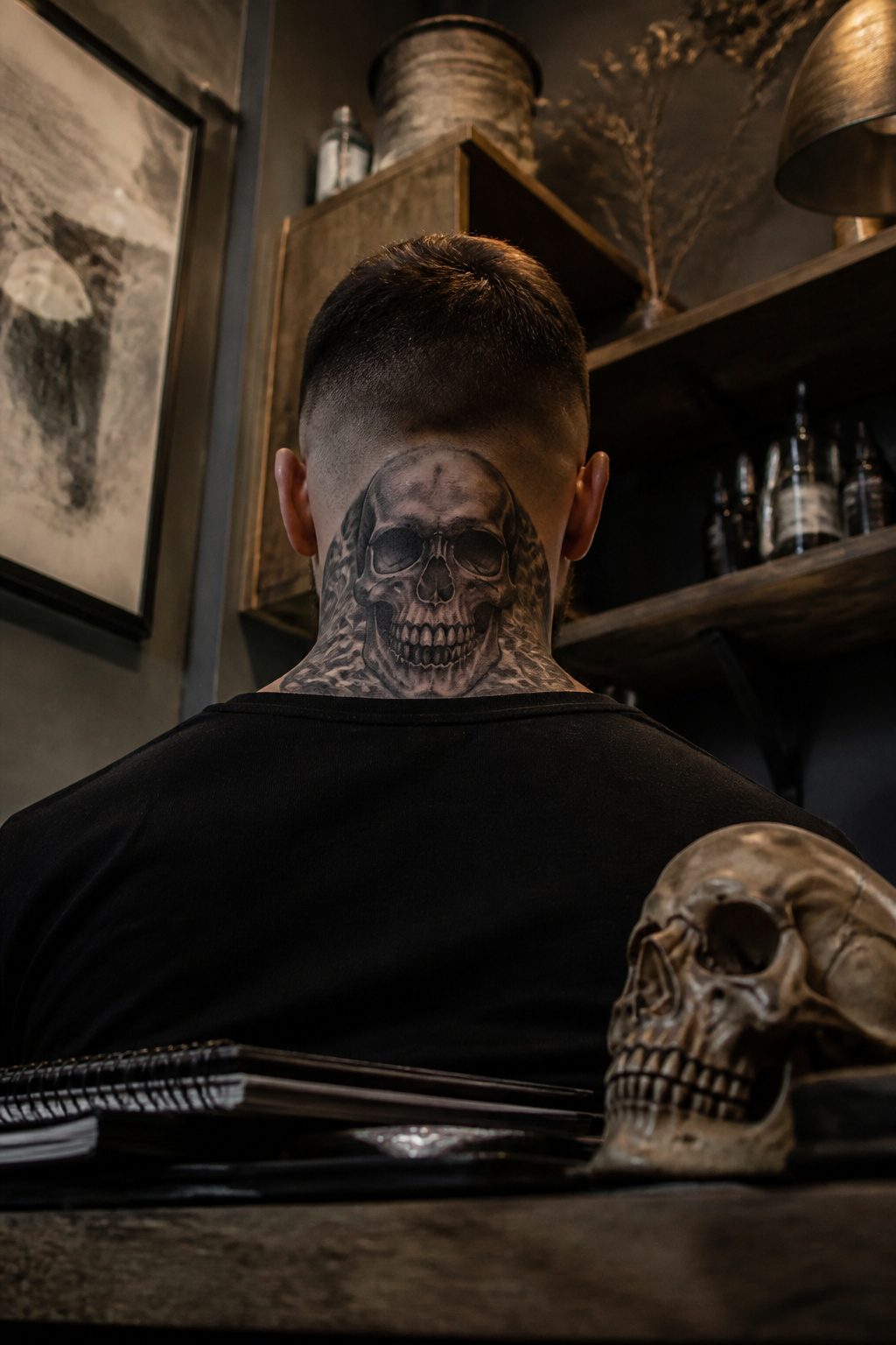
The cylinder of the neck forces every skull design into a negotiation between front and side views. A horned skull with heavy black shading and that almost smoky, blurred inkwork reads as strength from straight on, then dissolves into abstraction when the head turns. The artist has to build for both moments, not just the flat photograph most clients bring in.
Sugar skulls, realistic skulls, skulls paired with roses or with wings and a bleeding heart all survive this test better than trending styles because the symbolism is already legible from partial views. Mortality, rebellion, transformation, the overcoming of challenges: these meanings do not depend on the viewer catching every detail. A geometric piece falls apart when the angle hides half its lines. A skull half-lost to shadow still scans as a skull.
The dark, bold shading and fine details that pair with daring imagery are not decoration. They are the structure that lets the design hold its depth as the neck moves, the dimension that keeps the piece from flattening into a sticker look against skin that flexes and creases. That is why this form has held steady while cleaner styles have cycled through: it is built for the body it sits on, not the portfolio it was chosen from.
8. Compass Tattoos
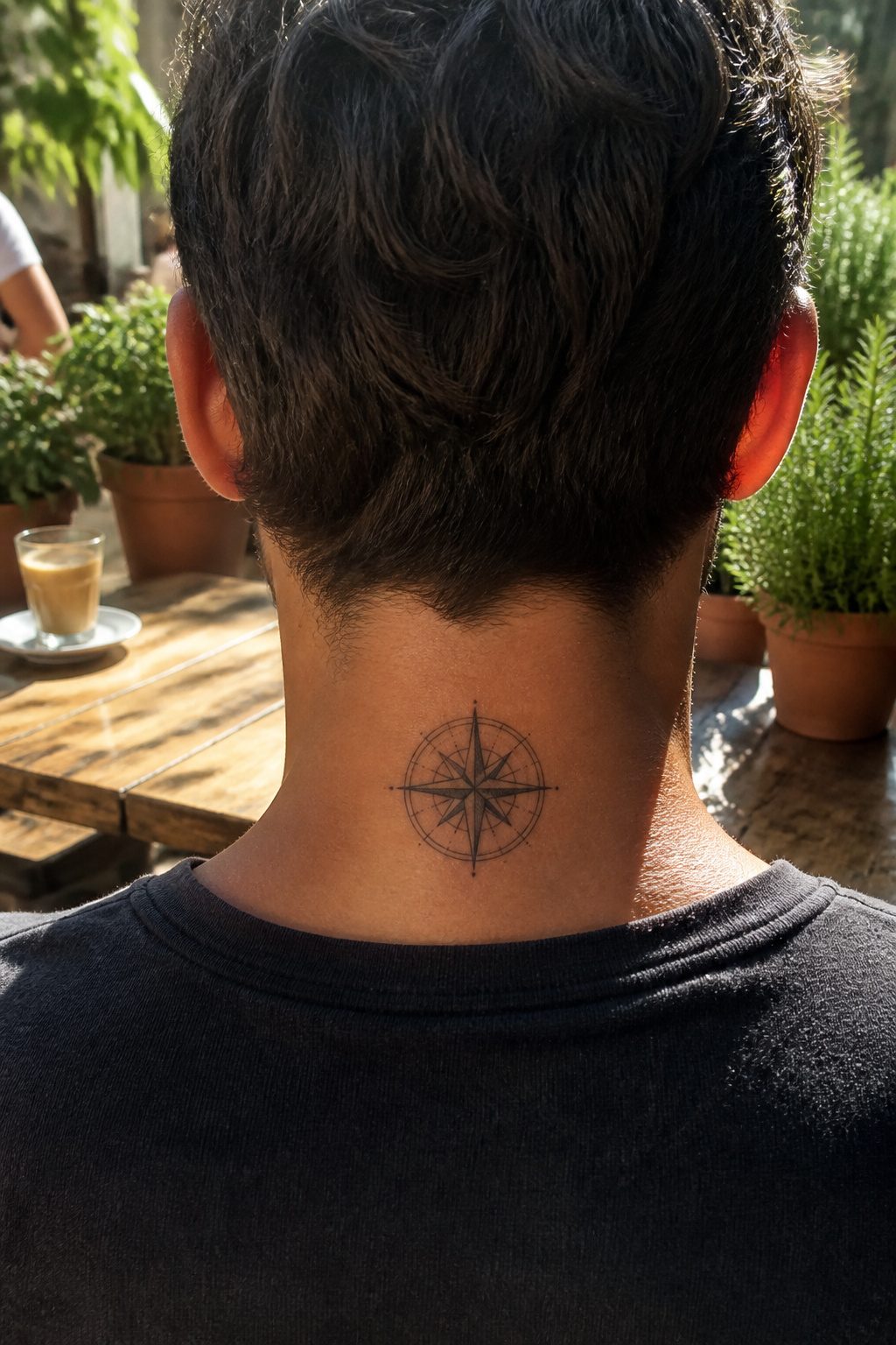
A compass on the neck carries its own logic. The throat curves naturally, and a circular design follows that line without fighting it. At the nape, the same compass sits flat, visible from behind when the hair is short or the collar is cut low. Keep the work small and relatively minimalistic if you need it to stay office-appropriate; grey and black shading with negative space gives the piece weight without shouting.
The men who choose this are usually after something specific: guidance, exploration, staying true to a path. The neck placement reinforces that. A compass here is not hidden on a bicep or under a shirt; it is forward-facing, literally the direction you move. Nautical stars sometimes travel with the compass, though the compass alone reads cleaner at this scale.
Pain is part of the calculation. The neck is thin-skinned and close to bone, and a compass demands steady line work for the circle to read true. A wobble in the outer ring ruins the whole metaphor. The artists I have watched work this area slow way down, building the circle in passes rather than one continuous pull. The result is worth that patience: a compass that actually points where it is meant to.
9. Cross and Religious Symbols

A cross or religious symbol on the neck reads differently than the same design on a shoulder or ribs because the placement is impossible to mask with a standard collar. That visibility signals something the wearer cannot walk back, which is why the choice of size and location matters as much as the icon itself.
Small marks running 2–4 inches behind the ear keep the commitment present but quiet, visible only when the hair is short or the head turns. Move the same cross to the throat, and the statement shifts entirely. Full throat pieces sit where a tie or crew neck cannot reach them, and in most professional settings they read as the "job stoppers" sources warn about. The tradeoff is exactly that: the more exposed the placement, the stronger the signal of conviction, but the narrower the range of contexts where the ink goes unnoticed.
Style widens the range more than size alone. A field of crosses with rays breaking upward toward the jawline carries the same spiritual weight whether rendered in fine-line black or heavy gothic shading with an ornate arch at the base of the skull. The latter approach, with birds ascending above the arch, borrows from older memorial conventions but wears modern on a neck because the anatomy itself supplies the movement. The sternocleidomastoid muscle runs from ear to collarbone, and designs that follow that line look anchored rather than pasted on. A cross that ignores that flow fights the neck’s natural geometry and tends to distort when the head turns.
10. Abstract Art
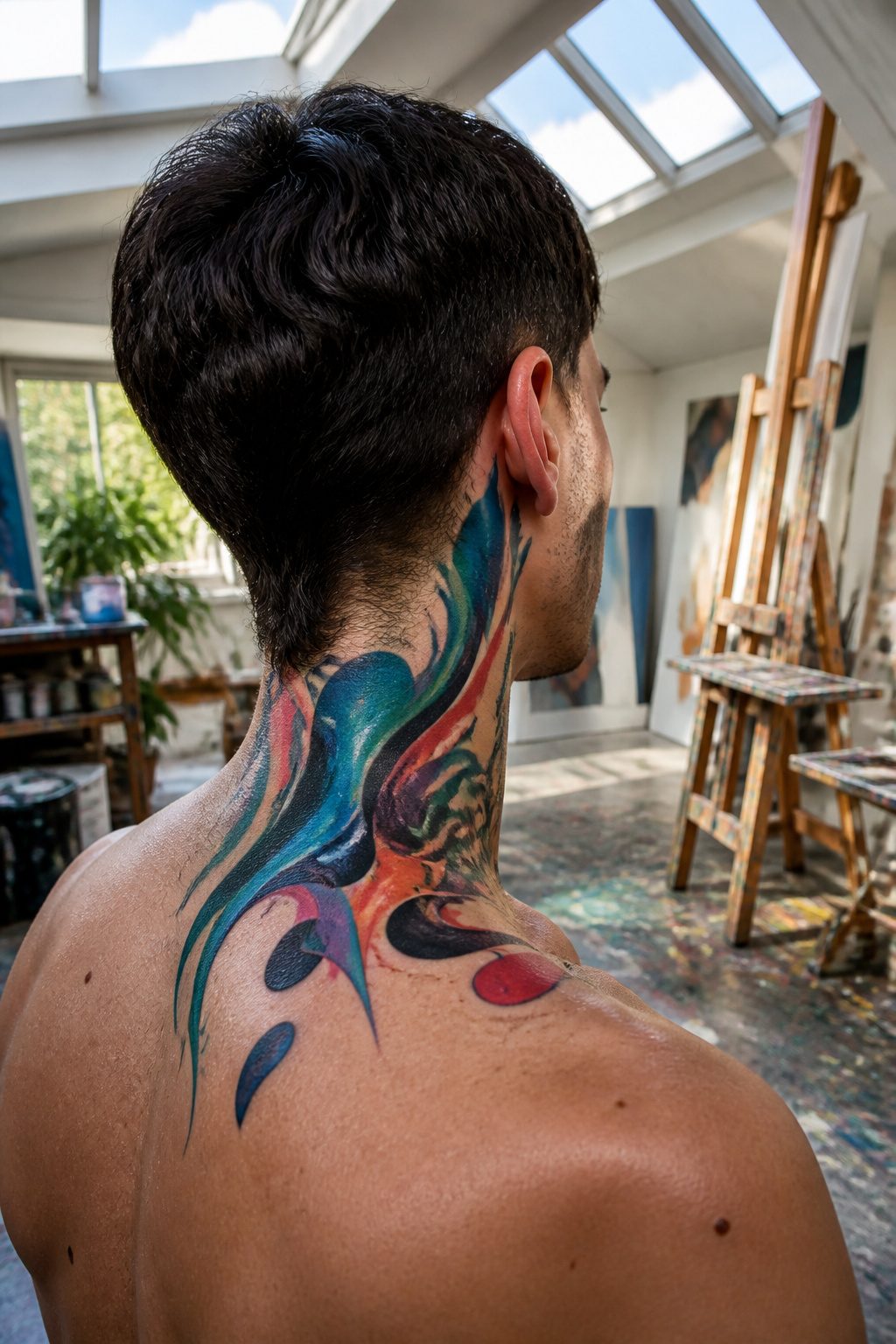
Abstract shapes and color fields turn the neck into a living canvas without locking the wearer into any fixed symbol. That openness appeals to men who want the visual impact without the literal meaning, though two things make this style riskier here than elsewhere on the body. Neck skin reddens easily and stays irritated through much of the healing window, which means bold reds or warm oranges can look inflamed long after the linework has settled, and the contrast you paid for may read as uneven for weeks. The skin on the neck also ages faster than on the chest or upper arm; abstract pieces rely on clean edges and color saturation, both of which soften and blur as collagen breaks down and sun exposure accumulates. A large color-block piece that reads as striking at twenty-five can look like a faded bruise by forty-five if it sits where a collar stops. If you are drawn to non-representational work, consider keeping the palette cool and the forms simple enough that a little diffusion still looks intentional rather than worn out.
Pain by Placement
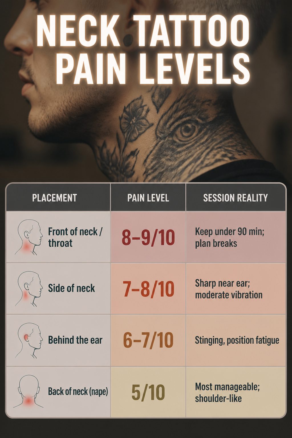
Thin skin and nerve density make the neck a high-sensitivity zone, and the exact spot on your neck changes the experience significantly. Front of the neck and throat hit 8–9/10, the side of the neck sits at 7–8/10, behind the ear at 6–7/10, and the back of the neck drops to a more manageable 5/10. Those top numbers mean vibration near the trachea and sharp, stinging sensations along the windpipe and jawline.
The higher the rating, the shorter your session should be. Limit throat work to about 90 minutes to manage swelling and the adrenaline drop that follows that kind of sustained intensity. Thicker spots like the back of the neck let you sit longer, and the forced position of holding your neck still adds its own discomfort regardless of the needle.
| Placement | Pain Level | Session Reality |
|---|---|---|
| Front of neck / throat | 8–9/10 | Keep under 90 min; plan breaks |
| Side of neck | 7–8/10 | Sharp near ear; moderate vibration |
| Behind the ear | 6–7/10 | Stinging, position fatigue |
| Back of neck (nape) | 5/10 | Most manageable; shoulder-like |
Workplace Visibility
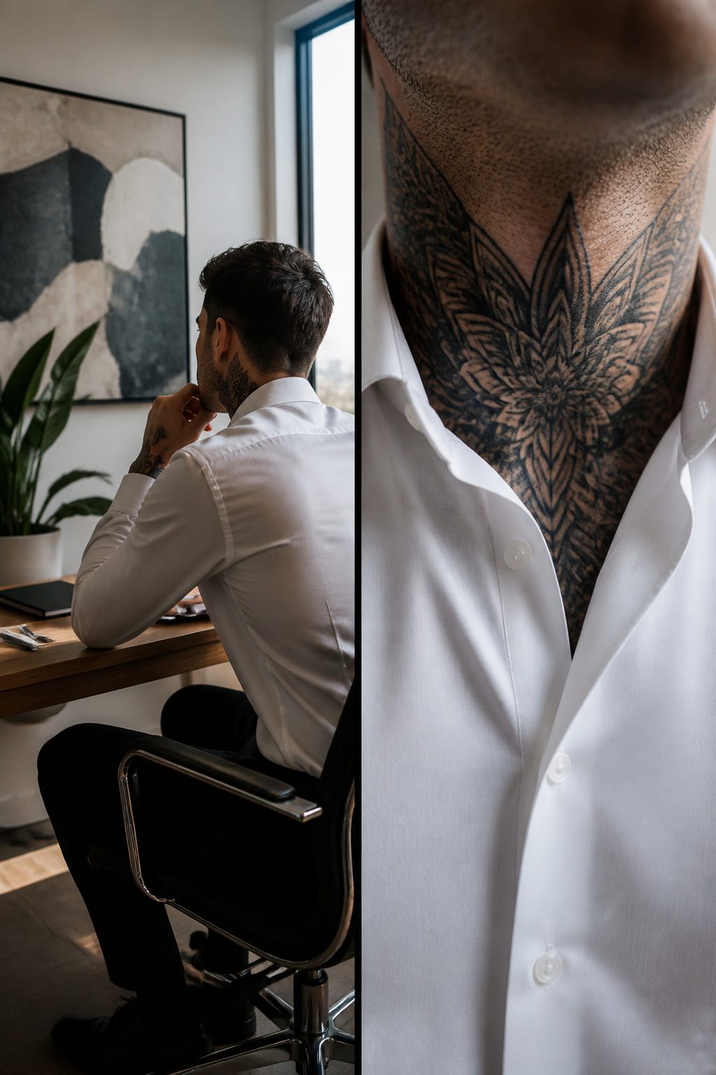
A throat tattoo sits above the collar line and stays visible in any standard dress shirt, which is why artists sometimes call that placement a job stopper. The nape, tucked behind the collar, hides for professional meetings and shows only when you choose. Side panels fall in between; a buttoned collar might mask a lower piece, but the area from ear to shoulder tends to peek out with movement.
High collars cover the nape. They do not cover the throat.
Industry norms still split sharply on this. Construction, automotive, culinary trades, tech startups, and creative agencies generally accept visible neck ink. Sales and retail vary by brand, with side or back tattoos sometimes permitted if the content is not offensive. Corporate finance, law, and traditional consulting usually demand full concealment, so the nape or below-collar line becomes the safer bet.
Tattoo artist Burak Moreno points to the visibility issue as career-critical, and Michelle Myles recommends getting less visible work first before committing to the neck. The acceptance of tattoos is broadening, but the research does not suggest that professional settings have shifted uniformly. Check your current or planned employer’s policy specifically; the trend line is not steep enough to assume cover without asking.
Aftercare for Neck Skin
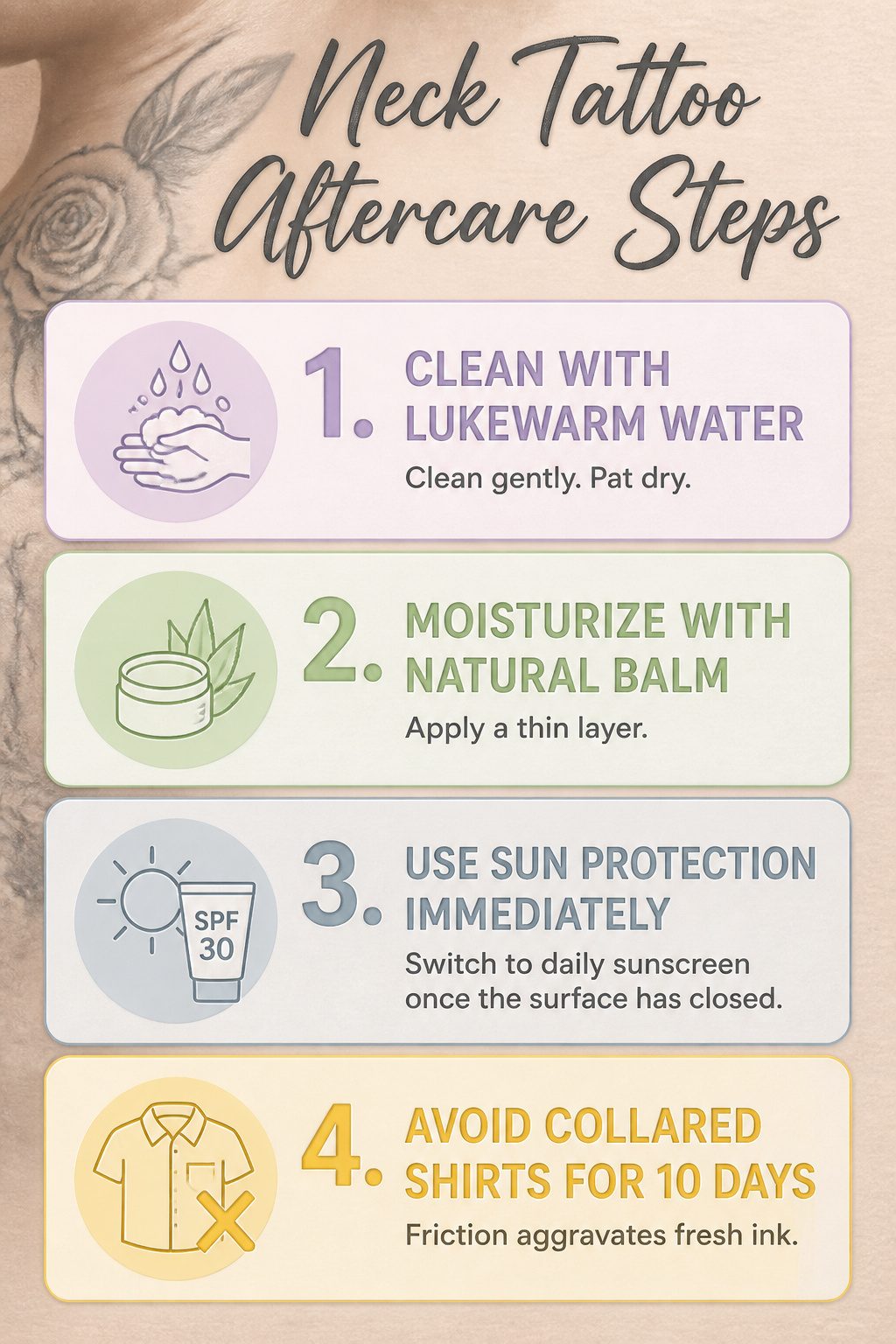
- Surface healing on a neck tattoo takes 2 to 3 weeks, and the location makes every step of that timeline harder than it looks. Thin skin and constant movement mean the scabbing phase is visible to everyone, not something you can hide under a sleeve.
- Clean the area with lukewarm water and a fragrance-free foaming soap, using only your fingers. No washcloths, no scrubbing motion. Pat dry with a clean paper towel rather than rubbing, since the neck’s nerve density already puts sensitivity at a 6 out of 10 on the sides and up to 9 out of 10 on the throat.
- Moisturize with a natural balm containing aloe vera, shea butter, or vitamin E, but apply a thin layer. The neck’s skin needs to breathe, and heavy occlusion from thick ointments traps sweat and bacteria against a surface that never really stops moving.
- Sun protection starts immediately. UV exposure in those first 2 to 4 weeks can fade ink before it settles, and the neck gets more incidental sun than almost anywhere else on the body. Once the surface has closed, switch to daily sunscreen.
- Collared shirts become a real problem for the first 10 days. The friction of a collar against fresh ink is constant, and long hair brushing the area adds another source of irritation. Plan your wardrobe and hair routine before you sit in the chair, not after.
What the Designs Mean
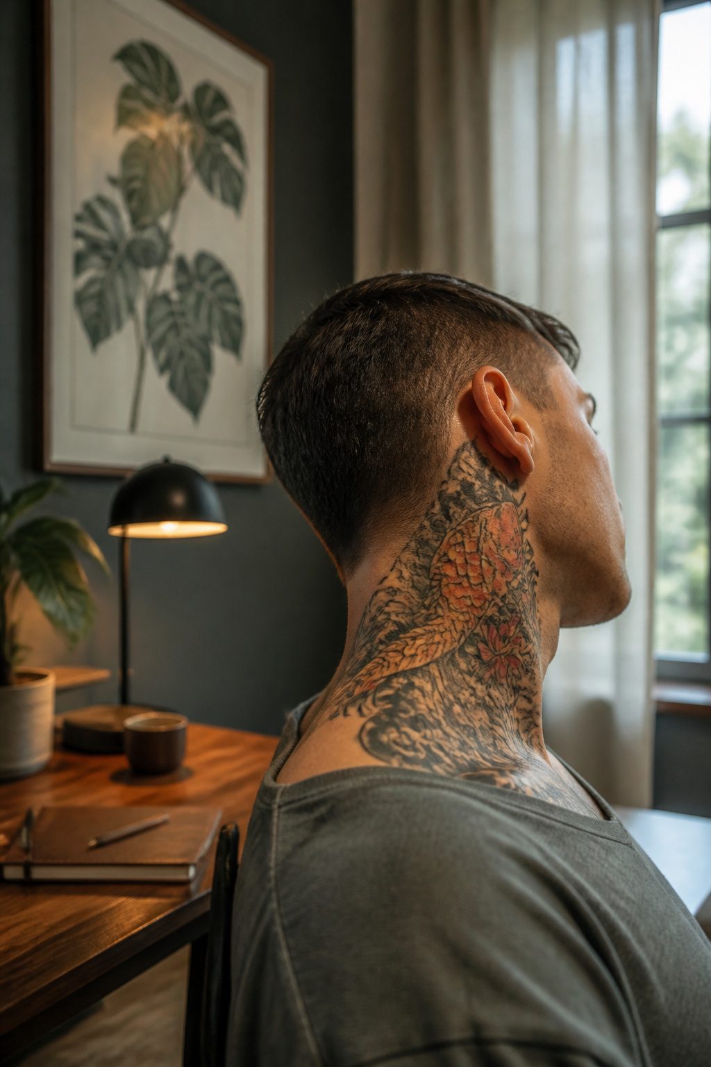
A neck tattoo flips the private meaning of body art into something you cannot hide. The design you choose has to survive that shift from reminder to declaration, because a symbol that felt intimate on your shoulder becomes a billboard once it climbs to your throat.
Strength and resilience thread through most neck work. The sources tie this partly to the pain of sitting for the needle in that spot, partly to the refusal to cover it. That same visibility has carried a history of rebellion, from counterculture movements through modern celebrity adoption. The choice now is whether you want the old edge or the newer mainstream confidence.
Personal milestones and protection symbols sit differently here than on a chest or back. A date, a name, a spiritual image that once served as private talisman now broadcasts your history to strangers. Some clients lean into that openness; others find themselves explaining a divorce they thought they’d stopped thinking about. The placement matters more than the ink.
Where the throat meets the jawline, a design reads as confrontation. Lower on the side of the neck, it softens to conversation. Either way, the meaning you assign gets overwritten by what the world reads into it, whether that’s the protection symbolism some cultures attach to the area or the professionalism question certain workplaces still raise.
Choosing the Artist
Neck skin moves differently than skin on an arm or a back, and the artists who build their portfolios around that difference are the ones worth the flight or the wait. A generalist can lay down clean lines anywhere; a neck specialist has already learned how the jaw turns, how the throat swallows mid-session, and where a design will settle two years in. That experience shows in portfolios that feature neck work as a repeating category, not an occasional outlier.
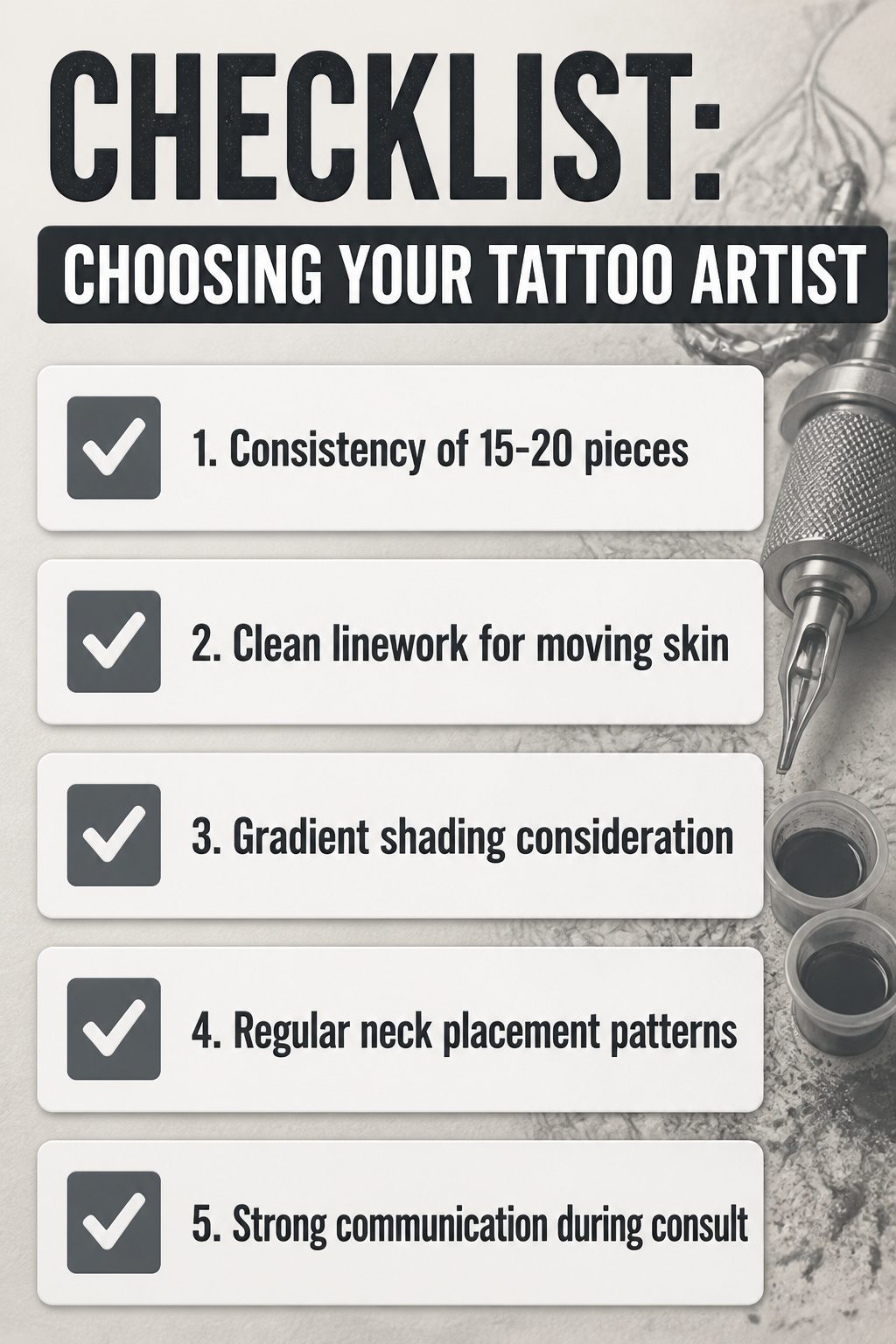
When I read through artist portfolios for this kind of placement, Grant Lubbock’s standard holds up: 15 to 20 consecutive pieces showing consistency in design, style, layout, and placement. For neck work specifically, I look for three things beyond the basics:
- Clean linework that stays crisp across the throat’s shifting surface, not just on flat forearm skin
- Gradient shading that accounts for how neck skin ages and sun-exposes differently than covered areas
- A visible pattern of neck placements, since an artist who returns to the area regularly has already solved problems a first-timer is still discovering
María Fernández González adds the communication test. The consult matters more here than with a hidden piece. You need an artist who listens to how visible this will be in your daily life, not one who treats the neck as just another spot to fill.
Style alignment matters too. If you want black and grey realism or dot work, two approaches that travel well on neck contours, the portfolio should show healed results in that specific style on neck skin, not fresh photos of easier placements.
I cannot name a specific studio here. The gap in verifiable, current research on who is actually specializing in this work means any name I gave you would be a guess pulled from marketing, not from demonstrated neck portfolios. The search is still on you: filter for the consecutive pieces, check healed results, and trust the consult more than the Instagram post.
Frequently Asked Questions
Do neck tattoos hurt more than other areas?
Yes. The front of the neck and throat rate 8–9 out of 10, the side sits at 7–8, behind the ear at 6–7, and only the back of the neck drops to a more manageable 5. Thin skin and proximity to bone mean sharp, stinging sensations and vibration near the windpipe and jawline, plus the forced position of holding still adds its own strain.
What are the best designs for neck tattoos?
Geometric patterns, tribal designs, animal motifs, and religious symbols all rank among the strongest choices. These styles share bold lines and readable shapes that hold up against the neck’s constant movement and sun exposure, while finer work like hyper-realistic portraits or micro-details tend to blur over time.
How should I care for my neck tattoo?
Clean gently with lukewarm water and fragrance-free foaming soap using only your fingers, then pat dry with a clean paper towel. Moisturize with a thin layer of natural balm containing aloe vera, shea butter, or vitamin E, and keep the area out of sun for two to four weeks. Plan around collar friction and hair brushing the fresh ink for the first ten days.