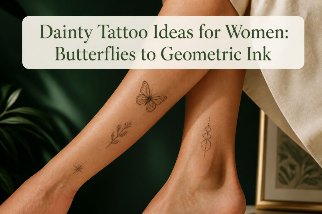
A dainty tattoo for women can sit anywhere from a single needle line behind the ear to a small geometric shape on the ankle, but the same design cannot simply shrink and move between them. The line weight and negative space read differently at each angle, and a butterfly placed too high on the ankle loses its lower wings in skin movement when you walk. JonBoy, who built a career on fine lines smaller than most artists will touch, clocks single initials at five to ten minutes under the needle.
1. Tiny Butterflies
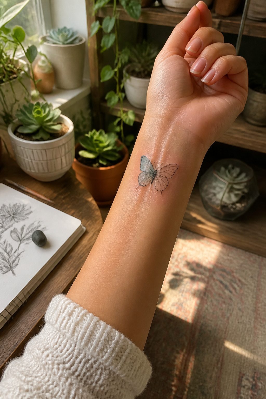
Butterflies hold up better than most images when the scale drops to an inch or two. The wing shape reads instantly even at distance, and a skilled artist can suggest the vein pattern with a single line weight change rather than full shading that would turn to gray blur. Five separate design collections I looked at all led with some version of the butterfly, which tells you how consistently clients request it.
The wrist and inner ankle are the placements that keep the wings recognizable. On the wrist, the natural fall of the forearm gives the butterfly a slight tilt that looks like motion. The ankle does the opposite; the flat plane of the inner bone lets the artist align the body dead center, and the wing tips wrap slightly around the curve so the whole shape stays intact when you stand. A butterfly placed too high on the ankle, up near the shin, loses the lower wings in skin movement when you walk. That is the placement mistake I see most often in portfolios.
Color choices are forgiving here. A single dark outline reads as jewelry. Filling one wing with soft orange or blue, leaving the other empty, gives the eye somewhere to rest without demanding the saturation a larger piece would need.
2. Minimalist Floral Designs
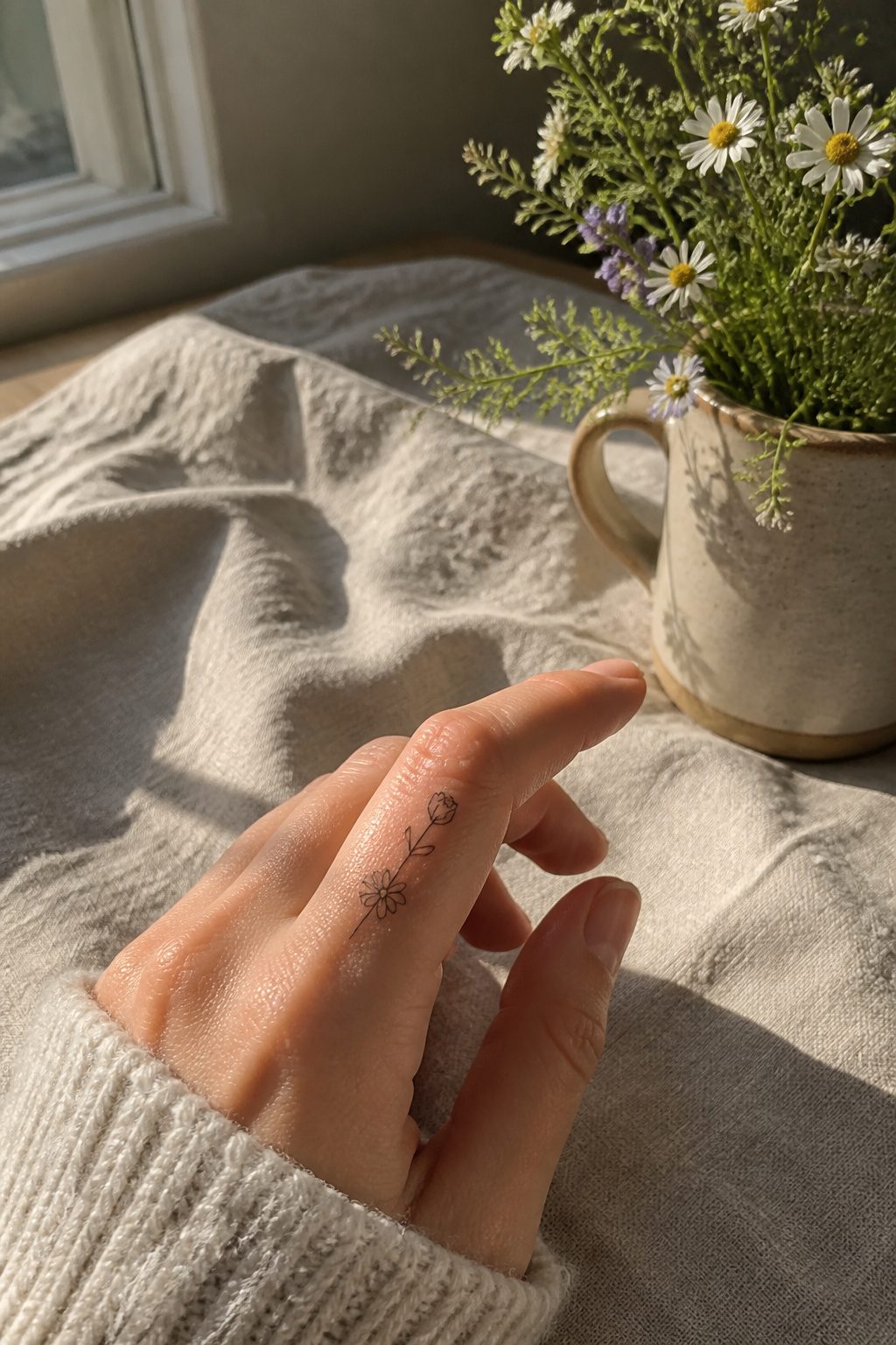
Single-line flowers sit flat against the skin, which makes them read as jewelry rather than illustration. A stem longer than two inches warps on a collarbone when you turn your head, so the clean look depends on keeping the line short or breaking it into two small blooms. I have watched this go wrong in consultation after consultation: someone brings a reference with a trailing vine, and the artist has to explain that fingers and clavicles punish anything that crosses too far over bone or bends with the joint.
Small blooms work because they age into soft dots of pigment rather than blurring into a smudge. The five-petal shapes, the tiny daisy, the single rosebud with no leaves, these hold their identity even when the lines relax slightly over time. Placement on the side of a finger, just past the last knuckle, keeps the tattoo from the palm side where ink drops out fastest. Behind the ear works the same way: the curve of the skull gives the flower a natural frame, and a stem of an inch or less follows that curve without fighting it.
3. Small Hearts
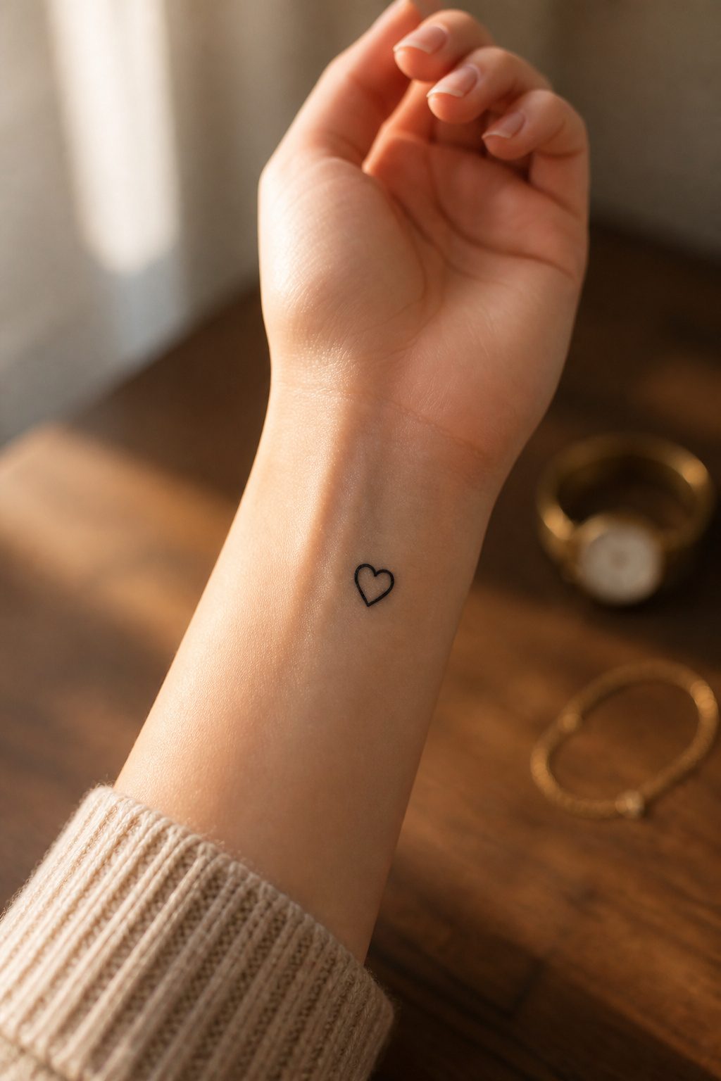
A small heart sits where a bolder piece would compete with your clothes, your jewelry, your day. JonBoy, who built a career on fine lines smaller than most artists will touch, calls hearts one of the three classics you will not tire of, alongside stars and crosses. The shape stays readable even when stylized, which matters when you are choosing between an outline and a filled design.
Outline versus filled is the decision that affects how this ages. An open line drawing keeps the shape light and disappears into the skin less abruptly as surrounding tone shifts. A filled heart reads stronger on day one but the solid pigment pools and softens faster; in five to ten years the edge you liked becomes a smudge where a line would have stayed a line. The outline also leaves room to add later, a name inside, a color wash, a second small shape nearby.
Placement on the shoulder, the wrist bone, the ankle hollow turns the heart into something you see at specific moments rather than every time you pass a mirror. That restraint is what makes it dainty rather than small.
4. Initials or Cursive Text
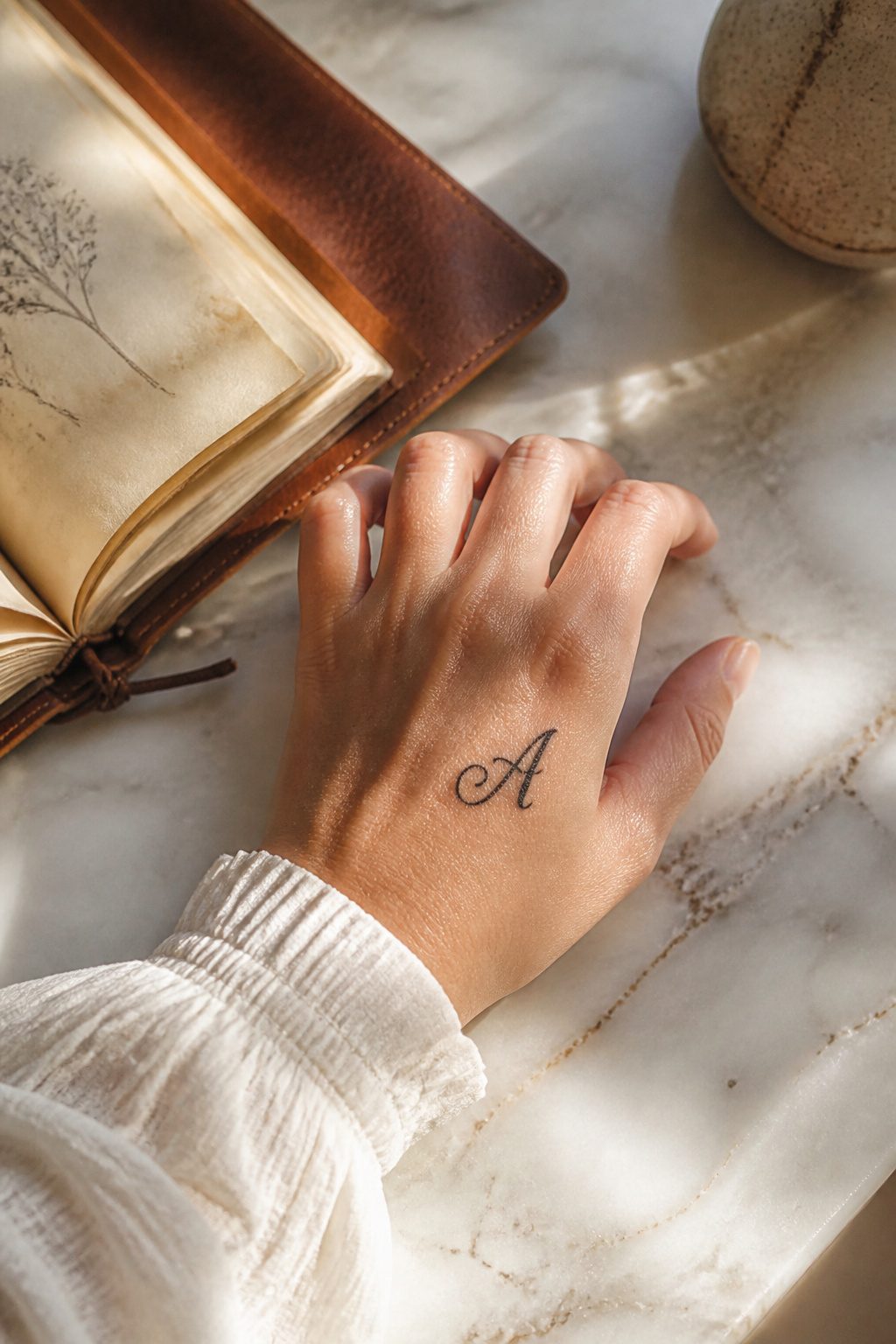
A single initial carries weight without taking up room. JonBoy, the artist behind Hailey Bieber’s tiny cursive B, clocks these at five to ten minutes under the needle, small enough to vanish under a bracelet or watch when discretion matters. The letter itself becomes the design, which is why font choice determines whether it stays readable as the years pass.
Thin script looks delicate on day one, but skin aging spreads ink the way it spreads on hands versus fingers. The back of the hand holds shape longer because the skin is thicker there; finger placements blur faster. Letter spacing that looks airy at twenty can turn into an illegible blob by fifty. A thicker initial, like the ones used for loved ones, buys you margin against that drift.
Five separate guides count initial work among their recommended dainty options, and the consensus splits two ways: go bold for longevity, or accept the tradeoff of a whisper-fine line that will need touching up. The name stays personal either way.
5. Stars and Celestial Designs
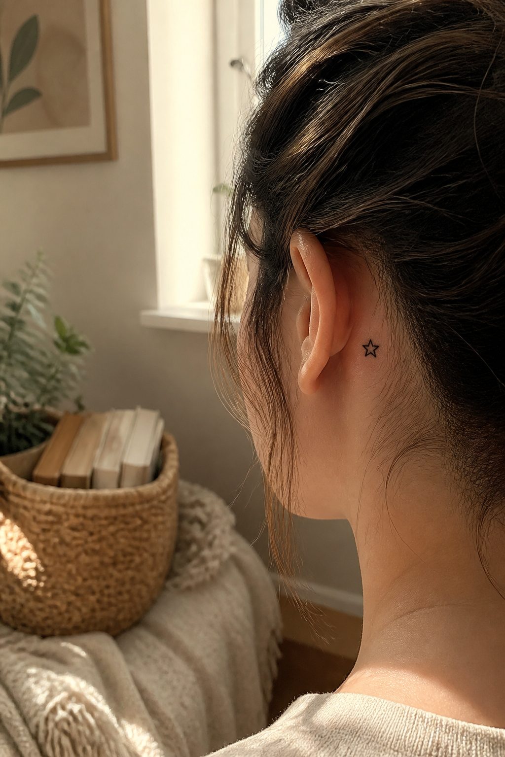
A single star behind the ear or on the collarbone reads as hope and guidance without shouting for attention. Solid shapes hold their edges longer than fine lines do, which matters when you’re weighing one star against a cluster. Constellation tattoos have that connect-the-dots appeal, but the thin lines between points tend to blur within a few years while the stars themselves stay readable. The moon offers a similar scale of choice, a waxing sliver for new beginnings, a full circle for wholeness, both small enough to sit on a finger or hand and still look deliberate rather than crowded. Earth-and-moon pairings work if you want two pieces that talk to each other across shoulders or wrists. Color stays optional with all of these; a simple black star or moon keeps the focus on placement and proportion, which is where the daintiness actually lives.
6. Meaningful Quotes
Short phrases carry weight when the words matter to you, not because they look pretty. "Carpe diem" or "I’ll rise up" sit small on a wrist or ribcage and serve as private reminders rather than declarations to a room. Five separate collections of small tattoos for women treat these as staples, which tells you how often people come back to text.
The real question is how the lettering holds up. Script ages faster than print on ribs, where the skin stretches and the ink spreads with movement and time. JonBoy, whose hand work is widely collected, points out that thinner skin means faster fading and more blur. That same risk applies to delicate word tattoos along the side body. Keep a phrase under roughly 50 characters for legibility at dainty sizes; longer quotes need more space or bolder lines to stay readable after a few years. Print fonts tolerate the stretching better, but script wins for softness on a forearm where the skin stays more stable.
Placement shapes the choice. A wrist sees sun and friction daily; a rib tattoo hides but lives in high-motion territory. Match the style to the spot, and expect a touch-up sooner on words than on solid symbols.
7. Animal Tattoos
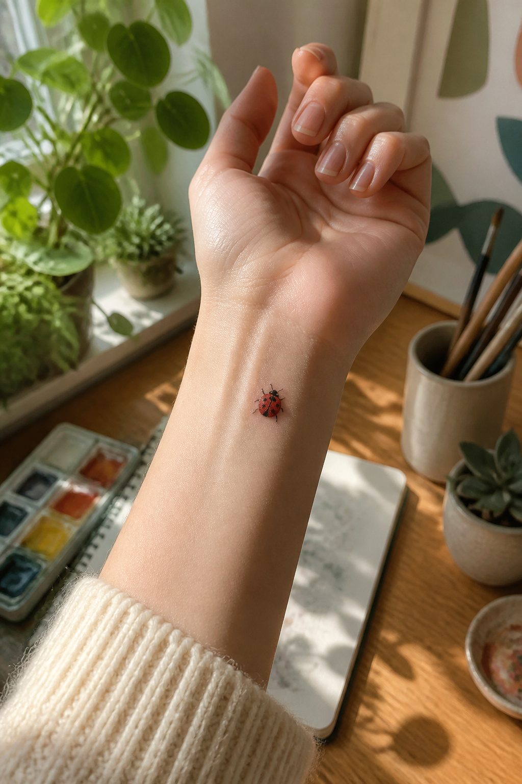
Ladybugs hold their shape better than you’d expect at small scale. The domed shell and clean spotting read even at an inch or two, which is why so many artists suggest them when someone asks for something tiny behind the ear or on the wrist. Rabbits are trickier. The long ears that make them recognizable also make them prone to blurring; at dainty sizes, those ears can soften into unrecognizable lines within a few years, and the face loses the gentle detail that made it appealing. Fine fur texture is almost impossible to keep.
Small birds and fish tend to collapse into dark blobs faster than insects with hard outlines. A hummingbird’s beak, which looks delicate on day one, often thickens and loses its needle quality. Geometric antennae on beetles stay readable longer than organic curves because the brain fills in straight lines more forgivingly than it does softened fur. If you want a creature that stays legible, pick the one with the harder edge and less internal detail.
8. Symbolic Tattoos
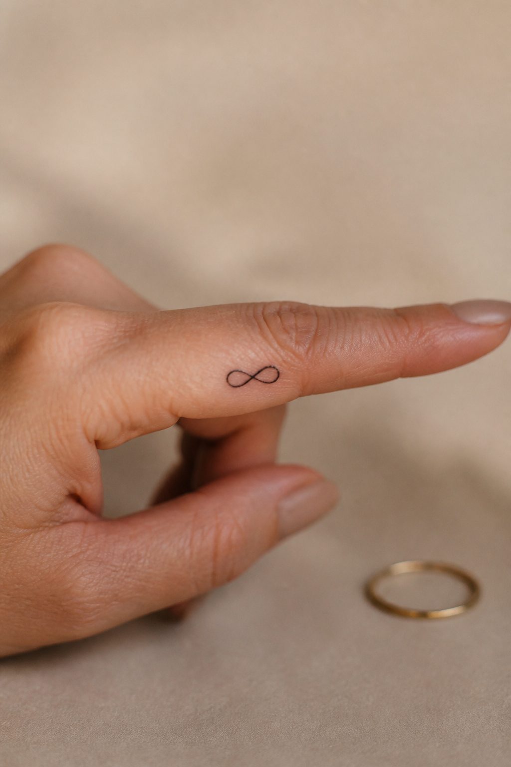
Infinity symbols and arrows still dominate the small-tattoo conversation, though four separate guides I looked through all keep them on the list for a reason: they scale down cleanly and read instantly from a distance. The catch is saturation. An infinity loop on a wrist or behind an ear has been done so widely that the personal story behind it has to do the lifting, because the shape itself no longer surprises anyone.
Placement changes the physical design more than people expect. An arrow pointing upward on a spine reads as forward motion; the same arrow following the curve of an ankle bone can look like it is falling backward unless the artist tilts the angle. Thicker line weight on an infinity loop survives better on high-movement spots like the side of a finger, where a hairline stroke will blur into a smudge within a couple of years. Inner-finger placement, like the small infinity tattoo Sofia Richie-Grainge’s circle has made visible, works because the symbol is complete in a quarter-inch of space and does not need surrounding context to make sense.
The abstract arrow on the spine from one of the collections I reviewed is a good example of letting placement reshape the symbol rather than forcing a stock image onto a body part. The spine’s vertical channel lets the arrow do what it actually means: direct the eye along a path. That is harder to achieve when the same arrow gets dropped horizontally across a collarbone just because the spot was free.
9. Geometric Shapes
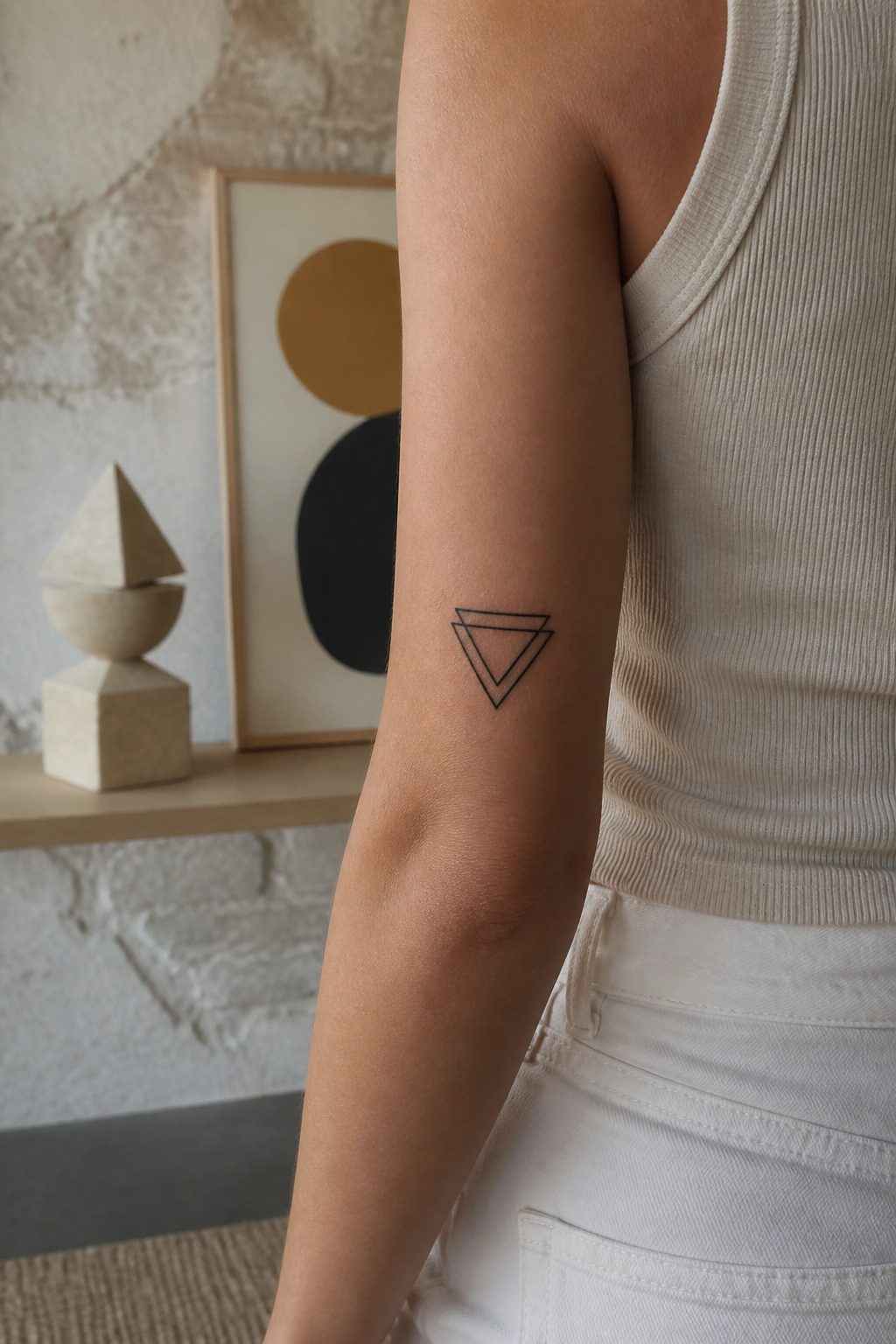
Straight lines hold up better than curves on fingers and hands, where the skin shifts constantly and ink tends to blur. A triangle or a thin vertical bar stays readable years longer than a circle in those spots, because the eye can still follow an interrupted edge even after some spread. That is why single-needle work matters for geometric pieces. Three passes with a standard needle group deposits more pigment than one hairline pass from a single needle, and the extra bulk turns a crisp angle into a soft corner. I have watched artists switch to single-needle for the final pass on a geometric line, and the difference in weight is visible immediately: the line stays sharp without looking drawn on with a ballpoint. For circles and rounded shapes, the placement matters more. The upper arm or ribcage, where the skin moves less, lets a small ring or concentric circles age cleanly. If you want geometry on a hand, keep it to lines and angles; save the circles for steadier ground.
10. Matching Tattoos
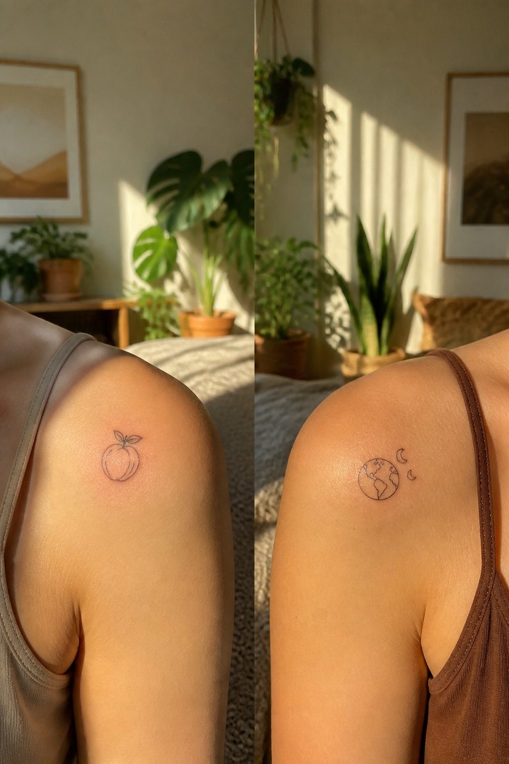
Matching tattoos land hardest when the relationship itself is the design, not just two copies of the same image. A pair of peaches on two shoulders, or the earth and moon as separate bodies that still orbit each other, carry more staying power than identical script that looks odd the moment one person is absent. Split designs age better through breakups or fallings-out because each piece stands alone as art; matching quotes or matching names do not.
The satisfaction gap shows up in what I have watched from the chair over the years. Two friends who chose complementary celestial bodies still like their ink five years later even though one moved cross-country. The ones who got each other’s initials tend toward cover-up conversations. A split design keeps the memory without holding the relationship hostage to it. That is the choice I would steer toward for anyone asking: something that reads complete on its own skin, beautiful on its own terms, and only gains meaning when the two are together.
Choosing Where It Goes
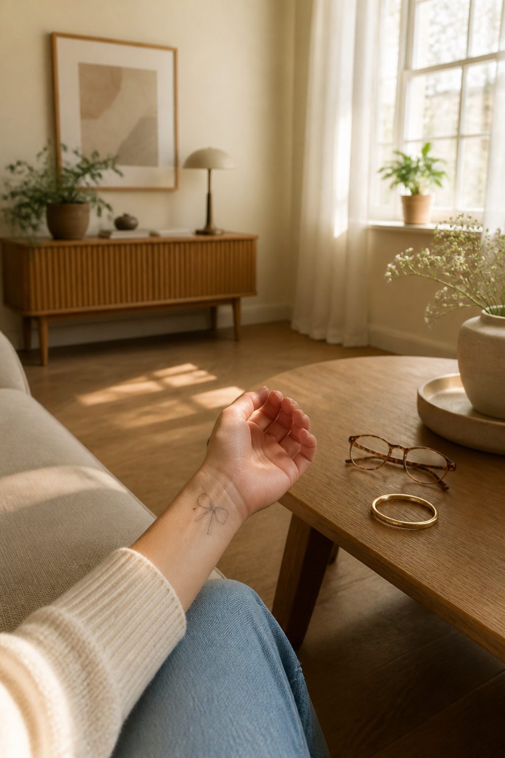
The wrist gets the most attention for dainty tattoo ideas for women because it sits right where you see it, which also means your employer sees it. A small dotted bow or fine-line design there reads as jewelry until someone looks twice, and a long sleeve covers it completely when needed. That half-second of visibility is the tradeoff you are buying or avoiding.
Behind the ear plays the opposite game. The spot is semi-hidden by definition, a simple framed heart peeking out only when hair is up or swept aside. Sun exposure stays minimal, which matters more than people think for ink that sits pale and delicate to begin with. Fading happens slower there.
The ankle shares some of that discretion, a line of text or tiny symbol hidden under socks or boots through work hours, visible at the beach or in sandals. Skin moves differently though. The ankle flexes and swells through the day, lines that looked crisp in the morning chair can blur slightly as the skin stretches and settles. Artists account for this by keeping detail spare on spots that see that motion.
Placement shapes the design more than the design shapes the placement. A piece meant for behind the ear cannot simply shrink and move to the wrist, the line weight and negative space read differently at each scale and angle.
What Happens After the Needle
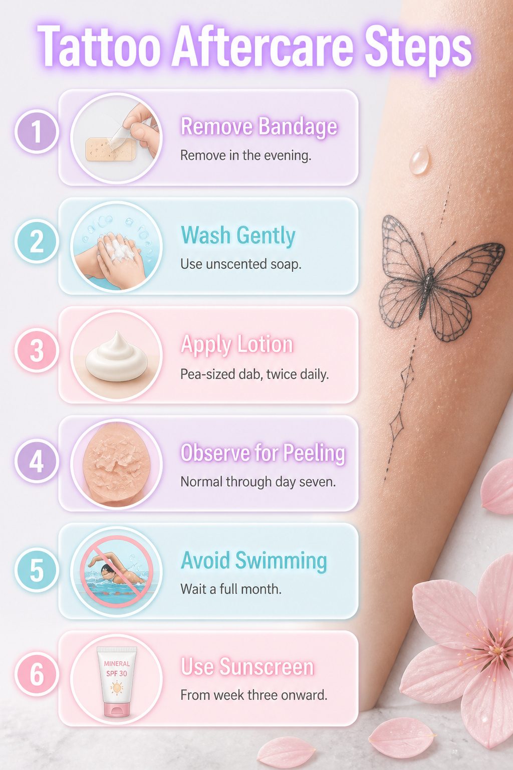
Ink stays wet under the bandage for about three hours. That first night, the plasma pools into a thin film that can glue the wrap to your skin if you leave it too long. I peel mine off in the evening, wash with unscented soap, and pat dry. No rubbing. The thin skin over a dainty butterfly or single-line geometric shape has less dermis holding the pigment, so every pull at a scab takes detail with it.
Days two through seven, the surface flakes like sunburn. A pea-sized dab of fragrance-free lotion, twice daily, is enough. More than that suffocates the wound and can push ink out with the excess. The tattoo should never feel wet.
Two weeks in, the top layer looks healed. It is not. Subdermal work is still settling, and UV light breaks down the smaller pigment particles first. A line thick as a thread has no margin for fading. Chlorine and salt water pull color outward through osmosis, so pools and ocean swimming wait a full month.
Small tattoos blur faster than sleeves because there is simply less ink to lose. A single needle line on a wrist can grey out in a season of unprotected sun. I keep mine covered or use mineral sunscreen from week three onward. The difference at year five is visible.
Why the Design Means Something
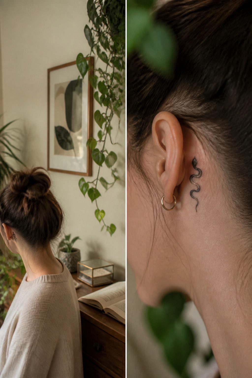
A small tattoo carries weight precisely because it refuses to shout. The snake behind the ear becomes mysterious instead of threatening when the line work shrinks. The star on a collarbone reads as guidance, not spectacle. That compression is the point: a glance of ink rather than a broadcast.
What changed my mind about reference images was watching how the same butterfly shifted from decorative to deliberate once the artist heard the story behind it. The placement stayed. The line weight stayed. But the angle of a wing tilted by two degrees, and suddenly the tattoo looked held rather than pinned. The story you tell affects the line work more than the photo you bring.
Foreign characters run the risk of meaning something else entirely. Research before you sit in the chair, because the artist cannot fact-check your intent in real time.
The self-hug shaped like a heart works the same way: the delicacy of the lines does not soften the meaning, it sharpens it. A tree at this scale becomes less about grandeur and more about staying rooted, which is a harder thing to draw small. The artist has to choose what survives the reduction, and that choice is always personal whether you name it or not.
Frequently Asked Questions
What are some dainty tattoo ideas for women?
Tiny butterflies, minimalist floral designs, small hearts, initials or cursive text, stars and celestial designs, meaningful quotes, animal tattoos like ladybugs, symbolic tattoos such as infinity symbols and arrows, and geometric shapes all work well at small scale. Butterflies lead most collections because their wing shape stays readable even at one or two inches, while single-line flowers read as jewelry rather than illustration.
How do I choose the right placement for my tattoo?
Decide first whether you want visibility or discretion. The wrist sits where you see it daily but also where employers notice it; behind the ear stays semi-hidden and fades slower from minimal sun exposure; the ankle hides under socks but flexes and swells through the day, which can blur crisp lines. A design meant for one spot cannot simply shrink and move to another, since line weight and negative space read differently at each angle.
What should I know about tattoo aftercare?
Remove the bandage the first evening, wash with unscented soap, and pat dry without rubbing. Apply a pea-sized dab of fragrance-free lotion twice daily for the first week; more than that suffocates the wound and can push ink out. Keep it out of pools and ocean water for a full month, and use mineral sunscreen from week three onward, since small tattoos have less ink to lose and blur faster than large pieces under UV exposure.