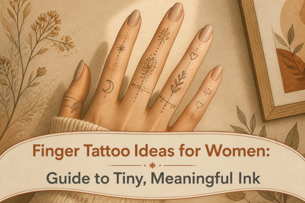
Finger tattoos for women run from a $50 infinity loop to layered constellations built across both hands, and the single factor that sorts one idea from another is not style but upkeep. The thin skin over bone sheds ink fast, so every choice carries a maintenance cost: side placements fade quickest, top-of-finger work lasts longer, and fine-line detail needs a 3RL needle or it blurs to a smudge inside two years. The women who keep these tattoos sharp budget for touch-ups the way they budget for the first appointment.
1. Tiny Heart
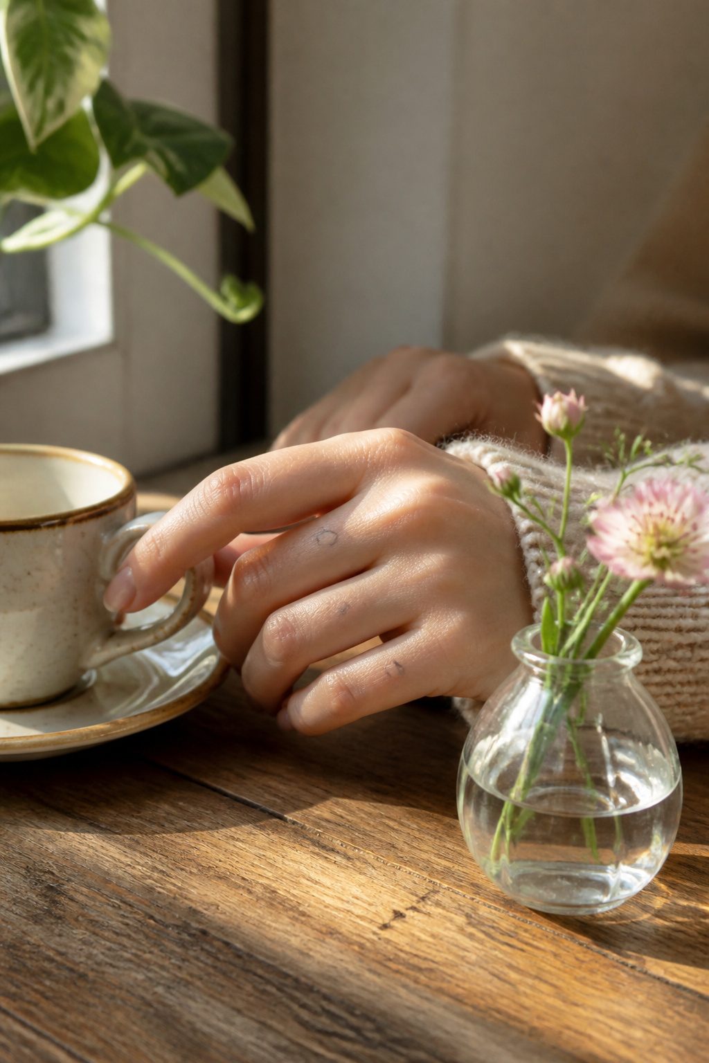
A tiny heart on the finger carries love you keep in motion, which is exactly the point of putting it there. Most women land this on the ring finger for a quiet romance signal, or on the pinky for something playful and light. The design reads as self-love, romantic love, or the people you’ve held onto, depending on what you assign it.
This is one of the most common finger tattoos women ask for, backed by four separate roundups. That popularity works for and against it. The heart is timeless and minimal enough to stand alone or layer with other small symbols, but the same simplicity that makes it elegant also makes it familiar. If you want distinct, you will need to adjust scale, placement, or pair it.
Placement matters more here than with busier designs because the shape is so spare. The side of the finger keeps it private, glanced at rather than announced. The ring finger center reads louder, almost jewelry-like. Either way, the finger’s constant friction means the ink fades faster there than on calmer skin, and touch-ups are normal, not a failure of the artist or aftercare.
2. Mini Butterfly
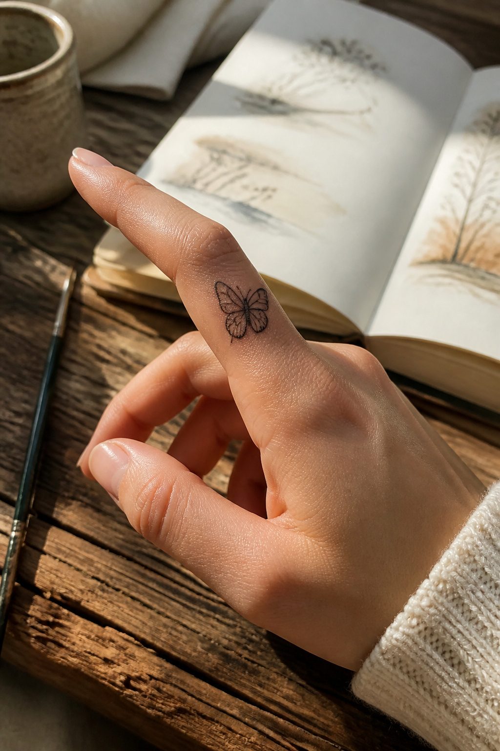
A mini butterfly on the finger lands best where the wing curve follows your own. The side of the finger or the top surface gives the silhouette room to read as butterfly rather than blot. I’ve watched this placement go wrong when the wings get too wide for the bone underneath; the skin shifts and the shape distort.
Butterflies carry transformation, which sounds grand until you see it sized for a finger. At this scale the meaning stays personal: a change you finished, not one you’re announcing. The lightness of the symbol matters more than the weight of the story behind it. Delicate line work catches light when you move your hands, enough that the image flickers rather than shouts.
The thin skin here means fine detail blurs faster than on your shoulder or back. Plan for touch-ups. A mini butterfly that starts crisp can soften into something closer to a smear if the original lines were too tight. Minimal form protects the design longer.
3. Dainty Star
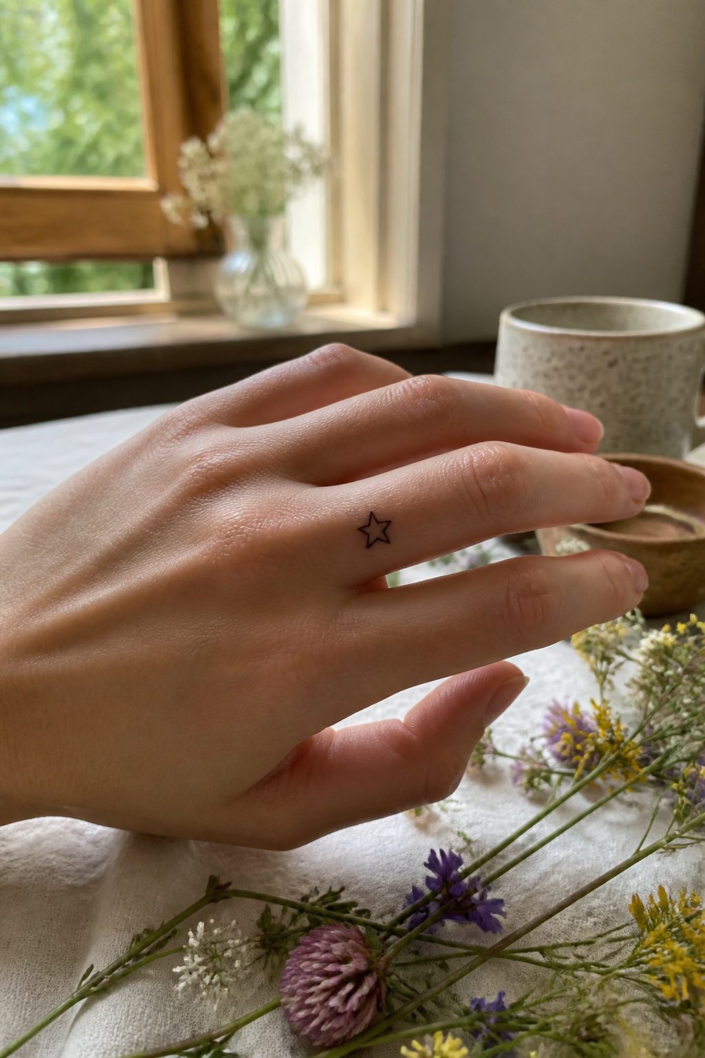
A single star carries more weight than you’d expect for something so small. The dainty star sits well near the knuckle or along the side of the finger, where it reads as guidance or aspiration rather than decoration. Sources that track these placements note that the proximal phalanx, the base of the finger, works with existing rings if you keep the ink low enough to avoid the constant rub of metal. The side of the index or middle finger offers what some call a peek-a-boo effect, though that same spot exfoliates rapidly and the line will soften faster than ink on top of the hand.
One star can mark a personal guiding light. Multiple tiny stars across several fingers build into a constellation over time, each point standing for a person or a moment. A small trail behind the star adds movement without cluttering the narrow canvas. The shape elongates the finger when it follows the bone rather than cutting across it horizontally, which is the difference between a tattoo that looks considered and one that looks stuck on. Side placement fades faster than top-of-finger work, so budget for earlier touch-ups if you choose the secret spot.
4. Crescent Moon
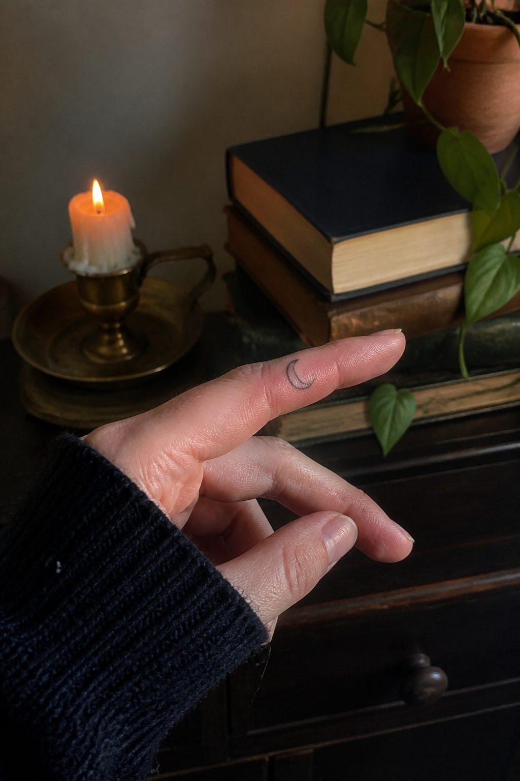
A crescent moon on a finger carries its weight in about a centimeter of ink. The curved shape follows the natural line of a finger’s side, which is where most women choose to place it. Mine sits on the side of my left ring finger, visible when I hold a coffee cup and hidden when my hand rests flat.
The symbol itself tracks with cycles, femininity, and the fact that phases pass. Dark to light, light to dark. Sources describe it as a marker for intuition and alignment with natural rhythm, though what that means in practice varies by who wears it. For some it’s spiritual bookkeeping, for others it’s simply a shape that ages well in a difficult spot.
The real consideration is line weight. Star points and crescent tips must stay sharp, and that demands adequate negative space between ink and skin. Lines too close merge into a dot within a few years. A clean crescent avoids the detail work that turns to blur on fingers, where ink naturally expands slightly over time. Block-based designs hold up better than intricate curves here, same as with finger script.
5. Sparkle or Shining Light
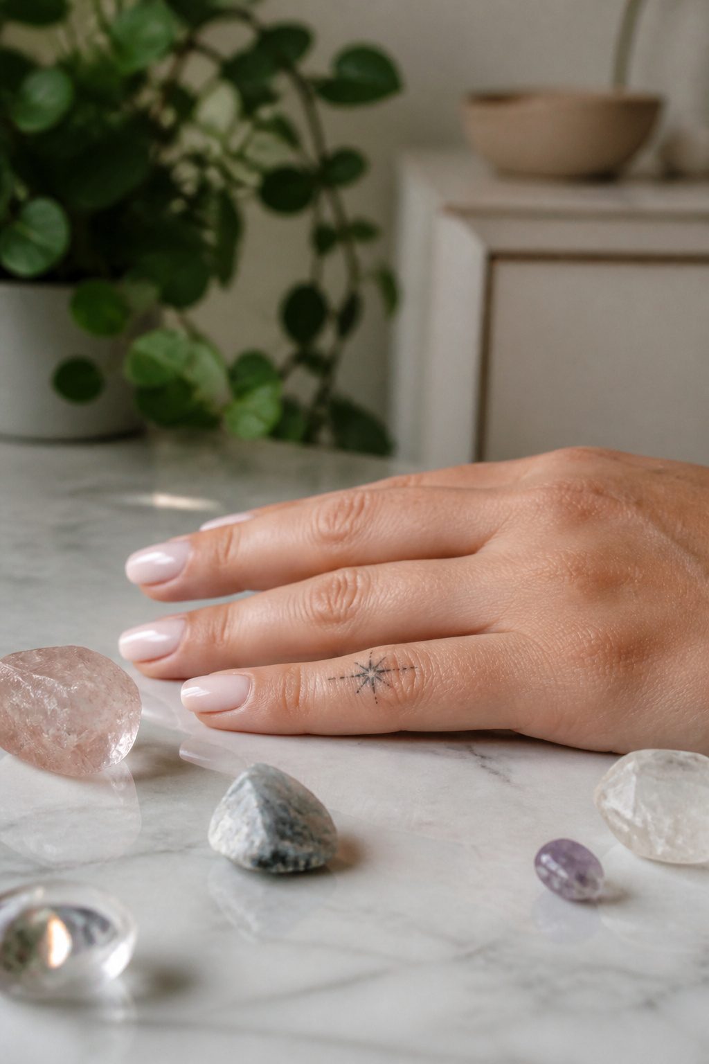
Tiny radiating lines or clustered dots can read as light catching on skin, and on a finger that small burst lives somewhere between jewelry and ink. I have seen these settle best along the side of a finger or just above a knuckle, where the eye catches movement before the mind registers a shape. The design asks for fine-line precision, usually with a 3RL needle, because any weight heavier than that collapses the illusion into a smudge.
Sources split on what the sparkle means. One camp treats it as pure mood, confidence and quiet magic carried outward. Another ties the radiating form to guidance or a personal breakthrough, the moment something finally clicked. Both read true depending on the wearer. What matters more than meaning is placement discipline: too many dots and the hand looks speckled, too few and the design reads as an accident. Three to five short lines, or a tight cluster of six to eight dots, tends to hit the right note. These work as standalone marks or as accent pieces framing another tiny design, a period at the end of a sentence you did not know you were writing.
6. Small Cross
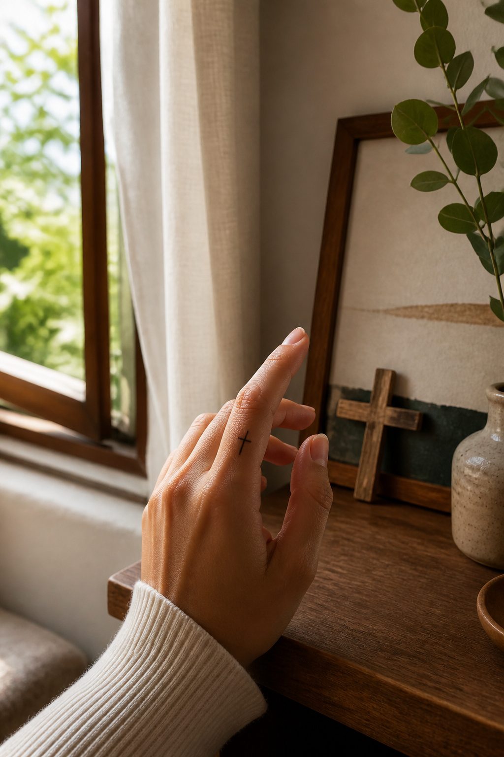
A small cross on the finger keeps spiritual meaning close without announcing itself to a room. The symbol carries weight, belief, sacrifice, connection to something larger, and it needs no explanation from the wearer. What convinced me, reading through a dozen of these guides, was how placement changes the entire effect.
The side of the finger hides the cross against your palm, visible mostly to you when you look down or fold your hands. That privacy suits a memorial piece or a faith you practice quietly. The top of the ring finger, by contrast, sits where a wedding band would rest. It can replace a ring, double one, or stand alone as its own vow.
Thin lines work better than anything ornate here. The sources agree that simple outlines survive where complex shading blurs, and finger skin, thin over bone, is especially unforgiving. A tiny fine cross in single needle keeps the detail legible longer. One guide notes that finger tattoos fade faster from use and exposure, so starting minimal gives you more time before the first touch-up.
If you wear a ring already, spacing matters. A thin band leaves room for a cuticle design to frame it; a large statement ring means moving the cross to a different finger or the side placement entirely. Two ways to play this: hide it for yourself, or let it sit where others see it when you gesture. The side placement wins if your job keeps hands in view and you want discretion. The ring finger top wins if the cross itself is the commitment.
7. Infinity Symbol
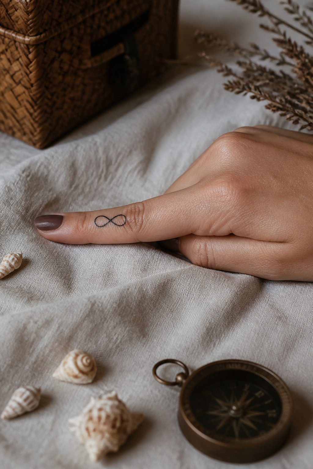
The infinity symbol works on a finger because the loop itself has no natural top or bottom; it sits balanced whether you face it toward you or the world. On such a small canvas, the shape reads instantly without needing color or extras. The meaning bends to whoever wears it: a matching piece with a partner’s initial tucked into one loop, or a solo mark about your own momentum.
Fine line is the only practical choice here. The skin on fingers sheds and blurs faster than almost anywhere else, so a thick line becomes a smudge within a couple of years. A single needle, hair-thin, gives the clean loop the best shot at holding its edge.
Budget around $50 to $100 for something this minimal, often with a shop minimum covering the whole job in under twenty minutes. That low entry is part of why the infinity loop stays so common; you are not committing to a sleeve or a session. You are buying a quiet shape that means what you decide it means, and that is exactly the point.
8. Yin Yang
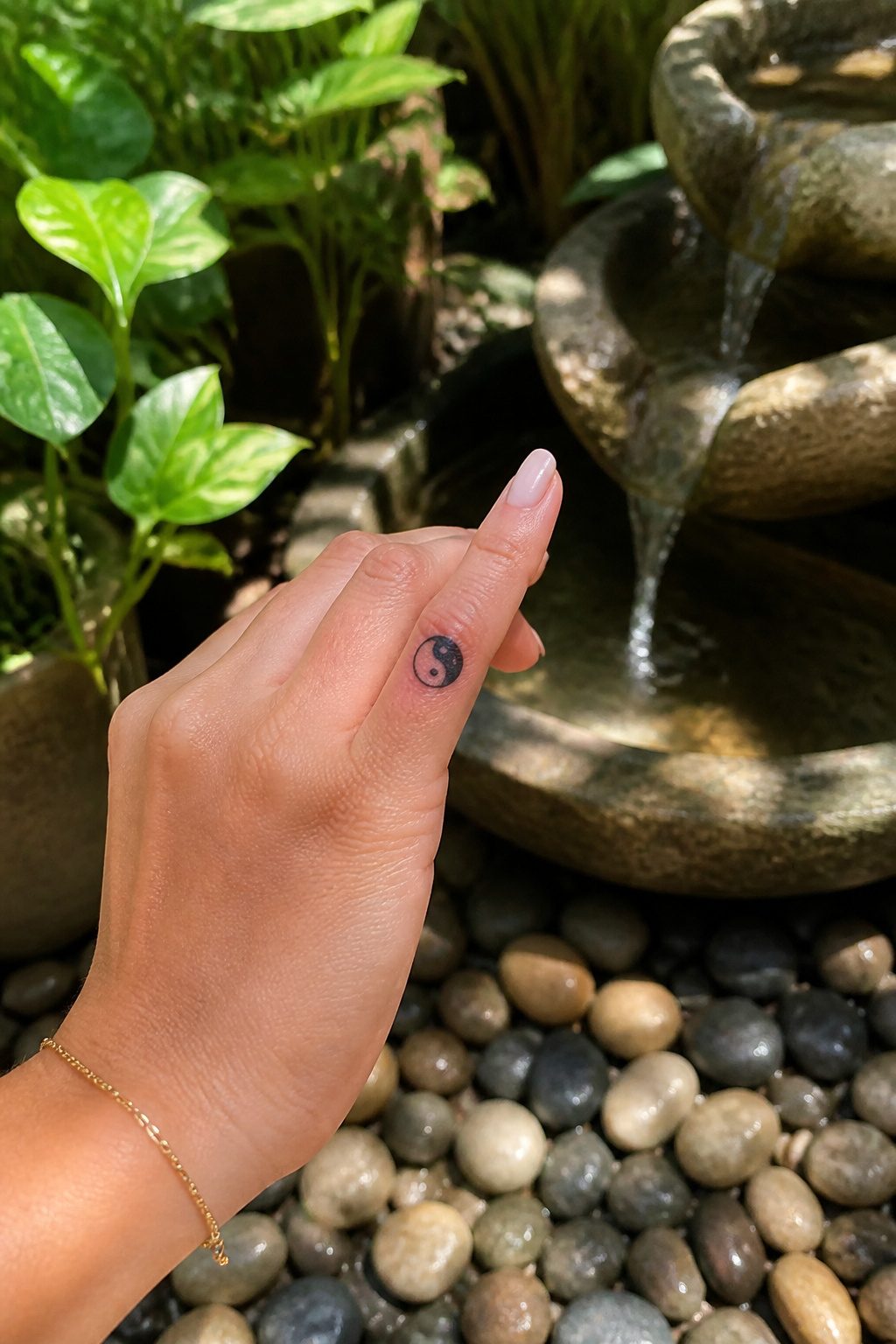
A yin yang symbol pressed onto a finger carries the full weight of an ancient idea in maybe a centimeter of ink. The design works because the circle stays readable even when the artist has almost no flat surface to work with. Two teardrop shapes pressed together, one dark and one light, each carrying a dot of the opposite color inside it. On a finger that reads as a small meditation you glance at ten times a day.
The meaning stays intact at this scale. Balance between strength and softness, between the wild days and the calm ones. What changes is the execution. An artist working a finger needs to hold the line weight extremely fine; too bold and the symbol crowds the knuckle, too faint and the smaller dot disappears into the skin tone within a year.
Finger placement for this symbol favors the side of the finger or a horizontal line across the top knuckle, not the pad. The pad sees the most friction and the fastest fade. Sources agree that finger tattoos demand touch-ups more often than work on the arm or back; the yin yang, with its two dependent halves, is a design where even slight blur changes the reading. Choose an artist who has done finger work specifically, not just one whose portfolio looks clean on larger skin.
9. Evil Eye
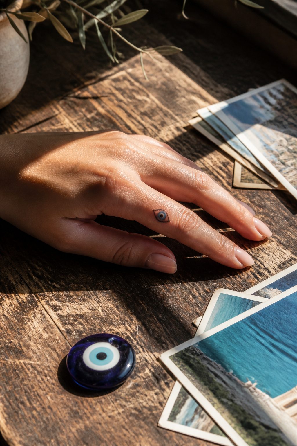
The evil eye carries weight as a finger tattoo because it sits where you shake hands, pay for coffee, type at a keyboard. That visibility is the point. The symbol does not hide its protection; it advertises it.
A small blue-and-white design holds up even in tiny scale, though simple line work works if you want something quieter. The color tradition comes from glass amulets you see across Greece, Turkey, and the broader Middle East, where the symbol predates tattooing by millennia. On a finger, the meaning shifts slightly. Instead of hanging near your doorway, the protection travels with you. It signals awareness, not superstition.
Placement matters for longevity. Fingers see water, friction, and sun in ways a rib or ankle never will. The evil eye’s circular shape helps here. A ring of cobalt around a dark center does not rely on hair-thin strokes that blur within a year. That durability makes it practical for women who want meaning without the maintenance anxiety that sends people back for monthly touch-ups.
The choice between traditional color and minimal line work comes down to how loudly you want the symbol to speak. Either way, the finger makes it a daily reminder rather than a private token.
10. Angel Number
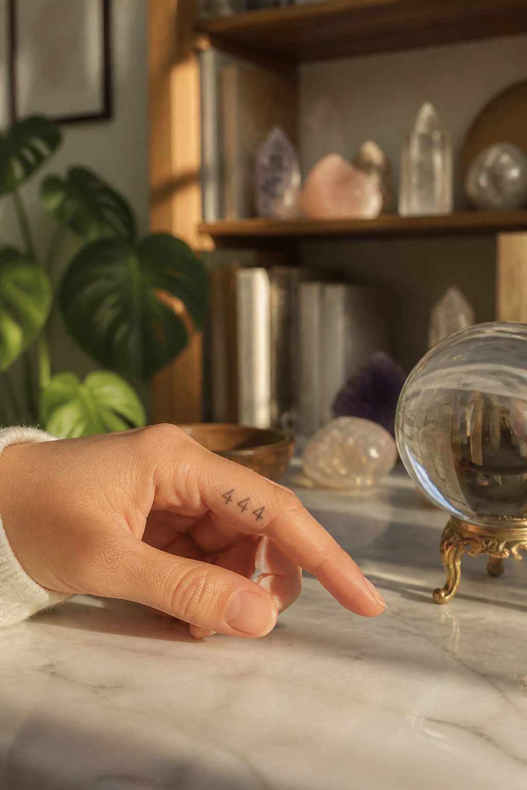
Seeing the same number everywhere usually stops being coincidence after the third or fourth time. A woman who keeps catching 111 on receipts, clocks, and license plates might choose that sequence for a finger tattoo not as decoration, but as a quiet signal back to whatever she thinks is sending it. The practice borrows from the idea that repeating digits carry specific messages: 111 for new beginnings, 333 for spiritual support, 777 for awakening. On a finger, the tattoo stays in sight during ordinary gestures, turning a morning coffee into a small reminder rather than a ritual you have to schedule.
The catch is readability. Finger skin sheds fast and blurs detail, so fine-line work with a 3RL needle is the only approach that holds. Even then, the design needs to stay simple. A single digit sequence, two or three numbers maximum, spaced along the side of the finger rather than the pad where printing disappears fastest. I have watched enough of these age to say that 777 holds up better than 1111 simply because fewer digits means fewer chances for one to blur into the next. The meaning is personal, but the execution is technical: pick the number that matters, then pick an artist who will talk you out of anything too crowded.
11. Roman Numerals
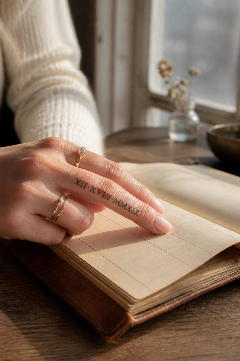
Roman numerals keep dates readable at a scale where regular numbers would blur together. The vertical and horizontal strokes of I, V, X, L, C, D, and M hold their shape on the narrow canvas of a finger, which is why a wedding date or a child’s birthday still looks sharp years later instead of muddying into a gray smudge.
Single dates work best spaced across one finger in a straight line, minimal and intentional. Multiple dates, spread across different fingers, build a private timeline only you fully read: one finger for the day you married, another for the day you chose yourself, another for a loss you still carry. The numerals can also wrap like a band, turning the finger itself into a continuous loop.
One woman told BuzzFeed she and her husband got their wedding date in Roman numerals on their ring fingers as a permanent replacement for bands they might forget or remove. The format suits that commitment precisely because it refuses to be decorative; it records.
12. Zodiac Sign
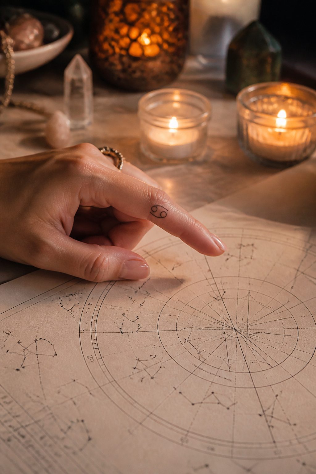
The zodiac glyph takes up almost no room on a finger, which is exactly why it works. A single character, the ram’s horns for Aries or the twin lines for Gemini, sits clean against the side of a finger or tucked just above the knuckle. Constellations need more care. The star points have to stay sharp with adequate negative space between them, or the lines merge into a soft dot within a few years. Blowout hits small tattoos harder than large ones.
Some women stack their sun, moon, and rising signs across three fingers. Others keep one sign for simplicity. Either way, the placement turns every gesture into a small declaration of identity, visible in almost everything you do with your hands. The style reads as spiritual without demanding a large canvas, and the meaning is fixed to a date rather than a trend. That permanence is the appeal and the risk: a glyph you choose at twenty-two still has to speak for you at fifty.
13. Initials
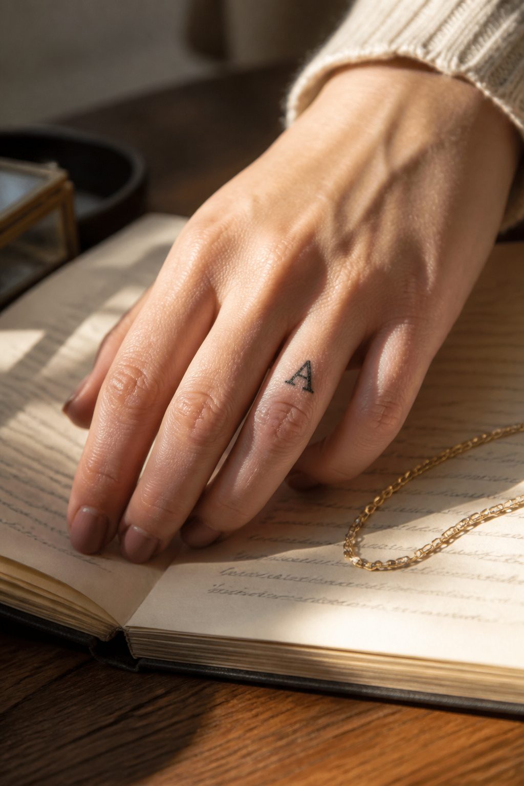
A single letter on a finger carries more weight than most people expect. One initial, kept to plain block or a clean serif, stays legible years longer than a cursive swirl on skin this narrow. The ring finger is the natural spot for a partner’s letter, though some artists warn that the constant friction from rings speeds fading. The pinky hides a child’s or parent’s initial more discreetly. I have seen vertical stacks of two or three initials tried on one finger, and the result is always cramped; the letters blur together inside a year. Better to spread them across separate fingers or commit to just one. Micro lettering demands a precise hand, and not every shop stocks the single-needle setups that keep lines this fine from blowing out. Ask before you book.
14. Signature-Style Name
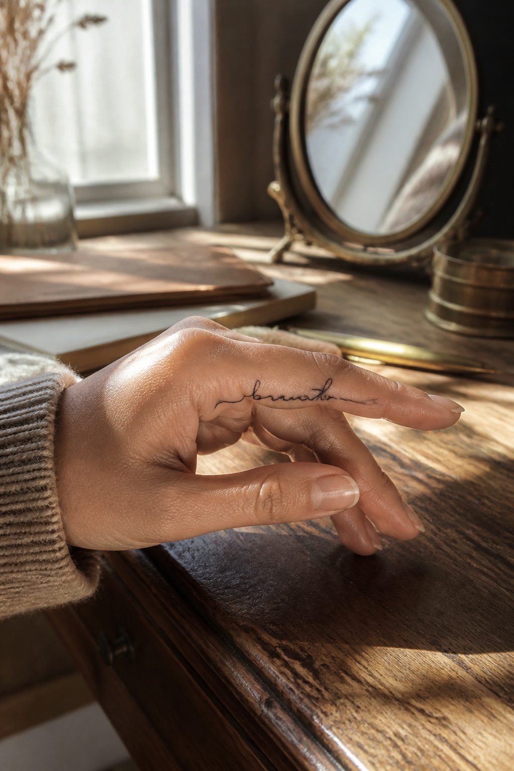
A signature-style name on the finger lives or dies by the flow of the script. The artist has to keep the line weight even while the skin curves over bone and tendon, and the best placement runs along the side of the finger rather than across the pad, where ink tends to drop out and blur. I have watched enough of these heal to know that wrapped placement looks elegant in the photo but often loses a letter where the finger narrows toward the nail.
The meaning is what draws women to it. A name carries the weight of identity or connection, and putting it on the hand, always visible, makes the statement daily rather than occasional. The sources note this as intimate and personal, and that matches what I have seen: clients who choose this are not after decoration. They want the name present in the gesture of handing someone a coffee or touching their own face.
Fine-line work here demands a steady hand and usually a 3RL needle, the standard for detail at this scale. The artist who rushes the downstroke on a letter like y or g will leave you with a blob that no touch-up fully rescues. Pick someone with healed photos of actual finger script, not just flash sheets.
15. One-Word Affirmation
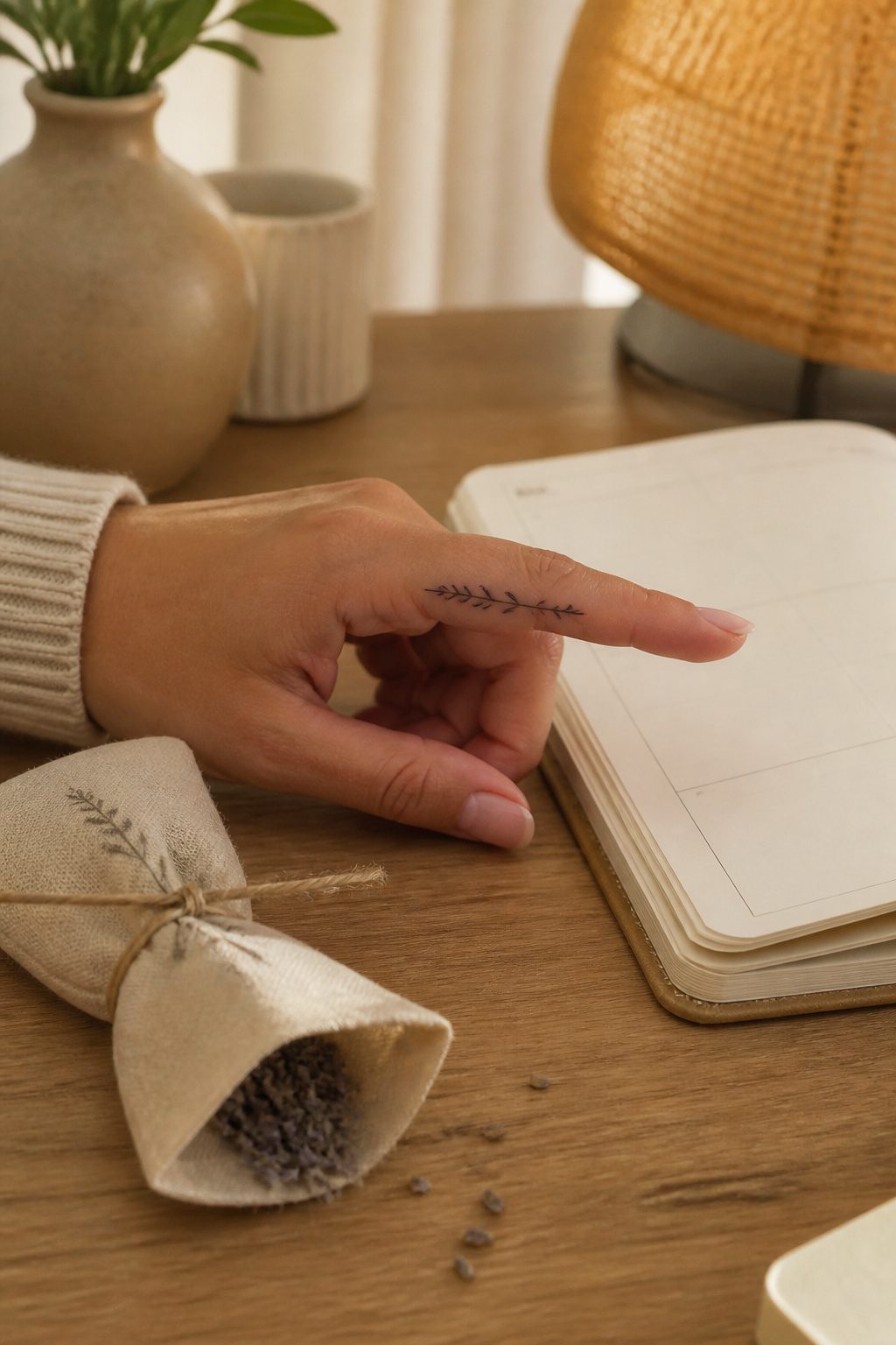
A single word on a finger carries weight because the hand never leaves your sight. "Breathe" across the side of an index finger, "stay" along the pinky edge, "believe" tucked between the knuckles — these placements turn a glance at your own hand into a private reset. The letters stay small, usually 3 to 5 millimeters tall, because anything larger cracks as the skin flexes. Fingers are almost all bone and tendon beneath thin skin, so the needle sits shallow and the ink settles closer to the surface than on a shoulder or thigh. That means faster fading, often within a year or two, and the word you chose for daily grounding becomes a smudge unless you budget for touch-ups. Most women I have watched choose these affirmations after a hard season, not before one — the tattoo marks the survival, not the intention. The word works best when you forget it is there, then notice it mid-gesture, mid-stress, mid-ordinary Tuesday. That surprise is the whole point.
16. Minimal Arrow
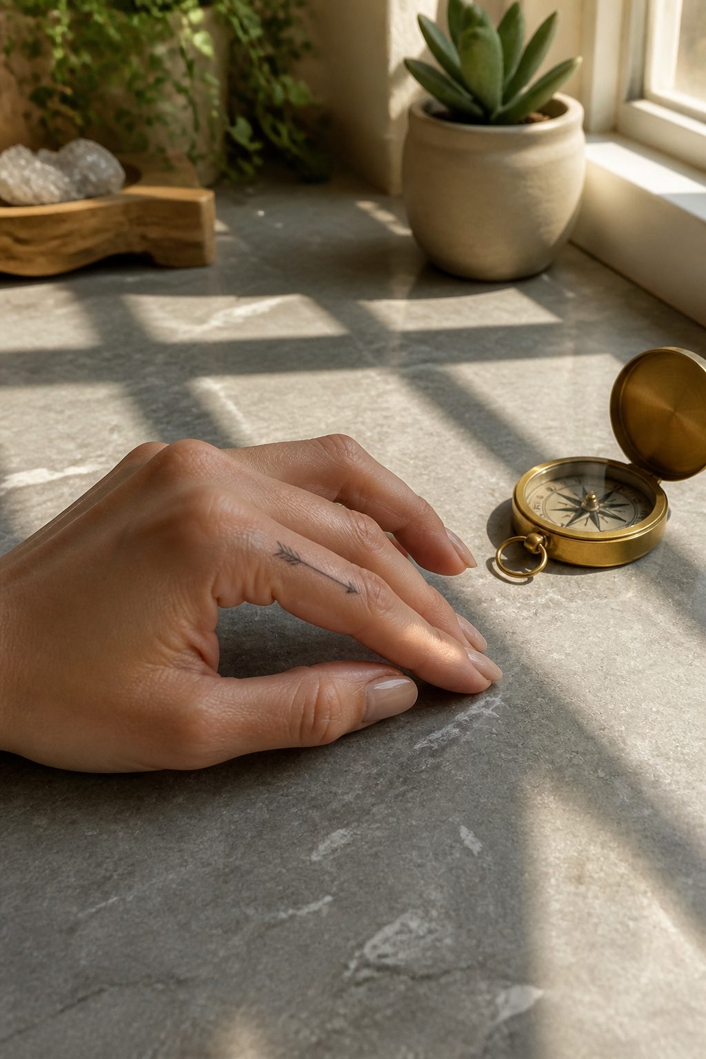
A minimal arrow on the finger works because the bone underneath gives it a natural runway. The line points toward the nail or the wrist, riding the finger’s own geometry instead of fighting it. That forward direction carries the meaning: progress, resistance met and passed through, the bowstring moment before release. One woman who chose this after a rough stretch at work put hers on the middle finger and said it felt like a pointed message to the people who had tried to hold her back. The design stays spare by necessity. Finger skin is thin, the canvas is small, and detail blurs fast. A clean shaft with a simple head and fletching holds up better than something ornate. Placement along the outer edge, where the finger meets the hand, keeps the line from distorting too badly when you curl or grip. The direction matters more than most people think. Toward the nail reads as outward motion, goals ahead. Toward the palm pulls the meaning inward, private resolve. Either way, the arrow follows the finger rather than sitting across it, and that alignment is what makes the tattoo feel intentional rather than accidental.
17. Tiny Wave
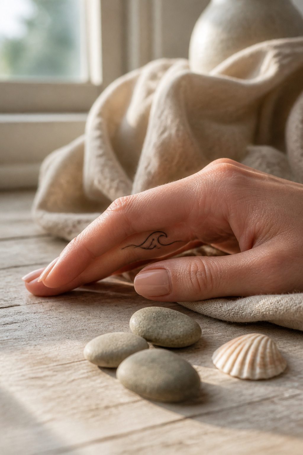
The side of the finger carries a wave better than the top because the curve follows the bone. Ink placed along the side of the index or middle finger offers a "peek-a-boo" effect as you move your hand, and the wave’s single flowing line elongates the finger rather than cutting across it.
Ocean imagery on fingers usually stands for change, fluidity, or a direct connection to water. I have watched clients choose this after a move near the coast or a period they described as learning to adapt rather than fight the current. The design asks for a simple outline; complex shading on a finger will blur within three years, while clean lines maintain legibility.
This skin exfoliates rapidly, so expect faster fading on the side placement. A touch-up plan matters more here than with a back-of-hand tattoo. For women who wear rings, the wave sits low enough on the proximal phalanx to avoid constant rubbing from bands, and the vertical flow pairs well with slender fingers. Shorter fingers benefit from this elongation; horizontal bands would visually shorten the digit instead.
18. Mountain Line
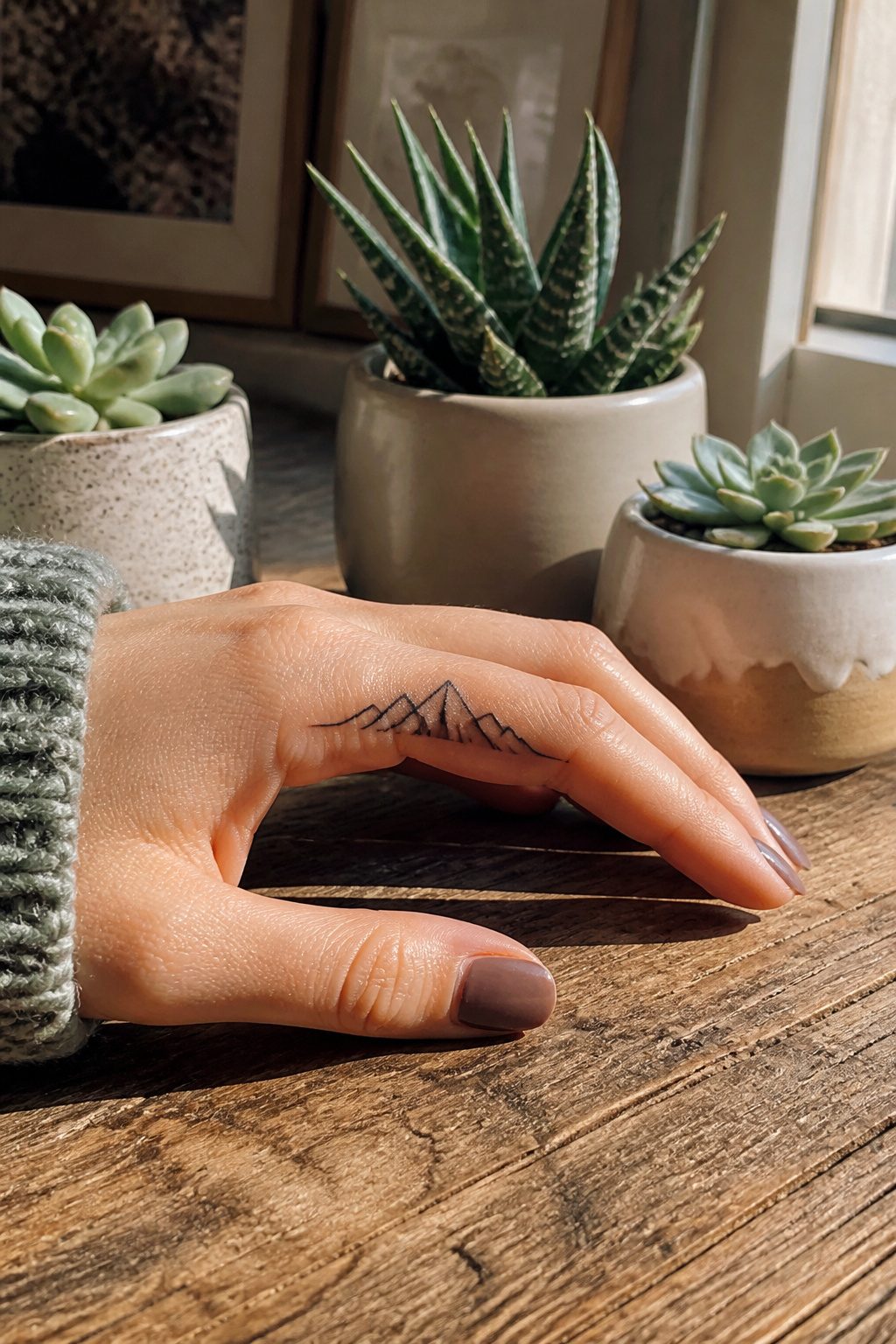
A single mountain range, drawn as a clean line of peaks and valleys, sits well on the side of a finger where the bone gives the skin just enough tension. The shape reads as stability for some and as the next climb for others; either way, the meaning holds because the mountain itself does not change.
Single-needle work, usually with a 3RL, keeps the ridges from blurring into a single dark bar. The needle grouping is fine enough that the line width stays under a millimeter, which matters because finger skin turns over fast and thick lines become muddy where thin ones merely soften. The triangular geometry helps here too: even if one peak fades slightly, the silhouette still reads as a range rather than a blob.
Placement along the finger’s outer edge, toward the pinky side, gets less direct contact than the palm-facing surface. That alone extends the crisp period by months. The trade-off is visibility; you see it when you want to, not every time you gesture.
Cost and touch-up reality belong to a later section, but the honest truth about this design is that its simplicity is what makes it survive at all.
19. Sun Symbol
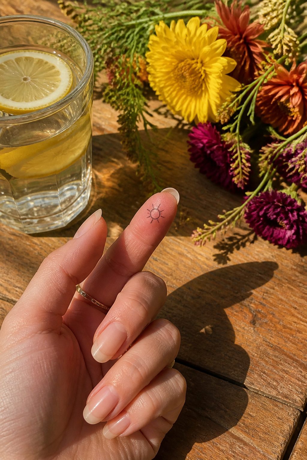
A small sun symbol on the finger pad carries the same weight as a full sleeve elsewhere: it is compact, daily visible, and hard to hide. The circle with radiating lines sits naturally on the rounded surface of a fingertip, and some artists place it along the side of the finger instead when the pad is too small for clean aging.
The meaning is direct. The sun rises without exception, so the design signals warmth, vitality, and the choice to show up even in low periods. A simple open circle with short rays keeps the line work minimal and holds its shape longer on hands that wash, type, and grip all day. A half sun, either rising or setting, can sit at the base of the finger and read as transition rather than constant brightness.
The finger location does cost extra in maintenance. Hand skin sheds faster and sees more sun than covered areas, so the crisp circle you start with will soften sooner than a sun placed on the shoulder or ankle. Plan for touch-ups within the first two years, or choose the side placement where ink sees slightly less direct abrasion against surfaces.
20. Feather
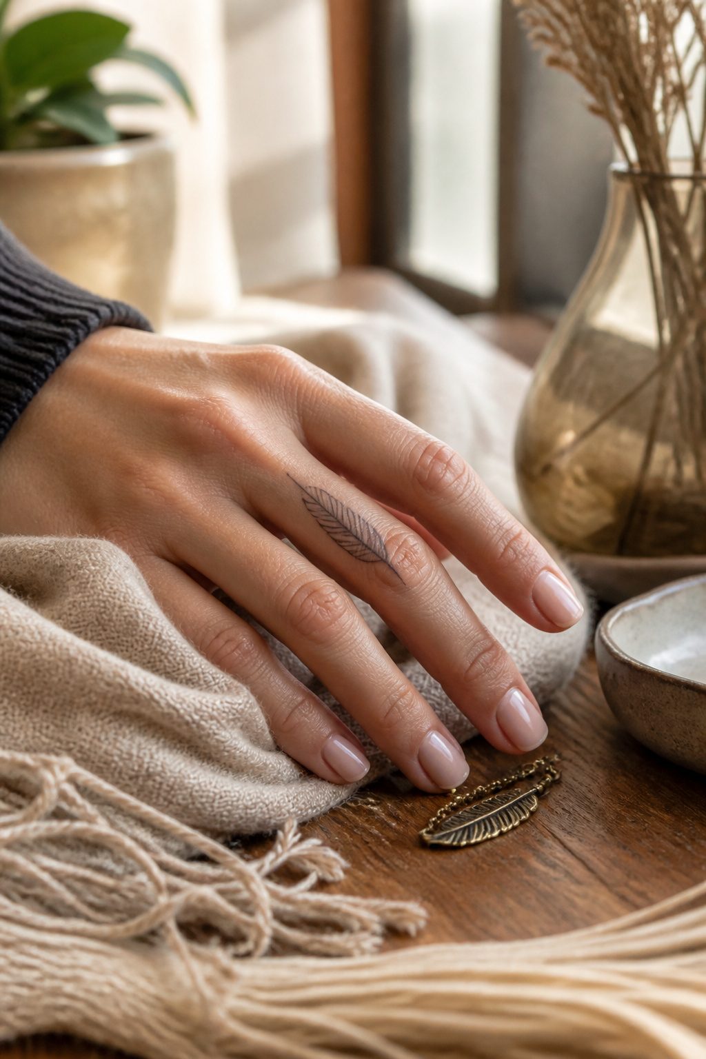
A single feather along the finger carries weight without heaviness. The design reads as freedom, spirituality, or the lightness of letting go, depending on what the wearer needed at the time. Peacock feathers lean toward beauty; owl feathers toward wisdom. The meaning stays personal because the image itself is so spare.
The thin lines that make a feather convincing are exactly what finger skin fights hardest. No fat pads the bone there, so the needle vibration travels straight to the nerve. A 15-to-20-minute session still demands steady work from the artist, because wobbling shows instantly in a line that fine. One slip and the feather looks like a frayed thread instead of something that could lift on a breeze.
Placement along the outer edge of the index finger or tucked beside the middle knuckle keeps the image visible without dominating the hand. The airy quality works best when the line weight stays consistent, no heavier than a strand of hair. That restraint is what makes the whole thing feel effortless, which is the point.
21. Ring-Style Line
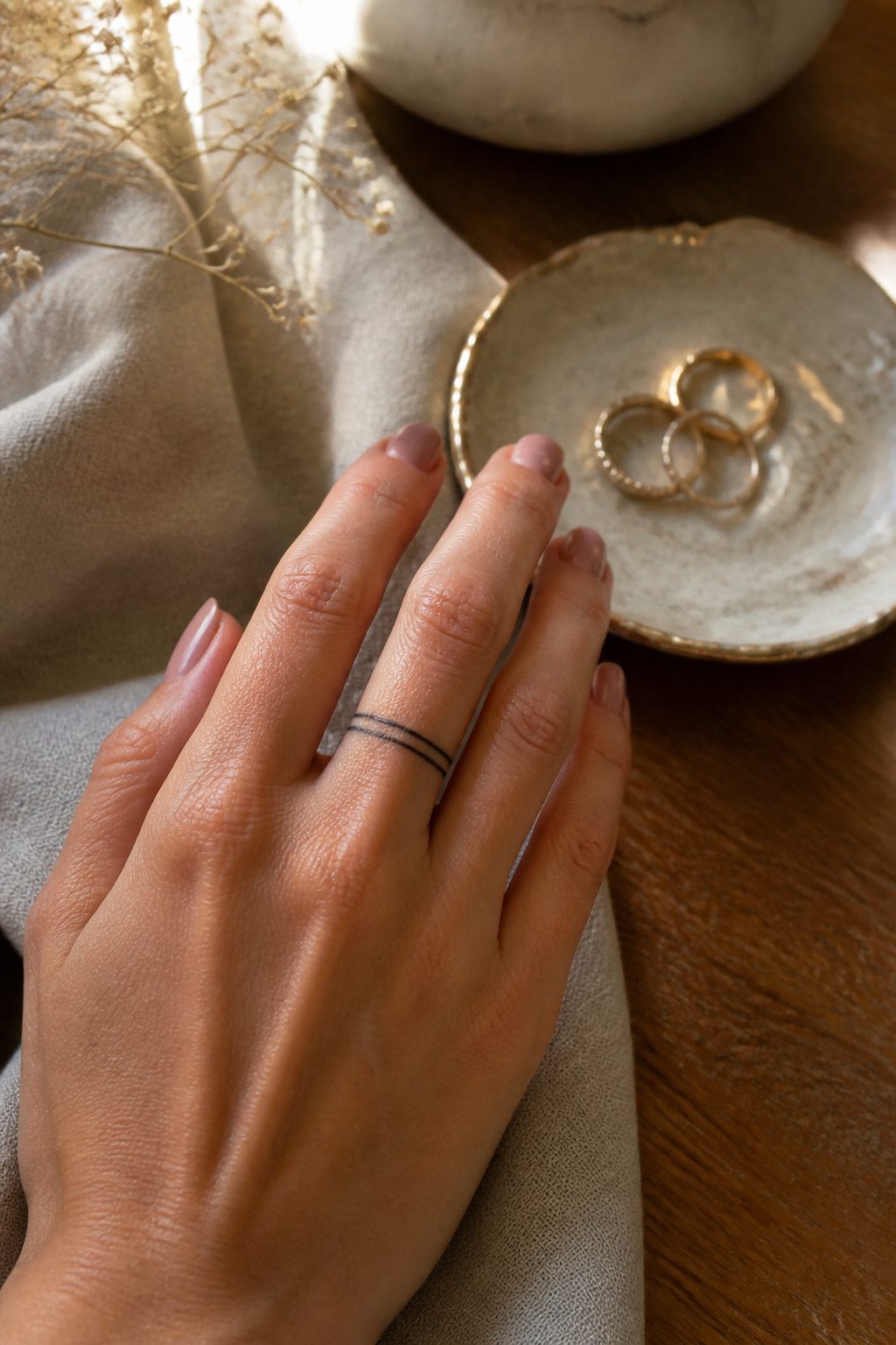
A ring-style line tattoo wraps around the finger like a band, plain or dotted, sometimes with a tiny symbol worked in. The appeal is easy to see: it reads as permanent jewelry, something that will not tarnish or need resizing. Women who wear no metal for work or sport often choose this as their stand-in wedding band, and others stack two or three narrow lines for the layered look.
The placement carries a built-in cost. Finger skin sheds and regenerates faster than almost anywhere else on the body, and the constant friction from rings, typing, and handling objects wears the ink down. A fine line done with a 3RL needle looks delicate at first, but that same fineness means less pigment sits in the dermis to begin with. What begins as a crisp dark band often softens to a grey shadow inside two years, with the palm-side edge fading first.
Touch-ups are not optional with this placement; they are part of the design’s maintenance. Budget for them from the start, and choose an artist who has healed photos of aged finger work, not just fresh ones.
22. Dotwork Pattern
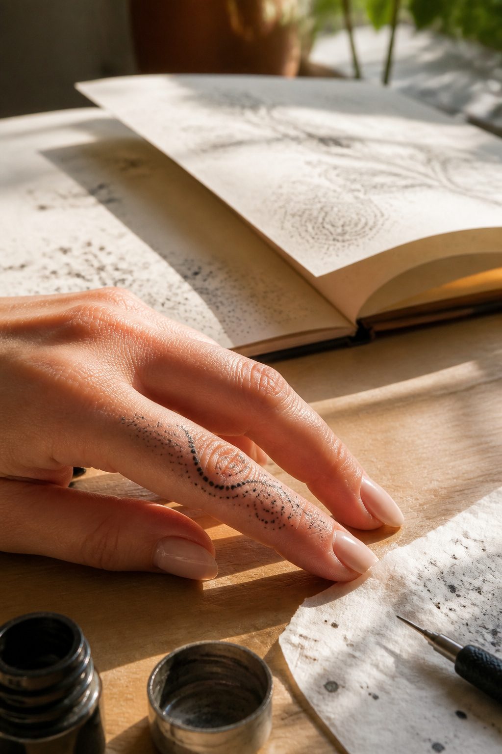
Dotwork builds texture through pointillism, thousands of tiny dots packed closer or farther apart to create gradients and shape. On a finger’s limited canvas, the technique suits mandala centers or small geometric accents where the dot itself becomes the line. The source credited to Sonyapokesyou shows how these patterns can wrap the finger completely or sit as isolated details near the knuckle.
What convinced me, reading through the guides, is how dotwork ages. Where solid black lines blur into the skin over years, dotwork fades into soft vintage appeal as individual dots soften and merge slightly. The effect is deliberate deterioration rather than failure.
The catch is artist selection. Dotwork demands precise, consistent needle depth; a heavy hand blows a dot into a blob, and on fingers where skin is thin and movement constant, the margin narrows. The competing sources agree that not every artist who does bold line work handles stippling well. Ask to see healed finger dotwork specifically, not fresh photos, before booking.
23. Crown
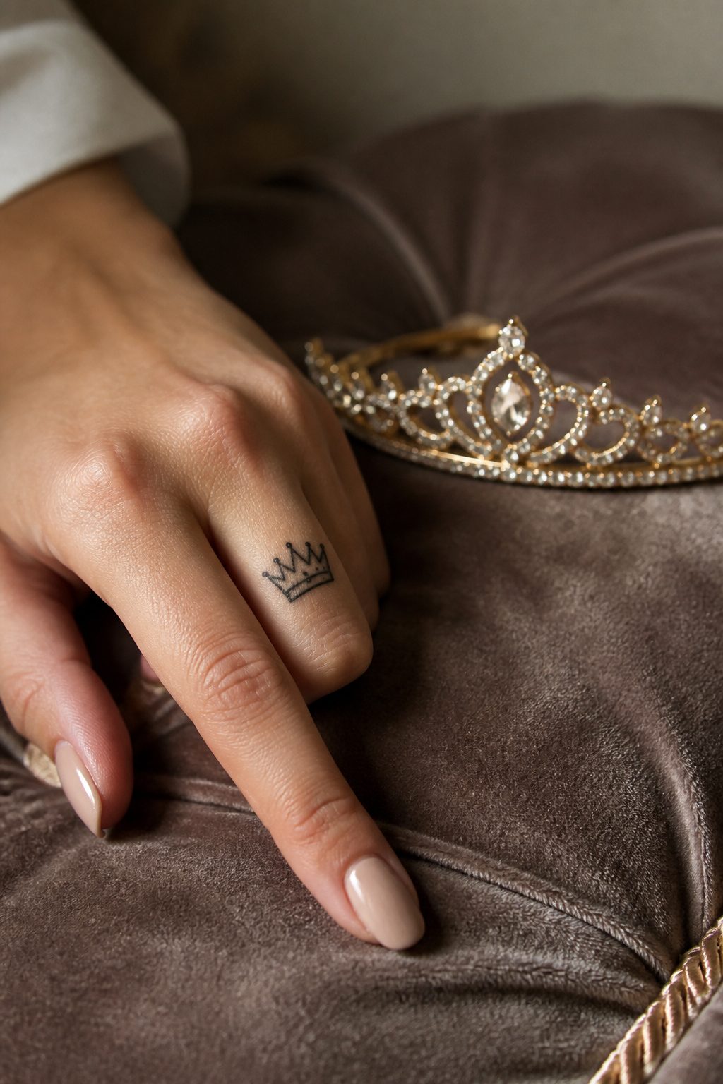
A crown on the index or middle finger sits where you see it yourself every time you reach for something, which is the whole point. The meaning is not about actual royalty. It is self-worth, sovereignty over your own life, the decision to crown yourself rather than wait for someone else to do it. That message lands harder when the tattoo is visible to the wearer first.
The finger’s anatomy matters. A crown placed on the proximal phalanx, low near the base, works with the bone structure and avoids the rapid exfoliation that hits side-finger ink. Keep it small enough that the points do not blur together as the skin ages, and sit it low enough that rings do not ride over it and grind the lines down. The design elongates visually when the points run with the finger’s length rather than cutting across it.
24. Leaf or Vine Wrap
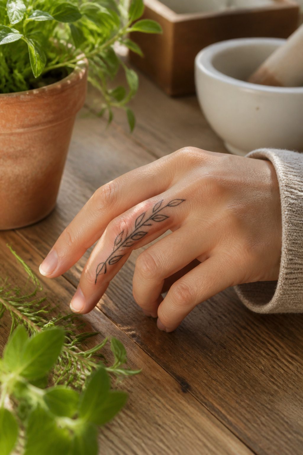
A vine that curves with the bone, not against it, follows the finger’s own architecture. The organic movement lets the design flex where the joint bends and settle where the skin stays still, which matters more on fingers than almost anywhere else. Straight lines across the knuckle crack and migrate as the skin stretches; a wrap that spirals or branches with the finger’s motion keeps its shape longer.
The sources split on detail. One camp shows delicate botanical illustrations, all tiny veining and graduated shading. The other warns that realism smaller than a dime blurs to a black blob within five years on this skin. What convinced me, reading through both, is that negative space is what saves a vine wrap. A single confident line with gaps for air reads as a leaf from across the room and still looks like a leaf up close at year three. Fill every millimeter and you are nursing a smudge by year two.
Touch-ups come every 2–5 years on fingers regardless, but the wrap ages better than block script or tight geometry because the eye expects some irregularity in growing things. A waver in a leaf edge looks natural; a waver in a letter looks like a mistake.
25. Mini Rose
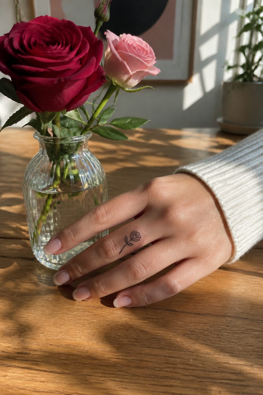
A mini rose on the finger carries the same weight as a full sleeve piece: love, beauty, and strength that looks soft from a distance. The problem is the petals. Below one inch, each line separating them sits almost on top of the next, and finger skin regenerates fast enough to blur the gap. What starts as a detailed bloom can settle into a dark smudge within five years.
The safer bet is simplification. A single-line rose, or one with two or three petal shapes total, keeps the romance readable. A ring-finger placement still signals what a rose has always signaled, just without the detail that time will swallow. The classic meaning survives; the fine work does not, so plan for that from the first sketch.
26. Snake Line Art
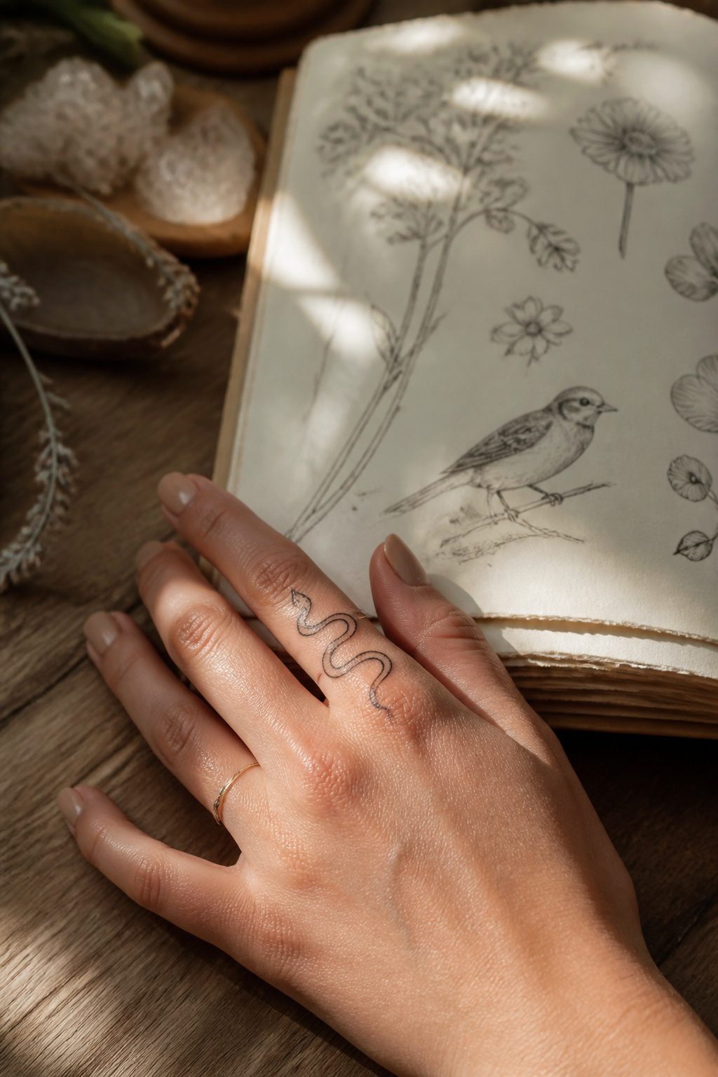
A single unbroken line can carry a snake from knuckle to fingertip without lifting the needle, and that continuous stroke is what separates a clever finger tattoo from a cluttered one. The serpent’s body already wants to wrap; the artist just has to let the curve follow the bone. 3RL needles keep the width consistent enough that the head and tail read as the same creature at thumbnail scale.
Symbolism on a finger works best when it needs no explanation to the wearer. Shed skin, new skin: the meaning is built into the biology. Sources describe the snake as a mark of transformation and protection both, which sounds contradictory until you remember that guarding something often means outlasting it.
The continuous line technique risks one failure. If the design circles the finger completely, the ink can spread on the inside edge where skin flexes most, turning two parallel strokes into one blurry band. A break at the inner knuckle, or letting the line terminate before the fold, buys the tattoo five extra years of looking intentional. The wraparound that looks seamless in a sketch becomes maintenance every eighteen months on the hand.
27. Tiny Bee
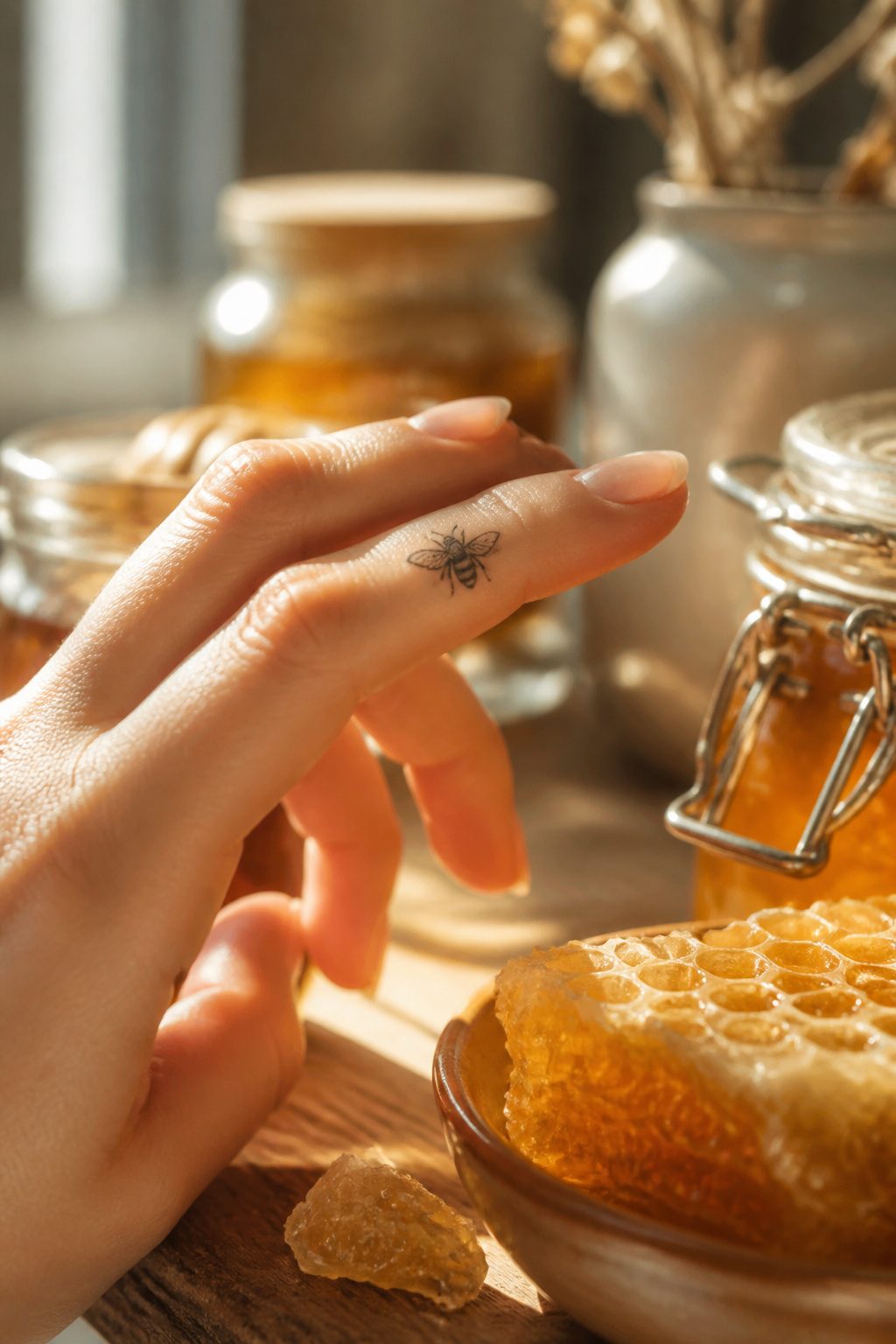
A tiny bee on the finger celebrates productivity and purpose. Bees represent hard work, community, and creating sweetness from effort, so the design carries weight even at a scale that fits beside a knuckle or on the outer edge of a finger.
The detail required is where this one tests the artist. Stripes, wing veining, and body segmentation have to read clearly in a space often under half an inch, or the insect collapses into an indistinct blob. A single-needle approach and high contrast between black ink and negative space keep the shape legible as the skin heals and ages. Color, if you want it, works best limited to two tones: amber for the body and perhaps a pale wash for the wings, nothing more.
Placement matters for wear. The sides of the finger and the area just above the middle knuckle see less friction than the pad, so the bee keeps its lines longer there. The meaning behind it, loyalty and working together, also makes this a popular matching choice: two people, identical bees, same placement. The commitment to the symbol runs deeper when the tattoo itself demands touch-up discipline.
28. Ocean Wave
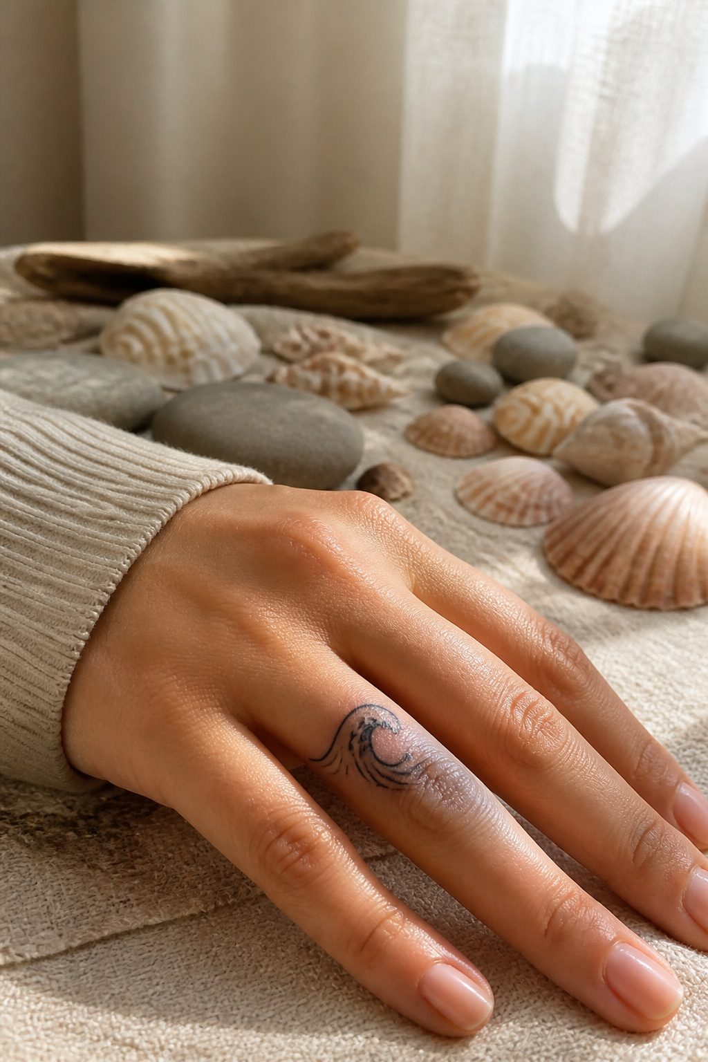
A single ocean wave wrapping the side of a finger carries more motion than the tiny line versions you see everywhere. The stylized crest breaks into foam near the knuckle, and that whitecap detail is what separates a generic water symbol from something that reads as lived-in. Repeated water imagery on the body tends to mark people who have moved through something and kept going, or who grew up measuring time by tide.
The foam detail needs a slightly heavier hand than most finger work. Fine dots and stippling for the spray can blur together after a few months of knuckle wear, so a confident outline on the wave lip usually holds cleaner. I have watched artists lose the foam entirely in touch-ups because the original was too subtle.
Placement along the outer finger, where the skin moves less, keeps the crest from warping into an unrecognizable squiggle when you grip a coffee cup. The meaning stays personal, but the construction is practical: water that looks like water, not a blue smear, six months in.
29. Animal Silhouettes
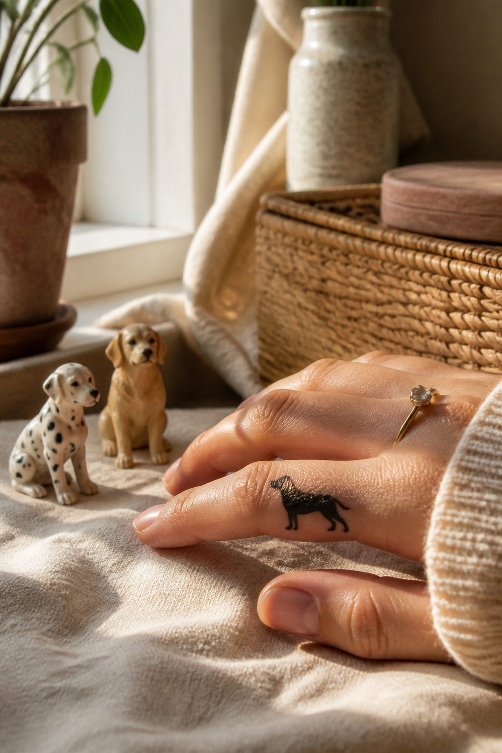
A solid black silhouette holds up better on a finger than an outline ever will. At this scale, thin lines blur or blow out within a year, but a filled shape keeps its readable form. A cat perched on the side of the finger, facing forward, reads instantly even from across a room.
Birds work best in profile with wings folded or slightly lifted. The trick is keeping the silhouette simple enough that a single needle pass fills it evenly. A songbird with too much feather detail turns to mud; a pigeon shape with a clean neck curve stays crisp.
Placement matters as much as design. The outer edge of the index finger, running toward the nail, gives enough flat skin for a small creature to register. The knuckle itself moves too much and sheds ink faster.
I have seen clients request their own pets simplified into these shapes. The ones that last are the ones where the artist stripped the reference down to posture and proportion, not markings. A calico pattern or tabby stripe is lost at four millimeters wide. What remains is the arch of a back or the tilt of a head, and that is usually what the person wanted to carry anyway.
30. Geometric Shapes
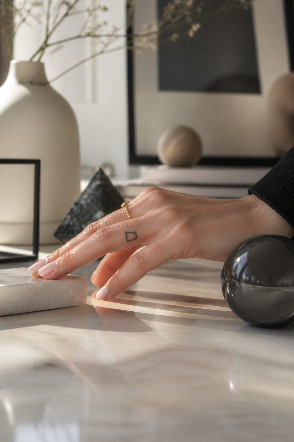
A single triangle on the side of a finger reads clean from across a room. That same shape, rotated, can stand for balance or trinity without needing a caption under it. Circles and single lines work the same way: a circle suggests wholeness or eternity, one straight line marks a journey or connection. The meanings stay compact because the canvas demands it.
What makes geometric shapes distinct on fingers is their ability to scale down without losing form. A complex polygon across two knuckles still registers as intentional, not blurred, because the edges are decisive. I have watched artists map these with a straightedge and a light hand; the margin for error is maybe two millimeters before the line looks hand-wobbled rather than deliberate.
The modern appeal sits in that tension between abstract and readable. These are not symbols everyone decodes the same way, which lets the wearer keep the meaning private. In 2026, the precision expected for this style has pushed artists toward finer needles and steadier linework than the trend required even five years back. Expect touch-ups, though. Skin on the fingers turns over fast, and a crisp triangle softens faster than a solid black band.
What Each Finger Means for Placement
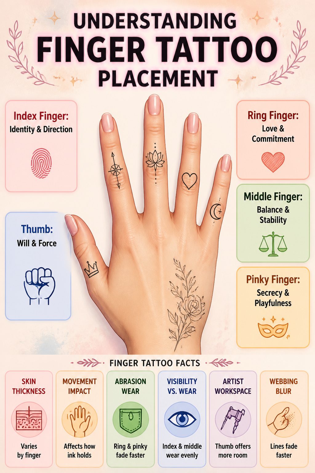
Placement on a finger carries its own language, and most women figure this out only after the first tattoo is already set. The ring finger is the one reserved for love and commitment, which is why a tiny heart or a partner’s initial lands there with almost no explanation needed. The index finger faces outward, toward whoever you gesture to, so direction and identity sit naturally there; it is the finger you point with, and the tattoo becomes part of that motion. Balance goes to the middle finger, dead center, the stabilizer of the hand. The pinky hides more easily, folded against the palm, so secrecy or playfulness tends to collect there. The thumb, thick and opposable, carries will; it is the finger of pressure and grip, and a word or symbol there reads as deliberate force.
Skin thickness and movement vary across these fingers, and that affects how the ink holds. The ring finger and pinky take the most abrasion against rings and pockets, so a design there fades faster and needs more frequent attention. The index and middle fingers show more but wear more evenly. The thumb’s size gives an artist more room, though the webbing at its base blurs lines faster than most clients expect.
Pain Level and Healing Timeline
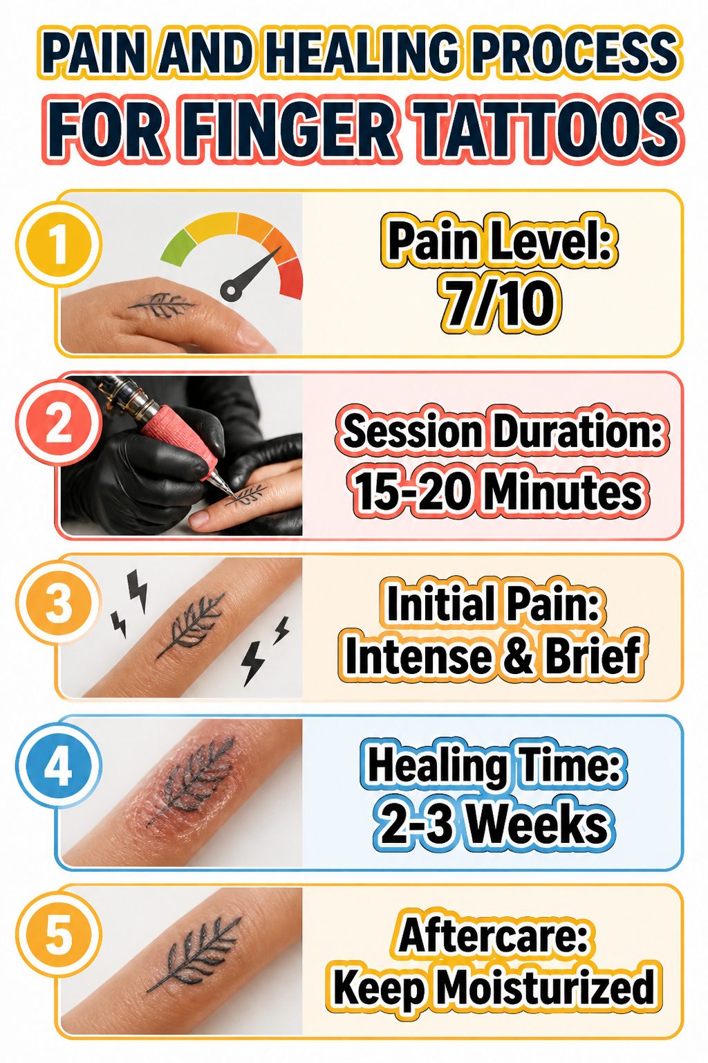
Thin skin stretched directly over phalange bones gives finger tattoos a pain scale of 7 out of 10, noticeably sharper than fleshier spots where some fat buffers the needle vibration. The session stays brief, often 15 to 20 minutes for a small design, so the sensation is intense but short-lived.
Healing runs about 2 to 3 weeks, though hands slow the process down. Constant joint movement and frequent washing keep the area from settling the way a forearm or shoulder might. The first week feels like a sunburn that cracks when you bend: the ink sits in a zone that never stays still, so keeping it lightly moisturized with a fragrance-free, water-based lotion 3 or 4 times daily matters more than on easier placements. Skip gel manicures and UV lamps for that full stretch; acetone and UV exposure will damage fresh ink before it anchors.
Aftercare That Actually Works
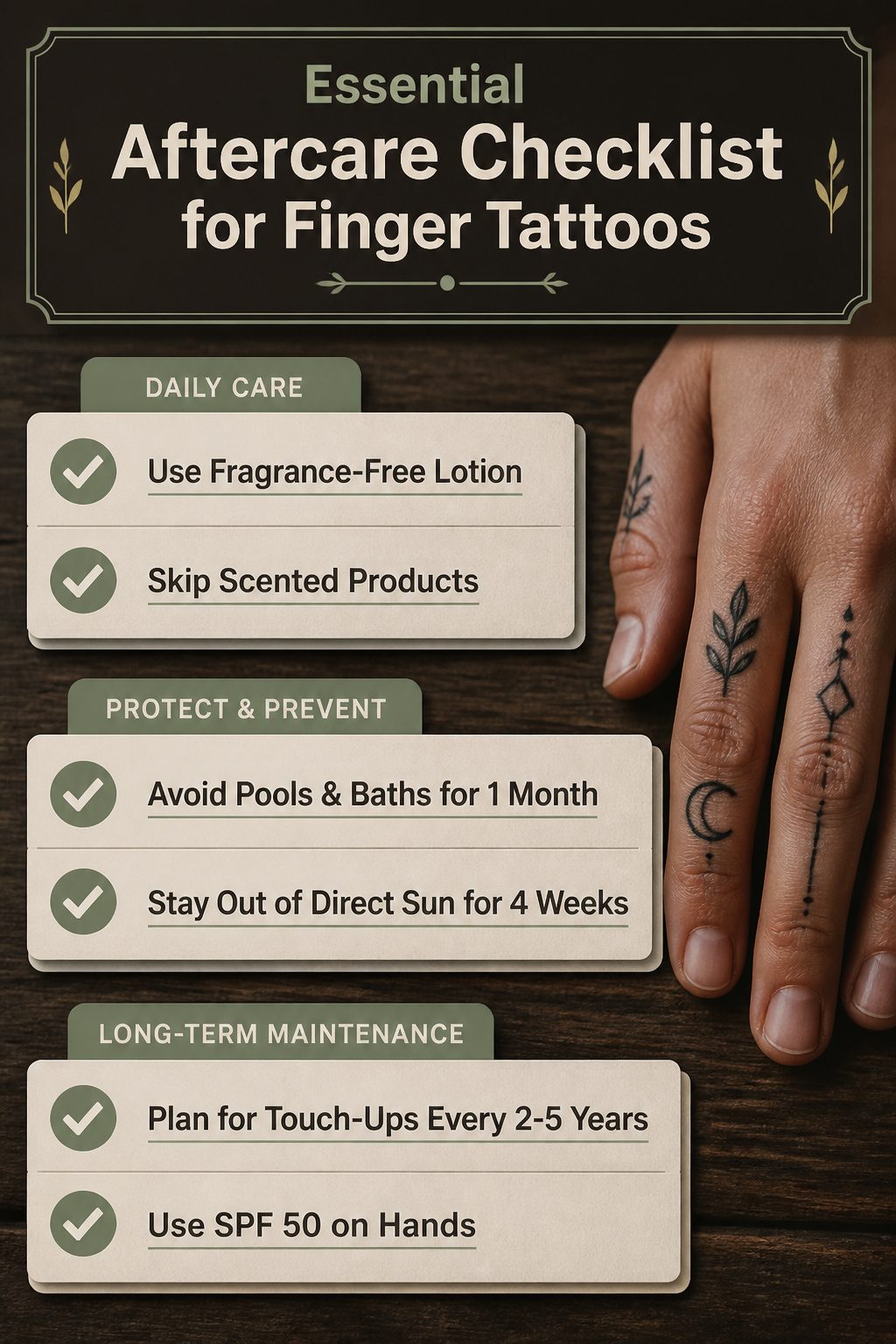
Finger tattoos heal faster than most people expect, usually in about 2 to 3 weeks, but the real work starts after the scabbing stops. The skin on your hands turns over constantly, and every wash, swipe of sanitizer, and hour of sun exposure pulls pigment out a little faster than it would from your shoulder or back.
A thin layer of fragrance-free lotion, something like Cicaplast or Hustle Butter, keeps the area from cracking without adding irritation. Skip the scented stuff; your hands are already in enough contact with unknown chemicals. For the first month, long soaks in pools or baths are off the table, and direct sun needs to wait at least 4 weeks.
Even healed, finger tattoos fade. The sources put touch-ups at every 2 to 5 years, sometimes sooner if you wash your hands for work or spend weekends outside without SPF 50. The sun is the ink’s worst enemy, and on fingers there’s no hiding from it. Plan for the maintenance; the small size makes it quick and cheap, but skipping it turns a crisp line into a smudge you did not pay for.
Cost and Touch-Up Reality
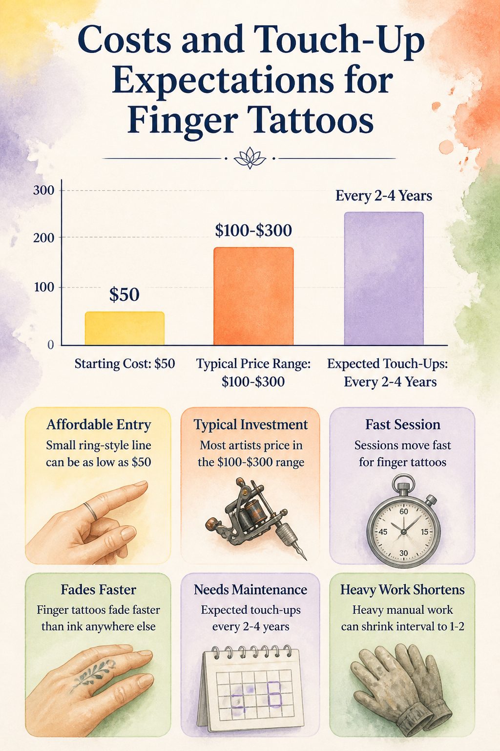
A small ring-style line on the finger can run as low as $50, though most artists price in the $100–$300 range once you factor in their minimums and any real intricacy in the design. What sold me on my first one was how fast the session moved; what I failed to budget for was the return trip.
Finger tattoos fade faster than ink anywhere else on the body. The skin there turns over quickly, and daily hand washing, friction from keys and pockets, and plain exposure to sun and air all pull pigment out ahead of schedule. Most artists expect touch-ups every 2–4 years, and for heavy manual work that interval can shrink to 1–2. The cost of upkeep is not dramatic per visit, but it is recurring, and anyone pricing finger tattoos for women should treat the first session as a down payment rather than the full bill.
Frequently Asked Questions
Do finger tattoos hurt more?
Yes. The skin on fingers is thin and sits directly over bone and nerve, so the sensation is sharper than on fleshier areas. The small size of most finger tattoos for women means the session ends quickly, so the pain is brief.
How long do finger tattoos last before needing a touch-up?
Plan for a touch-up every one to five years. The article notes that finger ink fades faster than anywhere else due to constant motion, friction, and frequent washing. Some designs need attention as early as a year out, while others hold closer to the five-year mark with care.
Can I get a finger tattoo if I work with my hands a lot?
You can, but tell your artist about your job first. Heavy manual labor slows healing and accelerates fading. If longevity matters more than placement, consider a different spot or budget for more frequent touch-ups.
Are finger tattoos more prone to infection?
Yes. Hands touch more surfaces and more germs than almost any other body part. Clean aftercare and strict hygiene during the healing period are non-negotiable.