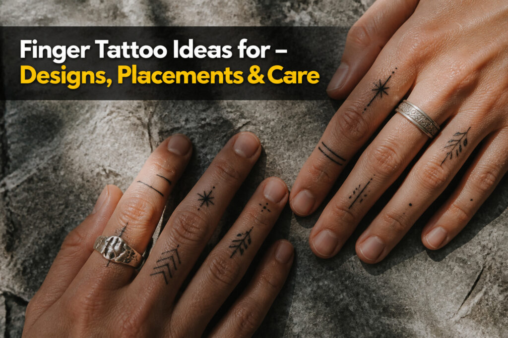
Finger tattoos range from a single dot to a full hand piece, but the deciding factor is not style; it is how much blur you can live with.
The skin here is thin, the ink spreads fast, and a design that reads clean at year one can turn unrecognizable by year five. Bold lines and open spacing are not aesthetic preferences on fingers; they are survival tactics.
A single unbroken line has nowhere to go wrong, while tight geometry with overlapping corners breaks down faster here than on almost any other placement.
The same rule governs script, symbols, and botanical work alike: what shrinks well and holds its shape at half the size you planned is what belongs on your hand.
1. Minimalist Line Art and Geometric Designs
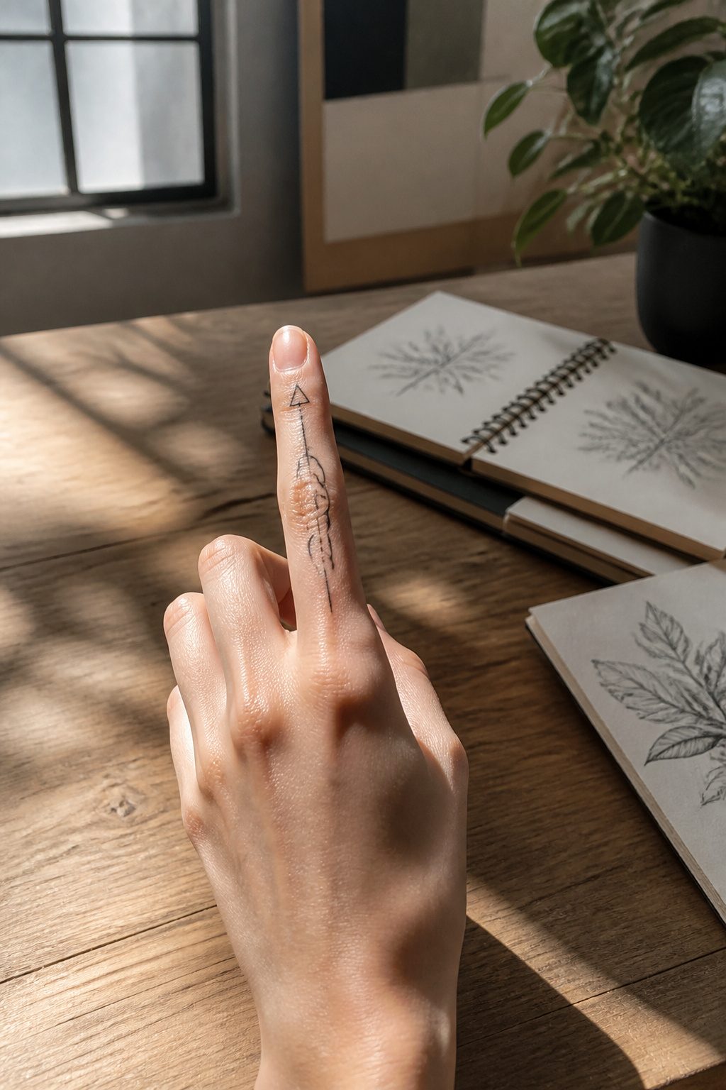
Thin triangles, tiny hexagons, a single wave, or a clean dot pattern use negative space well, which matters when the canvas is small and the skin keeps moving.
A simple geometric mark on the index finger or thumb feels polished without trying too hard. The better versions don’t crowd the finger with detail; they lean into shape, spacing, and confident line weight.
Simple lines hold up better than complex geometry over time because dense linework on fingers tends to blur together as the ink settles and spreads in the thin skin. A single unbroken line has nowhere to go wrong.
Complex geometry with tight corners and overlapping elements breaks down faster on fingers than on almost any other placement, so the design language of minimalism isn’t just aesthetic here; it’s practical maintenance.
Small symbols or thin linework suit anyone who wants something subtle, which on a finger is most people.
The mistake is choosing a design that looks crisp at thumbnail size on a screen but packs three layers of detail into a space that will never hold them.
What reads as clean in year one determines whether you’ll still recognize the shape in year five.
2. Small Symbols and Meaningful Icons
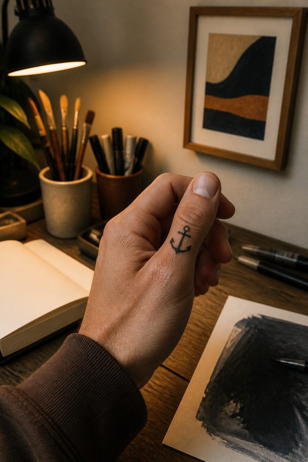
A heart on the pinky, an anchor tucked against the thumb, a semicolon riding the inside of a finger. These small symbols carry weight because the meaning stays private while the placement stays visible.
Bold lines hold up better than fine-line work on hands, where ink spreads and detail blurs into shapeless color over time.
American traditional styling or clean lettering fit the limited real estate; realism and neo-traditional pieces demand space fingers do not have.
Size constraints are real. Two centimeters of width is about the usable ceiling on most digits before the design wraps awkwardly or crowds against the knuckle.
Symbols work here precisely because they read instantly: a cross, an arrow, a moon phase need no context to land. The hand becomes a daily reminder you chose, not a billboard you explain.
Between-finger placement hides the work for discretion; the top or inner face of the digit puts it where you see it every morning.
Pick something that still matters after the thousandth glance, because you will give it that many by the first year.
3. Word Script and Quote Tattoos
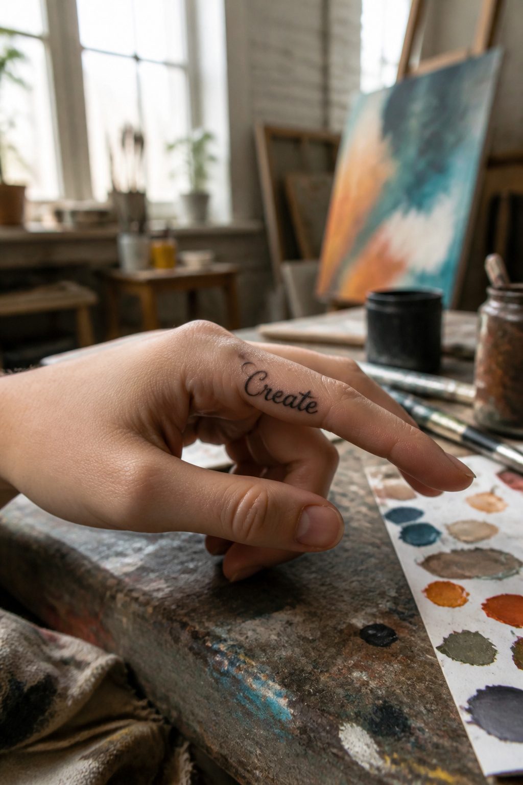
A single word like "Breathe" or "Create" sits clean on a finger bone, but the stroke width matters more than the word itself. Thin scripts that look elegant on paper bleed together within a year on finger skin.
What starts as a graceful loop ends up a smudge you have to explain to strangers.
Short phrases face a harder limit. Around eight to ten characters is where blur becomes a real problem, and that is pushing it.
A birth date in small numerals works because numbers stay legible even when the edges soften. Initials across multiple fingers spread the load, each letter large enough to hold its shape.
The four-letter word across four fingers, thumb left blank, is popular for a reason. When you close your fist the word reads out complete, and each letter gets the space it needs to age.
Crowding a longer phrase onto one finger means thinner lines and faster fading.
Font choice comes down to one test: can you still read it at half the size you planned? Pick the weight that passes at that scale.
Ornate scripts fail this every time, and by the time you notice, the tattoo is already set.
4. Nature and Botanical Designs
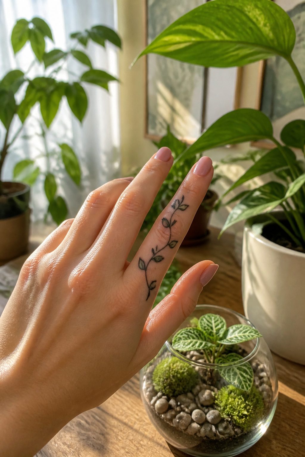
Leaves, vines, and flower forms have curves that follow the hand’s shape naturally, which makes them one of the more forgiving choices when you’re hunting for finger tattoo ideas that won’t fight the anatomy.
A single sunflower on the ring finger or a leaf outline wrapping the index finger stays soft without turning busy.
The real test is what survives shrinking. A rose doesn’t need every petal inked to read as a rose, and a vine often looks cleaner pared down to stem and leaf rhythm.
What gets lost is the fine stuff: delicate veining on leaves, the gradient between petal layers, any texture that relies on hairline strokes. Ink spread on fingers is aggressive, and botanical detail is usually the first casualty.
Some designs run the flower on top of the hand with stems extending onto the fingers, which buys more space for the detail that matters.
5. Animal and Creature Tattoos
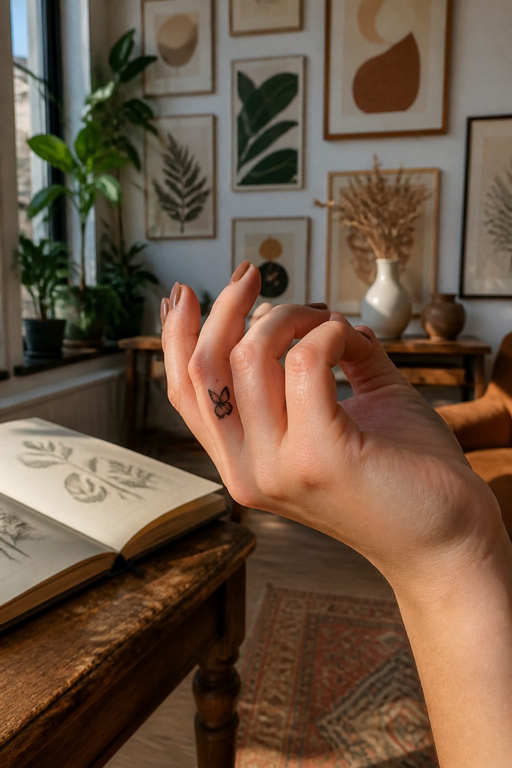
A bird silhouette on the thumb or a butterfly outline on the pinky reads instantly from across a room. The feature set is unmistakable at that scale: wings, antennae, a forked tail.
A snake wrapping the index finger keeps its identity with a simple S-curve and a tapered head, no scales required.
The trouble starts when the design tries to do too much. A lion head or wolf face packed onto a knuckle needs eyes, fur texture, and shading that finger skin cannot hold.
The linework expands over the course of a life, and detail that looked tight on day one becomes a blob by year five.
The same risk haunts dog profiles done as pet tributes: a clean side-view silhouette lasts, but a front-facing portrait with expressive eyes and whisker spots dissolves into abstraction fast.
Insect silhouettes work better than most mammals for exactly this reason. A beetle or spider reduced to its outline still scans as itself; the body plan is simple enough that a few millimeters of ink carry the whole message.
Simplified creature designs win on fingers precisely because they sacrifice realism for recognition.
6. Constellation and Celestial Designs
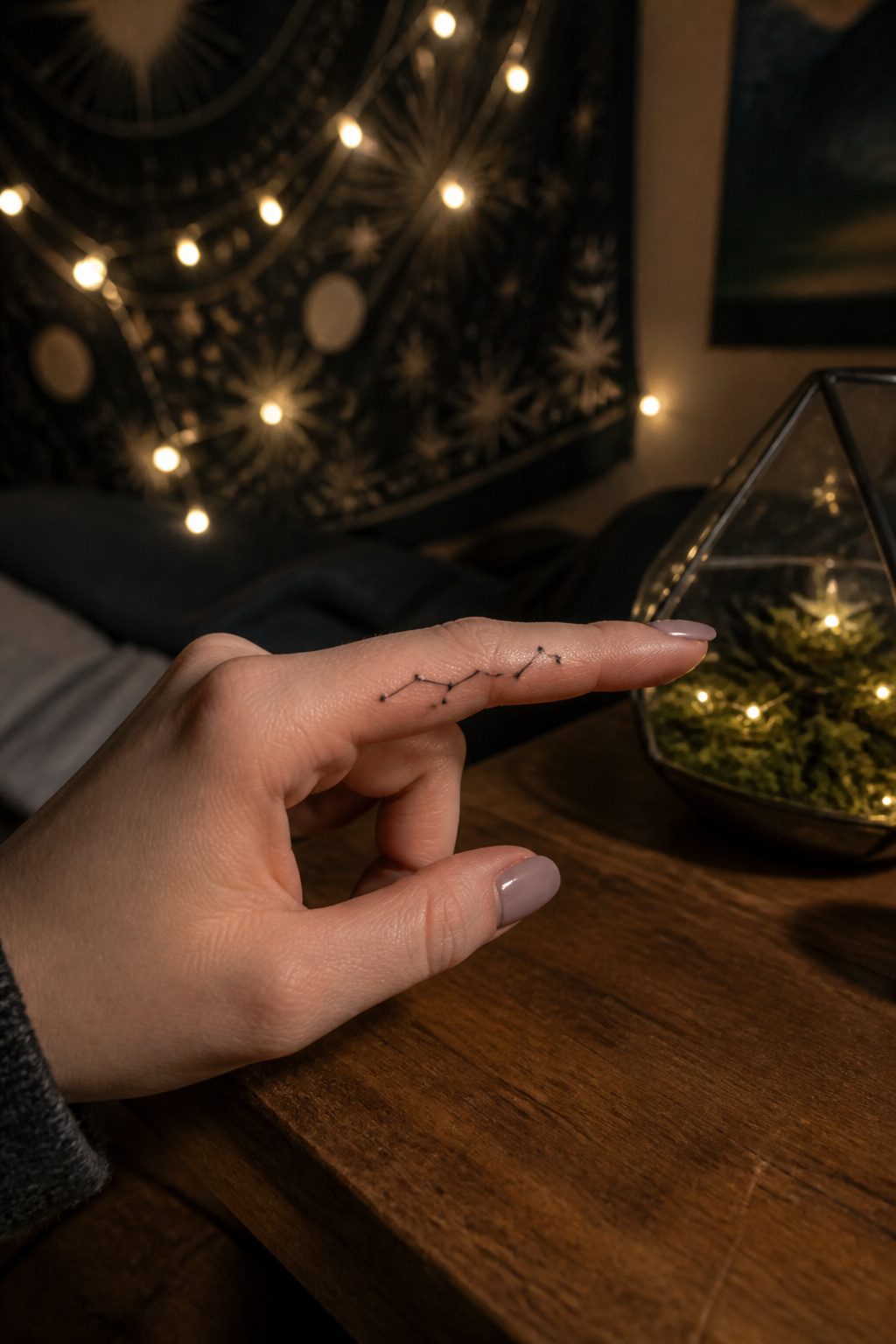
A North Star, a zodiac constellation, or a line of tiny dots can make a finger look elegant and intentional without needing much visual space.
The exact dot spacing matters more on a finger than on almost anywhere else, because dots that sit too tight soften into a visual smear later and the constellation loses its shape.
Bring a reference image or the exact pattern you want. Don’t rely on memory alone, especially if the design has multiple star points across more than one finger.
Finger shape changes how a star map reads once the hand moves, and curvature has to be respected in the stencil.
Moon phases work the same way: one woman got the exact phase from the night her daughter was born, a small crescent that carried the meaning without needing a name or portrait.
Black ink usually wins for celestial work on fingers. Color tends to read muddier at this scale, and the whole design depends on clean dotwork and line placement holding their geometry through healing.
The tattoo market is projected to grow from USD 2.43 billion in 2025 to USD 5.99 billion by 2034, with personalization driving much of that expansion. Constellation fingers fit that trend because they’re small, custom, and visually tied to identity.
7. Couple and Matching Tattoos
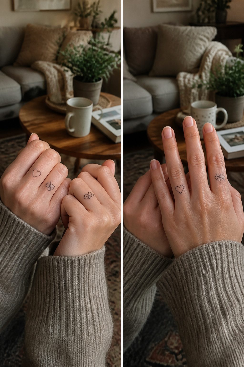
Ring-finger bands are the most common couple tattoo I see requested, usually by partners who work with their hands and cannot wear metal on the clock.
A replica wedding band, thin linework initials, or a small shared symbol like a heart or linked line sit cleanly on that narrow canvas. The Deathly Hallows symbol works for pairs who want something less literal than a name.
Matching placement matters more than matching design. Two people with tattoos on the same finger, same hand, read as intentional to anyone who notices.
Offset placement, one on the ring finger and one on the thumb, looks like coincidence.
The design should hold meaning even if the relationship ends. Initials of a current partner age badly; symbols the two of you chose together, or coordinates of a shared place, last better as private memory than as public statement.
Complementary symbols, where each person carries half of a pair, face the hardest test here. One half becomes a puzzle piece without a solution.
Fading is uneven between partners. The person who washes dishes without gloves, who works outdoors, who swims in chlorinated pools, their line thins first.
That mismatch can become its own tension. Plan the touch-up schedule together, or accept that the match will drift.
Subtlety has its own risks. A first initial on the finger is discreet enough that a new partner might never ask whose letter it is.
That silence is its own kind of weight.
8. Abstract and Artistic Tattoos
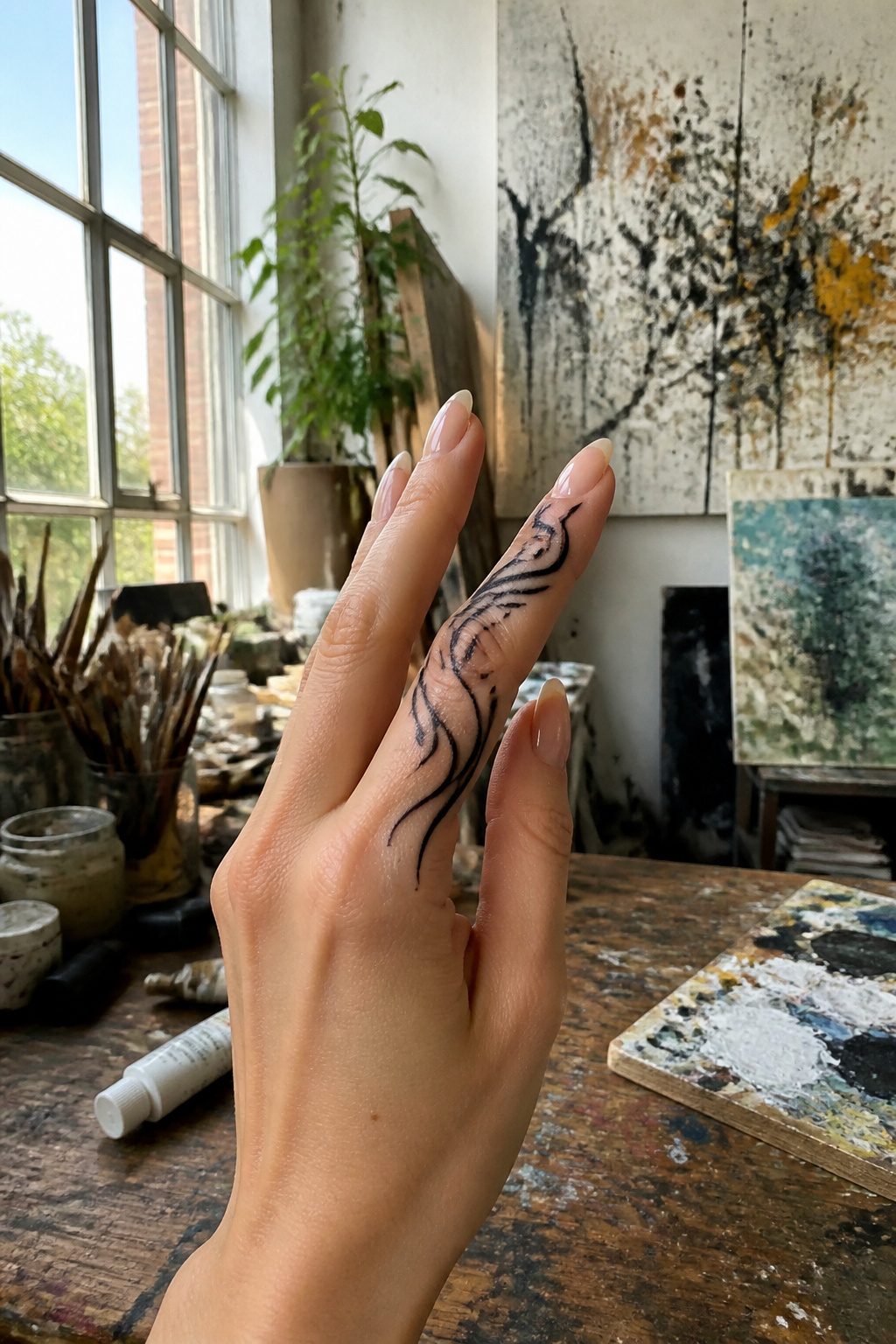
Abstract work on fingers makes sense for a reason most people figure out too late. A tiny portrait or a word in script has to stay legible to matter, but fingers are a moving target, literally.
The skin shifts, the ink spreads, and within a year that careful detail can look like a smudge you meant to clean off.
Black and gray abstract designs age more cleanly because they never had to spell anything out in the first place.
A brushstroke, a fragment of line, a soft geometric shape that bleeds slightly with time, still reads as rhythm rather than a letter gone wrong.
Watercolor effects draw people in when they are fresh, the color vivid against the hand. The hand itself works against that.
Washing, friction from pockets and clothing, constant motion, all of it pulls at the ink. Soft gradients and detailed color blending break down fastest here.
Some artists refuse finger work outright. Their art will not look its best for long, and clients sometimes blame the artist for fading that was inevitable.
The ones who take it on often push toward abstraction because it forgives what fingers do to pigment.
9. Knuckle Tattoos
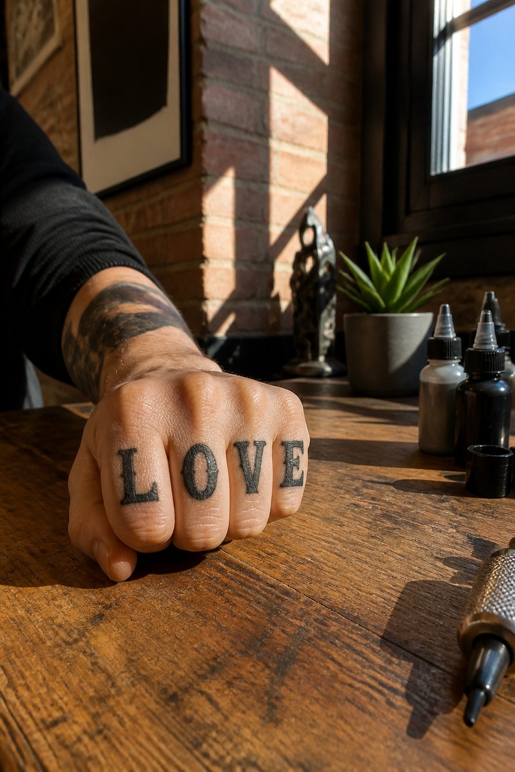
Knuckle tattoos carry a visual punch that no other finger placement matches.
The traditional eight-letter format, four letters across each hand, grew out of biker and prison culture in the mid-twentieth century: "LOVE / HATE" and "HOLD / FAST" remain the most recognized pairings, though plenty of people now choose personal phrases, band names, or nonsense words that read as a private joke.
Single-knuckle designs, one small image or letter per joint, spread the visual weight and read softer in a room where someone might notice your hands on a keyboard.
That matters because full knuckle lettering is hard to miss, and hard to cover without gloves.
A client of mine, a pharmacist, went with tiny planets on her dominant hand only; she could tuck that fist in a pocket during consults and let the other hand do the talking.
The historical association still carries weight in some workplaces. What reads as reclaimed art in a Portland coffee shop scans differently in a Dallas bank branch, and the same design can close doors you did not know were open.
If you are weighing this placement, the question is not whether you personally mind the look, but whether you can afford the conversation it starts every time someone new shakes your hand.
10. Thumb Tattoos
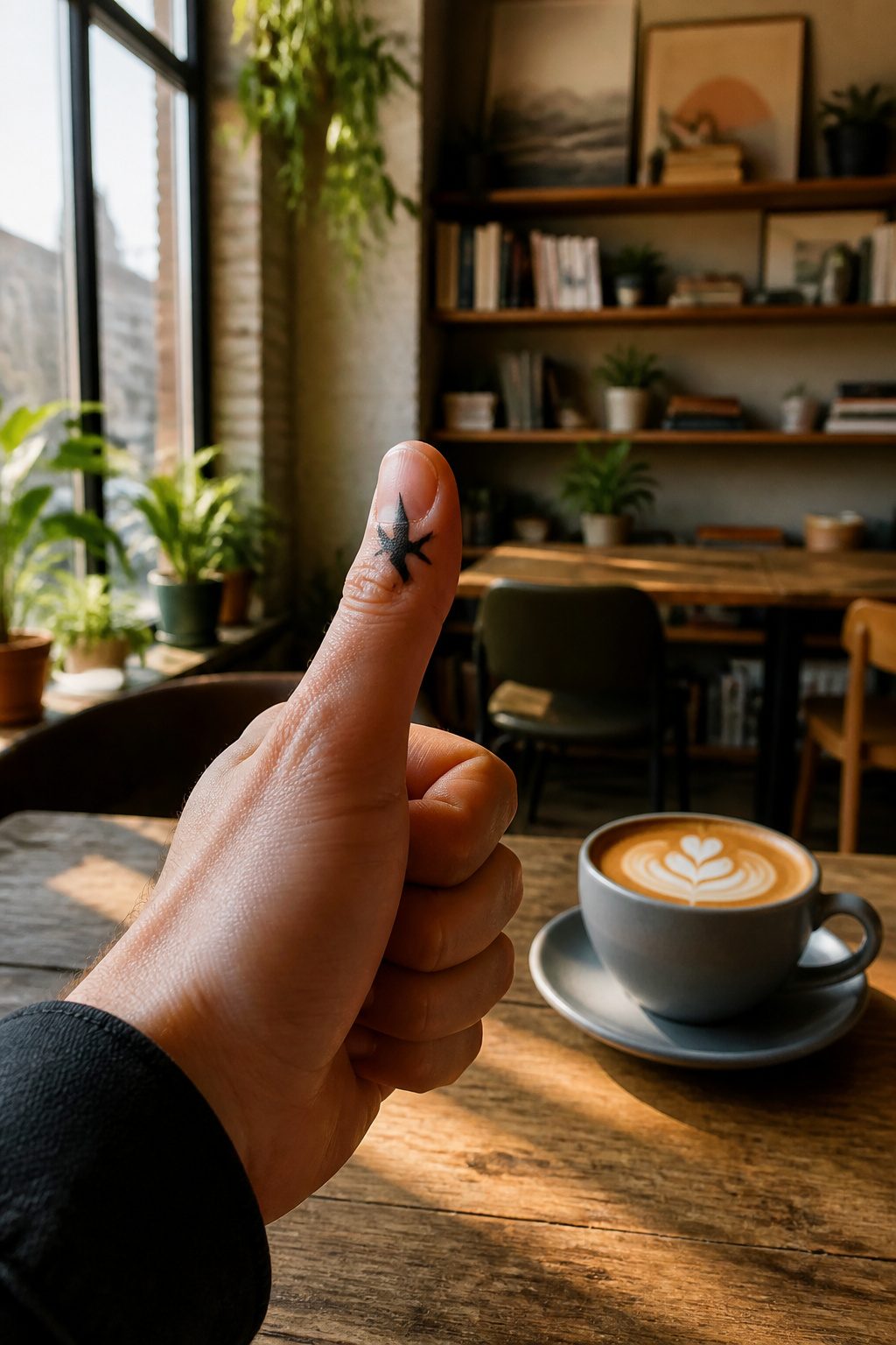
The thumb gives you more room than any other finger, but that extra surface comes with a catch: it moves differently, twists, and grips, so the skin shifts under the needle in ways the index or middle finger do not.
A bird silhouette, something simple and unmistakable even at a small size, sits well here because the thumb’s broader pad keeps the shape readable.
The side of the thumb can carry a tiny anchor or similar icon, visible to you throughout the day without shouting to everyone across a room.
A bolder line will outlast fine-line work on this placement.
The thumb sees friction from tools, steering wheels, and phone scrolling that other fingers partly escape, and the passages make clear that bold lines fade slower than intricate detail on hands.
Simple flowers with stems extending down from the hand can work, but keep the thumb portion itself stripped to the essential shape.
The temptation is to use all that space for complexity; the result is usually a blurred mess within a year or two.
11. Webbing Tattoos Between Thumb and Index Finger
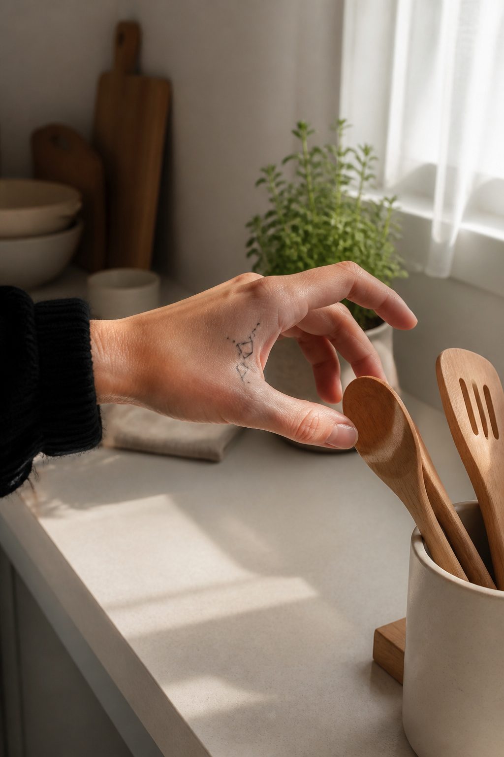
The webbing between thumb and index finger offers a small, visible canvas that moves constantly with every grip and gesture. This placement heals slower than most finger tattoos because the skin flexes and rubs against itself all day.
Friction from holding phones, steering wheels, and utensils works against the settling ink, and some artists simply won’t tattoo here because the wear makes their linework look aged within months.
Pain sits on the moderate side for this spot, less intense than the palm or under-finger areas but sharper than the top of the hand. Simple geometric marks, thin triangles, or a single clean line work better than detail-heavy designs.
The space is narrow, so crowding it defeats the purpose; negative space and confident shape carry the look. Expect touch-ups.
The movement and sun exposure that come with hand placement mean this tattoo will need refreshing to stay readable, and budgeting for that maintenance from the start saves disappointment later.
12. Under Finger and Palm Tattoos
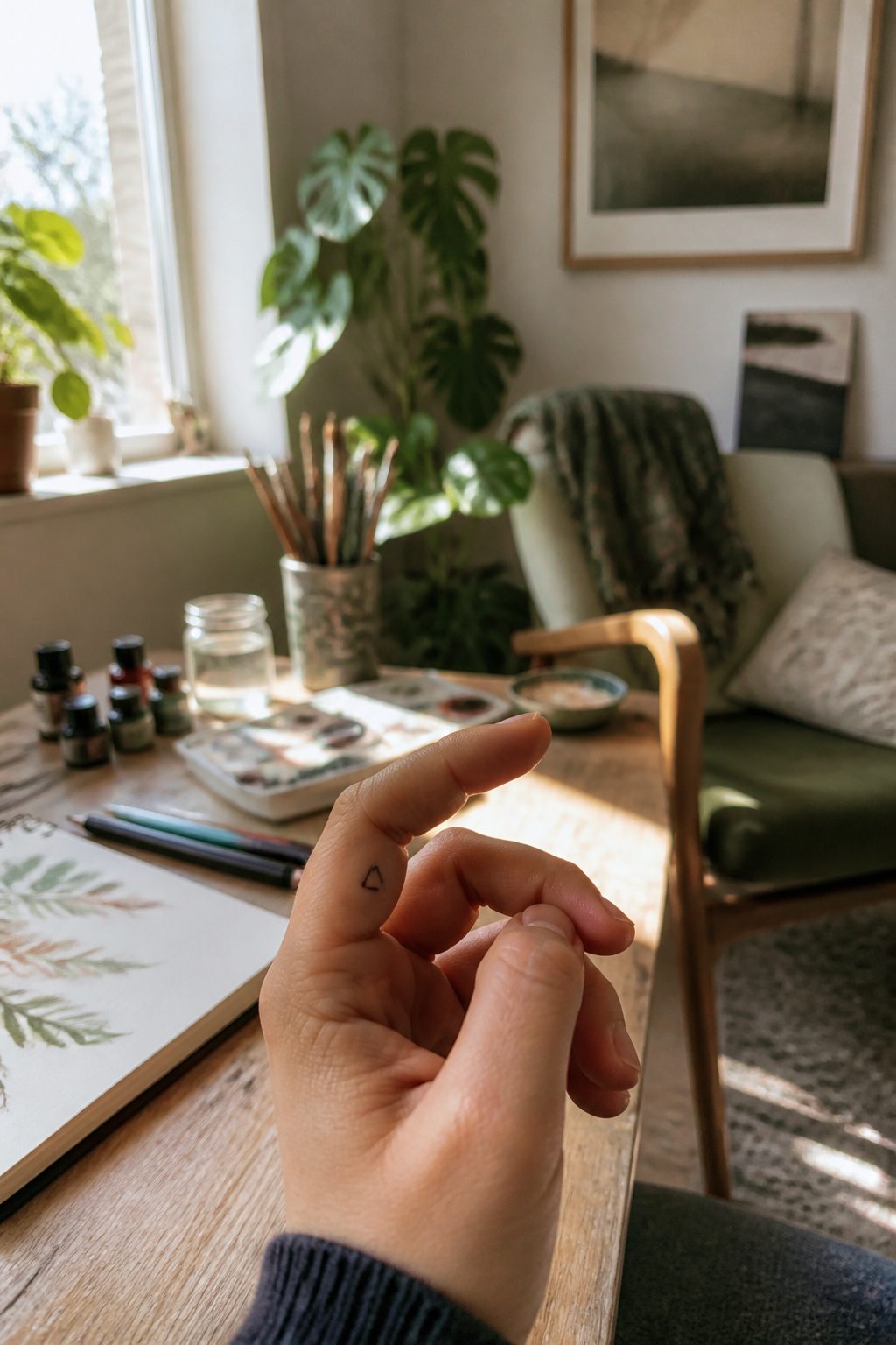
The palm side of a finger, and the skin just below it, represents the fastest-fading real estate in tattooing.
Constant contact with objects, sweat, and the simple act of gripping a steering wheel or a coffee cup means ink there faces roughly six months of visible life before blur sets in, based on what experienced artists routinely see in touch-up appointments.
That timeline makes the choice deliberate: you are selecting a design meant to live briefly and sharply, not to settle in for decades.
Pain runs higher here than on the knuckles or outer finger. Nerve endings cluster thickly on the palm-side skin, and the sensation during the session intensifies accordingly.
The tradeoff only makes sense for pieces that gain meaning from their hidden placement, a small word or symbol visible mainly to the wearer when the hand opens.
Even the webbing between thumb and index finger, which carries less direct abrasion, still sees faster degradation than top-of-hand work.
An artist who regularly handles finger work will steer the design toward bold lines and minimal fine detail, knowing what survives. Thin script or delicate shading on the palm side is a choice against the evidence.
The designs that justify the placement are the ones that read instantly from a short distance: a solid shape, a short word in block lettering, a single clean icon.
Anything more intricate belongs on the back of the hand, where the same ink earns years instead of months.
13. Side of Hand Tattoos
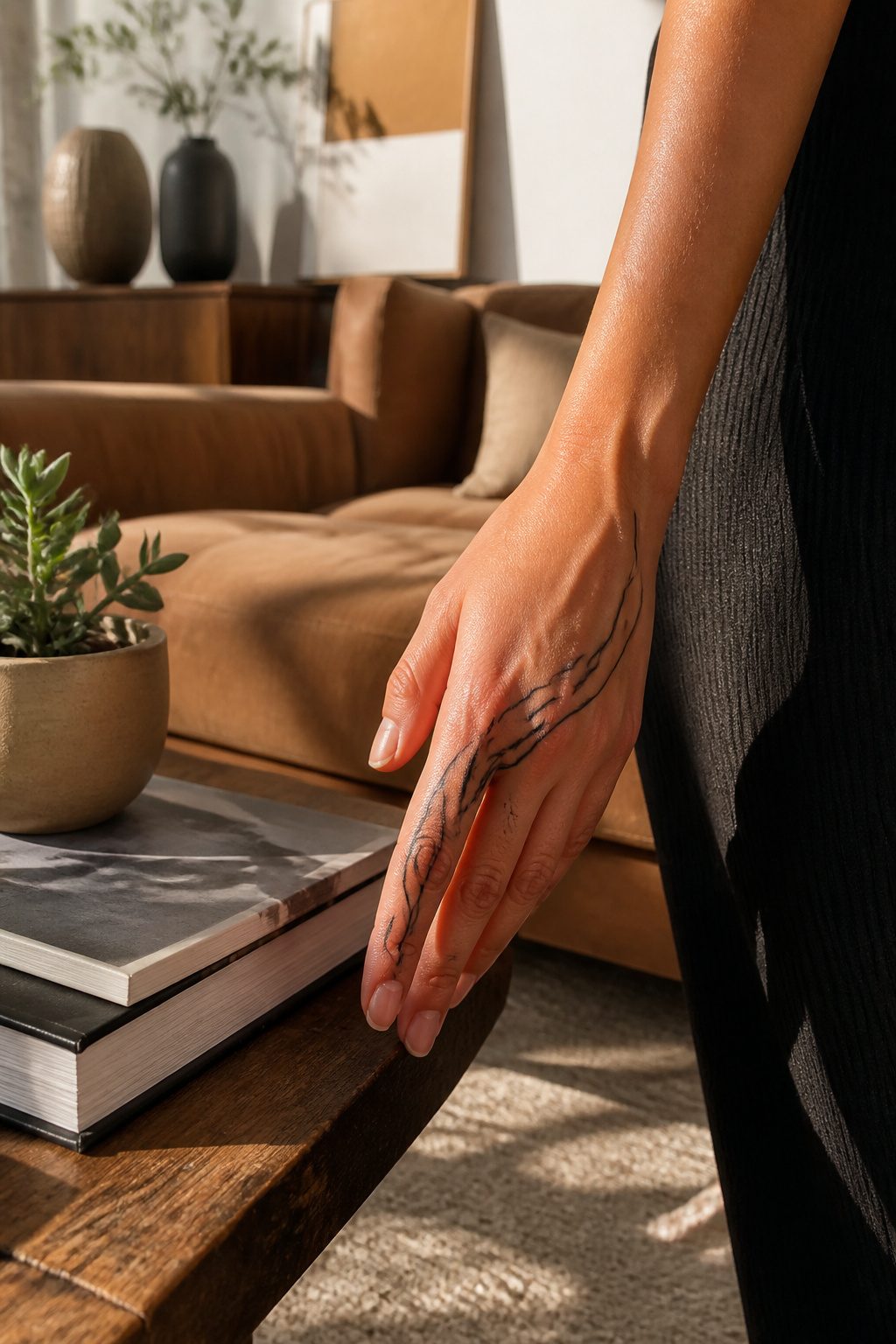
The outer edge of the hand, running from the wrist up toward the pinky or index finger, carries ink differently than the flat plane on top.
Skin there stretches and flexes with every grip and wave, which means lines soften faster and color drops out in patches where the hand works hardest.
A design that looks crisp on day three can feather along its edges by month six if the artist packs too close to the creases.
This spot tans unevenly too. The side of the hand catches sun at a glancing angle while driving, walking, holding a coffee cup.
Where finger tops brown relatively flat, the lateral edge develops a mottled fade that blots lighter pigments first.
Darker values and slightly heavier line weight hold up better here than the hairline work that photographs so well on Instagram fresh out of the chair.
Movement during the session itself is the other variable. The hand wants to curl inward, and holding it open against that reflex tires the muscle.
A session over twenty minutes starts to show in shaky linework near the end, so simpler geometry or short script tends to survive the compromise better than packed detail.
Pain sits between finger tops and the palm side, enough nerve density to notice, not enough to make most people tap out early.
14. Whole Hand and Finger Tattoos
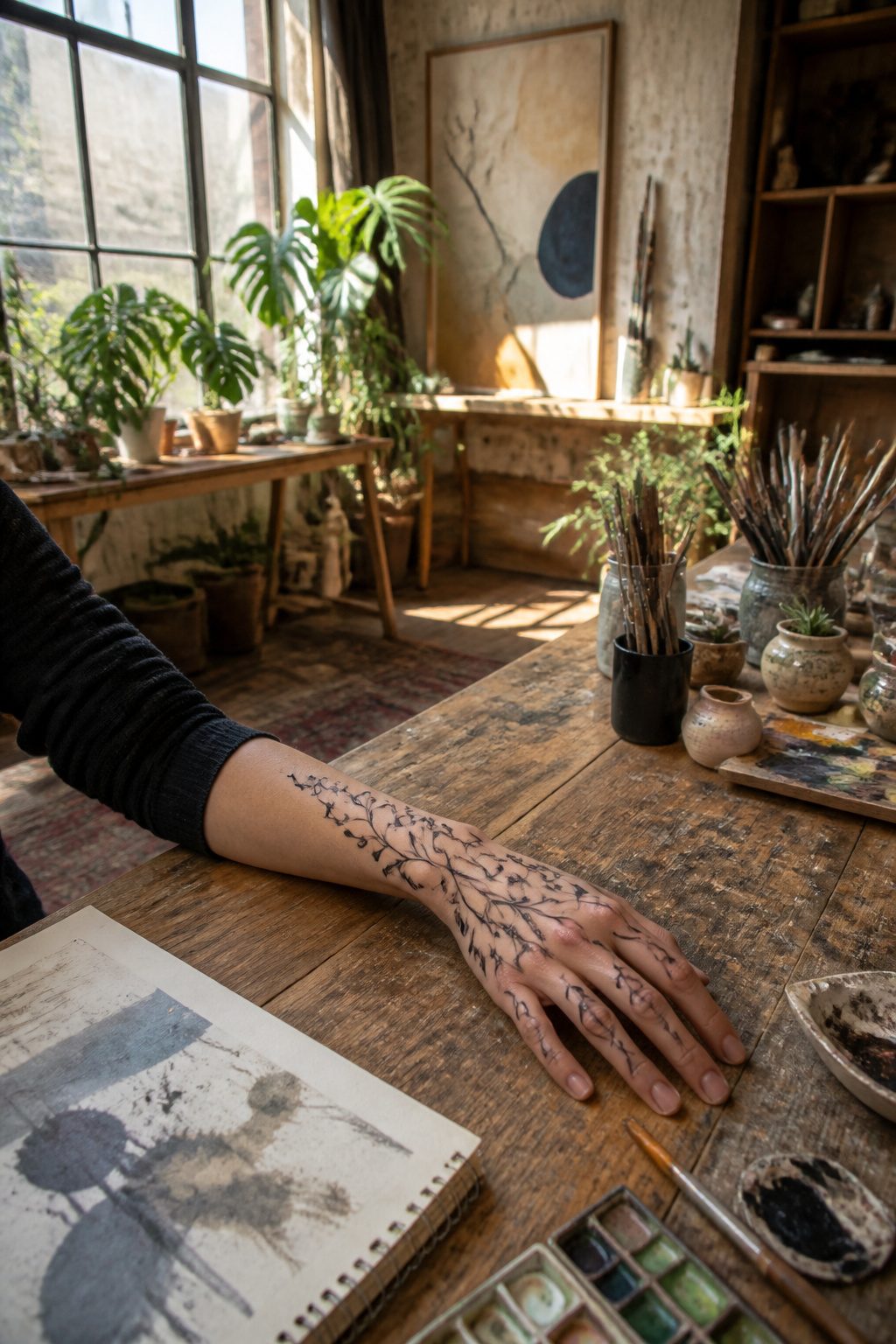
Coordinated hand tattoos work best when the fingers carry fragments of one image rather than unrelated pieces.
A vine that starts at the wrist, sends tendrils across each finger, and reunites at the knuckles reads as a single design; five separate flowers on five fingers read as five decisions.
The gap between knuckles is where most compositions fall apart, so plan how the line travels that half-inch of skin.
Coverage level matters more on fingers than anywhere else. Full blackwork to the nail bed commits you to quarterly touch-ups and limits your employment options more than a knuckle band or a single finger accent.
I have seen people request a full hand piece, then return six months later asking to leave the last two fingers blank for future flexibility. The tattooist can always add; removing negative space is nearly impossible.
Skin behavior differs across the hand. The palm-side of fingers holds ink poorly and blurs within a year.
The dorsal side, between the knuckles, stays cleaner longer. A composition that weights its detail there, and keeps the underside minimal, ages dramatically better.
Think of the hand as terrain, not flat paper: the knuckles are ridges that catch light and wear, the valleys between them shelter finer work.
15. Inside Finger Tattoos
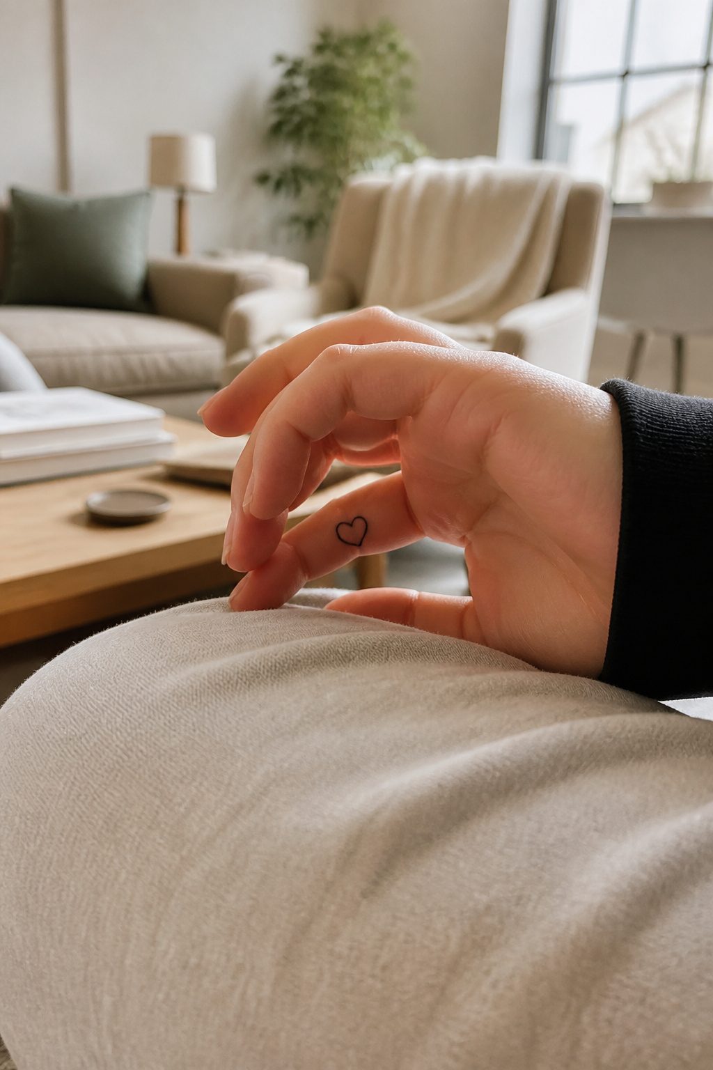
The inside of the finger, palm-facing, is where a tattoo lives in the half-hidden zone. Palms up, it shows.
Palms down, it vanishes. That flip of visibility is the main reason people choose it, and the main reason they regret it.
Inside finger tattoos fade faster than outer finger work. The skin there is thinner, the friction from gripping and folding is constant, and hand-washing hits that surface directly.
Between the sun exposure on the back of the hand and the chemical wear on the palm side, the inner face gets hit from both directions.
Artists who refuse finger tattoos often point to this spot specifically: the ink settles poorly, the client returns disappointed, and the art never holds the line quality it started with.
Bold lines survive better here than fine-line work, which blurs into a soft haze within months. Names, dates, small hearts or butterflies: the usual small designs can work, but expect touchups every eight months to a few years.
Some capacity of image remains for decades, but the crispness leaves early. Moisturizer with SPF and gloves for wet work slow the loss; nothing stops it.
Privacy is the trade. The inside of the finger keeps the tattoo off the stage, visible only when you choose.
Whether that privacy is worth the faster fade and the maintenance schedule is a choice that depends on how much hiding matters to you.
16. Top of Hand Tattoos
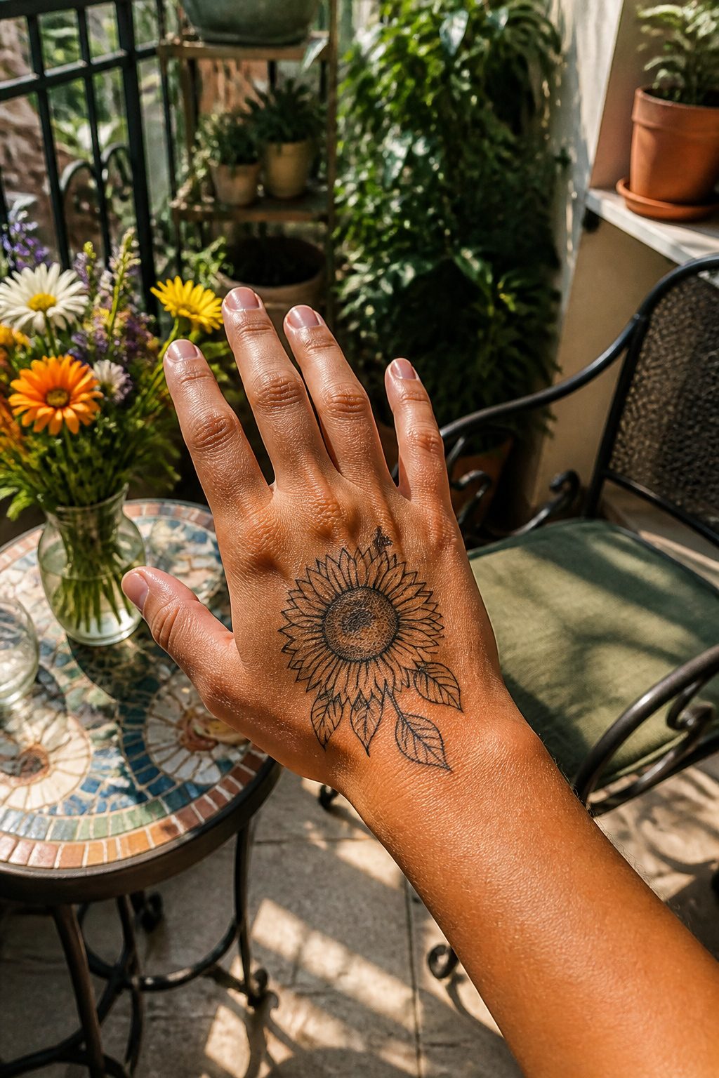
The top of the hand gives a design room to breathe without losing the intimacy that makes finger tattoos work.
A small sunflower or leaf outline starting at the finger base and running toward the wrist bridges two conventions: the restraint of finger placement and the openness of a hand tattoo. Botanical forms do this naturally.
Their curves follow the hand’s shape, and a vine or stem rhythm can stay simple without losing its identity.
Bolder lines hold up better here than fine-line work, which tends to fade faster on hands. That tradeoff matters because this placement stays in sight all day.
A heart, moon phase, or semicolon sitting at the base of a finger carries private meaning while remaining visible enough to catch your own eye during routine tasks.
Pain runs higher on the dorsal surface than on fleshier areas, though less than the palm side where nerve endings cluster thickly. The skin sits tight against bone, so expect more sensation during the session.
Most artists build this into their pacing.
Visibility is the real decision. The top of the hand draws more attention than between-the-fingers placement but less than the digits themselves.
For someone easing into hand tattoos, this spot splits the difference: unmistakably present, still easy to cover with a sleeve or watch when needed.
What Finger Tattoos Cost in Pain
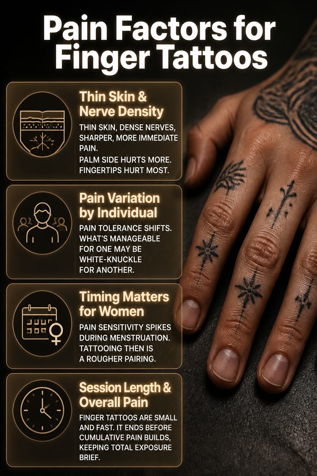
Finger skin sits thin and tight against bone, with nerve endings packed denser than most spots on the body. That combination makes the needle work register sharper, more immediate.
The palm side of the finger hurts more than the top; the fingertips collect the highest concentration of nerves, so a design pushing toward the pad edges into territory most people flinch at.
For women, cycle timing matters. Sensitivity to pain tends to spike during menstruation, and layering tattoo needles on top of cramping or general discomfort is a rough pairing.
Some artists will flag this and suggest booking around it; others won’t mention it unless asked.
The upside is scale. A finger tattoo runs small and finishes fast, so the session ends before the cumulative grind of a larger piece sets in.
That doesn’t make the individual moments gentle, but it keeps the total exposure brief. Pain tolerance still shifts person to person; what one caller describes as manageable pressure, another rates as white-knuckle.
No outside factor predicts it accurately, so plan for more than you think you’ll feel, then be relieved if it lands lighter.
Why Finger Tattoos Fade Faster
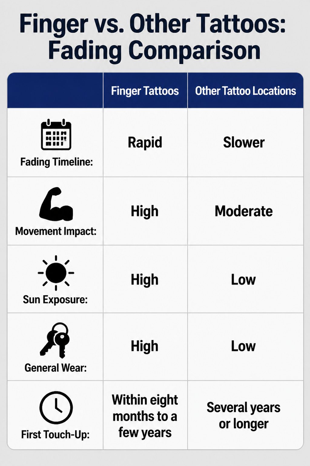
A finger tattoo starts fading the moment the bandage comes off, but the real drop happens between two and four years, when lines that once read sharp turn soft and gray.
That timeline is not a guess; it is what the work demands if you want the original design back.
Three forces drive it. Constant movement flexes the skin hundreds of times a day, and ink sitting over bone and tendon has no fat layer to buffer that stress.
Sun exposure hits the back of the hands harder than most body parts because people forget to sunscreen there, and UV breaks pigment faster than it fades on a shoulder under a shirt.
Daily wear completes it: pockets, keys, dish soap, and winter gloves all scrub at the surface. On a forearm, one of those factors might act alone.
On a finger, all three stack together every hour.
Some artists refuse the placement outright. Their work will not hold the way it does on a thigh, and a client who did not expect the fade will blame the needle instead of the anatomy.
The ones who do take it tend to book the first touch-up before the client leaves the shop, usually within eight months to a few years depending on how hard that person works with their hands.
Design Rules That Save Finger Tattoos
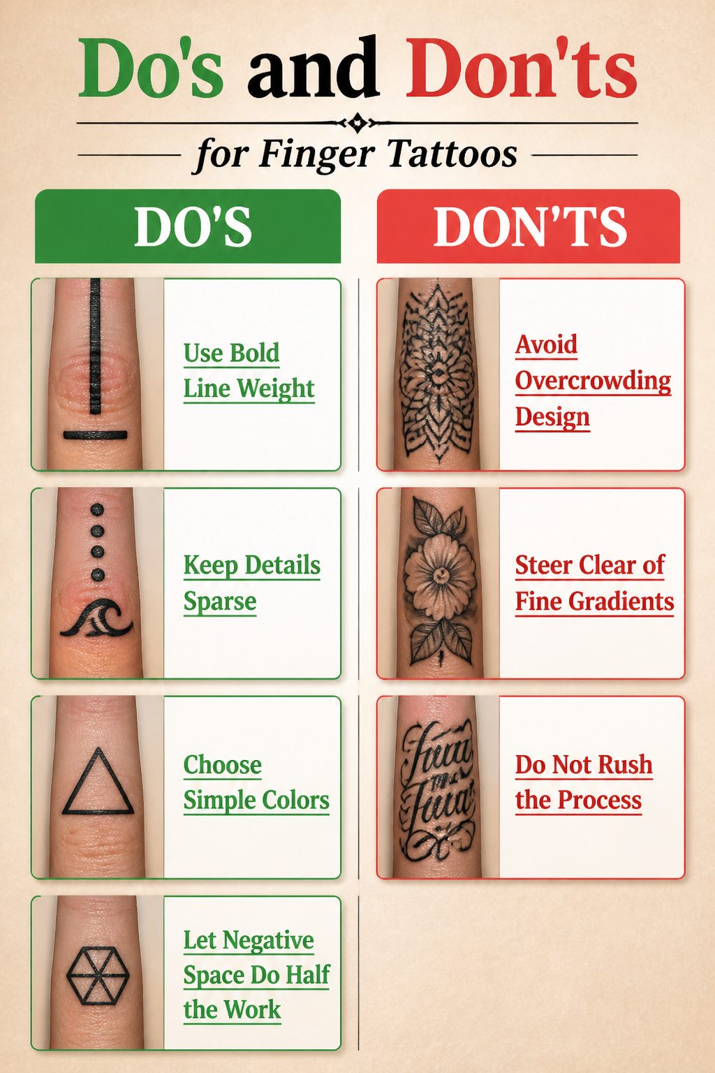
Finger skin turns over fast and the surface never stops moving, which means line weight matters more here than anywhere else. A single thick line survives where two thin ones will bleed together into a gray smudge.
The sources agree: keep detail sparse enough that each element has room to breathe, because ink spreads under skin over time whether you plan for it or not.
Geometric marks work because their clean edges forgive a little blur. Triangles, hexagons, a single wave or dot pattern, these shapes stay readable even when the edges soften.
Crowding the finger with detail is the mistake that turns a careful design into an unreadable blob.
Color choice follows the same rule. American traditional and bold lettering hold up because they rely on solid, uncomplicated fills.
Neo-traditional or realism styles pack in gradients and fine shading that need more space than a finger allows. The better bet is to lean into shape and spacing, letting negative space do half the work.
A simple mark on the index finger or thumb reads as intentional polish rather than a shrunken-down compromise from a larger piece.
Aftercare That Actually Works on Fingers
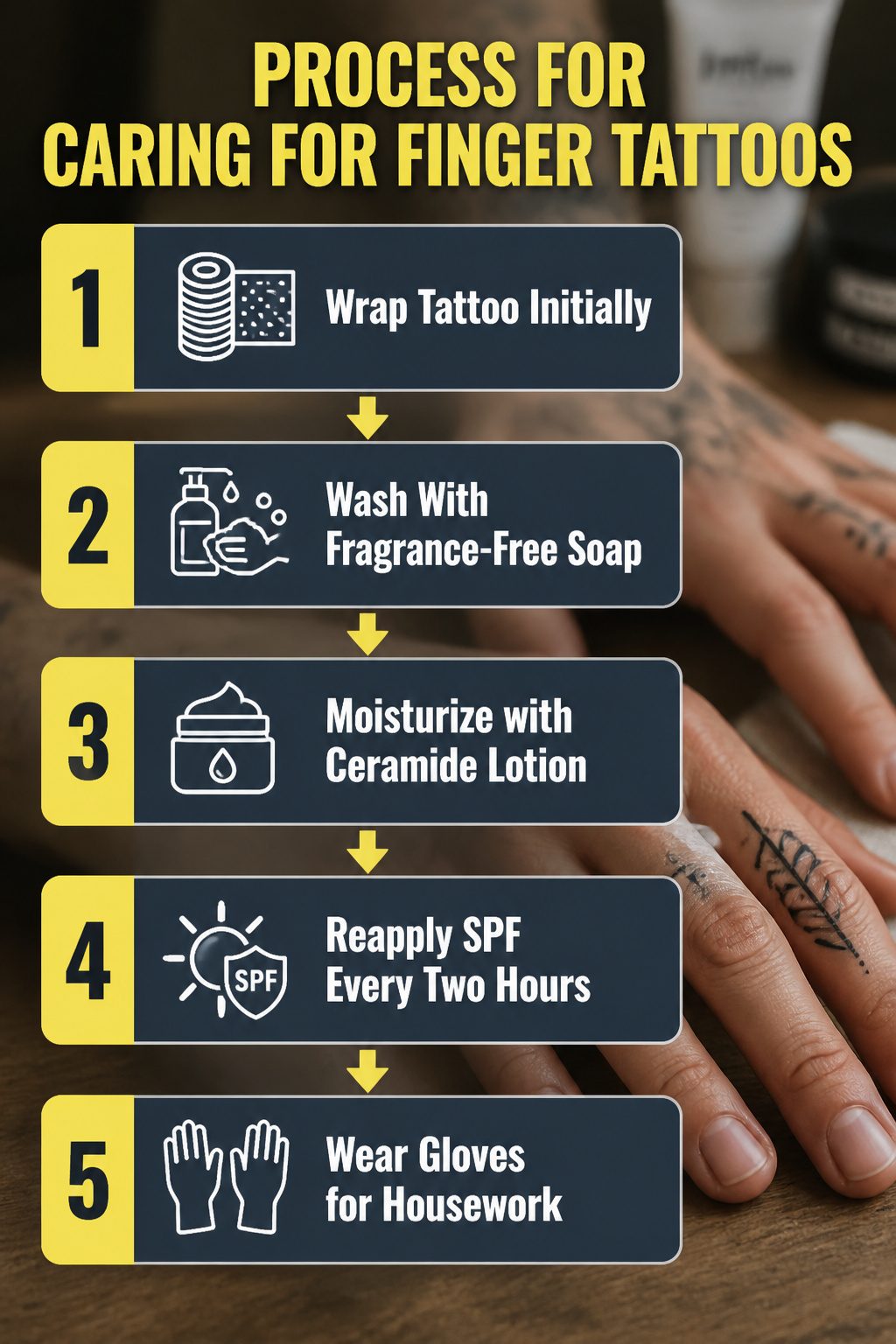
Healing a finger tattoo means fighting the one body part you never stop using.
My artist wrapped mine for the first few hours, then the real work started: washing with fragrance-free soap several times daily, keeping it dry enough that ink didn’t fade, and refusing to pick scabs for the full 4–8 weeks it takes skin to settle.
Moisturizer is where the 35–54 crowd gets particular, and rightly so. Fragrance-heavy formulas sting and can pull pigment.
A plain, ceramide-rich lotion or simple aftercare ointment, applied once the skin is fully dry, builds the barrier without interfering.
During the day, reapply SPF every two hours if your hands are in sun; UV fades finger ink faster than almost anything else because the skin there is thin and always exposed.
For daily tasks, the rules flip after healing. Fresh tattoos need air, so gloves are off.
Healed ones need protection from dish soap and cleaners, so gloves go on. That contradiction trips people up.
I keep a pair of cotton liners under rubber gloves for housework now, and a small lotion tube at my desk.
The touchup conversation comes later, every eight months to a few years depending on placement and how hard you are on your hands. Knuckles and inner fingers fade fastest, sometimes falling out entirely.
Budget for it before you book the chair.
How Finger Tattoo Placement Changes Visibility
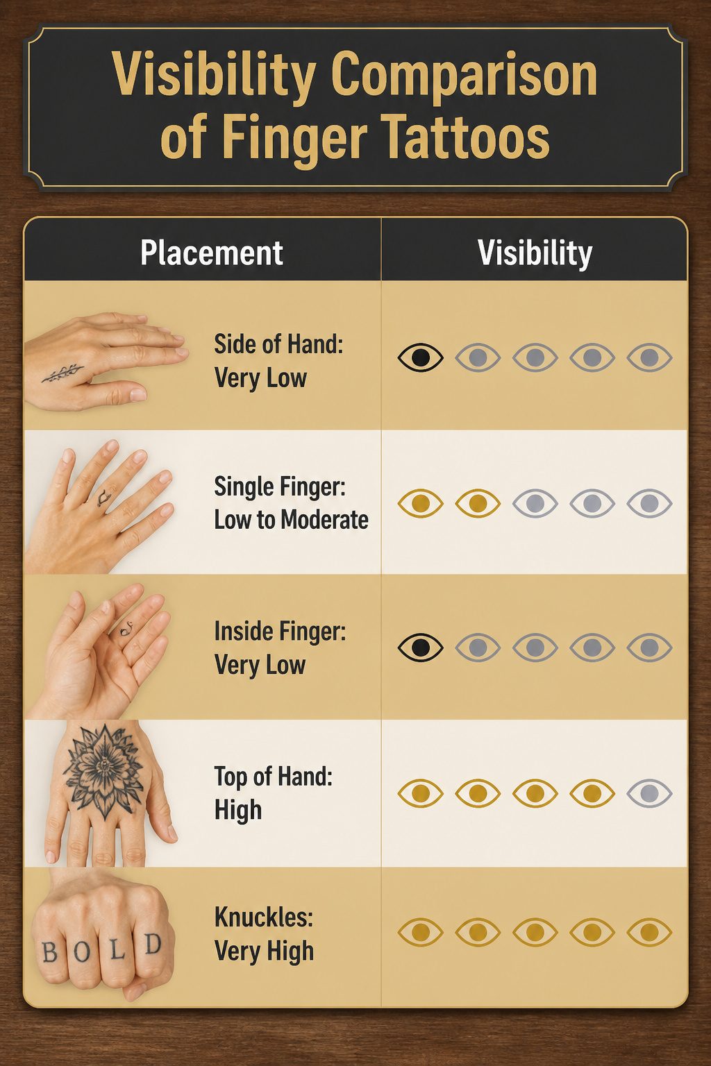
Side of hand tattoos slip past notice more easily than any other hand placement, making them the lowest-visibility choice for anyone who wants the ink but not the conversation.
Single finger tattoos keep the commitment small and the attention narrower; one finger draws less notice than a full set. Inside finger tattoos stay almost entirely private, visible mainly to you when you check a phone or hold a cup.
Knuckles and top of hand tattoos run the opposite direction. The top of hand meets everyone you shake hands with, and knuckles carry the classic visibility that makes them hard to miss in professional settings.
Covering any of these takes work. Gloves, bandages, or makeup can hide a finger tattoo, though none of them are practical for daily office wear.
Laser removal exists as the long-term fix if the placement turns out to be too loud for your life.
| Placement | Typical Visibility | Easy to Hide | Best For |
|---|---|---|---|
| Side of hand | Very low | Yes, with most gloves | Quiet professional settings |
| Single finger | Low to moderate | Yes | Testing the look |
| Inside finger | Very low | Rarely needed | Personal reminders |
| Top of hand | High | Difficult | Visible self-expression |
| Knuckles | Very high | Very difficult | Bold, traditional statement |
The friction that wears ink faster on side and inner finger surfaces also means those placements fade to even lower visibility over time.
Outer surfaces keep the design readable longer, which is a benefit or a drawback depending on whether you want the tattoo seen.
Frequently Asked Questions
Is a finger tattoo painful?
Yes, finger tattoos hurt more than most placements because the skin sits thin and tight against bone with dense nerve endings. The palm side hurts more than the top, and fingertips register the sharpest sensation.
Most people describe the feeling as immediate and intense rather than deep.
How long do finger tattoos last?
Finger tattoos fade faster than tattoos anywhere else, with palm-side work blurring within roughly six months and inner finger ink losing crispness within eight months to a few years.
Touch-ups every two to four years keep the design readable, and some capacity of image remains for decades even after the edges soften.
What are good finger tattoo designs?
Simple, bold designs work best: small symbols like hearts or anchors, single words in thick script, geometric shapes, and animal or insect silhouettes.
The design needs to read instantly at a glance and survive both shrinking and the natural spread of ink in thin finger skin.
How should I care for a finger tattoo?
Keep the tattoo clean and moisturized, using a lotion with SPF to block sun damage. Wear gloves for wet work like dishes or cleaning to keep harsh chemicals and prolonged water exposure away from the ink.
Expect to schedule touch-ups as part of normal maintenance, not as a fix for poor aftercare.
Can finger tattoos be hidden?
Hiding finger tattoos is difficult because hands stay visible during most daily interactions. Between-finger or inside-finger placement offers partial concealment, and gloves or long sleeves cover the work completely.
Knuckle tattoos and top-of-hand pieces are nearly impossible to hide without accessories.