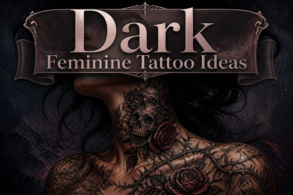
Dark feminine tattoos range from a skull tucked inside roses to a roaring tiger at the throat, and the difference comes down to whether you want the darkness readable from across a room or kept close enough to hide under a sleeve.
The skull almost disappears inside soft petals for one wearer; for another, the bone stays stark while the flowers wilt around it. That choice, acceptance or reclamation, is what separates a borrowed mood from a lived one.
1. Skull Tattoo
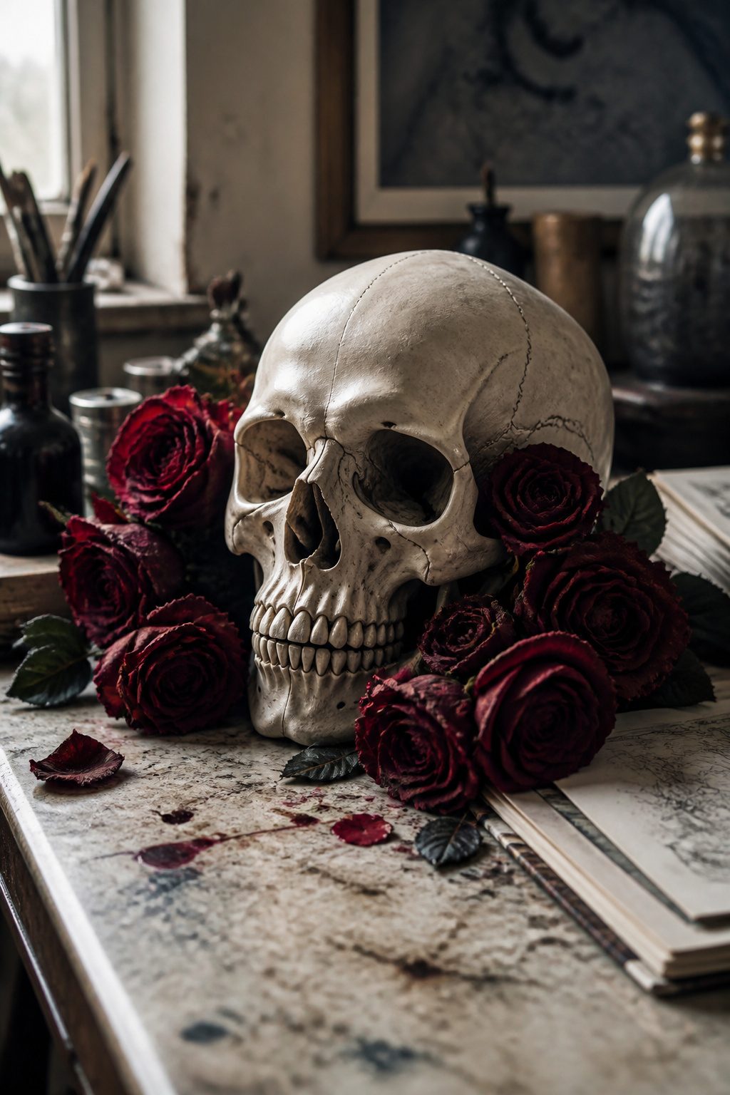
A skull surrounded by roses is the pairing that keeps dark feminine tattoos from tipping into pure goth cliché.
The bone reads as mortality, the blooms as the living world that keeps growing anyway, and the tension between the two is where the power sits.
Two ways to play it: wrap the skull in soft petals so the death imagery almost disappears inside the living ones, or keep the bone stark and let the flowers wilt around it.
The first reads as acceptance; the second, as reclaiming decay as part of the feminine cycle rather than its end. Either works, but the detail matters.
Fine linework on the bone itself keeps the piece from going heavy; too much black fill and the feminine half of the equation gets lost.
What convinced me, looking through portfolios, was how often the skull was small, almost tucked into the floral arrangement like an afterthought someone decided not to hide.
2. Death Tarot Card
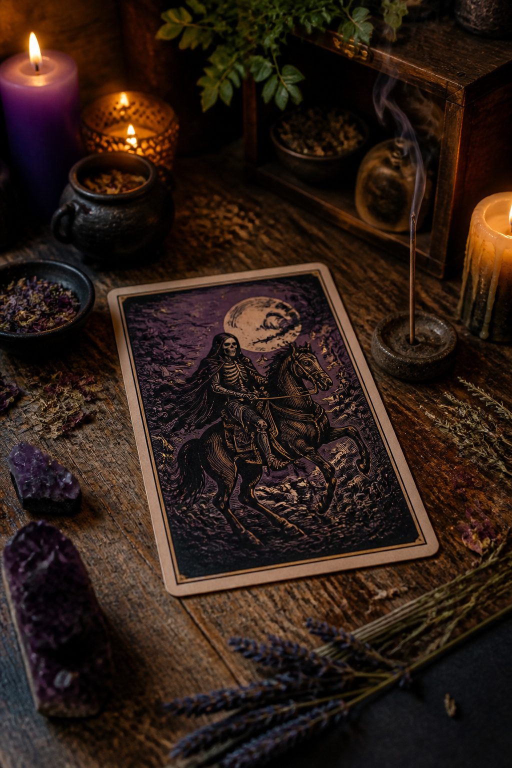
The Death Tarot Card ranks among the darkest imagery in the deck alongside The Tower, and that weight is exactly why it works for endings you chose rather than suffered.
Tarot carries layered cultural meaning for people who actually work with it, not as fortune-telling props but as a language for marking transitions. The card signals transformation, the kind that requires something to end completely before the next shape emerges.
In dark feminine tattoo culture, that resonance matters: the design rejects the pressure to stay palatable through every phase. Placement changes how it reads.
A Death card on the ribs or upper arm keeps the imagery close, almost private, while a larger back piece lets the skeleton rider and falling figures unfold with room for detail.
Some wearers pair it with specific flora, blooming through the bones, or leave it stark. Either way, the meaning stays active; the tattoo marks a threshold you crossed, not a mood you borrowed.
3. Long Inner Arm Rose
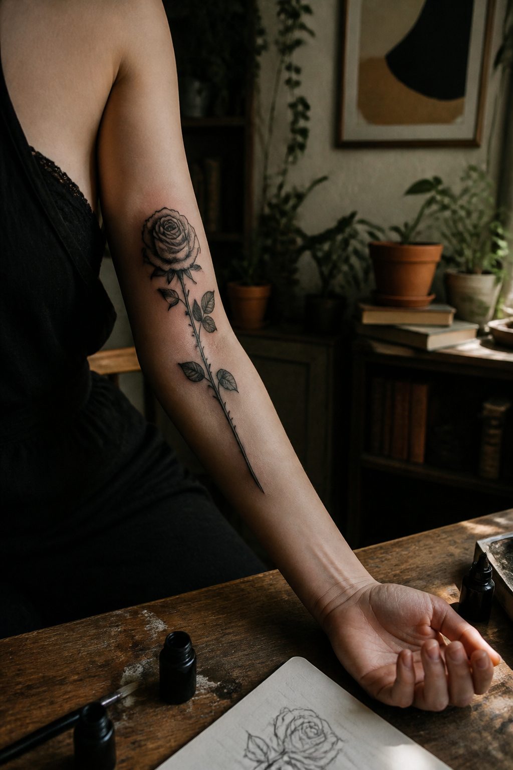
A rose on the inner arm runs vertically, stem to stern, which changes the whole read of a flower people usually see rounded and tame.
The long format pulls the eye up the bone, tracing the arm’s natural line rather than sitting flat like a sticker.
That placement makes it private: visible in a tank top, hidden under sleeves, a choice the wearer controls moment to moment.
The dark feminine take drops the garden-party sweetness. Black petals, thorns that draw blood, a stem that looks almost rotted in places.
The inner arm skin is thin and pale, so the ink sits close to the surface and heals to a softer grey than the same black on a calf or shoulder.
That softness actually helps the mood; the image reads more bruise than bloom, more memory than decoration.
Pain matters here. The inner arm carries more nerve endings than the outer, especially near the ditch of the elbow and the armpit line.
Anyone choosing this spot should know the session runs longer than a compact design would, simply from the stretch of skin being filled.
The result earns its intimacy: a classic symbol made specific to one body, seen mostly by the wearer and whoever they choose to show.
4. Nature Scenery Tattoo
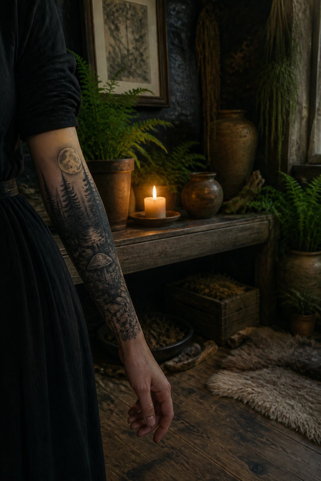
A forest floor half-eaten by rot gives a landscape its dark feminine pull.
The same trees that read as calendar kitsch in daylight become something else when the scene is set at 3 a.m., moonlight filtering through branches heavy with moss and no leaves.
That shift from pretty to charged is what makes nocturnal scenery the stronger choice for this mood.
Decay itself carries the symbolism. A split trunk with new growth corkscrewing out of the wound frames the cycle without softening it.
The feminine here is not the garden-in-bloom version marketed on skincare bottles; it is the part that keeps working underground, that feeds the next generation from what is finished.
Regrowth framed through ruin asks more of the viewer than a simple mountain vista. The eye travels first to what is broken, then finds the pale shoot or the fungal bloom that has colonized the dead wood.
That sequence, mistake to correction or loss to persistence, lands the meaning without needing a caption.
Placement matters for the detail. An inner forearm or rib panel gives enough height for the vertical reading: top to bottom, intact to compromised to renewing.
Too small and the rotted textures muddy together; the piece needs room for the contrast to breathe.
5. Lucifer Inside a Heart
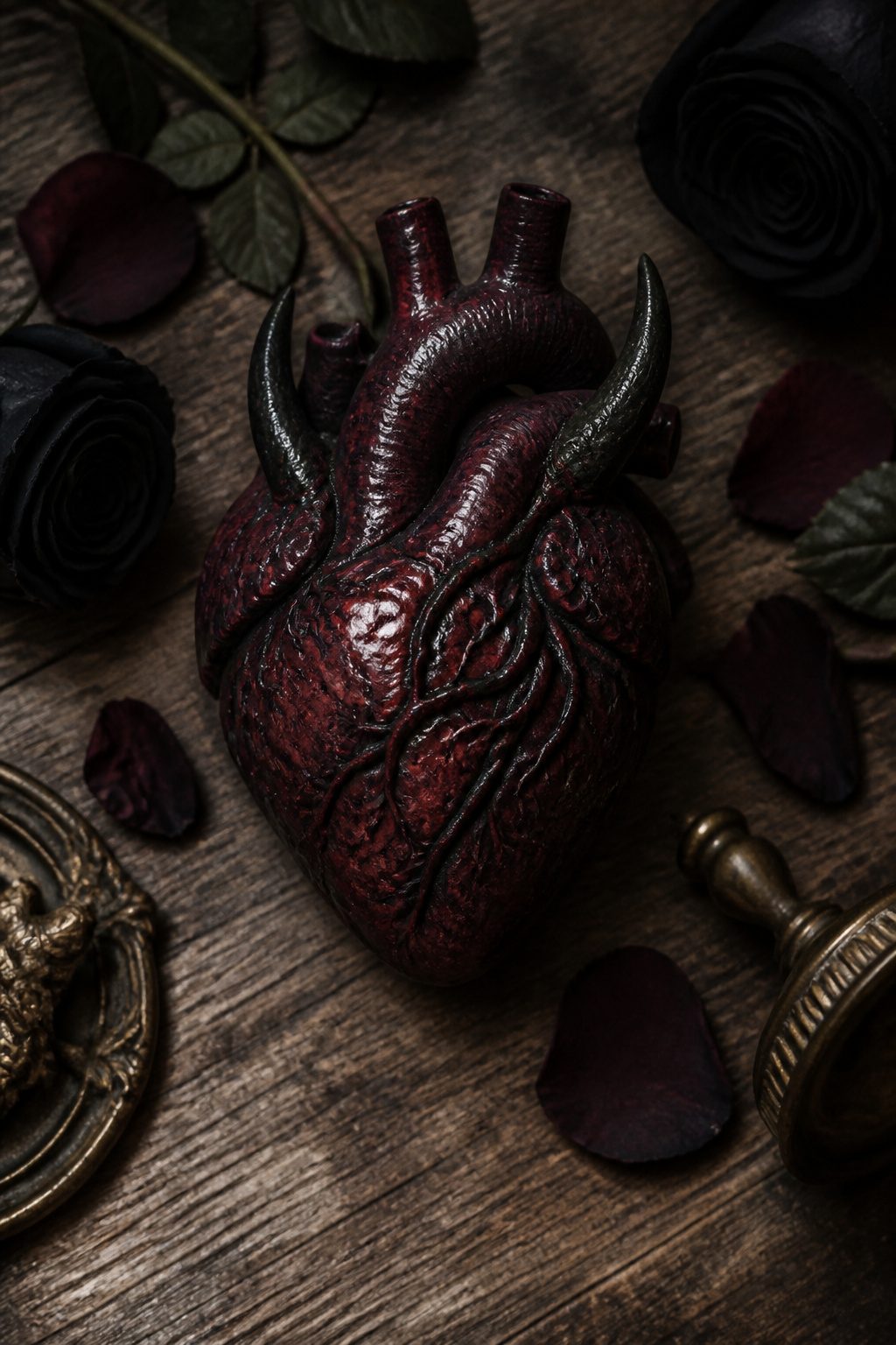
A Lucifer inside a heart tattoo walks straight into the argument most people prefer to avoid: that love and darkness share the same room.
The design typically shows the fallen angel’s face or full figure cradled within an anatomical or stylized heart, sometimes with flames licking the edges or horns piercing through the muscle.
Women drawn to this motif usually aren’t looking for shock value alone. The placement carries a specific claim, that acknowledging your own capacity for destruction, selfishness, or rebellion doesn’t cancel out your capacity to love.
That contradiction is the point. The controversy follows naturally.
Religious imagery in tattooing always risks misreading, and Lucifer as a figure still triggers assumptions about Satanism or edginess for its own sake. What separates a thoughtful piece from a cheap provocation is usually the execution.
Fine line work and careful shading on the face can shift the tone from cartoon villain to something genuinely mournful, a light-bearer who chose wrong and knows it.
Most women who sit for this design, in my observation of how these consultations go, already own the complexity they’re asking an artist to draw. They’re not defending the choice to anyone.
6. Big Forearm Moth Tattoo
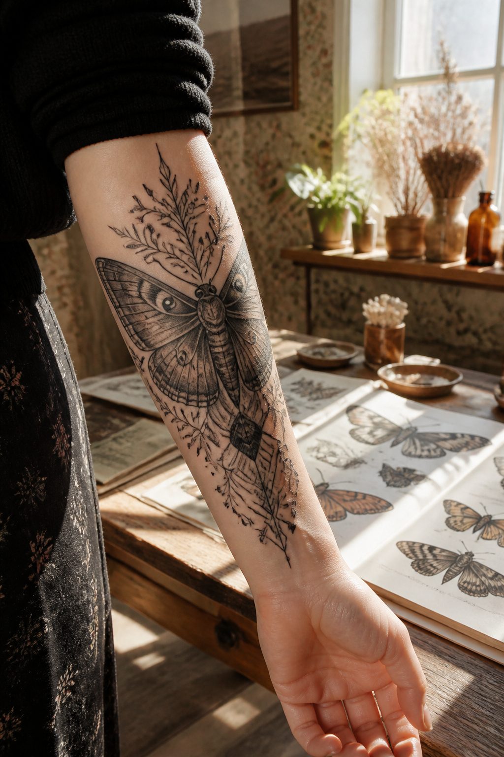
A moth drawn large across the forearm carries weight that a smaller piece cannot manage. The insect’s life cycle, built around breaking down and rebuilding, maps onto survival in a way that reads clearly across a room.
The forearm placement matters here more than it does for most dark feminine tattoos. That strip of skin between elbow and wrist sits in view during every handshake, every reach for a coffee cup, every typed sentence.
What stays private on a ribcage becomes public declaration here.
The design works best when the wings spread to use the full length of the muscle. Shading along the lower wing edges can suggest wear without making the moth look defeated.
A client of mine chose muted grays and single needle detail for the body, keeping the antennae thin enough to read as fragile.
The contrast lands where it should: the creature looks like it has been through something, not like it started damaged.
Pain sits moderate on the forearm, easier than the inner bicep, harder than the outer shoulder. Sessions run three to four hours for palm-sized work, longer if you want the body rendered in fine detail.
Healing demands restraint on sun exposure, since the forearm takes UV even through car windows. A faded moth loses the tension that makes the meaning stick.
7. Mysterious Mermaid Tattoo
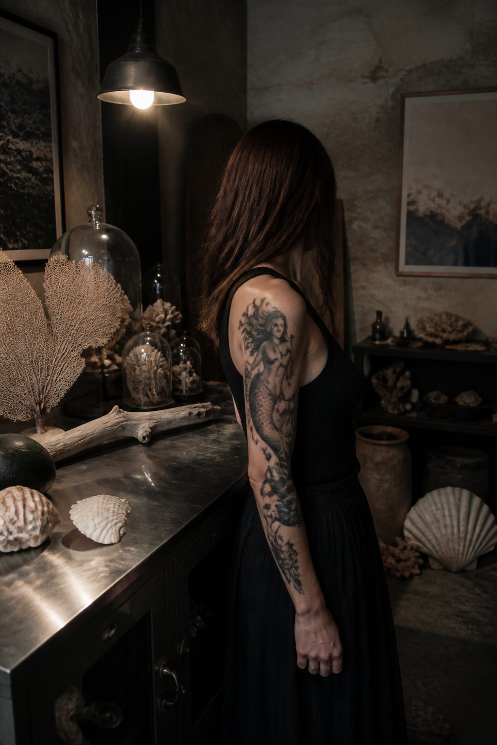
The mermaid in old stories was never the singing friend from a children’s movie. She was the reason sailors went overboard, and the stories called it beauty but meant something closer to dread.
A mysterious mermaid tattoo carries that older version: the feminine as actual threat, not costume. Heavy black-and-gray shading, pale emptied eyes, hair that moves like water itself, these are the details that separate the design from the Disneyfied one.
The siren and the mermaid share that same origin, luring men toward drowning with song or with looks, which makes the image a natural fit for dark feminine tattoos.
Transformation sits at the center of the myth too, the slip from human tail to human legs, or the reverse, always incomplete, always warning that the appealing form hides something else.
Some artists push the unease further with unsettling proportions or hollow gazes that suggest the figure has witnessed every trick played and feels nothing about repeating them.
What convinces me, sorting through the designs that actually work, is that the best ones keep the danger visible. A too-pretty mermaid misses the point entirely.
8. Ouija Board Tattoo
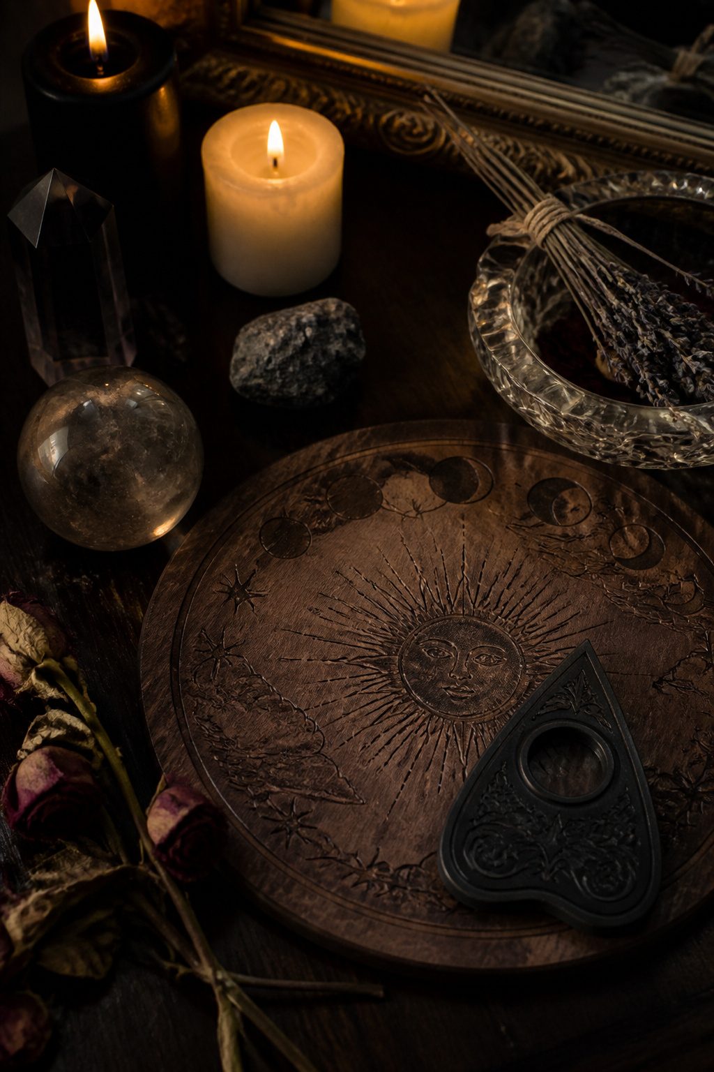
A Ouija board tattoo carries weight only if the viewer recognizes what the planchette and alphabet board mean.
For those who do, it reads as a deliberate symbol of darkness and the claimed connection between our world and whatever sits beyond it.
That shared recognition is what makes the design work; without it, the lines flatten into generic mysticism.
The board itself offers plenty of room for personalization through the surrounding elements: candles worn low, hands hovering or withdrawn, the particular style of lettering on the board. Some keep the classic William Fuld layout, others redesign the typography entirely.
Placement shapes how the piece reads. A stomach piece over the navel, like the commitment-level work some choose for supernatural themes, turns the body itself into a kind of threshold.
Smaller versions lose that scale but keep the reference intact for those who know to look.
The risk is overloading the image. The board already carries its own narrative; adding too many secondary symbols dilutes what makes it specific.
One or two supporting elements, chosen for personal rather than decorative reasons, usually outlast the crowded compositions.
9. Ghost in the Heart
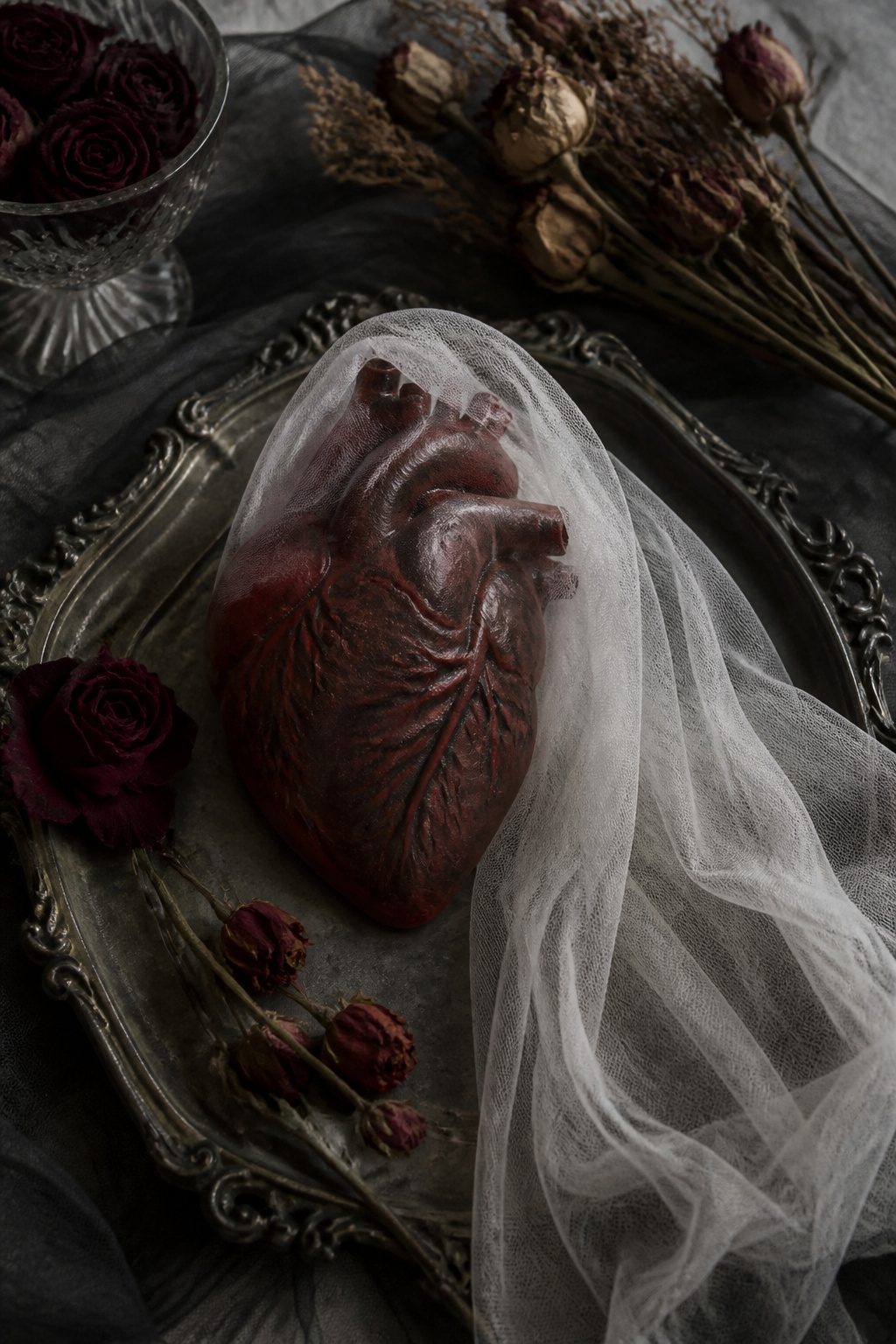
Dot work carries a ghost inside an open heart, and that pairing is what keeps the design from collapsing into a straightforward memorial.
The figure stays translucent, half there, which leaves room for two reads at once: a literal belief in something after this life, or simply the felt presence of someone who has gone. The ambiguity is the point.
Memorial tattoos usually name the person, fix the dates, or anchor the image to one loss. This one refuses to, so the same piece can mean inherited superstition on Tuesday and missing your grandmother by Thursday.
Extra artwork on the heart itself, wings layered behind, turns a small emblem into something that actually occupies space on the body.
Without that detail the design can look like clip art; with it, the dot work has enough density to read as shadow rather than outline.
I have seen this placement work best where the chest can carry some weight behind it, the ribs or the sternum area, because a floating heart with no anatomical reference tends to look placed rather than settled.
10. Spider Tattoo
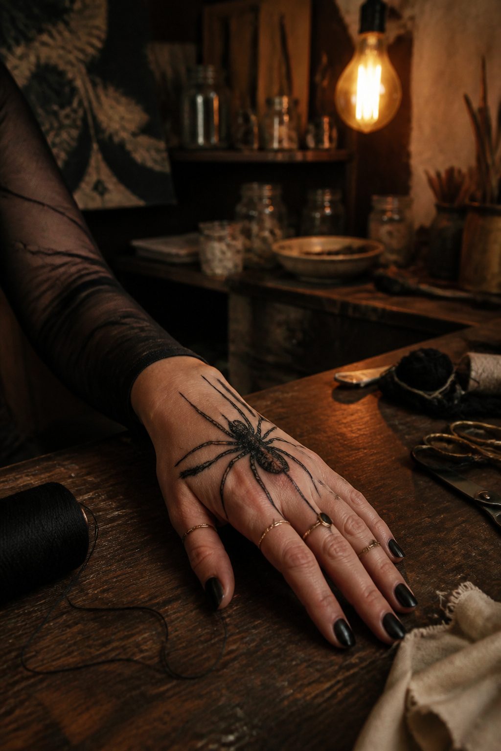
A spider tattoo works as dark feminine ink because the arachnid carries two stories at once. In the older telling, the spider catches what flies too close, and the feminine-coded figure was usually the one caught.
The tattoo flips that script. The wearer becomes the web itself: patient, calculating, the one who decides when the waiting ends.
Intelligence and cunningness are the traits the spider signals in this symbolism, not danger for its own sake.
The design range runs from a small black widow behind the ear to a full web sleeve with the spider descending the inner forearm.
A black-and-gray female figure merged with spider elements, what some call the spider-demon-witch hybrid, pushes the concept further into old intuition and midnight imagery.
That version reads as survival sharpened into something deliberate, the idea that even when others try to blind you, your inner sight stays keener than theirs.
Placement matters for the narrative. A spider on the throat or hand says the hunter identity is public; hidden under clothing, it becomes private knowledge, a role you step into rather than perform.
The web itself can wrap a joint or scatter across a shoulder, mapping the territory you claim.
11. Bat Tattoo With Words Lust
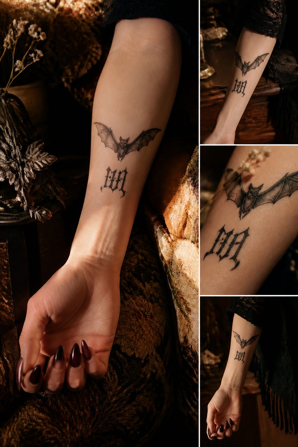
Bats carry a heavy load of bad press that the design leans into rather than corrects. The animal’s association with night, caves, and disease makes it an easy stand-in for parts of yourself that polite company would rather keep hidden.
Adding "lust" in script or gothic lettering forces the viewer to name the thing directly instead of letting the bat stand as vague darkness.
The word choice matters more than the font. "Lust" is not "love" and not "desire"; it is specifically the kind that outlasts reason.
Paired with a bat, the tattoo reads as survival instinct stripped of romantic packaging.
The bat does not hunt at night because it is tragic; it hunts because that is when the food moves, and the word underneath says the same about the wearer.
Placement changes the effect. Across a shoulder blade, the bat spreads like something that landed there; on a forearm, the lettering faces the viewer and makes the confession public.
The artists who nail this one keep the bat small enough that the word still dominates the read, letting the animal do atmosphere while the text does accusation.
12. Married Ghost
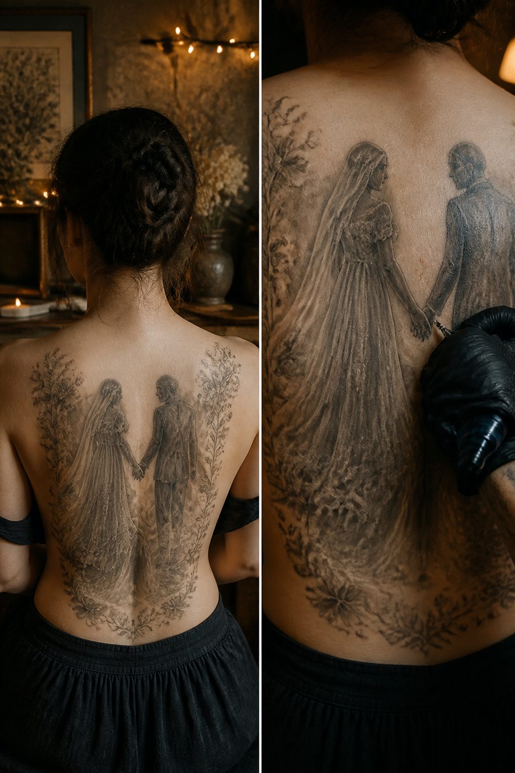
The married ghost tattoo carries a specific weight in the dark feminine lexicon: two figures in wedding attire, rendered in washed-out grays or soft bone white against black, sometimes with the veil still drifting where wind would have caught it.
The image commits to love as something that outlasts the body itself. What draws women to this design, in my observation walking through shops and portfolios, is the refusal of the till-death-do-us-part clause.
The vow gets extended past the fine print.
Placement tends toward ribs or upper back where the canvas fits both figures without crowding.
A skilled artist will push the contrast so the wedding details read immediately: the collar of the dress, the cut of the jacket, the hands still clasped.
The best versions let one figure fade slightly more than the other, suggesting who crossed first and who is still waiting. Without that imbalance, the piece flattens into generic gothic romance.
Color rarely helps here. A single accent, sometimes a ring of deep garnet or the palest blue in a bouquet, can anchor the eye.
More than that and the mourning quality dissolves into storybook illustration. The commitment being imagined is solemn, not sentimental, and the tattoo should feel earned rather than decorative.
13. Snake With Moon Tattoo
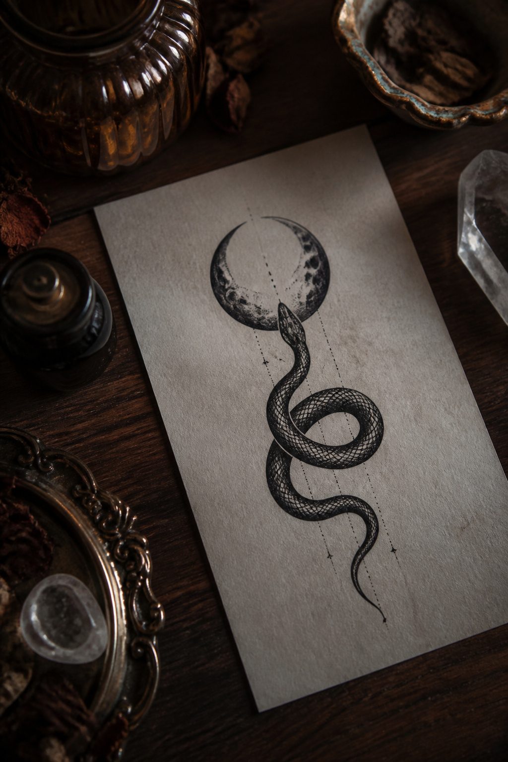
A snake paired with the moon lands near the top of every list of dark feminine tattoos for a reason. Both symbols have carried weight since long before tattooing became mainstream, and neither one flattens easily into a single meaning.
The moon pulls the tides through a fixed cycle: new, waxing, full, waning, gone, back again. That rhythm maps onto a particular idea of femininity, one tied to interiority and return rather than linear progress.
The snake matches it with shedding. A snake outgrows its skin and leaves the old one behind, still intact, still recognizable as what it was.
That is transformation without amnesia, a darker reading of renewal than the usual upward-and-onward story.
Together they do not decorate so much as argue. The moon governs what is hidden; the snake moves through what is hidden without needing light.
In a tattoo, the composition matters. A snake coiled around a full moon reads as guardianship or swallowed light.
A snake below a crescent, head lifted, reads as waiting or watching.
Either way, the design keeps both symbols active, neither subordinate to the other, which is the specific combination that makes this motif work for the category it sits in.
14. Goblet With Sun and Moon
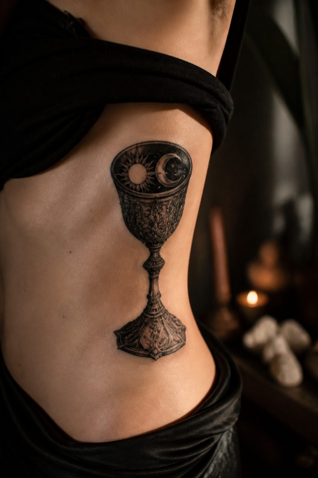
A goblet already carries weight as a feminine form, the open cup waiting to receive, and pairing it with sun and moon turns that receptacle into something stranger.
The vessel holds what cannot be held: two bodies that never share the sky, locked together in silver or blackwork on your ribs or down the spine.
It reads as ritual object, something you’d find on an altar rather than a shelf, and that ceremonial charge is what separates it from prettier celestial pieces.
The sun and moon inside the cup compress their usual grandeur into a private scale. They become secrets, not declarations.
A client of mine went with oxidized silver tones for the cup itself and let the sun bleed a dull gold while the moon stayed bone white; the contrast made the whole piece feel like something unearthed rather than designed.
The goblet walls should curve enough to suggest containment, almost as if the bodies inside might spill, because tension lives in that near-overflow.
Without it, the design flattens into a nice cup with nice planets, and nice is not what dark feminine work is built for.
15. Bloodied Dagger Tattoo
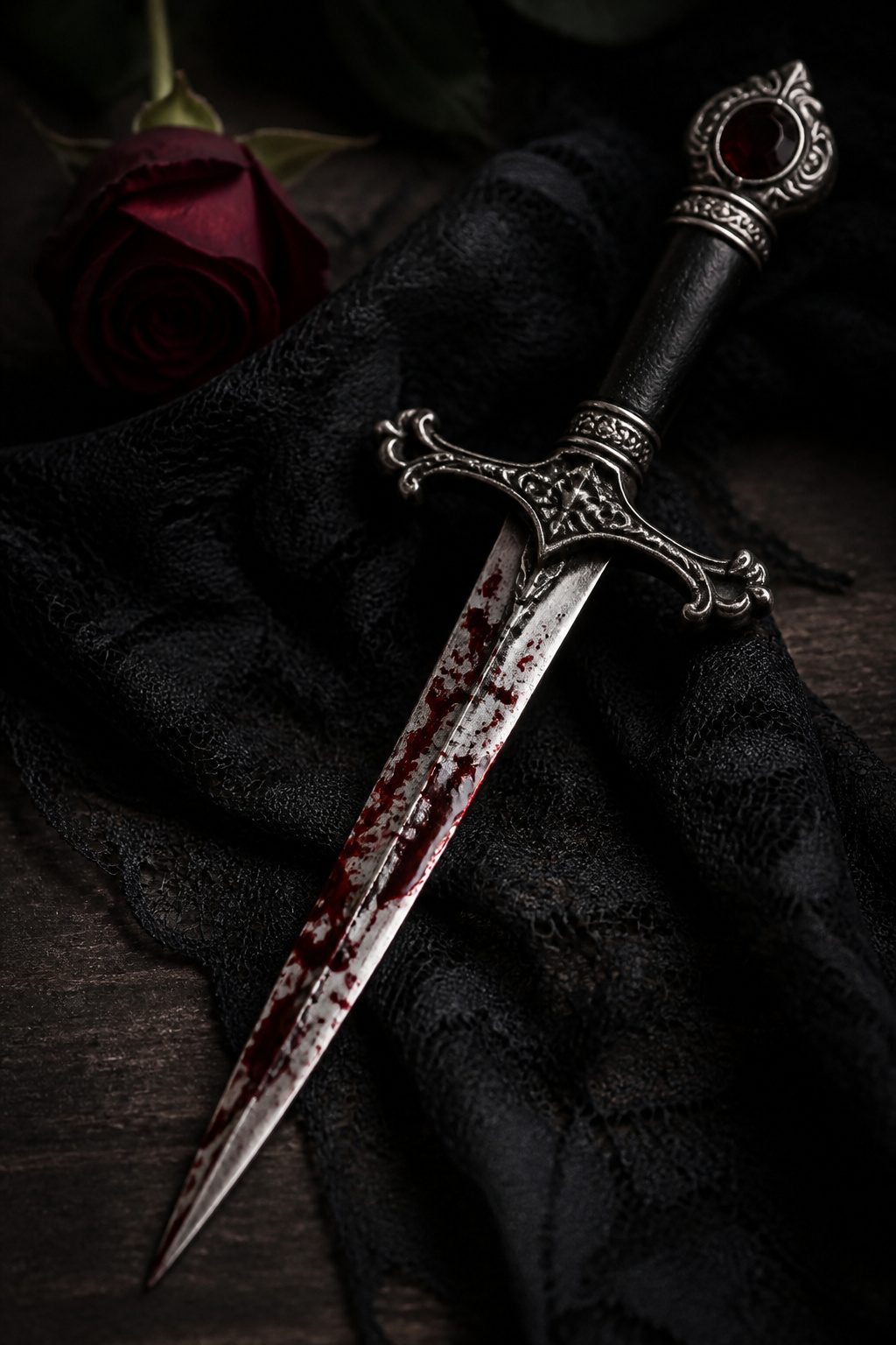
A bloodied dagger tattoo carries a specific weight that clean weapon imagery never reaches. The blade alone speaks to protection or aggression, something anyone might claim.
Add the red drops, the narrative detail, and the meaning narrows to the wound of betrayal, the moment after trust has already been broken.
The blood is what makes the story unshareable; it marks the design as personal history rather than borrowed toughness.
Placement shifts the reading. A dagger centered over the heart reads as sabotage, an intimate attack from someone who got close enough to cause real damage.
Across the back or along the breast, the same motif becomes quieter, carried more for the wearer than for any viewer.
The drops of blood add complexity whether the piece stays small or scales larger, and that complexity is the point. This is not a tattoo about being dangerous.
It is a tattoo about having been damaged by someone you let in, and the blood is the evidence you do not try to hide.
16. Scorpion With Flowers
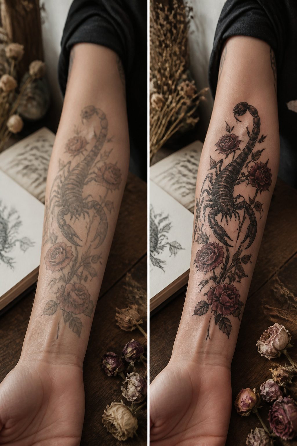
A scorpion curled among roses or wildflowers makes the viewer do a double take. The pairing works because the viewer expects softness or sting, not both at once.
In most feminine tattoo imagery, beauty carries no cost and danger stays purely decorative. Here the thorns and the tail share the same stem.
The scorpion itself reads as armor: segmented body, raised claws, that hooked stinger waiting. Set it against petals that are already wilting or half-eaten and the whole piece turns into a single statement about presentation.
The woman wearing it is not choosing between being seen as lovely or as someone to reckon with. The design insists those are the same person.
Composition matters more than with simpler pieces. A scorpion too small beside oversized blooms looks like an afterthought; too large and the flowers read as bait rather than balance.
The artists who pull this off usually let the tail curve through the bouquet so the stinger exits near the flower that is most open, most apparently vulnerable. That tension is the point.
Color deepens the effect or kills it. Heavy black on the arachnid with muted plum or dried-blood tones in the petals keeps the mood from drifting into something prettier than intended.
Full color on both elements softens the pairing into something more conventional, which defeats why someone chooses this image in the first place.
17. Roaring Tiger
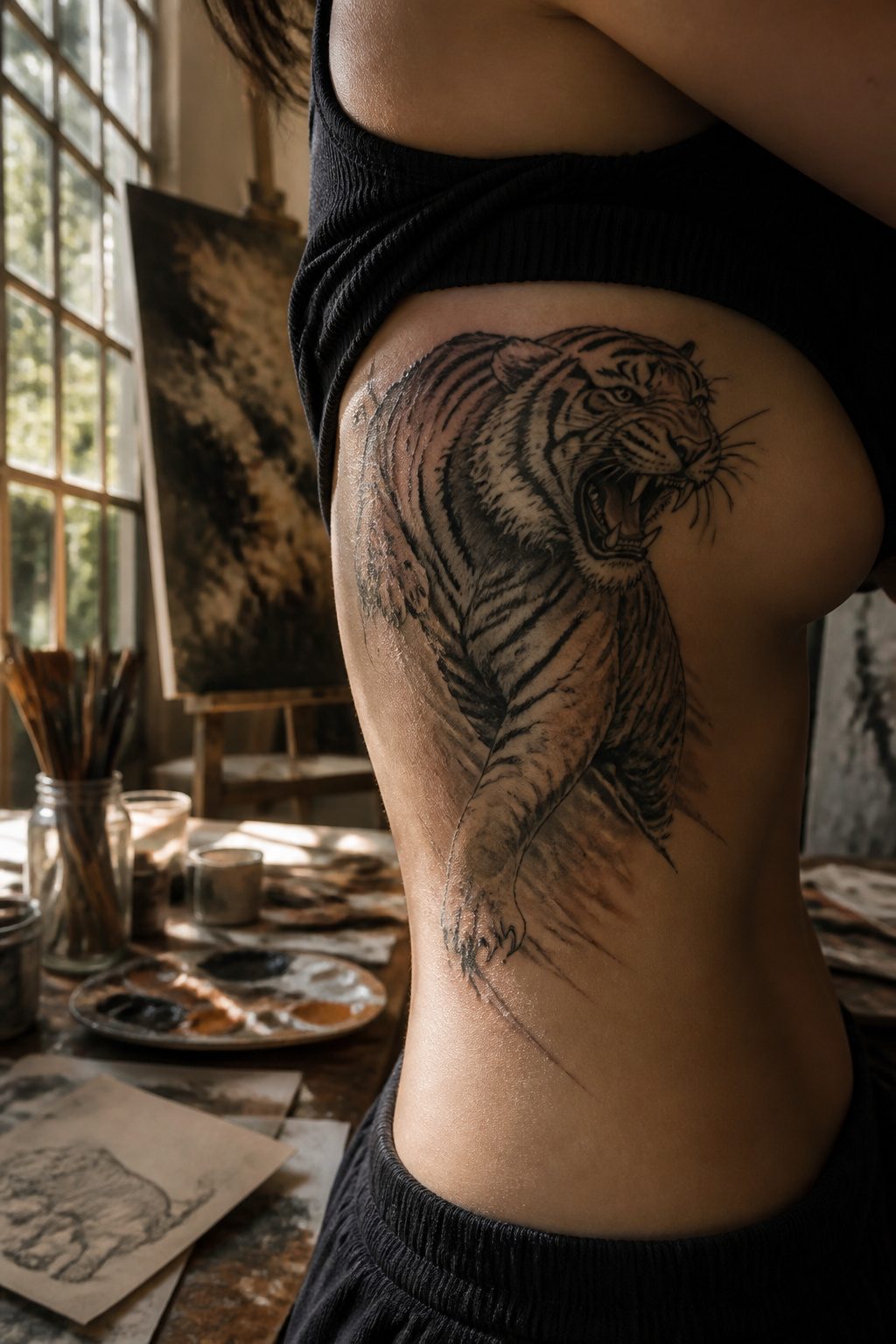
A tiger roaring mid-roar carries a jolt that softer imagery cannot touch. The face pushes forward, teeth bared, the stripe pattern breaking across muscle and bone in ways that reward a skilled hand.
What drew me to this design, paging through portfolios over the years, was how women who choose it stop apologizing for occupying space.
The symbol itself sits in odd territory. Tigers carry no automatic gender assignment in Western tattoo culture the way swallows or pin-ups once did.
That blankness is the point. A woman wears the roar and the meaning slides; some viewers read maternal ferocity, others sexual danger, others pure will.
The tattoo does not correct them. The best pieces I have seen place the head at the throat or the upper ribs, spots where the body moves with breath and the image seems to live.
Placement matters more here than with most dark feminine work. The tiger wants scale.
A small roar on a wrist reads as a sticker, not a claim.
The artists who handle this well tend toward neo-traditional or Japanese approaches, letting the black ink pool deep in the stripes while the eye catches a deliberate highlight. Without that contrast, the power flattens into decoration.
The risk is sentimentality creeping in. Add a flower crown or too much ornamental framing and the roar becomes costume.
The women who carry this piece best keep the edge raw.
18. Cat Skull Tattoo
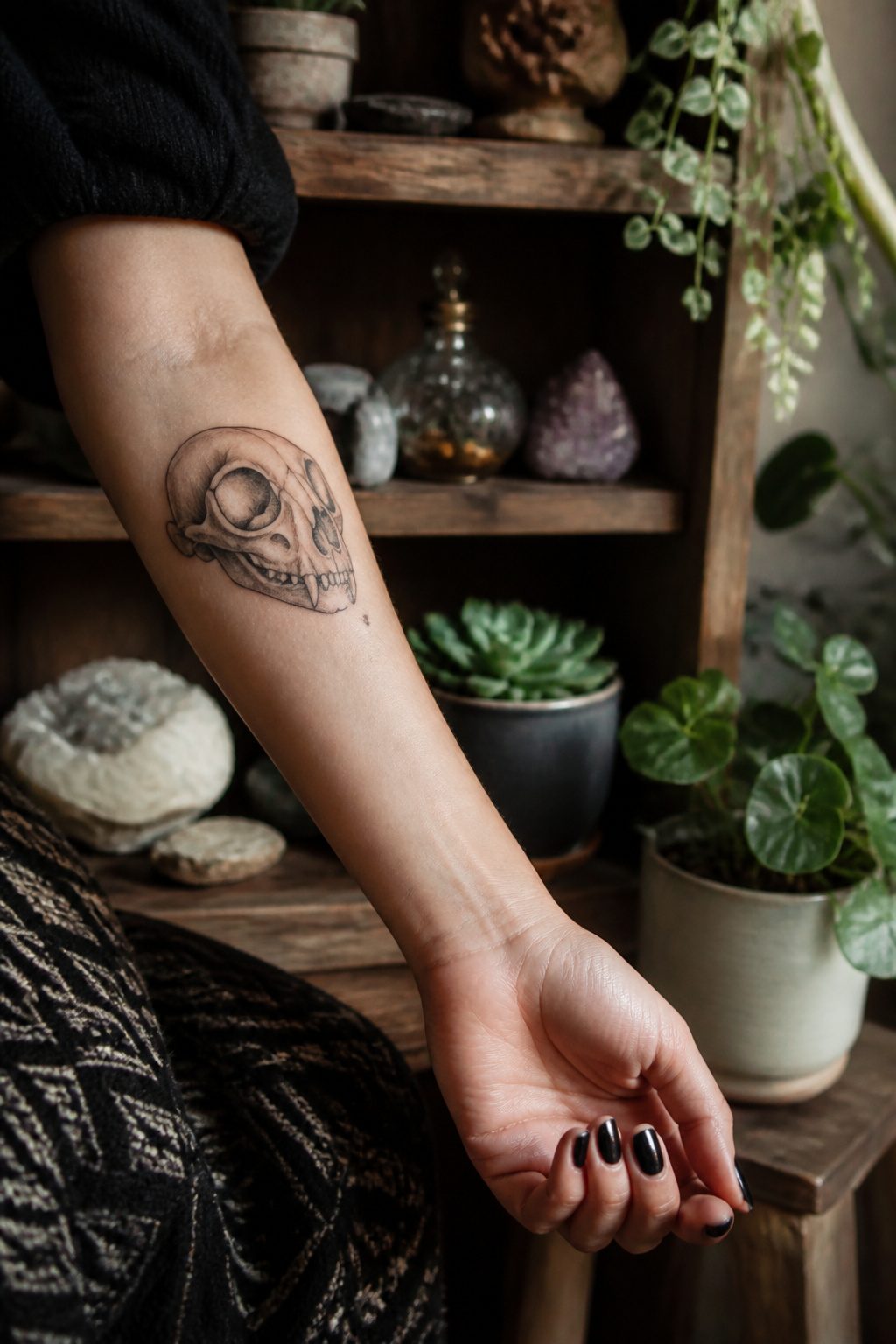
Cats carry female energy in almost every tradition worth naming, and a skull turns that energy toward what lasts.
The pairing works because it refuses to soften either side: the cat’s independence and night-eyed intuition stay intact, but the skull keeps the design from sliding into something decorative or cute. Bone structure matters here.
A clean, narrow cranium with those oversized eye sockets reads more elegant than ominous, and the jawline’s slight curve echoes the arch of a cat’s actual silhouette.
Placement on the inner forearm or along the ribs lets the shape follow the body’s own lines. Leave the eyes hollow; filling them with gemstones or flowers over-explains what the design already says.
Black ink with limited gray wash ages sharper than heavy shading, especially on smaller pieces where detail blurs over time.
The women who pull this off best treat it as a personal symbol rather than a trend piece, something earned by whatever the cat and the skull mean to them specifically.
19. Dark Portrait
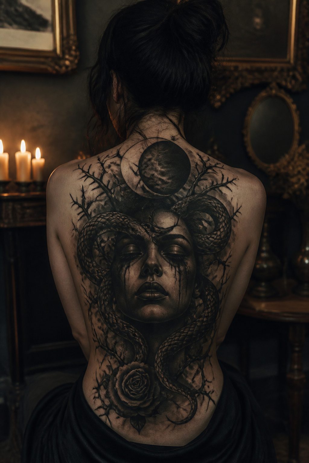
A dark feminine portrait does not ask permission. The face in the piece stares back, heavy with meaning, and the shadows do half the talking.
What separates this from a standard portrait is the willingness to distort: a neck too long, eyes that hollow out, a crown of thorns or a serpent coiled through the hair.
The figure might be Medusa, Hecate, Lilith, or Persephone, or she might be no one named at all, just a woman with the lights turned low.
The heavy shading is what makes it haunt.
Where realistic portraiture chases even skin tone and clear eyes, the dark feminine version pools ink in the hollows of the cheeks and lets the jawline dissolve into smoke or florals or nothing.
A moon overhead, a bat in the corner, a goat with tiny wings tucked behind the ear, these are the symbolic elements that turn a face into a warning. The reclaiming matters.
Historically the goat, the bat, the serpent were twisted into symbols of evil to shame anything feminine. Wearing them back feels like the defiance the whole style runs on.
20. Full Moon Mandala Tattoo
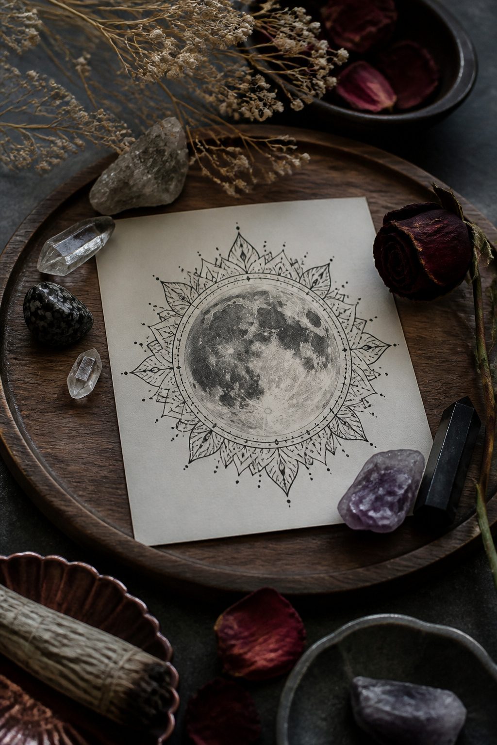
A mandala on its own reads as spiritual or decorative, something you might spot on a yoga studio wall.
Shift that geometry to a nocturnal context and the same pattern turns inward, becoming something you study rather than something that watches you.
The full moon sits at the center, often rendered in solid black or negative space, and the surrounding geometry responds to that darkness rather than fighting it.
What makes this work for a dark feminine piece is the tension between order and obscurity. Mandalas are built on repetition and balance, but moonlight fractures what it touches.
The lace-like layers that would read as delicate in daylight become shadow work under lunar context, edges dissolving into the skin around them. Placement matters more than usual here.
The back of the neck, the upper thigh, the ribcage where clothing covers and reveals by choice, these spots let the moon peek and withdraw.
Color tends to weaken the effect; the strongest versions stick to black and gray, letting the geometry create its own hierarchy without competition.
21. Crystal Ball Tattoo
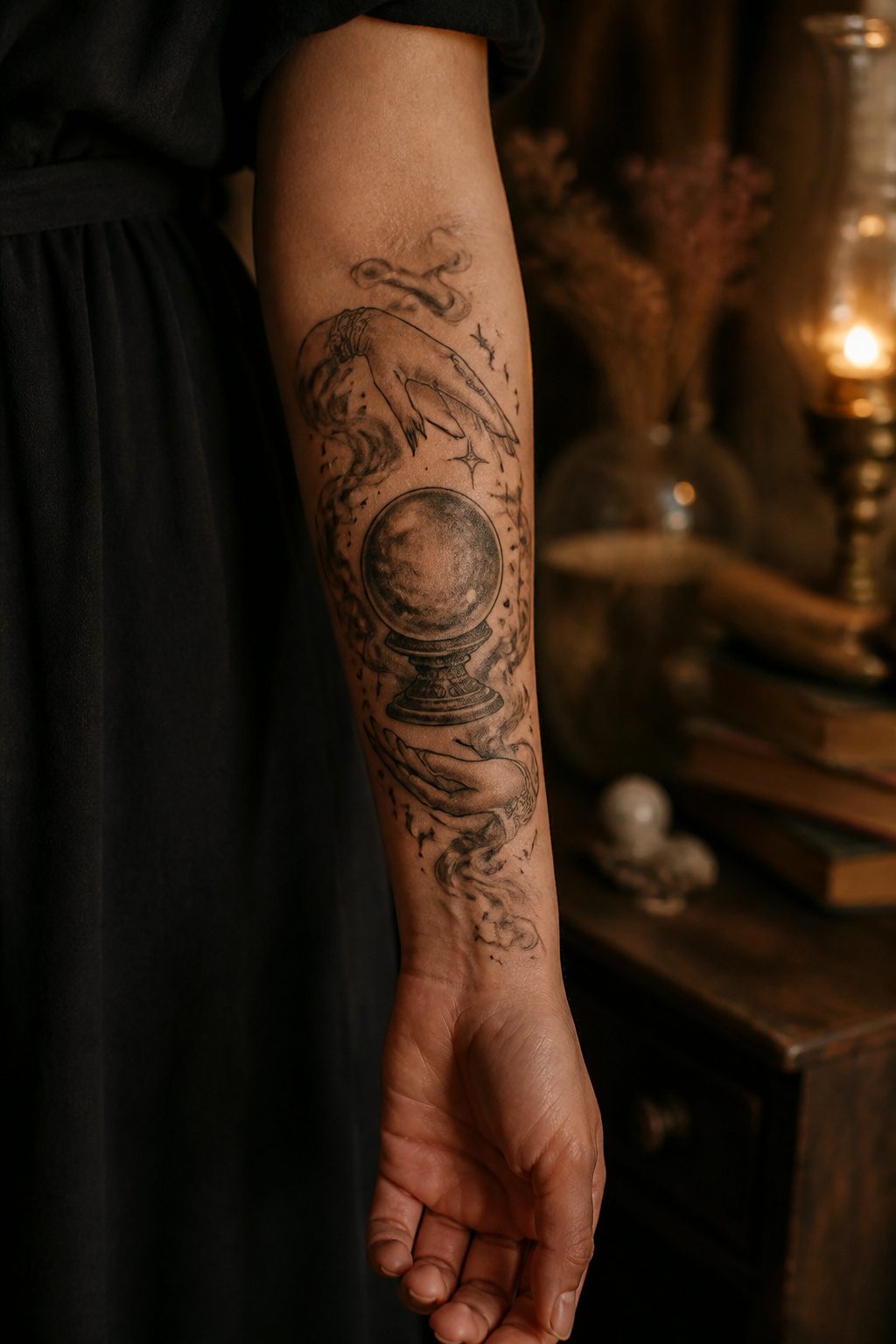
A crystal ball tattoo carries the weight of fate without making the wearer its passive subject. The glass sphere sits in the hands, but the eyes above it belong to the one doing the seeing.
That shift matters for a dark feminine piece: the woman is oracle, not object.
The imagery works best when the ball does not sit alone on the skin.
Hands around it, smoke curling from its rim, a single eye reflected in the glass, these details turn the symbol from a carnival prop into something earned.
The crystal itself should look clouded or cracked, not pristine; a clear forecast is a comfort, and dark feminine work trades in the opposite.
Placement shapes the meaning more than most motifs. On the forearm, the ball faces outward; the reader sees the seer at work.
On ribs or thigh, it turns inward, private prophecy, a reminder kept for the wearer alone. The eye contact or its absence decides whether the piece speaks of power or of burden.
Black and grey carry the mood without drifting into Halloween territory. A touch of purple or sick green in the smoke keeps it from reading as generic fortune-teller flash.
The lunar calendar numbers inside the ball, a name in reverse, a skull just visible beneath the haze: these are the specifics that separate a crystal ball from any other round object on skin.
22. Haunted Church
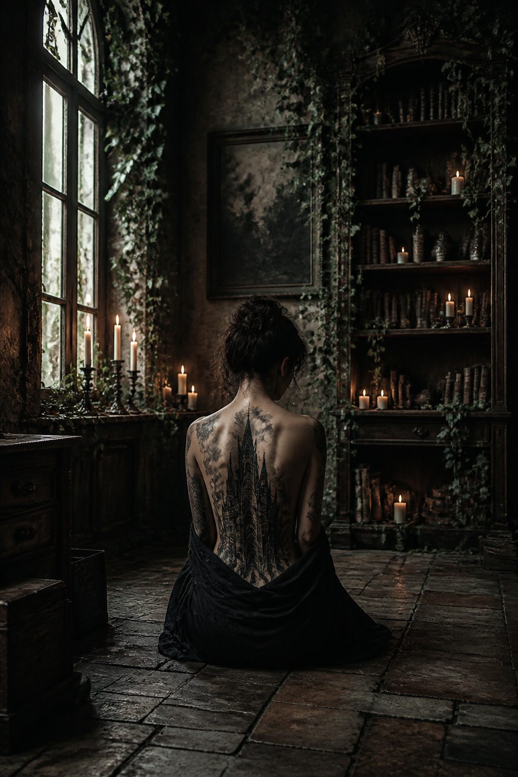
A haunted church tattoo turns the familiar silhouette of Gothic architecture into something quietly wrong.
Steeples lean at angles no stone should hold, or the façade stands intact while the windows glow with light that does not match any hour of the day.
What haunts the structure matters more than any figure placed inside it.
Some designs hollow out the steeple and leave it black, suggesting a bell that rings without a ringer.
Others show the nave in forced perspective, rows of pews leading to a door that opens onto nothing, or an altar cloth that ripples with no congregation present.
The most effective pieces let the decay stay implied: a single broken window, moss growing in the shape of a hand, or a flock of birds that all face the same empty point above the cross.
The dark feminine read comes from the collision itself. Sacred space carries expectations of sanctuary and light.
When that space withholds both, the result reads as personal mythology rather than generic spook.
A ruined abbey says one thing; a church where the candles still burn and the door still stands open says something more specific about what the wearer has learned to keep standing.
The absence of a visible ghost is what keeps the piece from reading as a horror poster. The architecture does the haunting.
That restraint also ages better; a half-seen face in a window dates itself to whatever film popularized it, but a building that breathes wrong stays unsettling on its own terms.
23. Bird With a Potion Bottle
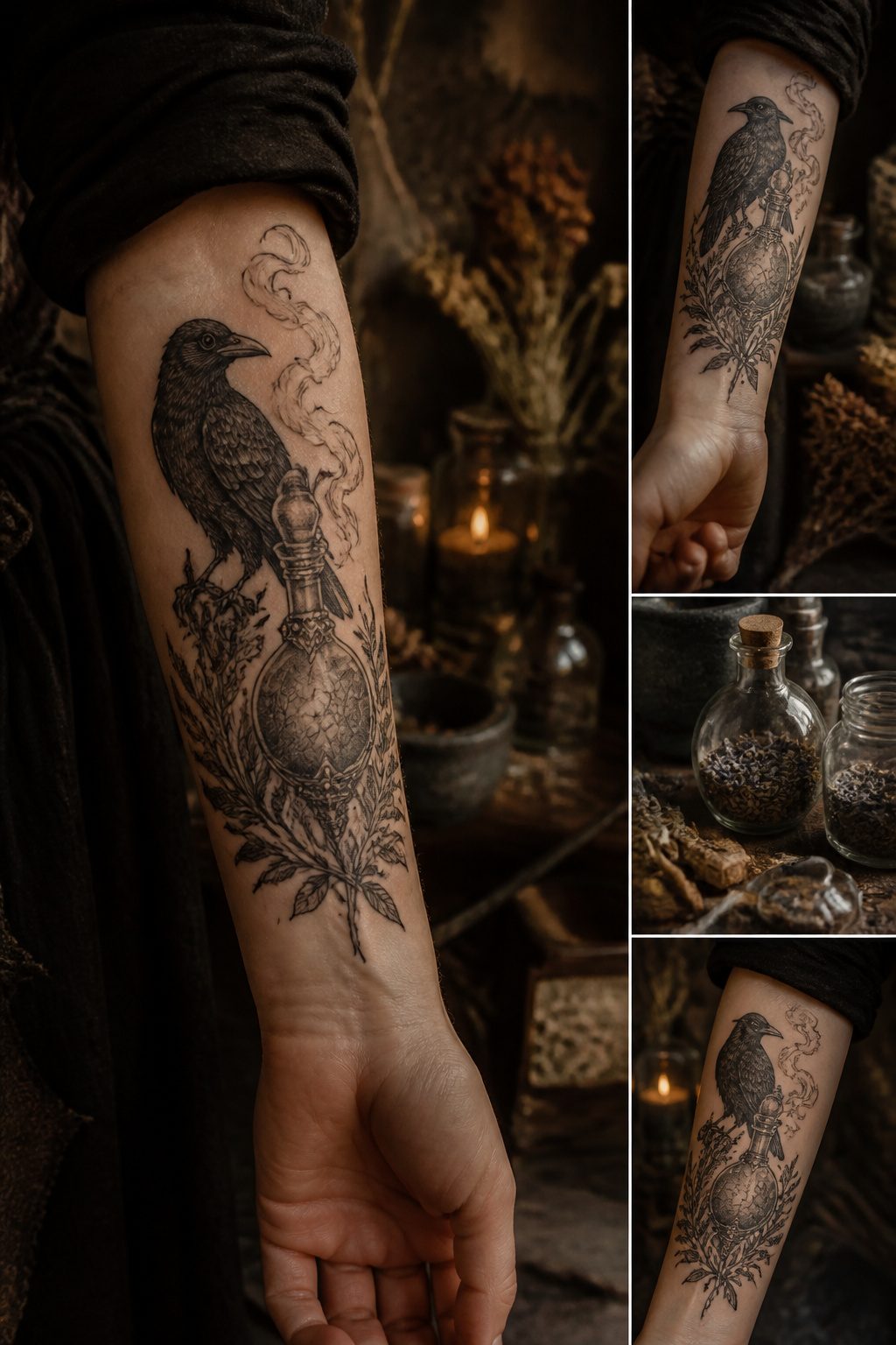
Neo traditional work gives a bird beside a potion bottle its narrative punch. The bottle holds whatever the wearer wants kept ambiguous, and the bird, usually drawn with clean lines and saturated color, carries that ambiguity on its body.
What works is the tension: beauty concealing truth or danger, not announcing it.
The pairing builds meaning through placement and detail. A raven or crow reads differently from a songbird; a corked bottle of dark liquid reads differently from one cracked open with vapor curling out.
The bird’s posture matters too, whether it guards the bottle or seems about to lift off with it.
In the Neo traditional style, the bold outlines and limited but vivid palette keep the image readable at small sizes, which matters for a design that relies on the relationship between two elements rather than either one alone.
This is one of the more flexible dark feminine tattoos for adding personal symbols.
A particular flower, a specific bottle shape, even a label with a date can turn the stock image into something that reads as private history without explaining itself to anyone else.
24. Dagger Tattoo
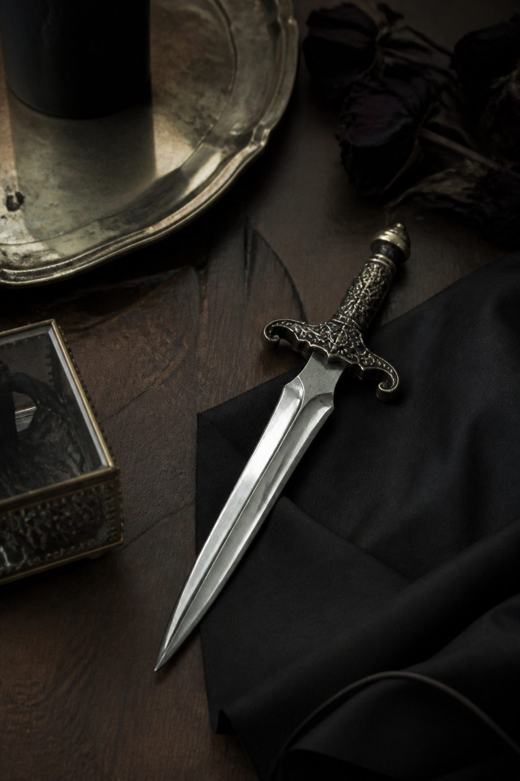
A clean dagger carries a different weight than the bloodied version. The blade itself holds the threat, not the aftermath.
That distinction matters for a piece meant to live on skin for decades.
The weapon stands alone: sharp edge, bare handle, no wound shown. Sabotage and betrayal live in the implication, not the gore.
Someone seeing it on your forearm reads the warning before they read the story. The form stays elegant, almost ornamental, which makes the menace feel more controlled.
A cursive line wrapping the hilt or a single gem set in the pommel keeps it feminine without softening the edge.
Placement changes the read. On the sternum or ribs, it sits close to bone and feels like a secret you have drawn out.
On the arm, it is outward-facing, more guard than confession. Either way, the clean blade signals intent held in reserve, violence as possibility rather than act.
That restraint is what separates this motif from its bloodied cousin.
25. Scorpio Tattoo
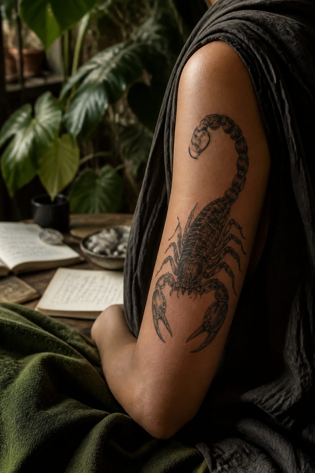
A Scorpio tattoo claims the sign’s sting as deliberate armor. The scorpion carries a reputation for toxicity, the creature that warns before it strikes and follows through when ignored.
In dark feminine work, that reputation gets flipped into something worn deliberately: a symbol that the wearer is not harmless, and that harmlessness was never the goal.
The zodiac connection matters here. Scorpio sits among the most negatively described signs in astrology: jealousy, manipulation, obsession, the capacity to wound.
A tattoo of it, especially in heavy blackwork, takes those labels and treats them as features. The wearer becomes the thing others were told to avoid.
Plenty of cultures already read the scorpion as protective, warding off bad omens.
A piece crawling up the bicep or tucked along a rib does both jobs at once: it signals danger to anyone who would test it, and it claims the survival instinct as a strength rather than a flaw.
The design works best when it keeps some of the creature’s actual ugliness, the segmented tail and heavy pincers, rather than prettifying it into something abstract. The threat should read as real.
26. Crow Tattoo
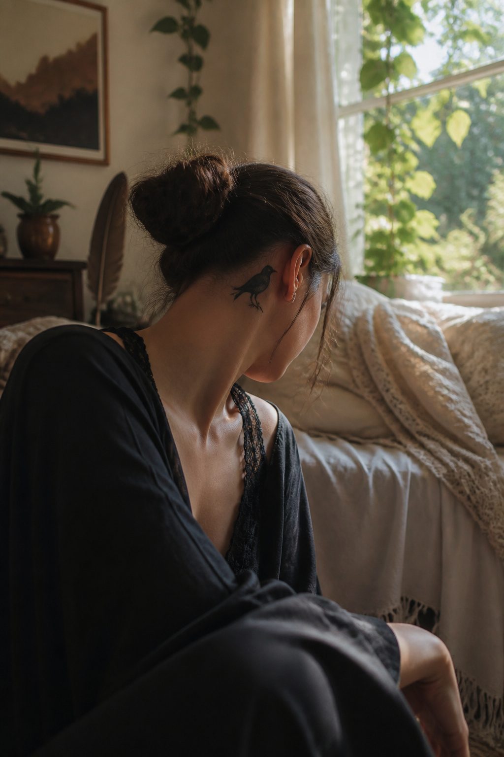
Crows carry the same funeral association as ravens, but the scale changes everything.
A raven spreads across a shoulder blade or ribs with a weight that announces itself; a crow fits quieter, behind an ear, along a collarbone, in the hollow of a wrist.
Women who want the death symbol without the theater tend toward the smaller bird. Its black reads as mystery rather than morbidity, especially at smaller scales where feather detail softens to silhouette.
Raven tattoos often pair with battle imagery or Norse reference. Crow pieces lean feminine in the line work itself, more curve to the wing, more delicacy in the beak, less bulk through the body.
Walking through reference books with clients over the years, the ones drawn to dark feminine tattoos usually pause longer at the crow.
They want recognized symbolism, but they want their own version of it, scaled to a body that moves through ordinary rooms.
Symbolism and What It Means
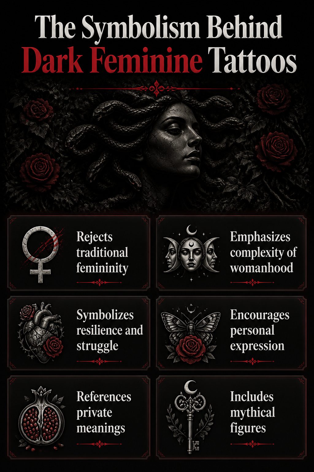
Dark feminine tattoos carry weight because they refuse the single story of what womanhood should look like.
Medusa, Hecate, Lilith, Persephone, these figures show up again and again not for shock value but because they name parts of lived experience that cleaner symbols cannot touch.
The gorgon who punishes the gaze that falls on her, the queen who rules the underworld half the year, they are not villains reframed as heroes. They are complications kept intact, and wearing them says the complication belongs.
The reclaiming happens in the choice itself. Femininity handed down as instruction, soft and accommodating and always available, gets answered with imagery that is soft and dangerous both.
Floral crowns on monsters, thorns through hearts. The juxtaposition is the point.
These tattoos mark resilience without prettifying it, struggle without turning it into inspiration porn for someone else’s feed. What the wearer survived stays hers to name or leave unnamed.
A client once sat in my chair for six hours on a Persephone piece, pomegranate seeds and all, and said almost nothing about the meaning until the second session. That is common.
The symbolism runs private by design. The tattoo speaks to those who recognize the reference and keeps its counsel from those who do not.
Motifs That Show Up Most
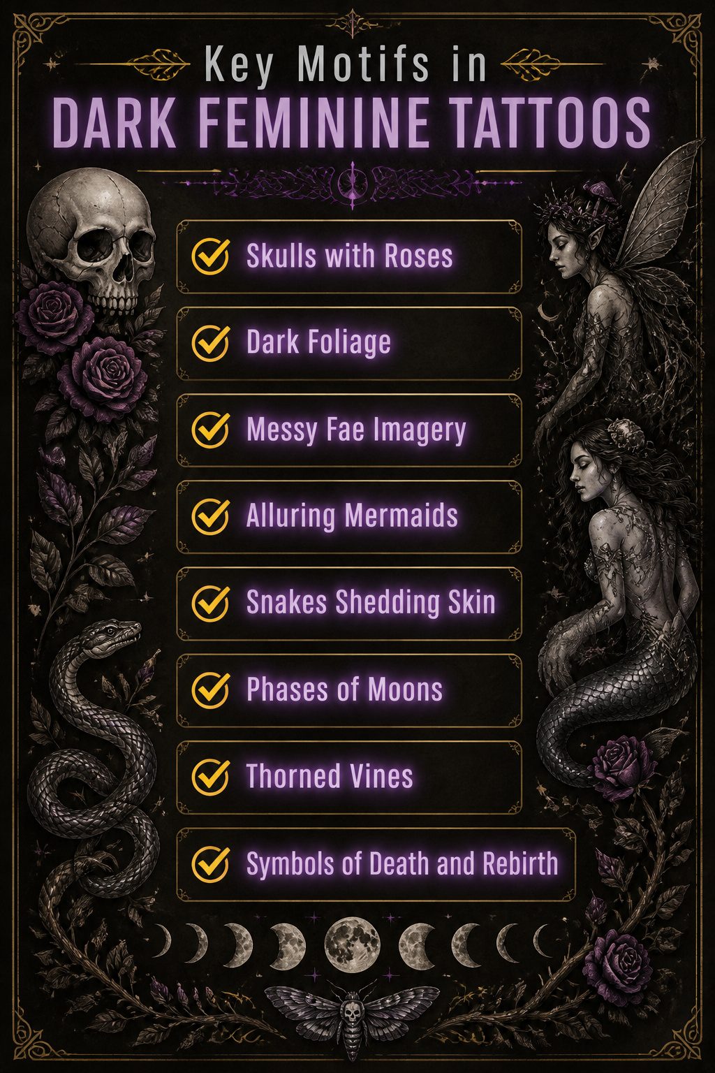
Certain images keep surfacing when you scroll through dark feminine tattoos, and they are not random.
Skulls paired with roses or dark foliage carry a conversation between death and beauty in the same piece, the bone keeping the floral lines from reading as decorative, the petals keeping the skull from reading as pure shock.
The fae show up messier and meaner than the twee fairies people confuse them with, delicate wings worked with webs, mushrooms, moons, tiny symbols that read like forest stories you hope to get lost in.
Mermaids and other mythical figures lean into the same ambiguity: feminine forms that are alluring and dangerous at once, not waiting to be rescued.
Symbols of death and rebirth, snakes shedding skin, phases of moons, thorned vines, circle back to the same throughline. These motifs do not perform femininity; they claim the parts of it that swallow sweetness whole.
Styles That Carry It
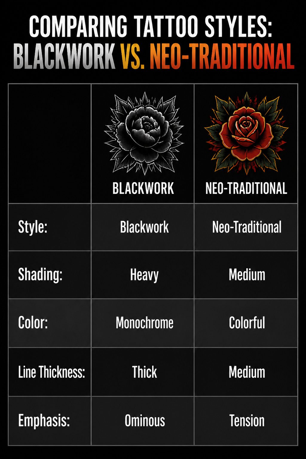
Blackwork carries most of the weight in dark feminine tattoos. The heavy shading and thick lines that run through two half-sleeves of flowers turn something traditionally soft into something bold, almost ominous.
That density of ink is what lets a piece stare back.
Neo-traditional builds on that backbone but adds the pop of color that makes a design feel like a secret wound or a memory that won’t quiet down.
A stab of red against black leaves does more than decorate; it creates tension between beauty and danger.
Illustrative style sits looser, more story-driven. It borrows from the same mood, the gods and witches and monsters wearing floral crowns, but keeps the linework lighter so the image reads like a page from a darker fairy tale.
The style you choose determines whether the tattoo whispers or confronts.
Frequently Asked Questions
What are some popular dark feminine tattoo designs?
Skulls with roses, Death tarot cards, long inner arm roses, nocturnal nature scenery, Lucifer inside a heart, large forearm moths, mysterious mermaids, Ouija boards, ghosts in hearts, spiders, bats with the word lust, married ghosts, snakes with moons, goblets holding sun and moon, bloodied daggers, scorpions with flowers, and roaring tigers all rank among the most sought-after designs for 2026.
What do dark feminine tattoos symbolize?
They symbolize the refusal to stay palatable through every phase of life, marking thresholds crossed rather than moods borrowed.
The designs claim complexity without apology: mortality accepted but not fetishized, decay reclaimed as part of the feminine cycle, destruction acknowledged as coexisting with love, and survival sharpened into something deliberate rather than performed.
How can I choose a dark feminine tattoo?
Start with which symbol already lives in your personal history rather than which image looks striking on someone else.
The article’s designs all carry active tension: skulls half-hidden in petals, moths that look worn rather than defeated, ghosts that fade unevenly to show who crossed first.
Match that tension to your own story, then let placement deepen the meaning: ribs and upper back for private vows, forearms for public declarations, inner arms for intimacy controlled moment to moment.