Earthy tattoo ideas in 2026 stretch from a single continuous line to a full back-panel landscape, and the deciding factor is how much skin you are willing to give the design. The catch is that small nature pieces fail more often than large ones; a thumbnail mountain collapses into a smudge without a foreground anchor, while the same scene at sleeve scale holds depth for decades. A two-inch butterfly behind the ear stays crisp, but only if you choose bark-brown species like the mourning cloak over brighter garden varieties.
1. Planet Earth Tattoo
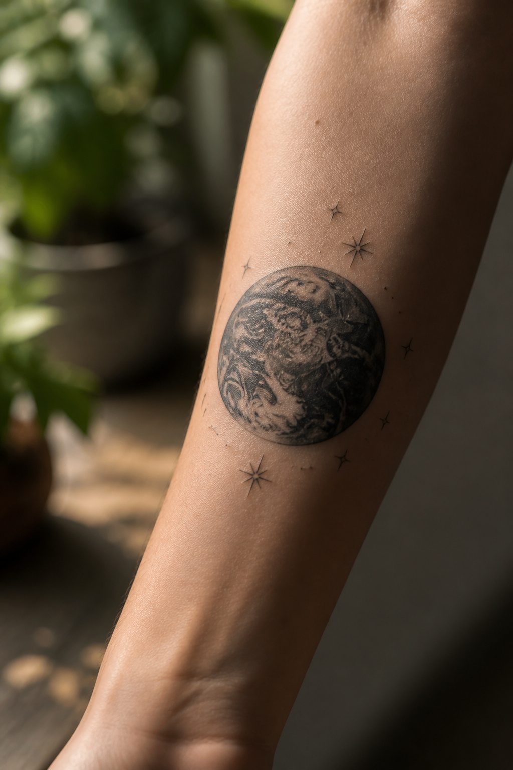
A full sphere of Earth in monochrome ink reads as a grounding symbol rather than a travel souvenir. The single-color treatment keeps the design personal; without the bright blues and greens of a classroom globe, the planet becomes a private emblem of stability and connection. Soft, dreamy accents of stars around the edges add atmosphere without sliding into tourism branding. Light and shade do the heavy lifting here, carving depth into the oceans and continents so the sphere looks like something you carry, not something you visited. Placement on the forearm or wrist reinforces that sense of rooted strength, since the design stays in your own line of sight as a daily reminder.
2. Floral Book Tattoo
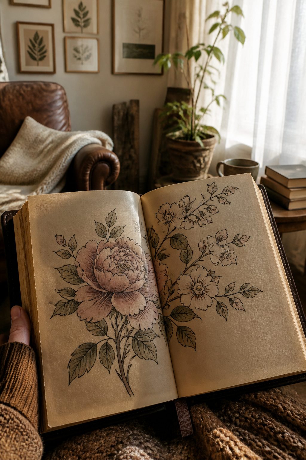
A floral book tattoo works best when the flowers look like they grew out of the pages rather than sitting on top of them. The spine and cover give you a dark, structured base; leaves and petals curling from the edges soften the geometry without fighting it. I have watched designs fail when the book is too detailed and the flowers too bright, each element shouting for attention.
Color palettes that keep it clean follow one rule: let one side carry the saturation. A deep emerald or burgundy leather binding pairs with muted sage and dusty rose blooms, or reverse it with a pale, weathered cover and one bold flower in coral or amber. Three tones total, maybe four if one is nearly neutral. More than that, and the eye has nowhere to rest.
The readers I have drawn this for usually want the book slightly open, a stem or vine trailing from the gutter as if the story itself is alive. That single narrative thread matters more than botanical accuracy. A peony that stands for something read at twenty, a dogwood for a place lived in. The earthy part is not the flower alone; it is the soil of memory the page holds.
3. Zodiac Constellation Tattoo
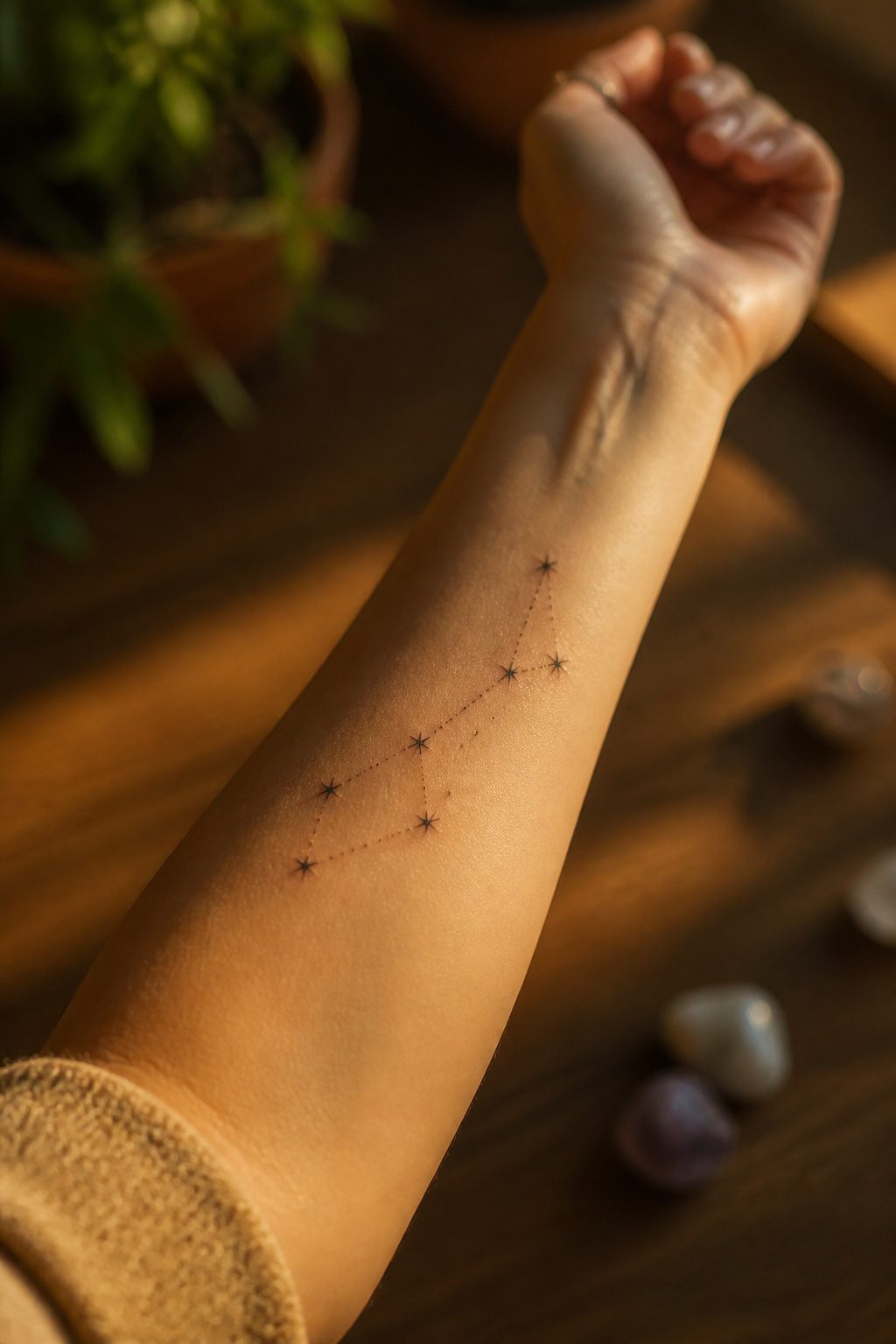
A night sky holds its own kind of earthiness for people who mark seasons by moon phases instead of bloom times. Zodiac constellation tattoos bridge that gap cleanly: a scattering of stars connected by thin lines maps your birth sign without needing a green leaf in sight. The design works because the lines stay readable even at an inch or two, which matters when you want something subtle on a wrist or behind an ear. I have seen too many nature tattoos blur after five years because the detail was packed too tight. Constellations avoid that trap. The negative space between points does the visual lifting, so the ink that is there can hold its weight long-term. Placement behind the collarbone or along the ribcage keeps the scale small while letting the line breathe. If you want grounding symbols woven in, a few dots can mark the earth’s position in the cycle, or the lines can curve to suggest an orbit rather than sitting flat. The result reads as personal and celestial at once, which is the point for anyone whose connection to nature runs nocturnal.
4. Birth Month Flower Tattoo
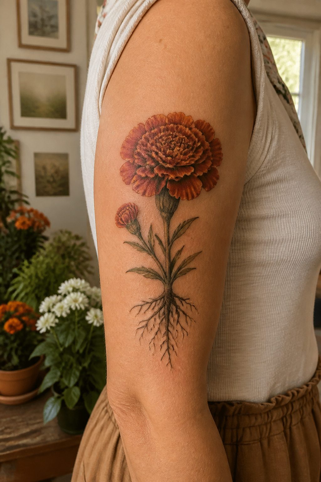
A January carnation carries a different weight than a rose picked off the wall. The birth month flower you get assigned, whether it’s a March daffodil or an October marigold, comes with its own history of meaning that you usually do not know until you look it up. That research is where the attachment forms. Someone walks in asking for a June rose because they were born in June, then learns the honeysuckle is actually their flower, and the design shifts into something they had never considered. The flower also gives you a color story that feels earned rather than chosen at random. A November chrysanthemum in deep rust or a September aster in soft purple carries the month in its pigment. The personal connection deepens because you did the work to find it, not because the artist sold you on symbolism. I have watched clients come back with second and third birth flowers after learning siblings or parents have their own. The set becomes a family timeline in bloom.
5. Wraparound Vine Tattoo
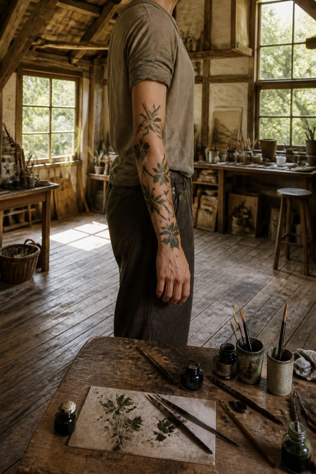
A wraparound vine tattoo uses the arm’s cylinder shape instead of fighting it. The leaves travel in a shallow spiral so the design reads from any angle without a single front-facing panel that has to stay centered.
Species matter more than most people expect. Grape ivy and Virginia creeper hold their shape when simplified, each leaf distinct enough to read at tattoo scale. Delicate vines like morning glory tend to mush together after a year or two of aging on skin.
The stopping point is what separates this from an accidental half-sleeve. Ending the vine two to three finger-widths above the wrist bone keeps it a contained piece. Carry it to the hand or run it all the way to the shoulder, and you have committed to a much larger conversation.
6. Continuous Line Tattoo
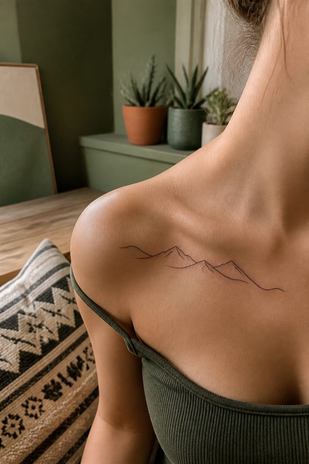
A single unbroken line forces every curve to earn its place. The artist cannot lift the needle until the shape is complete, so an earthy subject with a clear silhouette wins over one that needs internal texture. Mountains, a lone fern, or a crescent moon all read instantly at a glance; a forest scene or layered petals fall apart without crossings and shading.
The planning runs backwards from normal tattoo work. Most designs build dark tones through overlapping passes, but continuous line work demands the artist map the entire path before touching skin. One wrong junction and the eye reads a break where none exists. The stencil is less a guide than a proof, tested for flow and negative space. Skin shifts under the needle, so the line weight must stay light and consistent; heavy packing would turn a graceful arc into a wobbled trench.
Placement matters more here than with busier pieces. A forearm or collarbone gives the line room to breathe, and the viewer’s eye follows the motion naturally. Crowd it into a spot too small and the design collapses into a tangle.
7. Scenic Block Tattoo
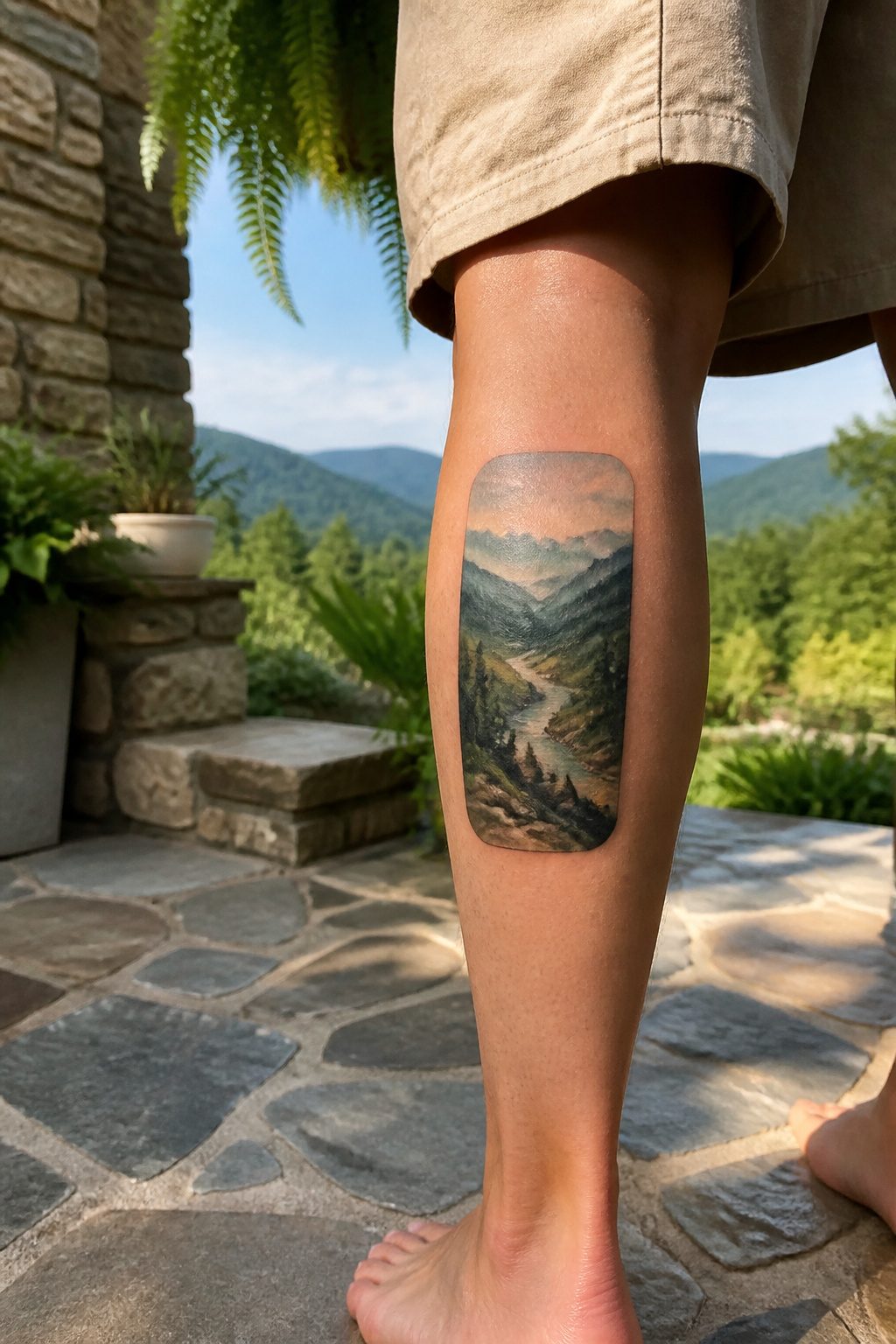
A rectangle of skin, about the size of a playing card or a little larger, can hold a view you actually stood in and still looked at years later. The block format does the heavy lifting: it creates a window effect, a deliberate frame that tells the eye this is a scene, not a symbol. Rounded corners soften the look on arms or ribs; hard corners read more modern and sit cleaner on flat planes like the thigh or the side of the calf.
The detail that holds up is middle distance. Foreground rocks or a single tree trunk, enough line weight to stay readable, then softer shading for hills or water behind. Tattoo ink spreads slightly over decades; the artists I have watched work leave the finest lines for elements that do not carry the composition. A distant ridgeline can blur and still read as distance. A foreground branch that blurs reads as a mistake.
Choosing a place you have stood in changes everything about the consultation. Photos help, but memory supplies the light: whether the sky pressed down or opened up, which slope of the valley felt steeper than it photographed. That translation, from standing there to wearing it, is where the tattoo earns its permanence. A stock sunset in a block frame is decoration. The trail you turned around on, the lake you saw at a specific hour, that is the difference between a landscape tattoo and a postcard.
8. Dainty Butterfly Tattoo
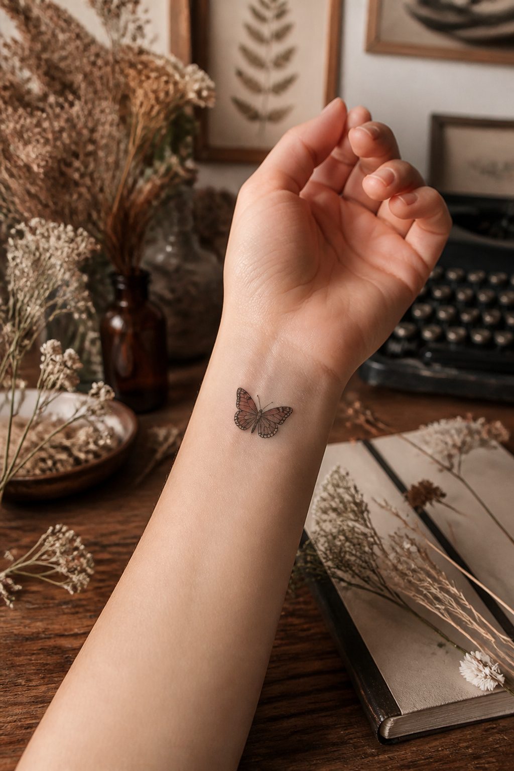
A dainty butterfly tattoo only reads as earthy when the species is right. Monarchs and swallowtails carry too much garden-party color; a mourning cloak or a comma butterfly, with their bark-brown wings and jagged edges, look like something you found pressed between the pages of a field journal. The small scale is what keeps it from tipping into decorative: at two inches or less, the linework stays single-needle fine, and the antennae become hair-thin suggestions rather than cartoon curves.
Placement matters more here than with bolder designs. The collarbone, the inside of a wrist, or the space just behind the ear let the piece peek out without announcing itself. I have watched these age poorly on fingers and feet; the detail blurs, and a butterfly that was once identifiable becomes a smudge with wing-shaped rumors. The ribs or the shoulder blade give it shelter from sun and friction, which is where most people who come in asking for something "natural, not pretty" end up settling.
9. Realistic Flower Tattoo
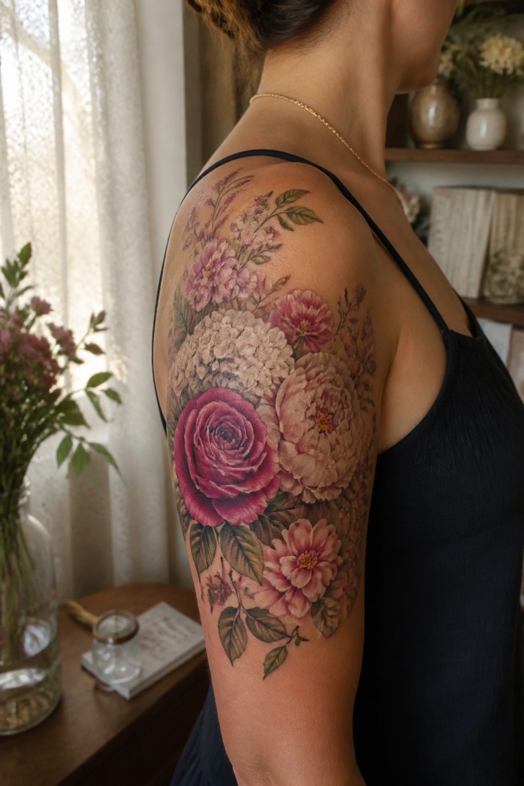
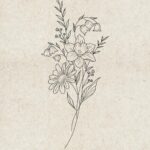
Realistic flower work sits at the opposite end of the spectrum from the stylized florals that dominated the last decade. A stylized piece simplifies petals into clean shapes and flat color; a realistic bouquet chases the way light actually passes through a rose’s skin-thin layers and pools in the hollow of a peony’s center. The gap between them is the difference between a graphic icon and something that fools your eye into checking for pollen.
Color saturation on skin taught me patience early. Paper holds pigment at full volume; skin drinks it down and settles into something quieter. What reads as a screaming magenta in the tube becomes a softer, dustier note once it heals. The artists who do this well build color in layers, expecting that drop, and plan the healed result rather than the fresh one. A realistic bouquet gives them room to manipulate that saturation across multiple blooms, letting some flowers sit forward in full chroma while others push back in muted recede.
The real advantage of a bouquet over a single stem is the permission to mix meaning without clutter. You can anchor the piece with a birth flower, add something that bloomed at a wedding or funeral, and still leave room for filler greenery that exists only because the shape needed it. Each bloom carries its own weight, and the eye reads the collection as one living thing rather than a list of symbols.
10. Abstract Earthy Tattoo
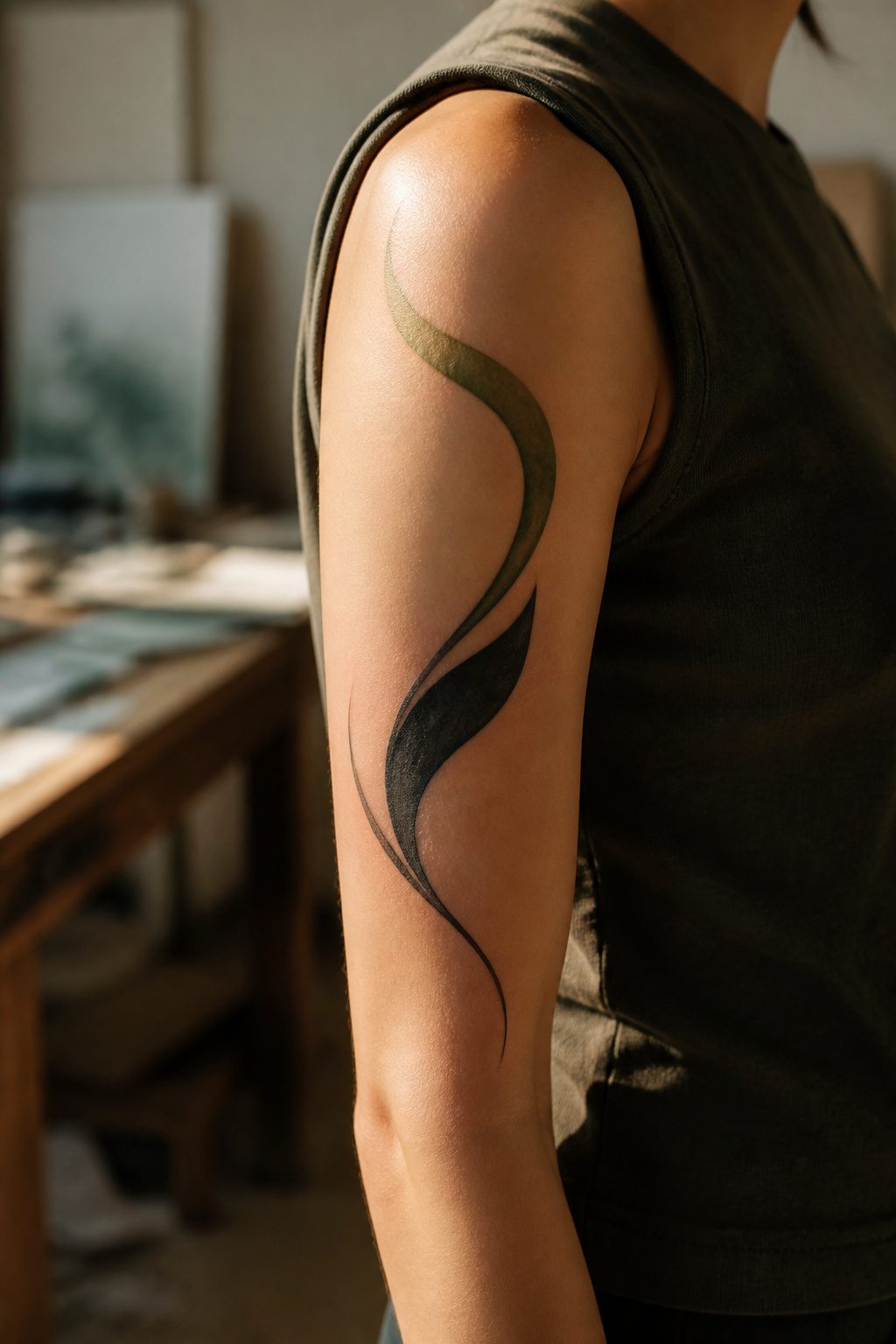
Abstract shapes carry more gravity than people expect. A curved line weighted green-black at one end reads as earth and root before the eye names it, because the color temperature shifts like soil drying in sun. The risk is the same curve without that weighting, which scans as mere geometry.
The right artist reads your mood, not a reference photo. I have watched this go wrong when a client asks for "something like a wave" and the tattooist draws a wave. The better approach is describing the feeling of standing ankle-deep in cold water at dawn; the abstraction arrives from that, not from the object. Water becomes negative space, shoreline becomes a single jagged interruption.
Placement matters more with abstract earthy work than with literal images. A flower reads as a flower anywhere. A blurred ocher block needs the movement of a shoulder or ribs to suggest weather or erosion. Static skin flattens it.
The artists who handle this well usually have a painting background, not only flash books. Their portfolios show color fields and fading edges, not line precision. Ask to see healed work from two years back; abstraction ages into either soft atmosphere or muddy confusion, and you want evidence of which this hand produces.
11. Whimsical Elephant Tattoo
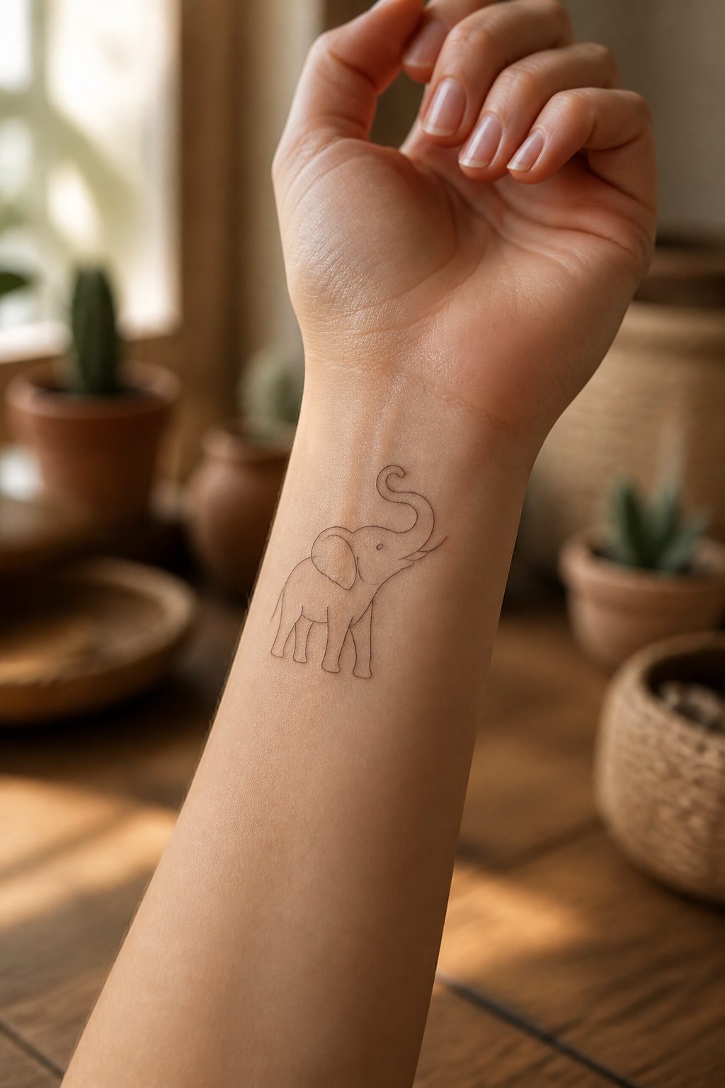
A single continuous line forming an elephant carries weight without heaviness. The animal itself grounds the design: elephants move slowly, work the soil with their feet, and shape the land they walk on, so the association with earth feels earned rather than forced. The minimal treatment keeps that symbolism from turning ponderous. A thin unbroken line leaves the eye room to breathe; there is no shading to darken the mood, no secondary imagery to crowd the message.
Trunk position changes the read more than most people expect. Curled upward, the same drawing feels alert, almost playful, a different energy than the trunk hanging relaxed toward the ground. One reads as luck or greeting; the other reads as calm, settled presence. The line quality stays identical, so the choice is pure posture, no extra ink required. For placement, the forearm or wrist let the small scale read as intentional rather than cramped, and the single-line technique ages cleanly even as skin texture shifts over the years.
12. Graphic Print Tattoo
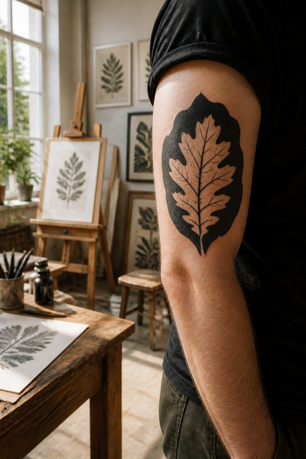
Graphic prints borrow from poster art’s flat color fields and deliberate negative space, then marry that to a bolder illustration style. The hybrid works best with earthy subjects because a mountain range or oak leaf gains immediate presence when the background drops to solid black and the foreground stays clean line work. I have seen this treatment fail when an artist mixes a hairline detail in one corner with a three-weight outline on the same branch; the eye reads it as two different tattoos. Keep line weight consistent within each plane, fat for the silhouette, uniform for interior texture, so the graphic read holds from across the room.
13. Floral Band Tattoo
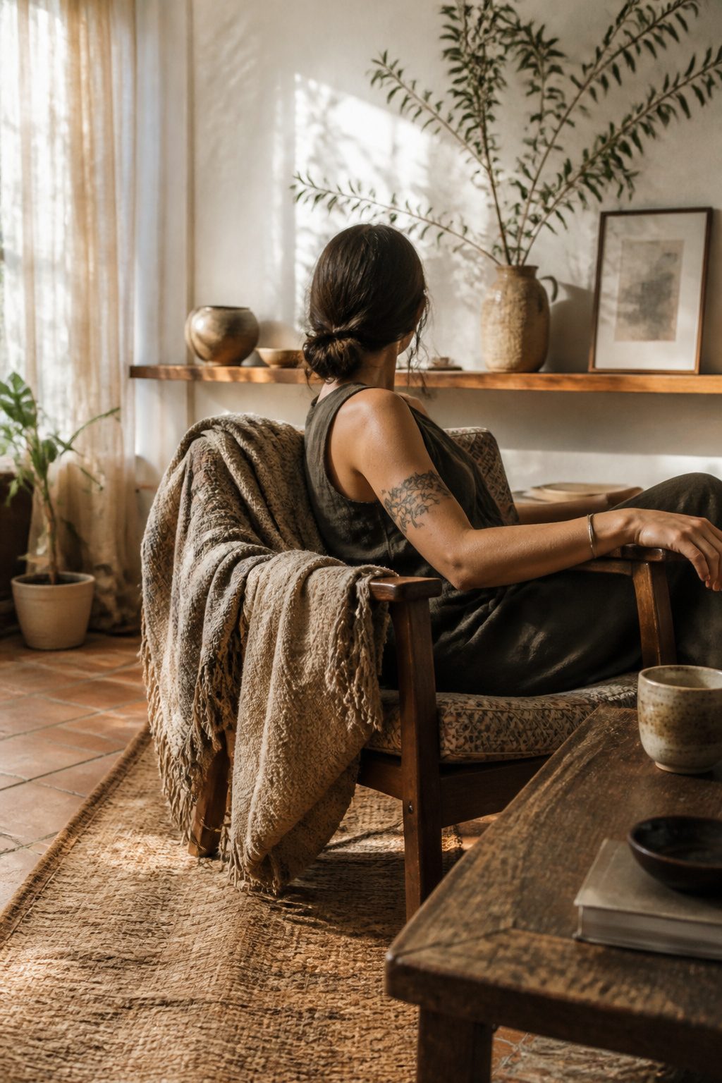
A floral band tattoo sits flat against the skin rather than wrapping like a vine, which changes how it reads from every angle. I learned this distinction the hard way after watching a client request a vine wrap and then realize she wanted something that looked like a cuff, not a spiral.
Width matters more than most people expect. Too narrow and the botanical details blur together within a few years; too wide and the band competes with actual bracelets or watches. Most placements that work, the wrist or upper arm, carry weight better at two to three inches across. The flat orientation lets the design read as intentional jewelry rather than a climbing plant that stopped short.
Some women stack the band with thin gold chains, letting the ink peek through as a permanent underlayer. Others treat it as the single piece they never remove, skipping metal entirely for travel or work with dress codes. The botanical shapes soften the geometry that a plain black band would impose; leaves and small blossoms break the edge so it looks grown, not stamped.
Placement above the wrist bone preserves more detail over time than the underside where skin flexes constantly. That is the trade most clients miss when they choose the spot for visibility rather than longevity.
14. Earthy Tree of Life Tattoo
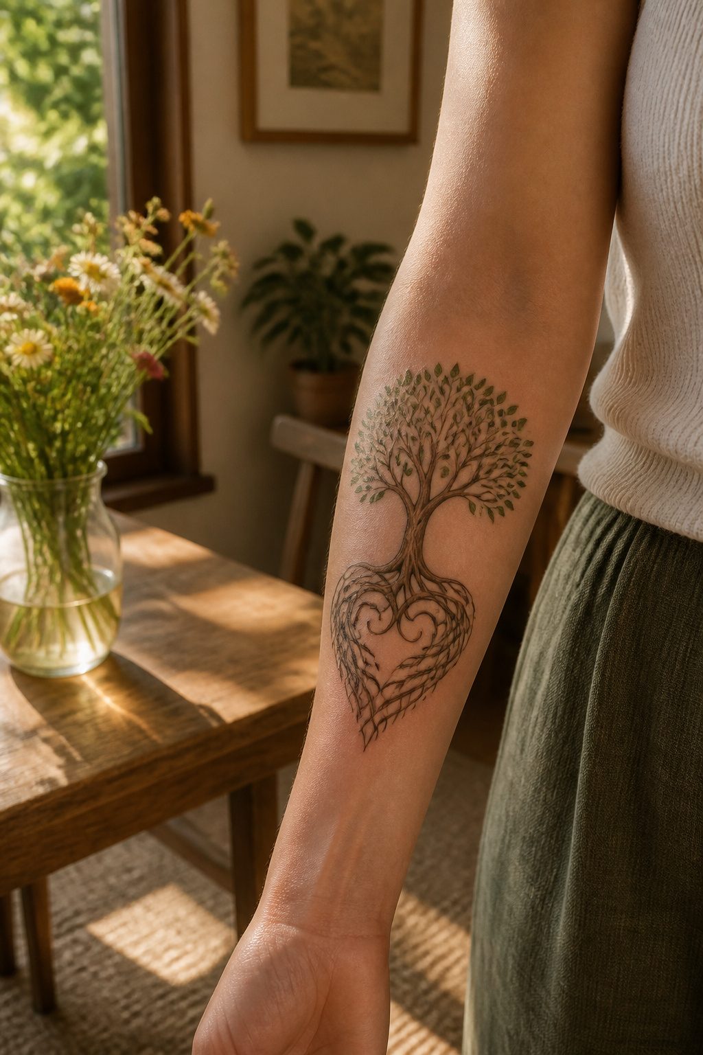
A tree of life in earthy greens and browns with roots shaped like one big heart reads differently than the same symbol in neon or watercolor. The palette matters because it anchors the design in soil and bark rather than fantasy. I have watched clients settle on ochre, sienna, and deep olive specifically so the piece looks like it grew rather than was applied.
The symbol carries weight across cultures. Ancient Greeks and Romans personified Earth as Gaia or Terra, representing fertility and life. Native American traditions revere the Earth as a sacred entity central to spiritual practice. A tree of life tattoo draws on that shared lineage without belonging to any single tradition, which is part of why it works for so many wearers.
Root and branch balance is the detail that separates a meaningful piece from mere decoration. Roots shaped like tiny hands or one unified heart change the message: they turn the design toward grounding, stability, and staying connected to your own heritage. The branch spread above ground matters less than what happens below it. Someone who chooses symmetrical weight between the two is usually making a statement about being rooted while still growing, not one or the other. I have seen that balance shift depending on placement; a forearm or wrist placement keeps the roots visible to the wearer, while a back piece lets the branches expand outward.
15. Nature Scene Tattoo
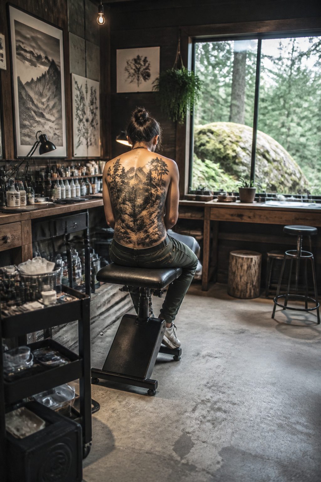
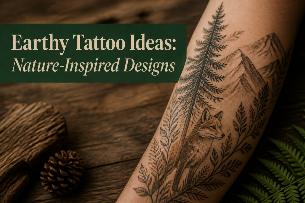
A nature scene with trees and mountains lives or dies on how the artist handles flat skin pretending to be deep space. The trick is stacking three planes: something close in the foreground, the middle ground doing the narrative work, and the background fading out. Without that front anchor, usually a fallen log, a boulder, or the base of a tree trunk catching light, the eye has nowhere to land and the whole image reads as wallpaper.
Skin makes this harder than canvas. A mountain ridge ten inches across your shoulder has to suggest miles of distance through line weight and saturation alone. Dark, crisp edges up front; softer, grey-wash silhouettes behind. The gap between them is where the composition breathes.
This is why the style rarely stays small. A thumbnail-sized mountain range loses the foreground entirely, and without that anchor the depth collapses into a smudge. The collectors who come back for these pieces usually start with a sleeve or a back panel in mind, not an afterthought. The scale isn’t showing off; it’s structural.
What Earthy Tattoos Mean
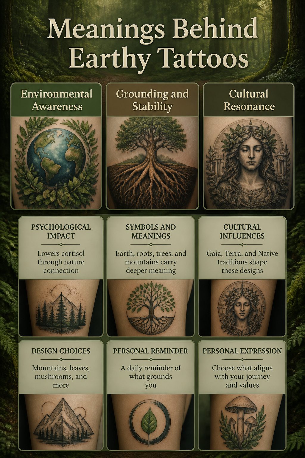
An earthy tattoo’s meaning shifts with the design you settle on. A planet Earth motif usually signals environmental awareness and a commitment to sustainability, while roots or soil imagery lean harder into grounding and stability, the sense of belonging that tattoosai.com notes as central to this category. Tree of life designs with exposed roots, done in greens and browns, carry that same grounding symbolism but add fertility and growth through the living branches above.
The grounding angle connects to something real in psychology. Research on nature exposure, the kind that gets cited in wellness circles without needing a source named here, shows that contact with natural elements measurably lowers cortisol. A tattoo that marks that preference on your skin operates as a personal reminder of the effect, not as the effect itself.
Culturally, the symbols run deeper. Ancient Greek and Roman earth deities, Gaia and Terra, tied the planet to fertility and life, a thread that still surfaces in modern designs. Native American traditions placed Earth as sacred and central to spiritual practice, a resonance that makes these tattoos about respect as much as aesthetics.
The specific design changes what you are claiming. A geometric mountain reads as stability and exploration both. A single leaf or mushroom is quieter, more about personal harmony than outward statement. Choose based on which of those you want permanent.
Where to Place Them
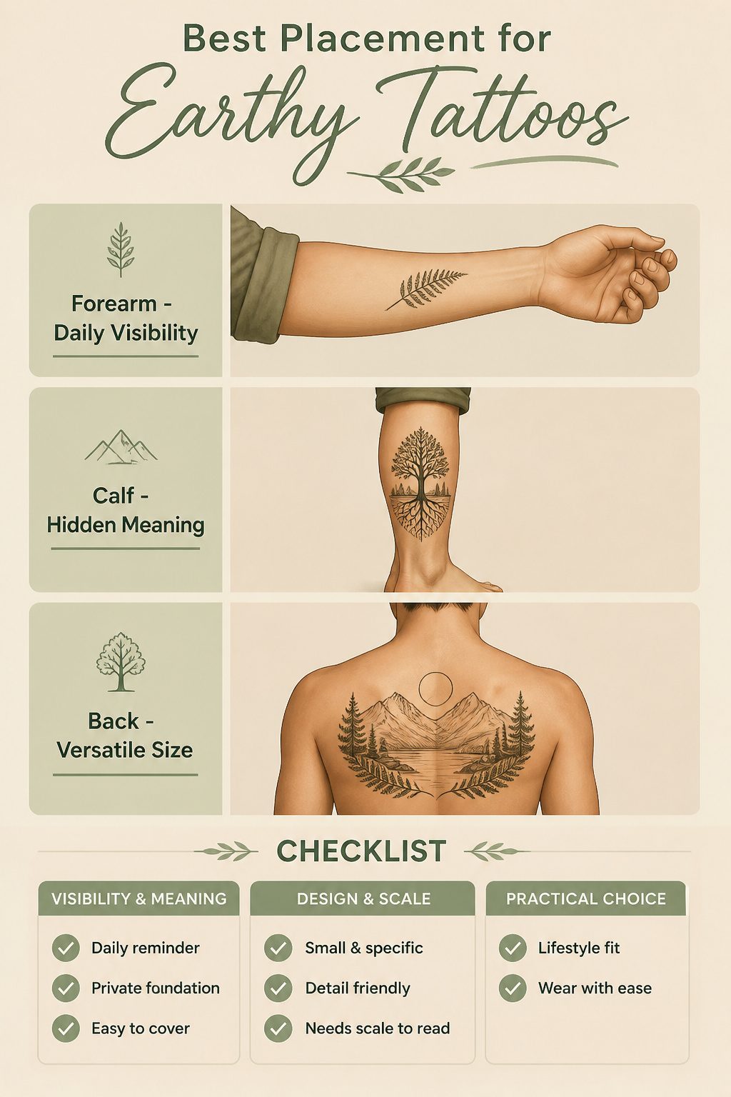
The forearm and wrist are where most people land for an earthy tattoo, and the reason is practical. These spots stay visible through a normal day, so the design registers as a small reminder every time you reach for a coffee cup or type. That daily visibility can feel like grounding, which is the whole point of an earth-themed piece. The calf works differently. It hides under pants most of the year and only shows in shorts or at the beach, so the meaning stays private, almost like a foundation you know is there rather than a statement you make. The back splits the difference. Large enough for a full tree or landscape, but easy to cover for work and reveal when you choose.
A wrist placement works best for something small and specific, a single fern frond or a tiny planet, because the space forces restraint. The forearm gives more room for detail without committing to a full sleeve. Calf and back pieces suit designs that need scale to read properly, roots spreading or a horizon line that needs width to feel balanced.
Styles That Work
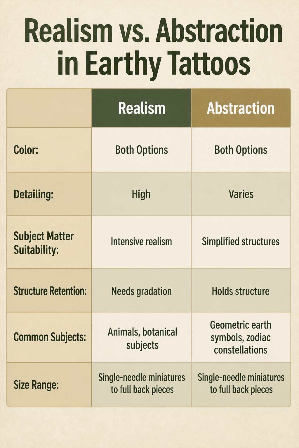
Realism and abstraction split the field about evenly, and either path can carry color or stay strictly black and grey. A dense pine forest rendered in fine-line greywash reads as a completely different statement from the same forest flattened into blocks of moss green and bark brown. The subject matter usually decides which treatment holds up. Geometric earth symbols and zodiac constellations tend to keep their structure better as linework or flat color, while animals and botanical subjects often need gradation to read as living forms.
What changed in the last decade is who is asking for what. Earth tattoos were once coded feminine in most shops, floral bands and dainty vines making up the bulk of the requests. The shift came as men started booking the same subjects, just scaled larger and placed differently. A tree of life on a forearm rather than an ankle, a bear paw print rendered at palm size across a shoulder. Artists responded by building portfolios that show the same motifs across scales and placements, not assuming a gendered default before the client speaks. The result is that earthy tattoo ideas now range from single-needle miniatures to full back pieces without the design itself signaling who it is for.
Frequently Asked Questions
What are nature-inspired tattoos?
Nature-inspired tattoos cover landscapes, animals, flowers, and other elements drawn from the natural world. They can be small and subtle or large and detailed, and they work in both black ink and color. The article lists specific styles including planet Earth designs, floral books, zodiac constellations, birth month flowers, wraparound vines, continuous line work, scenic blocks, and nature scenes with trees and mountains.
What do earthy tattoos symbolize?
Earthy tattoos symbolize grounding, stability, and a deep connection to nature and the planet. A planet Earth motif signals environmental awareness and sustainability, while roots or soil imagery lean harder into belonging and staying connected to your own heritage. Tree of life designs add fertility and growth through living branches. The specific symbol changes the meaning: a geometric mountain reads as stability plus exploration, while a single leaf or mushroom stays quieter, more about personal harmony.
Where should I place an earthy tattoo?
The forearm and wrist are the most common placements because they stay visible during daily routines, so the design registers as a small reminder when you reach or type. The wrist works best for small, specific images like a single fern frond or tiny planet. The forearm gives more room for detail without committing to a full sleeve. The calf keeps the meaning private, hidden under pants most of the year. The back suits large designs like full trees or landscapes that need scale to read properly, and it is easy to cover for work.