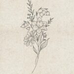
A full sleeve from shoulder to wrist wins if you already know the story you want told in one continuous piece, but start with a half sleeve if your vision still shifts week to week.
The gap at the inner elbow, visible only when you bend your arm, is the detail that separates sleeves you still admire years later from the ones you’d change; I watched that exact flaw on strangers for months before sitting in the chair myself.
1. Full Sleeve Tattoos
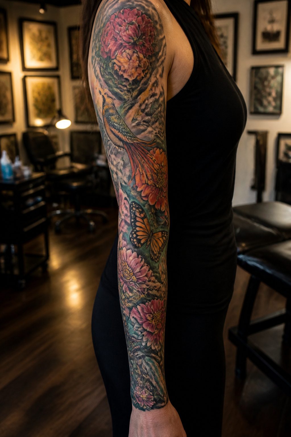
A full sleeve stretches from shoulder to wrist, which means every inch of skin becomes part of the composition.
Flowers, animals, or abstract shapes have room to develop across the whole canvas, turning separate ideas into one continuous piece that reads as a story rather than scattered images.
The commitment is real. Sessions add up, and the skin needs healing time between each one, so a full sleeve can take a year or more to finish.
Someone with a clear vision and patience for the process gets the best result. If the idea still shifts week to week, starting with a half sleeve or a single forearm piece leaves room to build outward later.
I have watched too many people lock in a full design they half-loved, then struggle to rework it once the outline was down.
The artists who do sleeves well usually specialize in large work. Their books show finished sleeves from start to end, not just close-ups of detail shots.
Checking for that full-progress documentation matters more than any studio’s star rating.
2. Half Sleeve Tattoos
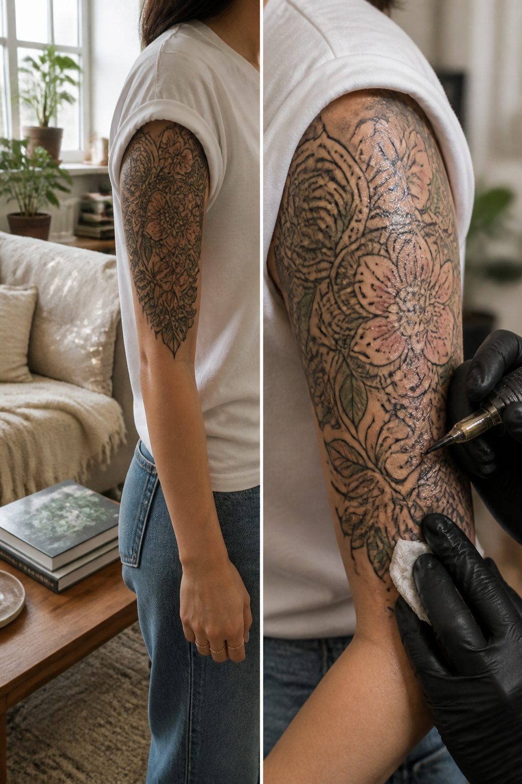
A half-sleeve tattoo covers the upper arm from shoulder to elbow, stopping where a short sleeve would end.
That placement became the sweet spot between showing it off and covering it up, which is exactly why the style took off when tattoo culture grew in the late 20th and early 21st centuries.
You get the canvas for intricate work without committing to a full sleeve.
The half-sleeve evolved from earlier traditions where women used tattoos for rites of passage, protection, or identity in various cultures.
Modern versions flipped that into personal expression and empowerment, with the visibility letting you enjoy the art yourself while choosing when others see it.
This size suits someone who wants bold, detailed work but needs professional flexibility or isn’t ready for the time and cost of a full sleeve.
Skip it if you know you want complete arm coverage eventually; building around an existing half-sleeve limits how cohesive a full sleeve can look.
Go smaller instead if your job or temperament makes any visible tattoo a stressor, because the upper arm is still exposed in plenty of clothing.
3. Floral Designs
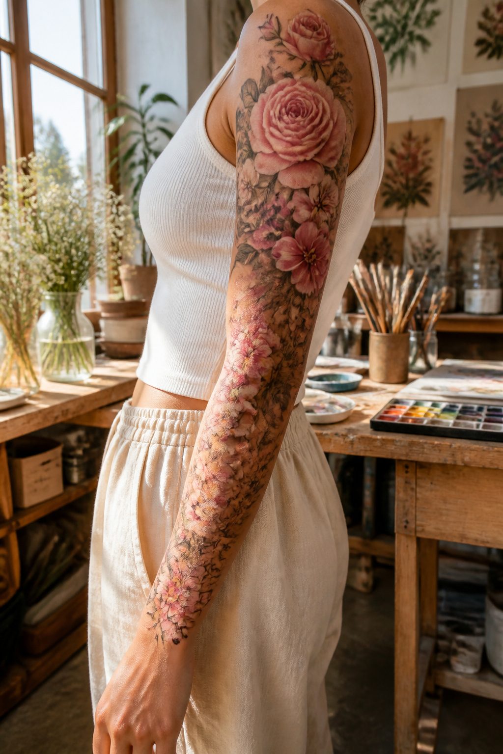
Floral designs occupy the softest real estate on an arm sleeve, wrapping the muscle line rather than fighting it.
Roses, peonies, and cherry blossoms each read differently across the full length: roses carry weight near the shoulder, peonies open well on the forearm where skin moves more, and cherry blossoms risk looking like wallpaper if they repeat without scale change.
I have seen sleeves where the artist varied bloom size from 3 inches at the top to under an inch near the wrist, and the result held depth; same flower, same color range, but the progression saved it from looking like a decal.
Meaning sits deeper than most clients expect. Lotus works for someone who wants the growth narrative without the garden-club aesthetic.
Magnolia, less common, reads as Southern without being Confederate if the color stays muted. The overdone threshold arrives when every bloom faces forward, full-on, like pressed flowers.
Angle some, let others be buds or spent petals, and the sleeve starts to look lived-in rather than applied.
4. Animal Motifs
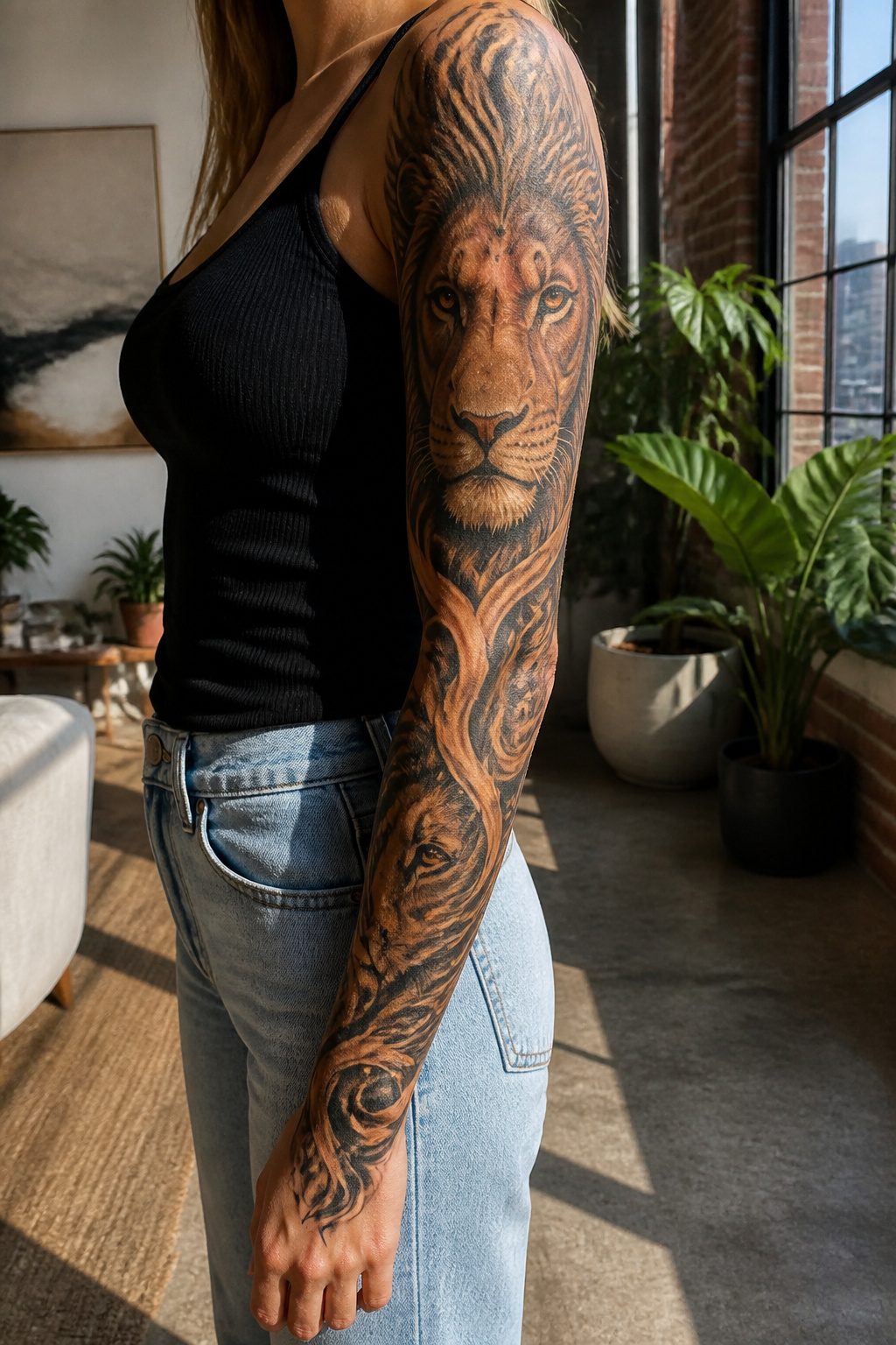
A lion’s intense gaze and flame-like mane carry across a full arm with the kind of presence smaller pieces never quite manage.
The animal reads as strength from a distance, and that matters on a sleeve where the viewer sees it in motion, not posed for a photograph.
Some animals collapse under that scale. Butterflies scattered up the arm, once a staple, now feel like the temporary transfers of the early 2000s.
Wolves howling at a moon that isn’t there belong to a different era of tattooing entirely. The rule I follow is this: if the animal’s posture needs a story to make sense, the sleeve has failed.
Birds in flight translate well because the arm’s length becomes the path of movement. Owls work for the same reason lions do; the face carries the weight, not the background.
Snakes coil naturally around the cylindrical shape, though the 1990s tribal python wrapped through barbed wire is exactly the dated look to avoid.
What separates the current approach from older sleeve work is restraint in the surrounding filler.
A single animal rendered at scale, with skin showing between the mane or feathers and the next element, holds up better than the crowded menageries that once passed for storytelling.
5. Geometric Designs
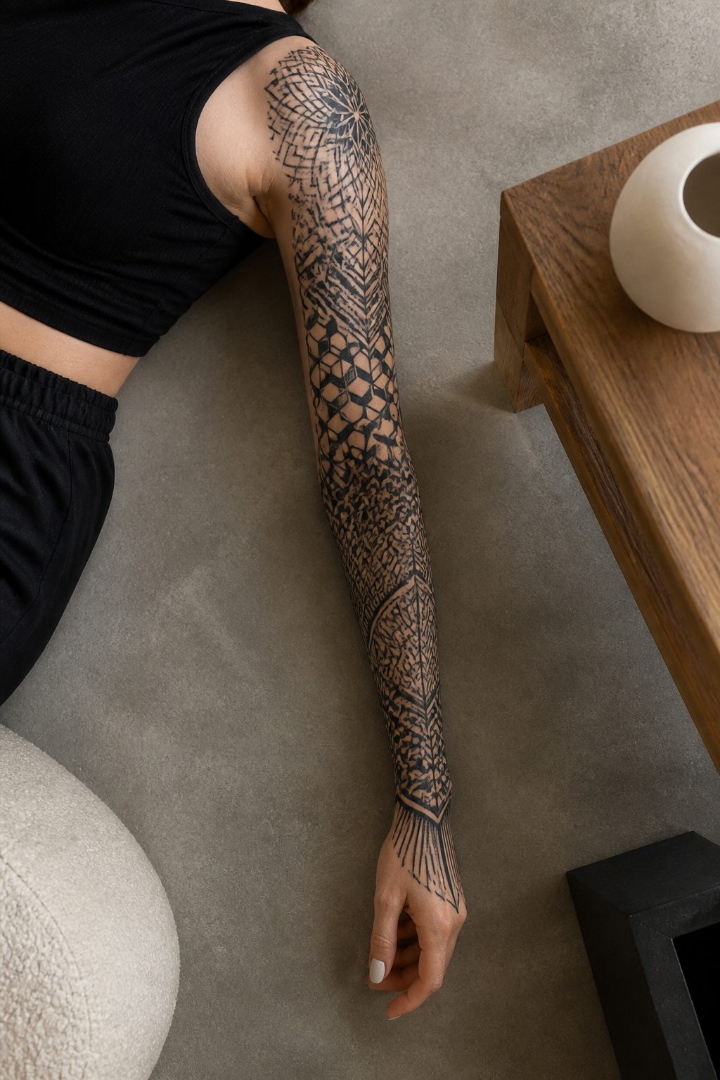
Clean lines read differently on a curved surface than on paper.
What convinced me, looking through portfolios of arm sleeve tattoos for women built on geometry, is that the pattern has to travel with the muscle or it breaks apart the second the arm moves.
Circles and triangles that sit dead center on the bicep distort when the flexor contracts; the same shapes offset slightly toward the outer edge hold their structure through a full range of motion.
Geometry works as the main sleeve language when the pattern carries enough variation to carry the eye from shoulder to wrist without a centerpiece to rest on.
Think interlocking polygons that shift scale as they travel, or a single repeating unit that compresses at the elbow and expands toward the collarbone.
It fails when the design is too uniform; the eye needs the variation to read it as art rather than wallpaper.
As an accent, geometry solves problems other styles create. A floral sleeve can lose its structure past the mid-arm mark.
A band of hexagons or a radiating grid behind the flowers gives the composition a skeleton the organic shapes alone lack.
The mix is harder to pull off than a single-language sleeve, which is why fewer artists attempt it, but the ones who do are building the most distinctive work I saw in this category.
6. Abstract Art
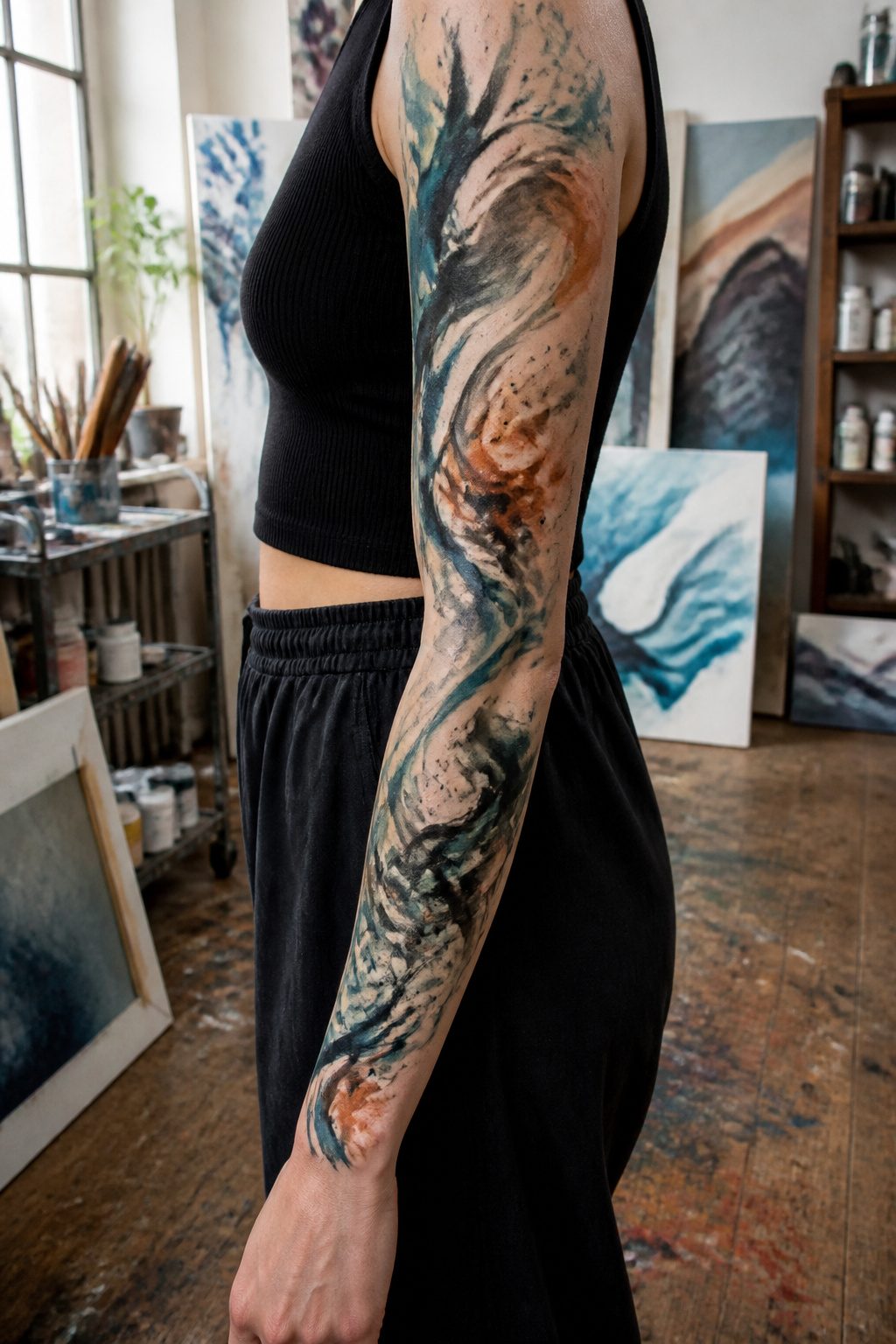
Abstract sleeves let color and line do the work that a rose or a wolf would do elsewhere.
I have watched these shift over the years from clean-edged color fields to looser, brushstroke-heavy pieces, and the gap between intentional and unfinished is where most of them fall apart.
The difference is edge control: a shape that fades to skin with a plan reads as gallery work; one that drifts off because the artist ran out of ideas reads as abandoned.
Blues and earth tones hold their placement better than high-contrast primaries, which pool and muddy where the ink settles unevenly in the inner arm’s softer skin.
Large forms age more gracefully than scattered small ones, since a single moving shape can blur slightly and still carry its logic, while a cluster of disconnected marks just becomes noise.
If you are drawn to this style, ask to see healed photos from two-plus years out, not fresh work. Fresh abstract tattoos always look intentional; time is the test that separates the considered from the merely spontaneous.
7. Cultural Themes
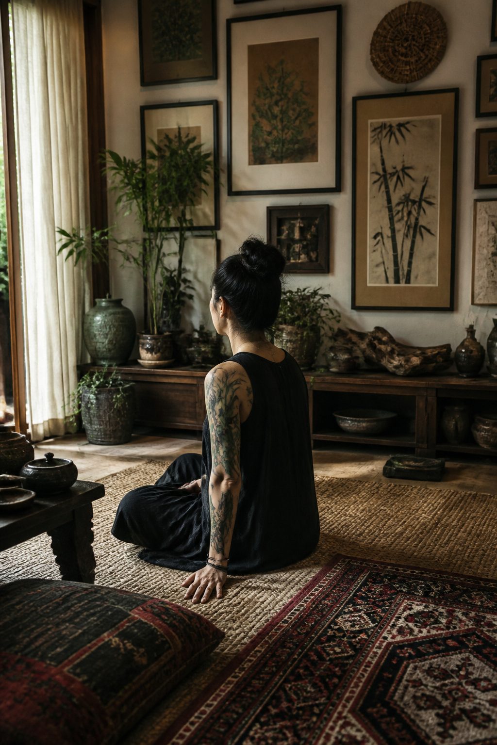
Cultural symbols carry weight on skin that they do not carry on paper.
A bamboo half sleeve rendered in traditional ink wash style, the kind rooted in Chinese painting, marks resilience and integrity for the wearer whose heritage it actually belongs to. That distinction matters more than most tattoo discussions admit.
The late 20th century shift toward larger, more intricate designs gave women space to claim these symbols seriously. But the same openness created a market for borrowed imagery stripped of context.
If the symbol is not from your lineage, the line between appreciation and appropriation thins fast. A Japanese koi sleeve without family connection or living study of the tradition reads as costume.
The same design on a Japanese-American woman reclaiming her grandmother’s motifs lands entirely differently.
Modern interpretation works when the wearer has done the work: learned the symbol’s history, found an artist trained in that specific tradition, and accepted that some designs remain closed.
Tribal identification tattoos, historically used for spiritual protection, are not open source. The half sleeve format tempts people toward spectacle because the canvas demands filling.
Resist that pressure. A smaller, culturally grounded piece outlasts a sleeve assembled for visual impact.
8. Personal Stories
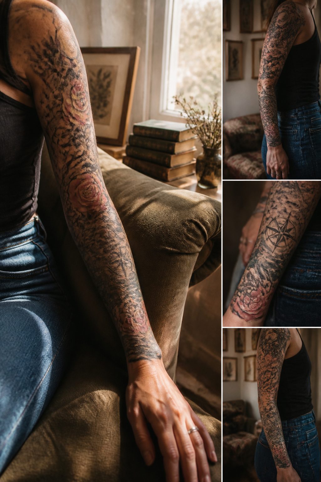
The arm sleeve tattoos for women that carry the most weight are the ones built from actual life, not borrowed symbolism.
A sleeve tracing a single narrative arc, birth to motherhood to loss, demands more from the artist and more from the wearer than any floral or geometric template ever could.
What separates the rewarding pieces from the regretted ones usually shows up around year three, when the daily mirror stops feeling like a reminder and starts feeling like homework.
What convinced me, reading through a dozen accounts of sleeves built from personal milestones, was how often the visual interest collapsed once the story’s urgency faded.
A wedding date rendered in a partner’s handwriting, a child’s footprint scaled to shoulder size, these read as irreplaceable at twenty-six and as anchoring at forty-six.
But a sleeve needs at least three visual systems working at once to survive that shift: line variation, negative space, and color temperature that holds up in winter light and summer tan alike.
Test your story against a smaller piece first. A forearm panel, six months healed, will tell you whether the imagery still carries charge when the event itself feels ordinary.
If the smaller work goes flat, the sleeve will go flatter, because scale magnifies both confidence and doubt.
How I Judge a Sleeve Design
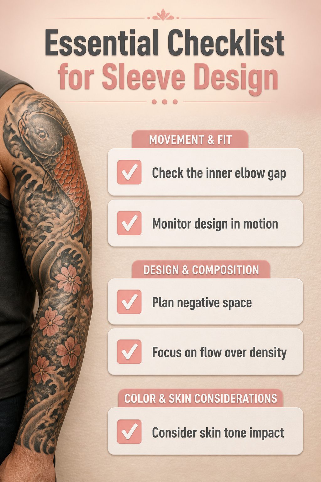
Coverage that looks complete when the arm hangs straight but gaps when you bend the elbow is a mistake you notice on other people first.
I spent months watching sleeves in motion before sitting in the chair myself, and the gap at the inner elbow is the detail that separates work I still admire from work I would change. Flow matters more than density.
A design that reads as one continuous piece when the arm moves requires planning the negative space as deliberately as the ink, something I understood in theory but underestimated in practice.
Skin tone shifts how color sits, not whether it sits.
Reds and yellows that hold on fair skin muddy faster on deeper tones unless the saturation is pushed, a variable my artist adjusted session by session but one I had not factored into my original concept.
The sleeve I ended with behaves better in motion than the one I first designed, because I learned to judge a layout by how the shapes compress and stretch across the muscle rather than by how they look flat on paper.
Mandalas and Symbol Meanings
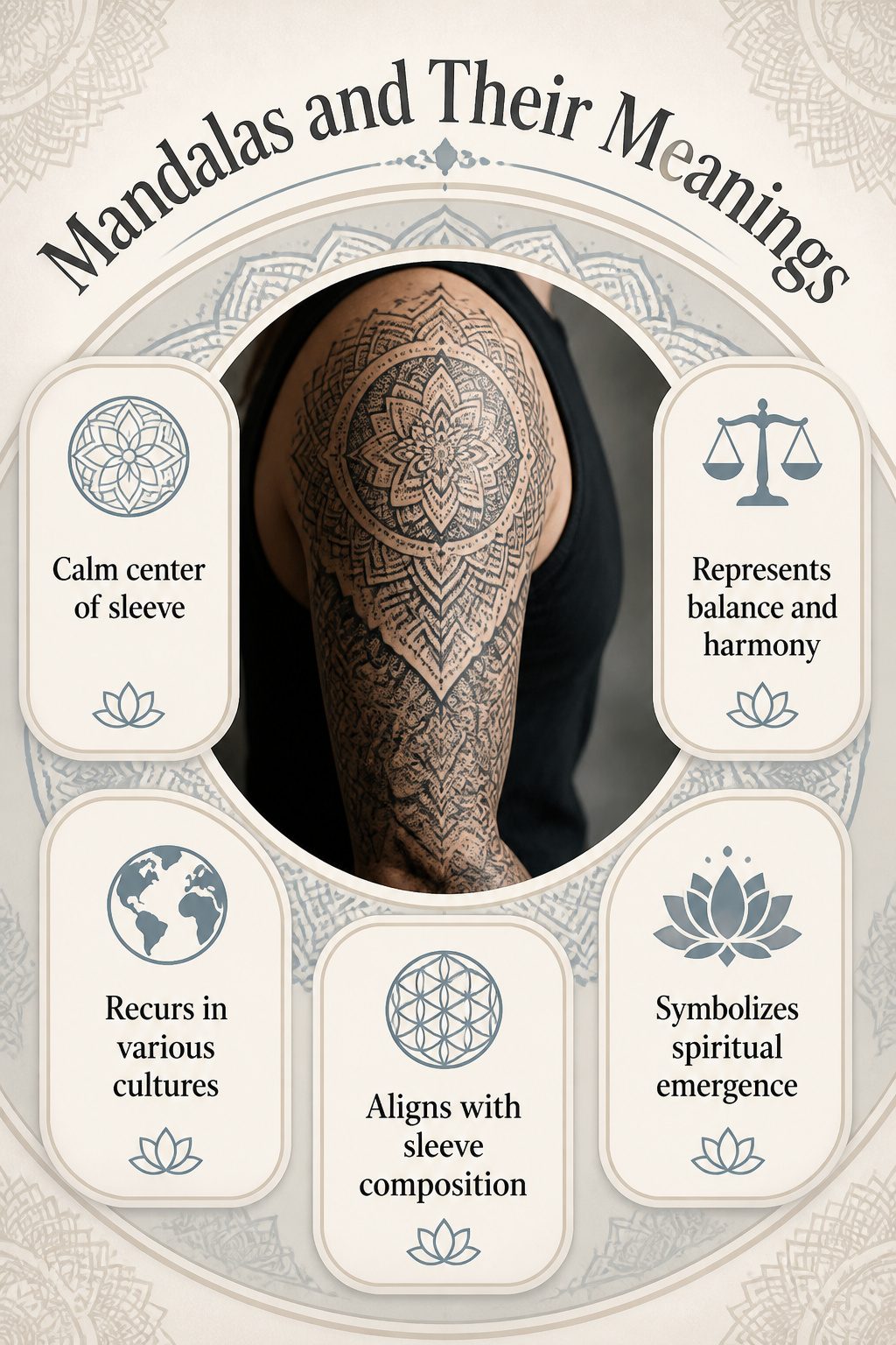
A mandala placed at the elbow or shoulder reads as the calm center of a busy sleeve, and the rest of the design organizes itself around it.
I have seen this work as a single large piece and as smaller units that repeat down the arm, each one slightly varied so the eye keeps moving.
The geometry itself carries weight: concentric circles, radial symmetry, the sense of a center that holds.
The symbols that recur across traditions are worth knowing before you commit. Lotus petals frame many mandalas, representing emergence and openness.
The eight-spoked wheel, the endless knot, the sacred geometry of the Flower of Life, these appear in Hindu, Buddhist, and secular interpretations alike.
What changes is the detail work, the line weight, whether the artist builds the pattern with dotwork or solid fill.
A sleeve that mixes mandalas with other imagery needs one of two approaches.
Either the mandala dominates and other elements orbit it, or the pattern breaks apart at the wrist and reforms at the shoulder, acting like punctuation between larger scenes.
I have watched designs fail when the mandala is treated as a sticker slapped between unrelated images. The radial structure demands that everything around it either align to that center or deliberately oppose it.
Most artists I respect choose alignment, letting the geometry breathe by keeping the skin around it relatively quiet.
What to Look For in an Artist
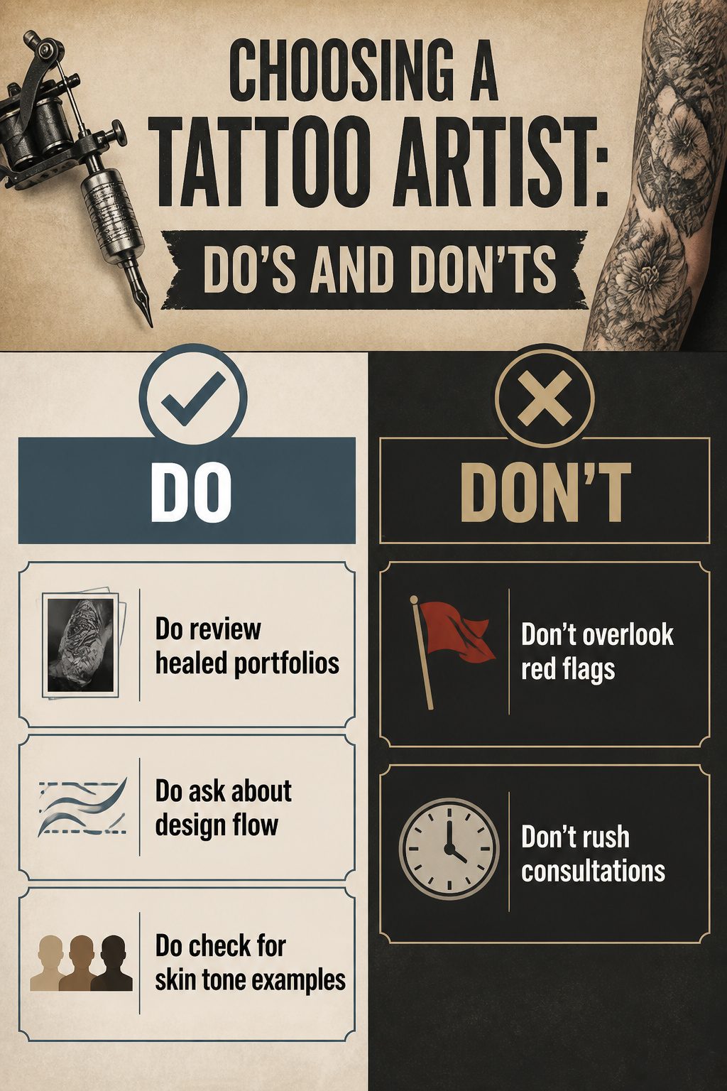
Every ranking list for arm sleeve tattoos for women skips the part that matters most: naming who actually did the work. The gap is real, and it leaves you guessing.
I filled it the hard way.
I spent two evenings scrolling portfolios before I knew what to look for. Fresh photos look crisp and saturated; healed work, shot six months to a year later, shows whether lines stay tight and colors settle flat.
A portfolio with only fresh pieces is a portfolio with something to hide. That filter alone eliminated two studios near me.
The third studio fell out when I asked to see healed photos of sleeves specifically, not isolated flash pieces. The artist had none.
The one I chose had three full sleeves in her healed gallery, two on women whose skin tone matched mine. I asked how she handles the stretch and compression of the inner arm, where the skin moves most.
She described adjusting the design flow to account for it, not just tracing the stencil flat.
That answer cost me forty percent more per session than the lowest quote I received, and it was the cheapest insurance I bought in the whole process.
Red flags beat price every time. An artist who rushes consultation, who cannot explain why a design element will or won’t age well, or whose healed work shows blowout in the linework, will cost more in cover-up than you saved.
The Timetable I Actually Followed
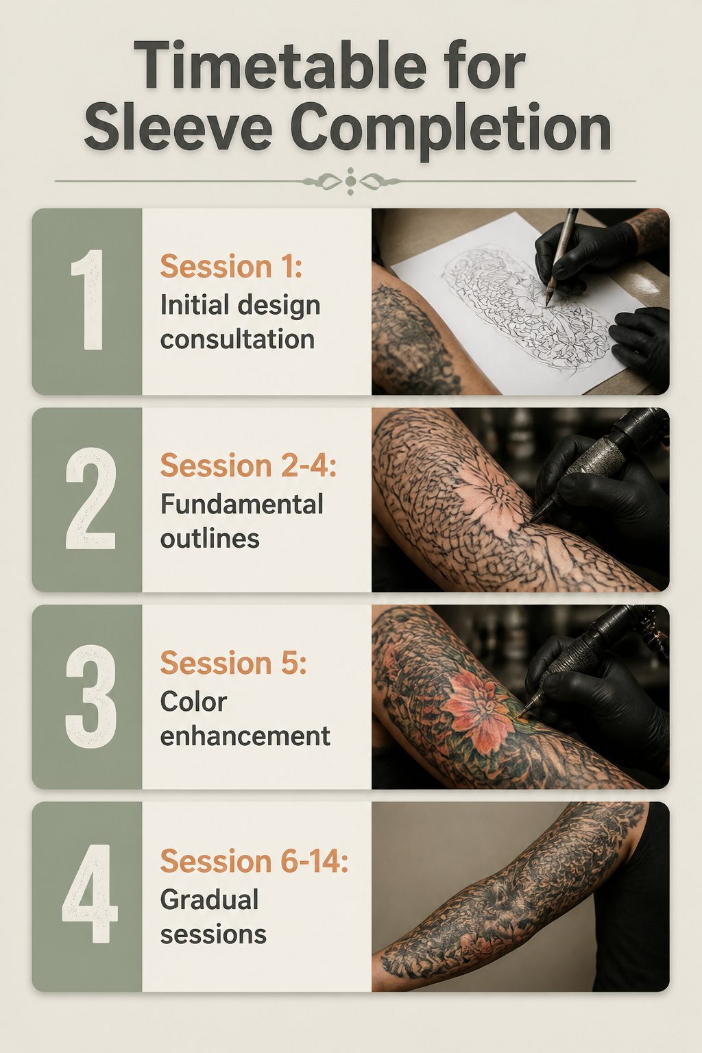
A full sleeve took me fourteen sessions across eleven months, and that spacing mattered more than I understood at twenty-eight.
The first four sessions came three weeks apart; the skin felt ready, the color held, and I assumed momentum was the point. By session nine, rushing the second half became the mistake that shaped the whole piece.
Scabbing on the inner bicep pulled ink unevenly, and the artist had to rework areas that should have settled clean.
Three weeks is the minimum; five to six weeks is what the skin actually needs for the deeper saturation a sleeve requires.
At thirty-five, I would have sketched the full flow before the first needle touched skin. Healing gaps shifted my design plan in ways I did not anticipate.
A planned gradient on the forearm had to become solid black when the original lines blew during a too-quick second pass. The body tells you when it is done; the appointment book does not.
Placement Tricks That Change the Read
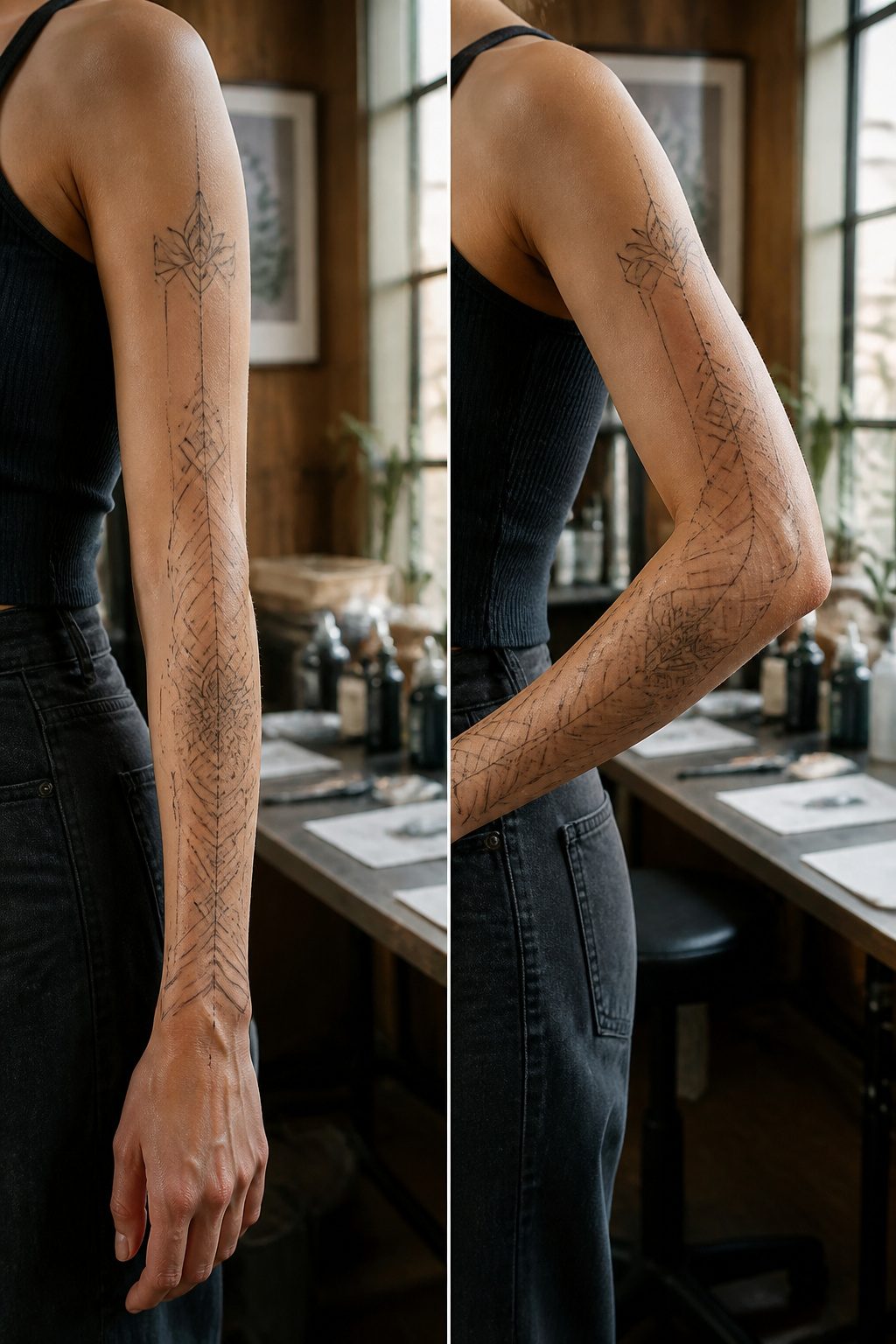
A straight arm and a bent arm tell two different stories. The shoulder-to-elbow zone stays fairly stable, which makes it the safer bet for faces, lettering, or anything that needs to read instantly.
Drop below the elbow and you are working with skin that stretches, folds, and disappears when the arm hangs at your side.
I learned this watching my own sleeve in mirror checks over months: a geometric pattern I loved on the flat of my forearm turned into a blur of lines the moment my elbow bent past ninety degrees.
Some motifs only survive in one zone. Delicate linework above the elbow held; below, the same needle weight looked washed out within a year.
If your design relies on a single focal point, plant it where the arm moves least.
Two half sleeves versus one full comes down to how much continuity matters to you. A full sleeve forces one narrative start to finish.
Two halves let you switch styles, switch artists, or stop entirely without a half-finished band running down one side.
For anyone who commits slowly, the split approach buys time to see how the first half settles before the second gets drawn.
Frequently Asked Questions
What are the best sleeve tattoo ideas for women?
The strongest arm sleeve tattoos for women right now are floral designs, animal motifs, geometric patterns, and abstract art.
Florals wrap the muscle line naturally, animals like lions and owls carry presence at scale, geometry travels with the arm’s movement, and abstract work lets color and line replace literal imagery.
Each style ages differently, so the best choice depends on how much skin you want covered and whether you need the flexibility to hide it.
How do I choose a tattoo design?
Start with a clear vision that has stayed consistent for months, not weeks. Test the imagery on a smaller forearm panel first; if it goes flat in six months, a sleeve will only magnify that doubt.
Look for an artist whose healed portfolio includes full sleeves on skin like yours, and ask how they adjust design flow for the inner arm’s stretch and compression. The consultation should feel thorough, not rushed.
What does a half-sleeve tattoo symbolize?
A half-sleeve tattoo for women carries whatever meaning the wearer builds into it, from personal milestones to cultural reclamation.
Historically, women in various cultures used tattoos for rites of passage, protection, and identity; the modern half-sleeve flipped that into personal expression and empowerment.
Its placement from shoulder to elbow gives you control over when the work is visible, which itself becomes part of what it represents.